InStep: Creating Mosaic Tile Effects with Illustrator & Photoshop
Learn to use Illustrator and Photoshop to create custom text with subway mosaic tile effect.

This article appears in Issue 1 of CreativePro Magazine.
The subway system in New York (and, indeed, like that of many cities around the world) is known for the tiled signs that display the names of the stations. In the example below, showing the mosaic at Carroll Street Station in Brooklyn, the text is three tiles thick throughout.

(Image courtesy of Ben Franske, under Creative Commons.)
Creating this effect is a somewhat tricky procedure, as each letter has to be drawn by hand as simple outlines. But as the effect is more hand-lettered than mechanically typographic, any vagaries in the letterforms only add to the overall effect.
In this tutorial, you’ll start creating the artwork in Illustrator, as that program allows you to run a pattern along a path. After you’ve created the basic text, you’ll take it into Photoshop for modification. Grab on to something; here we go.
Step 1: Make Your Pattern
Start by creating two squares, and draw a bounding rectangle that encloses them. (You can use three or more squares if you wish, for chunkier text.) Using contrasting fill colors such as blue and yellow looks all wrong, but later it will make selecting the different regions easier.
Choose New Brush from the menu at the top of the Brushes panel (or just click the + icon at the bottom of the panel), and then choose Pattern Brush as the type. You’ll see an indication of how the pattern will run along your selected path (Figure 1). You don’t need to worry about the size and spacing at this point, as it’s easy to modify later.

Figure 1
Step 2: Draw Your Letters
Use the Pen tool to draw the shapes of your letters (Figure 2). For letters such as S, U, and B, I drew a circle then deleted one of the anchor points to make a semicircle, which is a lot easier than trying to draw symmetrical shapes by hand. Alternatively, you might get good results by converting text to outlines and removing some parts of the path. See this thread at the Adobe forums for a clever technique using blends to create simplified letter shapes.

Figure 2
Step 3: Apply the Brush Pattern
Select all the paths that make up your text and click the newly created brush pattern. It may look all wrong, as it does in Figure 3, but we’ll fix that. With the text outlines still selected, choose Options of Selected Object from the menu at the top of the Brushes panel.

Figure 3
Step 4: Adjust the Scale
With the Stroke Options panel open, reduce the size of the pattern until it’s a suitable size for your lettering. In the Fit section of this panel, choose Stretch to Fit for a better appearance. Already, it’s starting to look more like real mosaic lettering (Figure 4).

Figure 4
Step 5: Cut Up the Paths
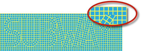
Even with the stroke reduced, the lettering isn’t looking quite right (Figure 5). One problem is the sharp points on the W and A; but when you look at the corner of the B, you can see how the mosaic has been distorted to make the corner. The solution? Use the Scissors tool to cut each of the corners, so the offending letters are all built from individual rather than joined paths.

Figure 5
Step 6: Modify the Lettering
With the W, A, and Y split into separate paths, the lettering is starting to look as if it could be made from mosaic tiles (Figure 6). Drag guides down from the ruler, and adjust the heights of the paths so that they line up. I deliberately stretched the W, A, and Y to extend over these guides; it will be much easier to fix this in Photoshop later.

Figure 6
Step 7: Taking It into Photoshop
Select all your lettering, and copy it. Make a new Photoshop document of any size, and choose to Paste as Pixels. You can stretch the artwork as large as you like (Figure 7). Because Illustrator artwork is in vector format, there’s no limit to how big you can make it.

Figure 7
Step 8: Make a New Pattern
You now need to make a background filled with tiles—and the size must match the size in your lettering. To do this, select a single tile, together with the space to one side and below it. From the Edit menu, choose Define Pattern (Figure 8).

Figure 8
Step 9: Fill with the Pattern
Make a new layer, and choose Edit > Fill. Choose your newly created pattern from the menu, and it will fill the whole canvas. You can now crop the image to the size you want, ensuring whole tiles appear at each edge (Figure 9).

Figure 9
Step 10: Invert the Pattern
To make it easier to see what’s going on, choose Image > Adjustments > Invert to invert the colors in the pattern (Figure 10). This is a good time to use the Rectangular Marquee tool to select and delete the tops of the W, A, and Y that extend too far. With the background tiles in place, you can also see that the letters aren’t lining up with the background tile grid, so that will need to be fixed next.

Figure 10
Step 11: Fix the Alignment
Figure 11 shows the lettering moved around so that the strong verticals in letters such as U, B, and Y line up with the background mosaic grid. Line up your letters with your grid, but don’t obsess over exact, precise alignment; we’re simulating tiles that have been cut and placed by hand, after all.

Figure 11
Step 12: Separate the Elements
You need to separate the tiles from the cement between them, so that they can be treated independently. Because you used very contrasting colors when creating the tile in Illustrator, this is easy to do. To select the text tiles, click a single tile with the Magic Wand, and then choose Select > Similar. Use Command/Ctrl+J to copy this selection to a new layer and hide the original text (Figure 12).

Figure 12
Step 13: Select the Cement
Switch to the background pattern layer, select all the cement with the Magic Wand, and copy it to a new layer. Then, load the original text layer as a selection by holding Command/Ctrl and clicking the layer’s thumbnail in the Layers panel; use Delete/Backspace to delete this from the new cement layer (Figure 13).

Figure 13
Step 14: Add the Text Cement
Reveal the text layer again, and select the cement on this layer with the Magic Wand. Switch to the background tile cement layer, and use Option+Delete/Alt+Backspace to fill this selection on the layer. Choose a suitable cement color, such as the dark brown in Figure 14, and use Option+Shift+Delete/Alt+Shift+Backspace to fill all the pixels on this layer with your foreground color.

Figure 14
Step 15: Add Some Texture
Switch to the text tiles layer, and select foreground and background colors such as mid-brown and white. Use the slash (/) key to preserve the transparency of this layer, and use Filter > Render > Clouds to add a random texture to the layer (Figure 15). Tip: You can hold Option/Alt as you do so for a tighter effect.

Figure 15
Step 16: Add a Bevel
Open the Layer Style dialog box from the bottom of the Layers panel, and choose Bevel and Emboss. Add a small Inner Bevel, and (optionally) a small Drop Shadow for added effect (Figure 16).

Figure 16
Figure 17 shows the artwork with the bevel applied. Notice it gives the tiles a more three-dimensional appearance, which enhances the overall effect.

Figure 17
Step 17: Add a Background Texture
Hide the background texture layer, leaving just the unified cement texture visible. Then, create a new layer at the bottom of the layer stack, and fill it with a suitable color. For Figure 18, I chose a light and a dark green and used the Clouds filter once again to create a random texture.

Figure 18
Step 18: Bevel the Background Tiles
Select the unified cement layer, and use the Layer Style dialog box again to add a bevel effect. Because you’re adding the effect to the cement, rather than to the tiles, you need to change the way it works. Choose Outer Bevel rather than Inner Bevel, and change the Direction from Up to Down (Figure 19).

Figure 19
Step 19: The Finished Artwork
Figure 20 shows the result of applying the bevel effect to the cement. It looks as if it has been applied to the tiles. As one final touch, you could select the outermost ring of tiles, as I did, and recolor them to match the lettering.

Figure 20
Enjoy the Ride
In this example, we emulated the look of tiled subway signage, but you need not limit yourself to that niche. You can employ these techniques any time you want to create a unique mosaic effect for lettering or other shapes.
Commenting is easier and faster when you're logged in!
Recommended for you

Illustrator Downloadable: Winter Birch Pattern Set
Lovely patterns and colors to use when you want to evoke the feeling of a cozy s...

The Digital Art Studio: Recoloring a Scan with Illustrator
How to recolor Illustrator images with a new color palette—and do it quickly.

Illustrator Downloadable: Lush Leaves Pattern Set
Add a feeling of freshness, growth, and tranquility to your designs with these v...


