Inspiration from the East: Taiwan

After my travels in Japan (Inspiration from the East: Japan) earlier this year, I returned to the United States out of Taiwan. During my brief stay there, I managed to capture some interesting designs. I hope you’ll find inspiration and delight in them.
Flyers
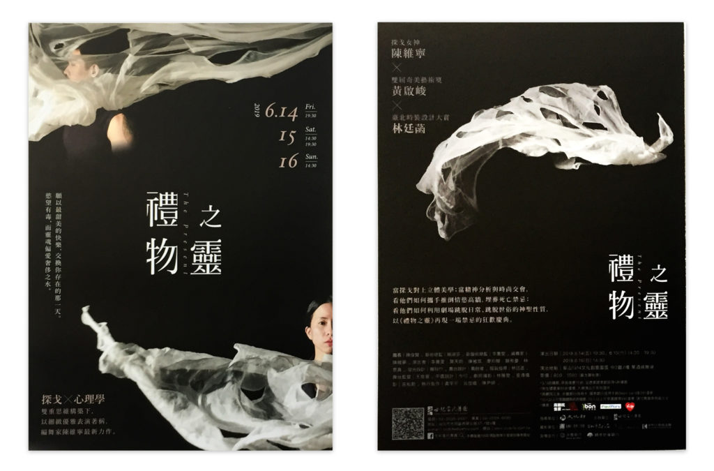
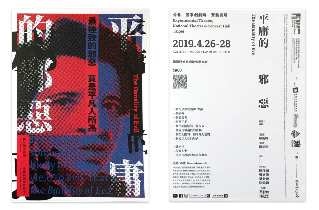
Chinese can be written vertically or horizontally (as can Japanese and Korean). These flyers show English also flexibly arranged in vertical and horizontal positions, a juxtaposition that adds a sense of motion and dynamism to these layouts for theatrical productions.

An intriguing fold and cut job makes a playful multilingual flyer for an exhibit featuring pieces from five national cultural centers. When opened, the flyer displays the descriptions in Chinese (top row, right). That panel lowers to reveal the English translation (middle image). The back of the flyer, when partially folded, connects between HI, STORY (playing on “history”) and the Chinese characters for “past” and “future” (the first part of “past” connects to the “HI,” on the flip side).
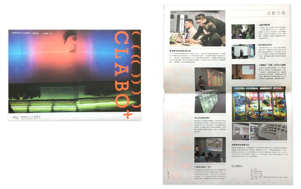
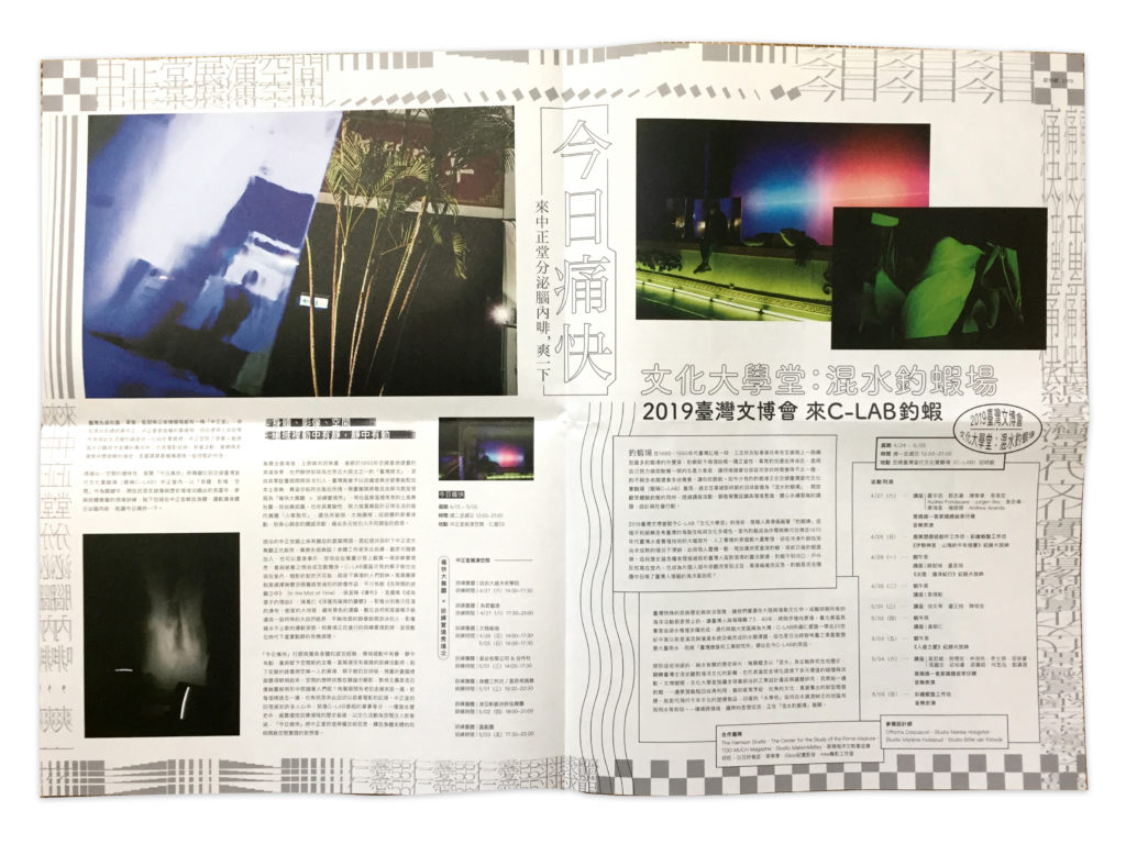
Not quite a flyer, yet not quite a pamphlet, this newspaper-sized document boldly advertises and describes the latest happenings at a cultural center. The pixellated style of the neon orange display text renders a digital aesthetic on paper, and the borders of the interior spread show extreme distortions of Chinese characters. They visually suggest an effort to push the boundaries of accepted contemporary culture in Taiwan.
Poster

Neon orange grabs attention, as does the Chinese character for “power”—its scaling effects suggest reverb, echoes, shaking, and high amplitude. This dramatic design seems to pulse with barely contained energy when delivered in its folded state (left), and when opened (right), screams with force.
Packaging
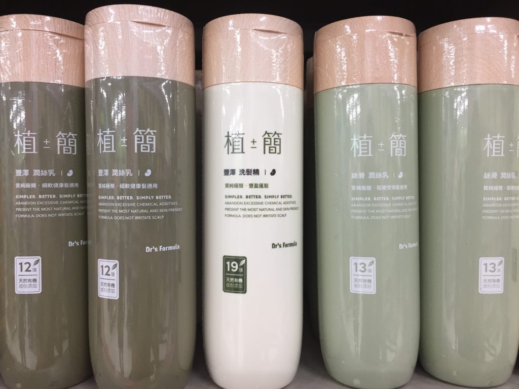
Japan still takes the cake (in my book) for stunningly beautiful product packaging. But I found a few interesting pieces in Taiwan, including these shampoo bottles. The shampoo bottles look like segments of bamboo, as though you are in a rainforest. The pale lid in a bamboo-ish shade tops it off.
Book covers
In Taiwan there is a street of entirely bookstores, just one after the other. It’s quite overwhelming, as these bookstores sell more than just books—from carrot-shaped pens to music score notebooks and notepads of stressed-out squids. Here’s proof:
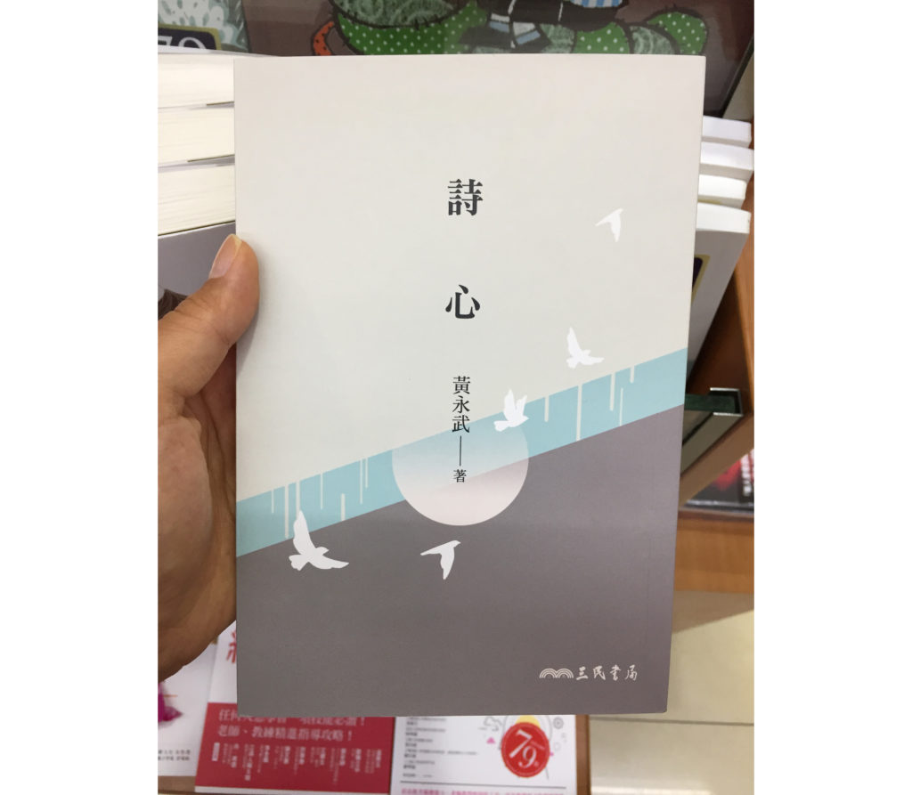
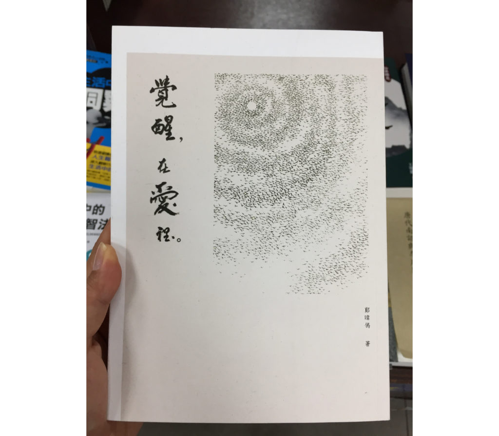
But many of the book covers offer a zen-like peace amidst the crowded shelves. A few finds:
The return home
When I returned from my travels, a non-designer friend asked me, “What are you going to do with this experience?” I explained that, to me, design education is so much more than taking courses and reading books, or even working on projects. It’s also about looking broadly, which builds your visual vocabulary, and thinking about what you’re noticing (and not noticing). It’s about constantly challenging the way you perceive and interact with life. Travel will change the way you serve humanity with your work, whether you do something with the experience immediately or not. Because travel changes the way you see things.
Whenever the opportunity arises, go out and see the world. See what’s beautiful, and what’s broken. Share what you find.
This article was last modified on May 20, 2021
This article was first published on August 5, 2019
Commenting is easier and faster when you're logged in!
Recommended for you
CreativePro Week: Designing for the Real World – George F. Baker III
Atlanta-based muralist George F. Baker III shares his insights into what it take...

Color Inspiration and Creation: Color Me Inspired!
Where does creative inspiration come from? One of my biggest challenges when des...
CreativePro Week 2024 Keynote: Thriving by Design with David Blatner
David Blatner opens CreativePro Week 2024 by inspiring attendees by talking abou...


