


During my childhood, my dad traveled often for his work. Before he’d leave, he’d always ask if I there was anything I wanted him to bring home for me. Usually, I’d ask for a small rock to add to my collection—except when he went to Japan. Because as much as I liked rocks, I loved Japanese design. From the little I had seen of Japanese products, everything seemed exquisitely, distinctively designed, whether it was a box of crackers or the hotel soap. I vowed to visit Japan myself someday, and this year, I did. I took about a thousand photos (completely forgetting about rocks). I’ve selected some highlights to share; I hope you’ll find inspiration and delight in them.
Flyers

The flyer on the left advertises a museum exhibition on the Kamakura earthquake of 1923. It is designed to look as jarring as its subject matter. Text and images are scattered across the page. The silhouetted artifacts reinforce the feeling of destruction and ruination. It feels disorderly and uncomfortable, with angles juxtaposed against curvy shapes. But it holds together with an underlying grid and the color theme applied to the photos and text.
The flyer on the right frames a Van Gogh piece with bold yellow and Japanese type filled in with the painting. The effect conveys a modern, Asian perspective merging with and embracing a Western classic. At a smaller scale in the flyer, the ultra-thin Roman typeface tucked into the Japanese character also integrates with and reframes a Western statement.
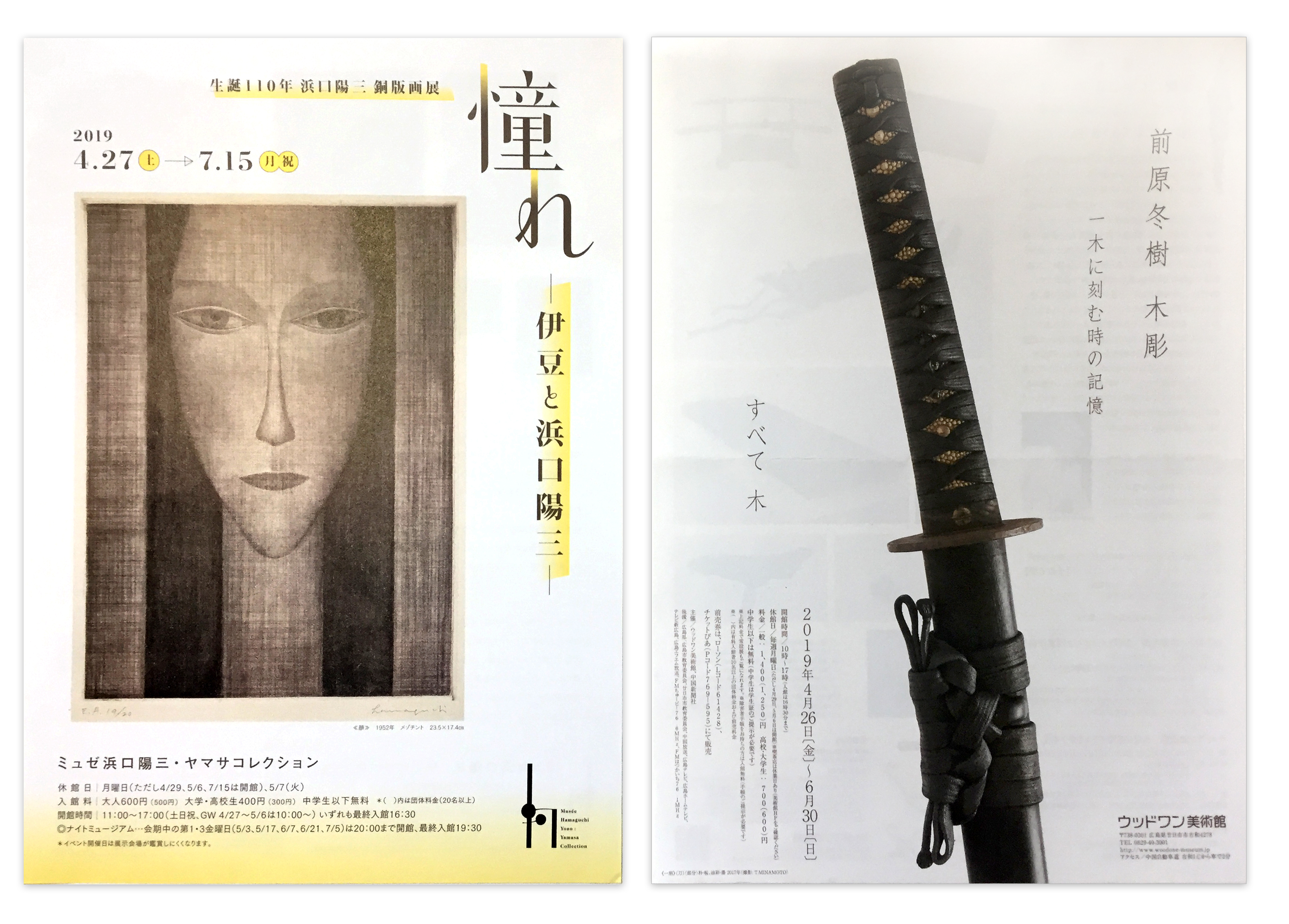
Simple yet refreshing, the flyer on the left uses a lemony gradient to highlight key info and add a touch of warm light—such as along the bottom of the page and on the verticals of the two characters at the top right. The vertical text is positioned to frame the face from the eyes to the chin, subtly drawing a parallel between the image and the copy.
In the flyer on the right, vertical type reinforces the shape and direction of the sword. This simple layout is powerful in its use of contrast and the intense image of the weapon. The close-up angle makes us imagine the weight, the scent of the leather bindings, and the feel of the textures of the handle in our grip.
Posters

A poster is meant to attract and inform. The leftmost poster does both—the choice of photography is dramatic; the subtlety of its focal point (a tiny post in the dark carrying a speck of light) makes you do a double-take.
In the middle poster, the layout emphasizes the square in the artwork by framing it in white. The typeface looks heavy, strong, and stable, mirroring the saturated shapes in the art. Gray and black text correspond in English and Japanese.
The rightmost poster shows an interesting way to portray motion. Notice also the leg illustrations set on top of the Japanese characters in the header. The centered layout creates stability.
Menus

This menu shows how the layout design can be coordinated with paper folds and cuts to create beautiful results. The menu cover evokes a sense of traditionalism; the rough edges of the logo, the hand-wrought text, and the deep earthy color set this stage. The menu opens left to right, and inside is a gatefold, with the brown reaching across the split. Three types of food are distinguished by a gradient of browns. Open the gates, and inside are the categories of dishes, each neatly contained within the folds of the brochure.

Here is another beautiful vertical, right-to-left menu, with a suite of vertical business cards. They look like the strips of paper hanging down from lanterns and wind chimes, or like the flaps of a Japanese door curtain.
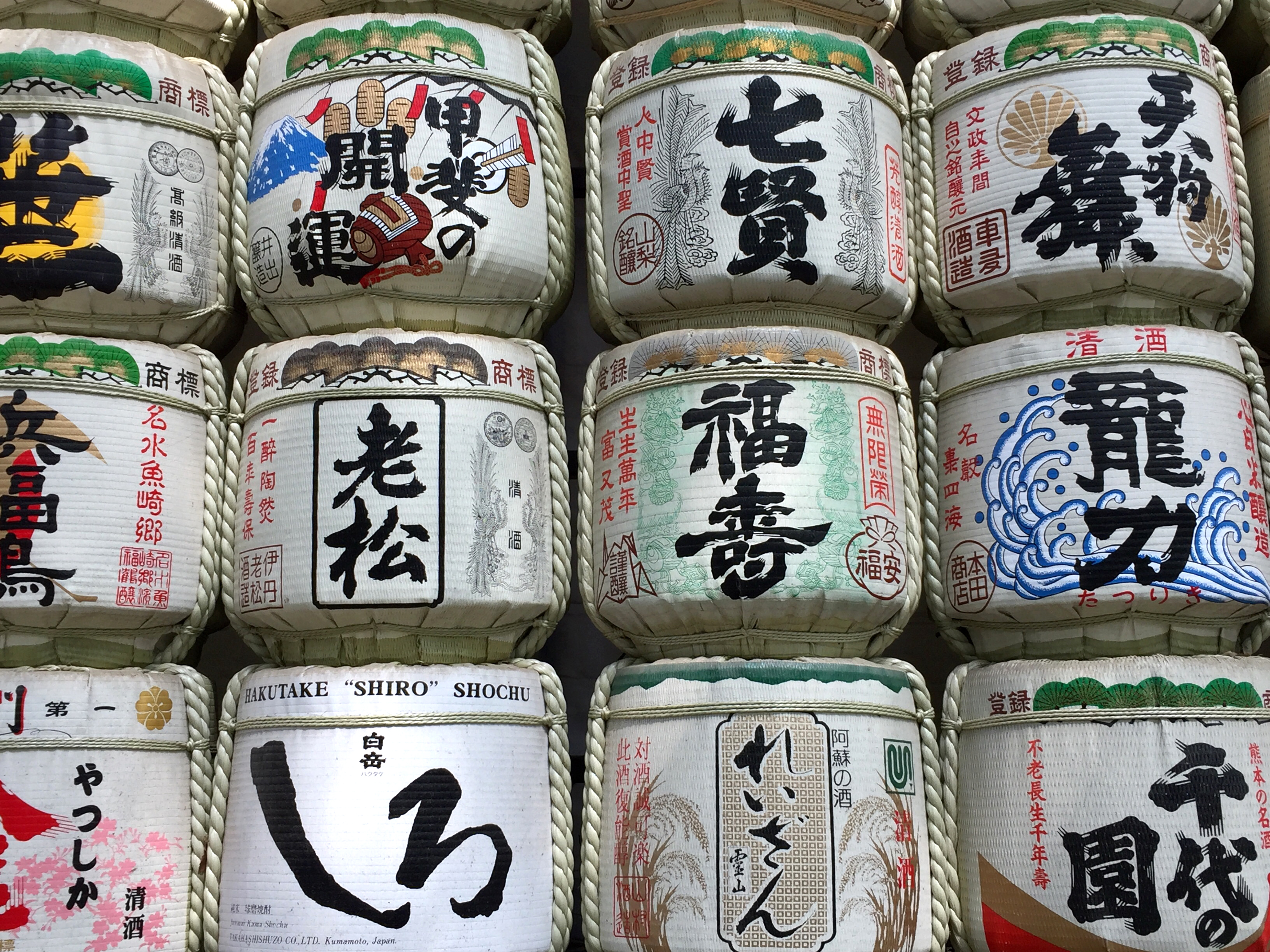
Packaging
Japanese packaging design is simply stunning. From bold, colorful patterns to delicate illustrations, these examples show how product branding is approached as an art form. 


There is simply too much beautiful packaging to show here. For more, visit my Twitter (twitter.com/MayaPLim), where I shared heaps of photos.
The next leg of the trip…
After Japan, I returned to the U.S. out of Taiwan; flights were far cheaper that way. But of course, I didn’t spend the extra days only sitting around, eating dumplings (even though that would have been fun). Look for my Taiwanese design highlights and commentary in “Inspiration from the East: Taiwan.”
This article was last modified on May 7, 2020
This article was first published on July 8, 2019
Commenting is easier and faster when you're logged in!

Recommended for you

Color Inspiration and Creation: Color Me Inspired!
Where does creative inspiration come from? One of my biggest challenges when des...

5 Ways to Find Creative Inspiration
Finding inspiration is one of the most challenging things that designers and art...
How to Be a Better Designer: Step Away from the Computer!
Look away from the screen to find yourself as a designer