
InFocus: Summer 2022
A roundup of tools, fonts, add-ons, assets, and other InDesign-centric goodies


This article appears in Issue 8 of CreativePro Magazine.
With summer on the horizon (at least in the northern hemisphere), it’s time to get outside, discover new places, and re-visit those we haven’t thought of since the weather turned cold. Or, if you’re sitting at your desk and working away in InDesign, a little adventure and discovery may be welcome there, as well. Let’s take a peek at what’s new (or at least new to you) and look into some tools that could help your workflow zip along. The sooner we’re both done with our work, the sooner we can go outside and play!
Font Repositories
Who doesn’t love free fonts? I know I do, and I love stumbling on new-to-me repositories of them. These two font aggregators have very similar names, but each offers up fonts with a slightly different twist.
First up is FontRepo. The TrueType fonts in this collection are mostly governed by Creative Commons license. While you should check to be sure, most are offered freely with “no attribution required.” You can search by the usual parameters like serif, script, or decorative fonts, but also by classifications such as horror, techno, and elvish. If you are interested in only those in the public domain, FontRepo has you covered, but oddly there is no way to search for fonts available for commercial use. The viewer loads quickly, which makes it easy to view the license, and provides links to the font’s designer.
Next up is the almost-the-same-named FONTSrepo (Figure 1). All of the fonts found here are free, though it might not seem that way at first because of all the ad links to paid sites, like Creative Market. Most of the fonts are licensed for commercial use. Pick a type category and scroll down a bit to see the fonts displayed with sample cards for each. The cards feature a bit of design in most cases, as opposed to just the font name. Clicking a card will bring you to the font’s page with samples, waterfall text, plus a custom text generator and quick access to the license.
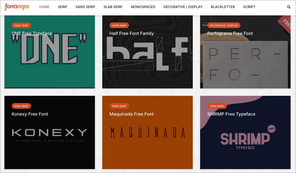
Figure 1. A selection of fonts from a search at FONTSrepo
Muzli 2
The Muzli 2 browser extension for Chrome and Safari puts inspiration right in front of your face whenever you open a new browser window. It’s a curated collection of links to articles, blog posts, and videos on design topics of your choice (Figure 2). Just like for good ol’ RSS feeds, you choose the topics that interest you most to end up with a custom information and inspiration feed. From graphic design to culture to tech, Muzli offers feeds from over 120 sources like TechCrunch, Tuts+, Creative Bloq, and Typewolf. More than just a newsfeed, Muzli 2 lets you even pick color palettes, test them in a simple UI setting, and download them as an SVG file. Muzli is also available as a standalone mobile app.
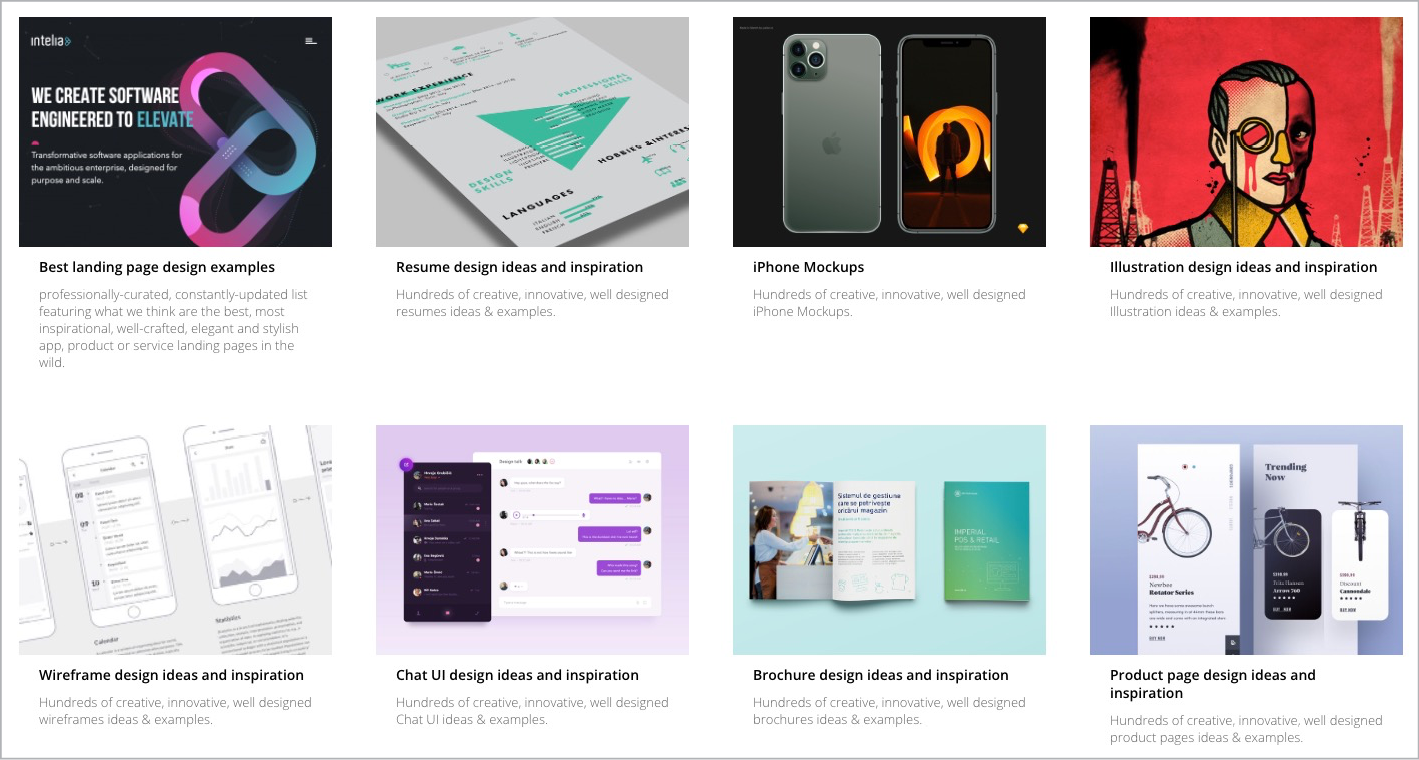
Figure 2. A curated list of design articles from the Muzli 2 Chrome extension
Find Text in Location
Here’s a question I get asked a lot in regard to InDesign’s Find/Change feature: “How can I find X in text, but only when it’s at the end of a line?” I usually reply with “You can’t” and a shrug… or if I’m being hopeful, I might suggest it would be possible with scripting. Well, now there is a script to do just that (Figure 3). The free Find Text in Location script by Kasyan Servetsky finds text at the beginning or end of a line (or even both!). Its functionality is added to the Find/Change dialog box in both the Text and the GREP tabs. Enter your criteria in the Find/Change as usual, run the script, select the location within the line, and narrow the search to the current story if desired, then click Find in the script’s interface.

Figure 3. Finding a GREP expression only when it appears at the end of a line using the Find Text in Location script
Birdfont
Are you the do-it-yourself type and you’ve always wanted to build a custom font? The Birdfont open-source font editor may be just want you need. This font-making tool lets you create TrueType fonts from scratch, using vector graphics you create in Illustrator or Inkscape (Figure 4). The range of typographic features you can build into your fonts include stylistic sets, swashes, ligatures, and custom kerning. Though open-source, Birdfont offers extra paid license levels, including a Commercial level ($4.99), which adds in the ability to sell your font, and a Plus level ($9.99) for creating color fonts as well as OTF and SVG formats.
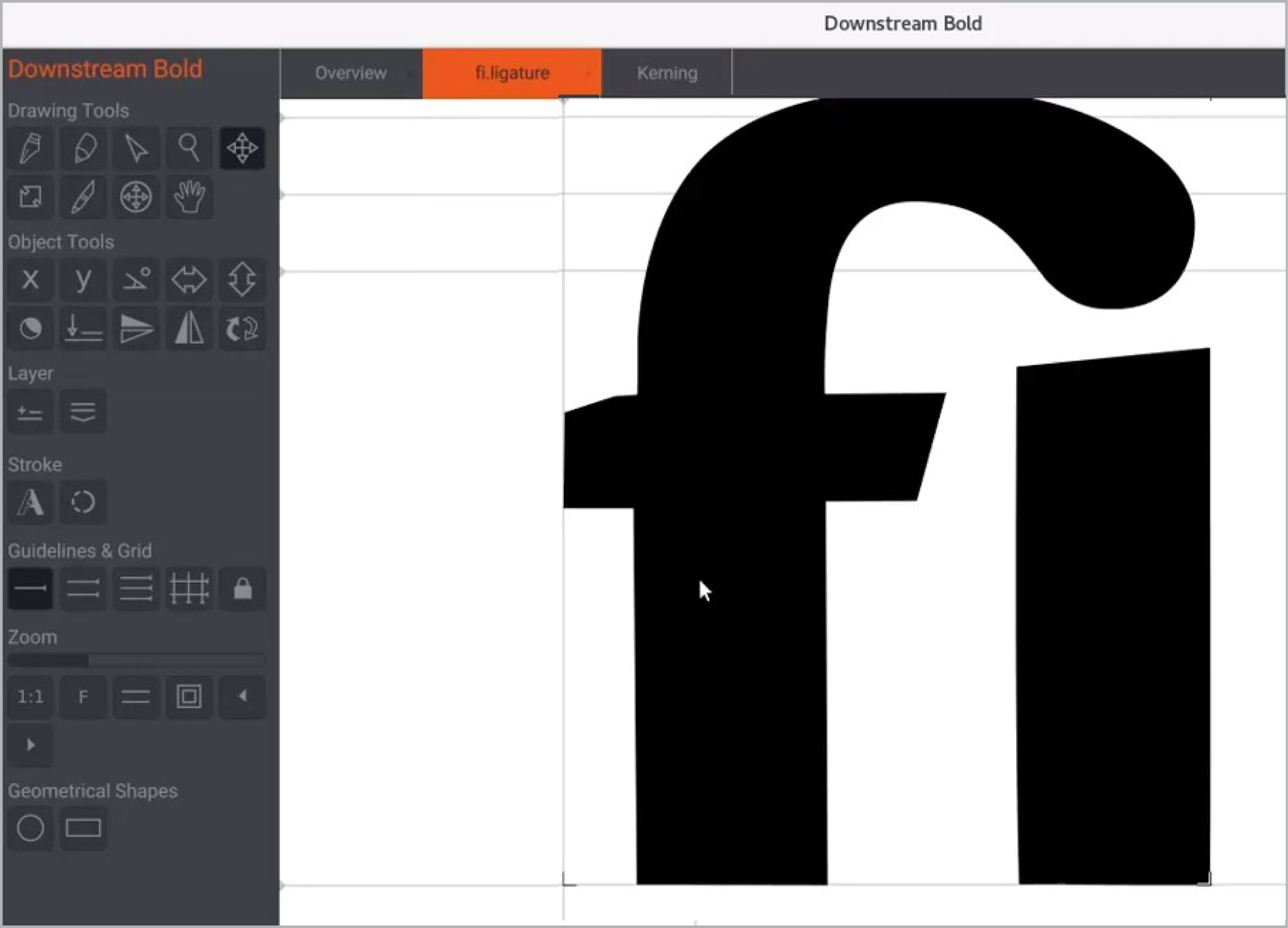
Figure 4. Creating a ligature using the Birdfont editor
The Beauty of Bézier Curves

Figure 5. A look at how Bézier curves work, from The Beauty of Bézier Curves
I’ve seen countless design inspiration/tutorial videos all over the internet, but I don’t think I had ever seen one that illustrated the concept and underpinnings of Bézier curves until I stumbled on The Beauty of Bézier Curves by game developer Freya Holmér. It is a deep dive into the mathematic concepts that form the roots of these flowy, curvy staples of vector shapes (Figure 5). The animation should make the process and physics (Is this even physics? I’m a designer, what do I know?) of the curves easy to understand, yet it only seems to add to their mystique. While some of the details might be too much for non-technical/non-math folks like myself, the video makes it easier to anticipate or visualize the curves’ behavior when working with Béziers in InDesign. Or, at least I feel like I can anticipate which way a curve might bend when I pull on the control handles.
OpenType Features Dialog
This next gem can be filed under “Scripts I didn’t know I needed, but secretly have been wishing for all along.” Here’s why: I have always hated using the OpenType submenu in the Character panel menu. Heck, just describing how to find it takes a lot of effort! If you’ve ever had to turn on ligatures or check to see if your current OpenType font has swashes, the trip to this menu—sometimes with disappointing results—takes valuable design time. The open-source OpenType Features Dialog script by Roland Dreger takes all of these OpenType options and puts them in a convenient dialog box (Figure 6). Only the available options in your current font are selectable (the rest are grayed out). Simply turn a feature on and see the results in selected text right away. You’ll be alerted of any conflict between your choices, and you can create a new character style from your selections. This is seriously one of my favorite scripts I’ve found recently, if only for being able to immediately see what’s included in nondescript groupings like Stylistic Set 1, Set 2, and so on.
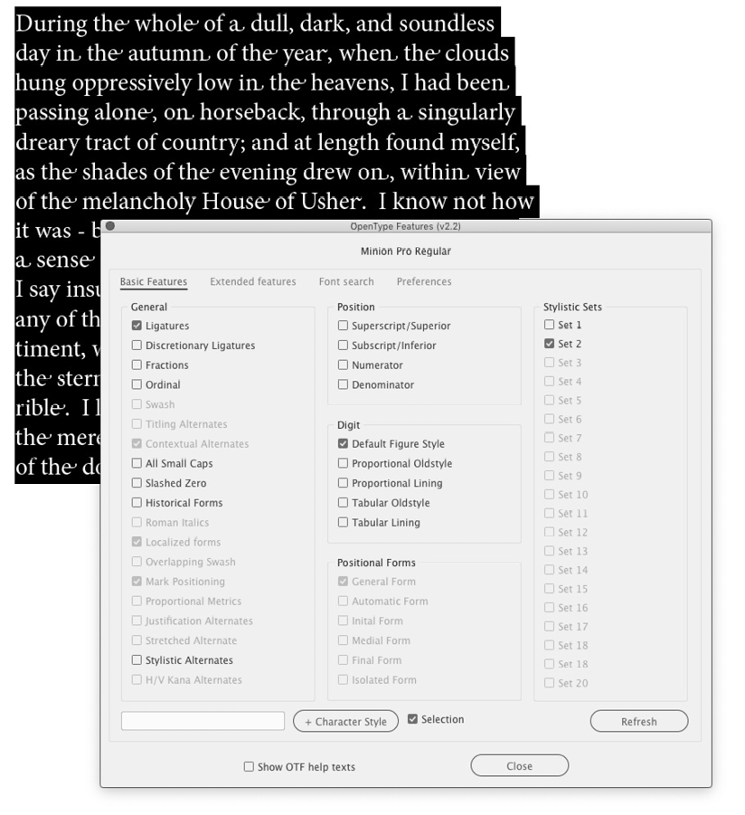
Figure 6. The OpenType Features Dialog script interface
TV Dinner Fonts
Font Diner always delivers the nostalgia—whether real or imagined—and their TV Dinner set of typefaces offers up a hearty serving! The font bundle draws inspiration from media of all types from the middle of the last century (Figure 7). The styles range from familiar TV show titling scripts to type featured on 1950s menus. Or at least those found at quaint 1950s-themed dining establishments. If you’ve been tasked with creating this nostalgic feel, Font Diner’s TV Dinner set contains 10 fonts in both OpenType and TrueType formats for $28. Like most of Font Diner’s offerings, each font sports a full complement of international glyphs.

Figure 7. A sample of the Singlesville font, part of Font Diner’s TV Dinner collection
Dictionary of Color Combinations
If you’re looking for color inspiration, the pocket-sized A Dictionary of Color Combinations or its accompanying website might be just the ticket (Figure 8). The color combinations featured in the book are culled from Sanzo Wada’s volumes of work from the 1930s. Wada was a well-known costume designer—among many other artistic talents—in mid-century Japan and was also instrumental in forming the Japan Color Research Laboratory. This color dictionary features nearly 350 of the more than 1,000 he compiled over six volumes. Each combo is laid out with very little text, other than the color’s name in English and Japanese, and grouped by two-, three-, or four-color sets. The index in the back is arranged by hue, brightness, and saturation, and includes CMYK values plus a listing of all the combinations a color appears in. Although color palette websites are handy, there is something to be said about the slow discovery of a palette from within the pages of a printed book.
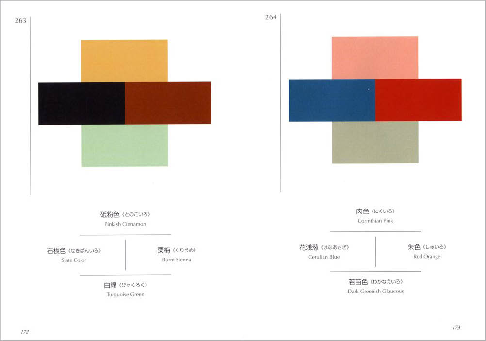
Figure 8. Sample palettes from A Dictionary of Color Combinations
Print.pm
Back in the day, I loved getting business cards at networking events. I was the person who would take a card, run my hand along the face of it, inspect the back, and hold it at an angle to look for varnish, foil, or embossing. I guess what I’m saying is that I like to savor high-quality print work. Nowadays, I mostly operate in the digital realm and have to find print inspiration in other ways. Print.pm is a website with daily inspiration featuring photos of actual printed pieces or mockups of them (Figure 9). The pages are sparse on information. Most have little other than a link to the designer’s website. This approach draws your focus to the visuals while the Print.pm Instagram page features multiple images of each piece. It seems the site is no longer being updated, but with nearly 250 pages full of existing samples, you’ll have “printspiration” for many a month to come!

Figure 9. Printed pieces serve as inspiration on Print.pm’s site.
Khroma
There are a lot of online color pickers and combination creators out there, and they all work a little differently. While some are curated and others let you make your own, Khroma uses machine learning to create its color palettes. That isn’t to say the user doesn’t do any of the heavy lifting, because they certainly do, at least in the beginning. To start, you have to pick 50 colors that appeal to you from the seemingly endless scroll. You’re encouraged to pick from varying hues and saturation to return a wide spectrum. Khroma then employs a neural network to recognize similar colors and create the palettes, the results of which are displayed in two-color samples using type (Figure 10), gradients, color blocks, and images, or with four-color palettes. Clicking any palette will display the colors as hexadecimal colors or by their RGB values, which you can click to copy. To help you choose colors for accessibility, the palettes also display WCAG contrast ratio values and you can even restrict the results to only WCAG-compliant combinations.

Figure 10. A sample of color combinations on Khroma
SmartSort
There are several reasons you might want to sort paragraphs alphabetically and having a script to do the heavy lifting is key. SmartSort from Indiscripts is a free script that does just that. One of the killer features of SmartSort is that you can tell the script which language the text is in—and therefore apply any special sorting rules for that language. Other options include sorting by case, by numbers, and whether or not to ignore diacritics when ordering the paragraphs. The shuffle feature could also come in handy when you want to randomize the order, perhaps when creating multiple choice or a general list of names. SmartSort can also sort rows in tables, which is beyond handy (Figure 11). You can even opt to sort into sections, and then further sort just within those results.
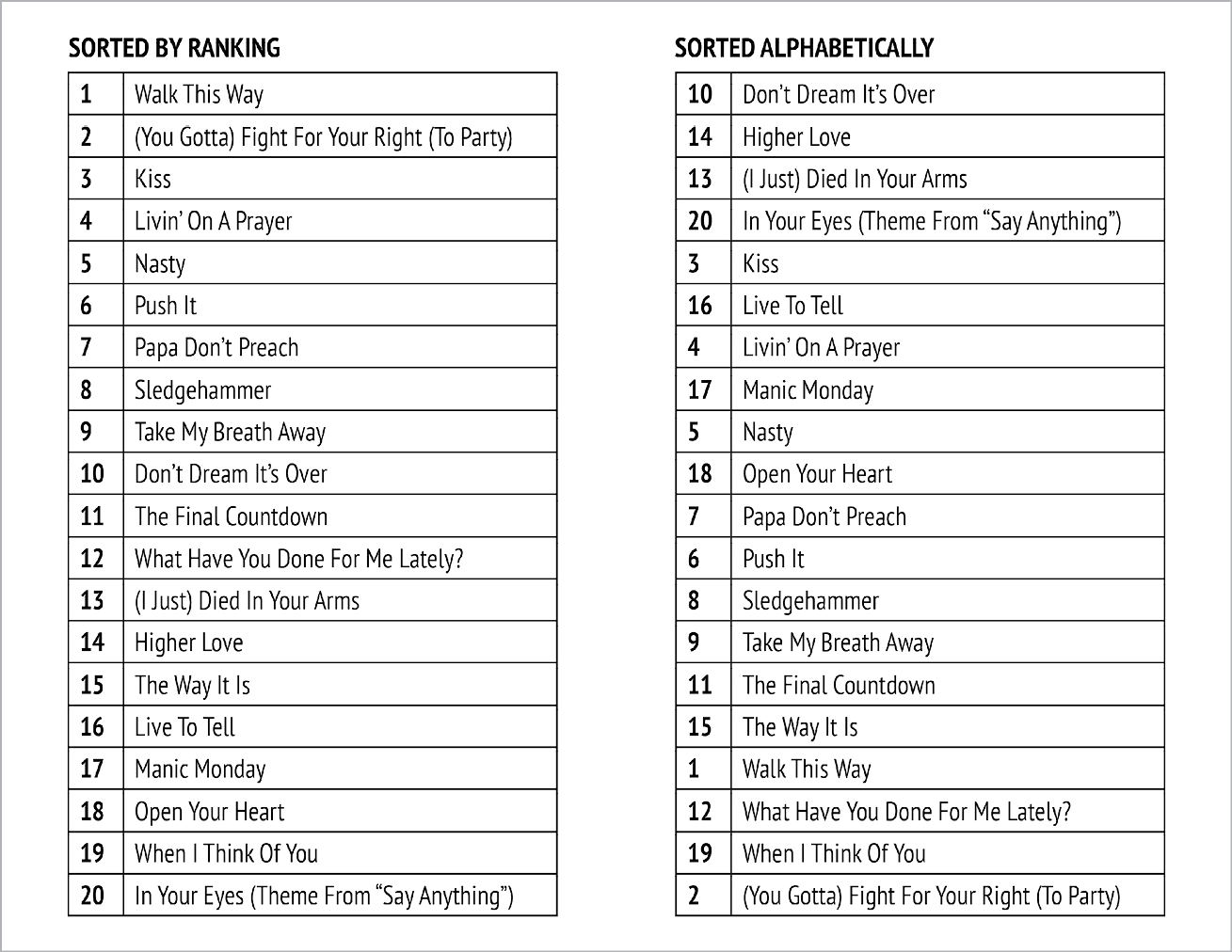
Figure 11. A numerical list in a table (left) and the same list, sorted using the SmartSort script (right)
Higumin Font
Higumin is a new font from Adobe Originals—available with your CC subscription—from Adobe Principal Designer Ryoko Nishizuka. This free-flowing, hand-letter-styled font breaks barriers in its Japanese characters, by letting them out of their boxy constraints (Figure 12). In collaboration with Japanese painter and illustrator Yuko Higuchi, Nishizuka created a lovely blend of organic brush strokes and hand-painted whimsy. To carry out the hand-drawn look, Higumin uses OpenType contextual alternates to vary the look of adjacent duplicate letters. To get an idea of the variation in this font, you could employ the previously mentioned OpenType Dialog script and take a look at the variations.
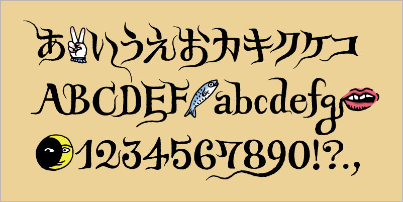
Figure 12. A sample of the Higumin font
iColorpalette
This online color picker creates palettes from images, in much the same way as InDesign’s Color Theme tool. But what the latter lacks, iColorpalette delivers. You have the choice of uploading or providing the URL of an image, both of which will generate a five-color palette with hexadecimal values (Figure 13). If you’re not happy with the colors chosen, you can select an unsatisfactory color and re-sample to choose one you like. Clicking the Shuffle button scraps everything and chooses five new colors. If you like the choices, you can save a collage in JPG format, showing the image as well as the palettes. Further down the iColorpalette page you’ll see a large collection of many more colors used in the image. In addition, iColorpalette lets you download ASE files with the color swatches, ready to load into your InDesign Swatches panel.
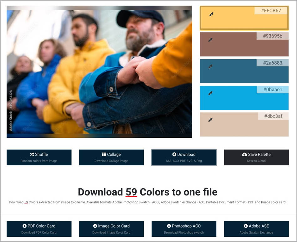
Figure 13. An iColorpalette created from an image’s URL, and download options
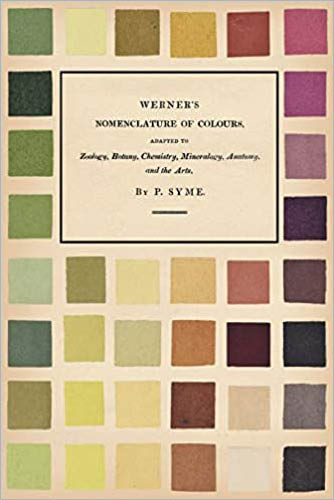
Figure 14. The cover of Werner’s Nomenclature of Colours
Werner’s Nomenclature of Colours
If you’re a color enthusiast or a history buff—or a little of both—you might enjoy Werner’s Nomenclature of Colours ($19). This is a reproduction of a groundbreaking guidebook from the early 1800s that attempted to codify colors and standardize their names. Considered the first standardized book of swatches, it spawned later color systems like Pantone and served as a valuable reference to scientists, including Charles Darwin on his explorations of the natural world. Author Abraham Gottlob Werner was a geologist who wanted to make classification and description of color in science texts more accessible and understandable. The guide he created was continually enhanced by scientists and artists alike. This facsimile edition is published by Read & Co. and contains 110 of Werner’s color swatches and flowery descriptions (Figure 14).
Explore and Enjoy
I certainly hope these little InDesign nuggets pique your curiosity and encourage you to explore and find new treasures along the way. I love discovering valuable little gems that help me get my job done faster or more efficiently—preferably both! May you have a wonderful season of discovery.
Commenting is easier and faster when you're logged in!

Recommended for you

Customize InDesign’s “Edit Original”
Ira writes: Is there some way to have the contextual menu item for "edit origina...

Fixing a Broken JavaScript (and How To Avoid Breaking It in the First Place)
First, I freely admit this post might come across like an ad for Peter Kahrel...

InDesign Template: Resume and Cover Letter
Includes the template in INDD and IDML formats in letter size, plus instructions...