

This article appears in Issue 93 of InDesign Magazine.
Ah, yes… January. That time of year when many of us look hopefully to the future as we attempt to reinvent ourselves and erase our flaws of the previous year. January is a time of making lists of things we want to improve upon, even as we know those lists will probably be gathering dust come February. I blame the fact that those lists are filled with items like “procrastinate less” and “go to the gym.” Well, there’s your problem! Instead, I’ve made a list of things you’ll actually want to act on—items that will make your job as a designer more fun, more stylish, and maybe even easier! Do what you want with that shiny new gym membership, but do yourself a favor and resolve to check out the following goodies.
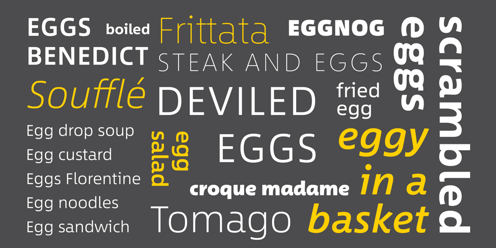
Between Font
Akira Kobayashi’s new font, “Between,” from Monotype, is a bit of a chameleon in the type world. This approachable font actually comes in three flavors, or states, generically named Between 1, Between 2, and Between 3. Each state of this sans serif varies slightly from the next, from the sharper Between 1 to the more organic Between 3. The forms are more similar than they are different, which lends itself well to mixing and matching among the states. Whether your design could benefit from mixing swaths of text set in each state, or having single characters peppered in here and there, Between is versatile for just such a mash-up. Each state shares the same cap and x-height, making this process seamless and smooth.
Each of the three states includes eight weights—ranging from thin to black—in both roman and italic styles. Between is available in both TrueType and OpenType
formats, with the latter sporting many features and alternate glyphs. Each individual Between font can be purchased for $35, or you can score the entire family for $199 at normal price. At the time of this writing, the family was on sale for only $99.50. If I’m doing my math correctly, that works out slightly more than just $2 for each individual style. That’s a deal I can get behind. Or Between.
For more on Between, see Ilene Strizver’s Introducing Between: A New Typographic Triumvirate from Monotype at CreativePro.com
Understanding Color
Having a firm grasp on color and color theory is a vital task for designers. Linda Holtzschue’s Understanding Color makes great strides in illuminating this topic. The 272-page book takes a real world approach and puts color theory into terms that make sense to graphic designers of all stripes. The newest edition includes a chapter that discusses how color is viewed on a cultural level, while the chapters on color harmony and digital color—and the issues that spring up across media—have been expanded.

The strength of Understanding Color is that the author doesn’t use too much technical jargon to convey her points. While we designers should know the topics covered, many of us choose to ignore anything beyond a basic color understanding, leaving those tasks to the “experts.” (Hint: That should be us!) More than just color theory and explanations of the difference between additive and subtractive color, Holtzschue’s book conveys how to use color most effectively in one’s designs. It discusses the difference in colors that occurs in different light, how placement of colors can affect your perception of them, and how to avoid or resolve color issues in practical terms. If “get better at using color” is on your professional self-improvement list—I know it’s on mine—you owe it to yourself to check out this gem.
Lift Mini
As anyone who has ever worked on a laptop for more than an hour or two can tell you, it’s an undertaking that can land you in the chiropractor’s office if you aren’t careful. Lifting your laptop up to eye level often works wonders for “designer slouch.” As with most things, my first thought is, “How would I do that in style?” And style is what you’ll get with the Lift Mini laptop riser. Hand-crafted from sturdy bamboo by the iSkelter team in Phoenix, Arizona, the Lift Mini raises your laptop almost six inches off your workspace. The space below creates the perfect home for a keyboard and mouse.
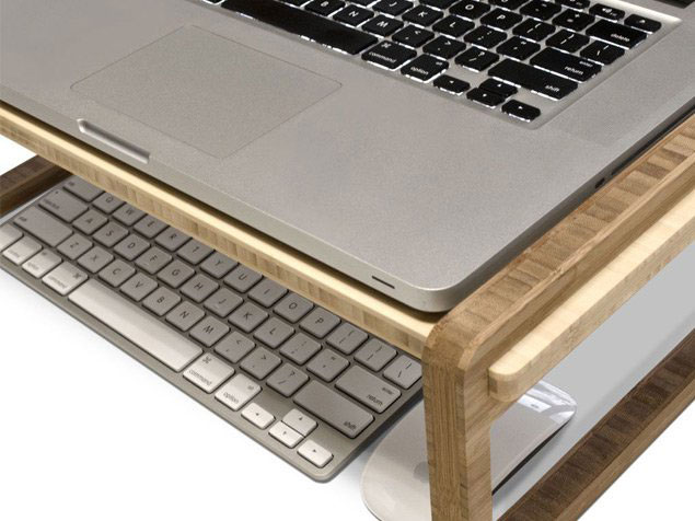
The Lift Mini comes in a long (22-in.) or short (17.5-in.) version, is just 11.5 inches deep, and supports up to 60 pounds (the equivalent of about 13 MacBook Pros). The Lift Mini could easily be employed as a lap workstation for those work-from-bed days.
The iSkelter team also have hand-crafted lap desks, workstations, charging stations, and even a mini lap desk to fit your shiny new iPad Pro! The Lift Mini runs $80, and their beautiful semi-customizable bamboo creations run from under $25 all the way up to $2,000.
PageProof
Let’s face it, the digital proofing process can often be clunky. Don’t get me wrong—being able to proof half a world away via PDF is amazing. It’s just that keeping track of who has looked at which version of the PDF, and actually organizing and implementing those edits, can be a job in itself. Luckily, the folks at PageProof are taking a collaborative approach to proofing through their online tools. Armed with the slogan “Everyone gets a red pen,” PageProof actually sets up and monitors the workflow involved in the proofing process. The proof owner is the conductor in this multi-member proofing symphony. The owner assembles his team and creates the workflow, and then sends out the proof for comments and input. Proofs can be in many different file formats, including PDFs, image files, and even videos!
All the viewing and commenting is done live online via PageProof’s encrypted system, pulling files from Dropbox, Google Drive, Box.com, OneDrive, or simple computer upload. As comments start rolling in, the proof owner can automatically create to-do lists based on that feedback. Being an online solution means that multiple people can work on the proof at the same time and that proofing can be done from any computer or device with a modern browser. One of the perks of this online system is the ability to replace the existing proof with an updated version, and have all the comments and redlining remain in place! PageProof’s free account gives the account owner the ability to proof unlimited incoming documents. The premium plan ($30/month subscription) allows the user to upload unlimited proofs, as well as unlimited commenting on proofs.
GreenLight
If you’ve ever thought InDesign’s built-in Preflight panel was lacking, you may want to check out GreenLight by Circular Software (starting at £25/month). I had the pleasure of seeing a full demo at The InDesign Conference recently, and I was pleased with what I saw. This standalone Mac app works with InDesign to not only run a preflight check on your files, but to give its stamp of approval when the file passes muster. Start by creating checks to be run, based on categories you’d expect, such as image resolution, font usage, link issues, and color and file types. Each check is accompanied by an in-depth explanation of the check, the reasoning behind employing it, and steps to take to avoid falling outside the check’s parameters. This integration with the support site is head and shoulders above the vague explanations in InDesign’s built-in Preflight panel.
The app itself is launched from a mini panel inside of InDesign. Its lone button runs a GreenLight check on the active document. The results of the checks are displayed in a table on the pasteboard. The items from the checklist are colored green or red to indicate whether they’ve passed or failed.
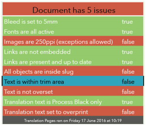
Clicking on one of the failed checks will indicate the issue and also redirect back to the support site for tips on fixing the issue. A wish list item of mine for InDesign’s native Preflight panel has long been a yellow light to indicate a potential issue that has been “noted yet approved.” GreenLight partially provides that with the ability to mark an item as OK, and then not have it be flagged as an issue on future re-checks. When all checks are passed, the app not only adds “Green Light” to the results table and turns the table all green, but a green stripe is added to the document’s desktop icon as well. The final seal of approval is the green dot added to any output PDF so it is immediately obvious that the file has passed the preflight process with flying colors.
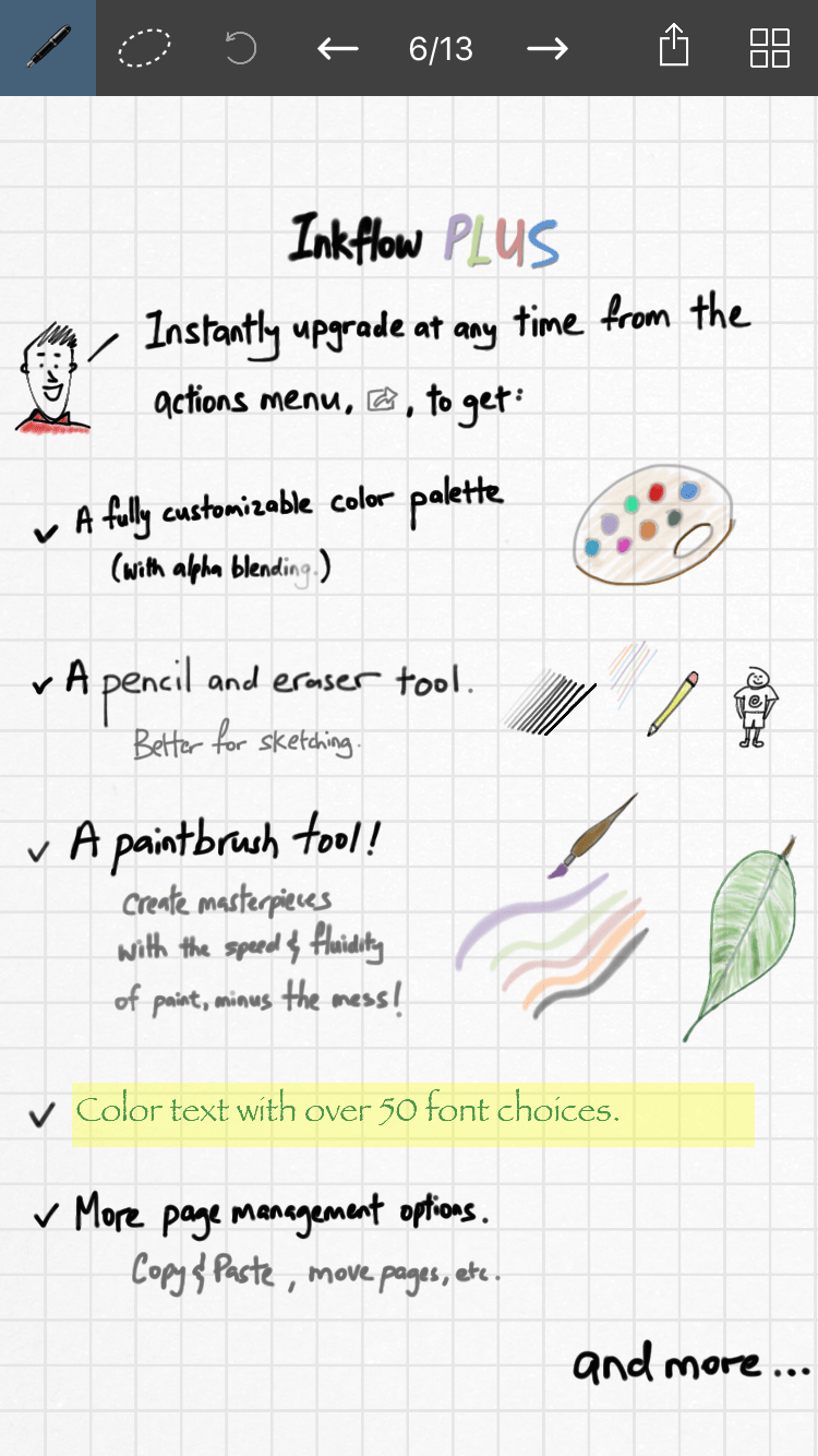
Inkflow Visual Notebook
I find that note-taking apps often hinder my production more than they help, mostly due to their proximity to Facebook and Snapchat on my phone. However, I recently started playing with Qrayon’s Inkflow Visual Notebook on both the iPhone and the iPad, and I’m able to launch it and get right to work in it. The app—which offers a free, limited version and the Plus version for $7.99—lets you get your ideas down quickly, without letting technology get in the way. The “ink” part of Inkflow is smooth and makes it easy to create hand-written notes, with or without a stylus. They refer to this as “Vector Ink,” which means that you can zoom in on your hand-drawn creations and they’re just as crisp and clear as ever. I especially appreciate being able to zoom in to write when using Inkflow on the iPhone, and then having it look as if I used the finest of fine point pens to create that text.
Of course, if you want to use text boxes and insert pictures, Inkflow is set up to do that. The free version includes five fonts; the paid version adds in over 50 more. No matter what you create, even hand-drawn items, it’s a piece of cake to select just a portion with the lasso-like selection tool and then move, size up or down, or delete that item. In the paid Plus version, you can use the Inkport function to capture a photo with your device’s camera, and then manipulate that image (or only a part of it) in the same manner. The paid Plus version adds even more functionality, including a customizable color palette—the free version only offers black ink—and extra drawing tools. Inkflow Visual Notebook is a handy tool for comping up quick ideas or to act as a base layer to build upon, and whose finished product can be saved as a JPEG or PDF and then emailed or sent to DropBox and other file storage services.
DataLinker
DataLinker is Teacup Software’s database publishing solution, delivered in the form of an InDesign plug-in. The plug-in picks up where InDesign’s built-in Data Merge feature leaves off. DataLinker uses a panel similar to Data Merge’s and also lets you import a .CSV or database file.
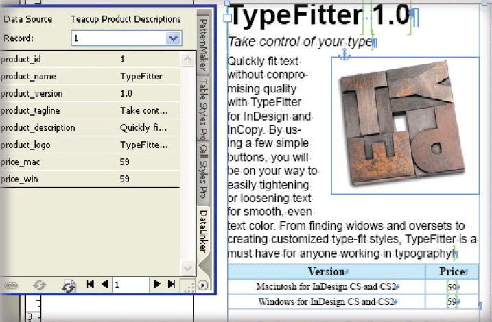
Once you’ve chosen your data source, you can browse through the file’s individual records within the panel. Setup works in a similar fashion, where you can drag or double-click the data placeholders to merge the data. DataLinker makes it easy to update all records if the source file is updated, even letting you choose to update only specific data fields.
One of the plug-in’s finest features is the ability to format data text as it is placed, with custom formatting for each field. And you have to love a solution that lets you use GREP to format that incoming data. You’re not limited to one source file, either, as DataLinker lets you link to multiple sources for a truly robust data merging solution. If you’re merging large amounts of data, the plug-in lets you split the data across multiple documents, giving you the freedom to import essentially an unlimited number of records. DataLinker can then combine those multiple documents into an InDesign book. Add in the fact that DataLinker is scriptable and works with Teacup’s Barcode Maker to create barcodes from the merged data, and it should be easy to see that this is the missing link (see what I did there?) between your data and your InDesign file. Teacup Software’s plug-ins ($150/year subscription for all) have recently been updated to work with InDesign CC 2017.
ID2Office 2.2
We all have those clients. You know the ones… the ones that ask if we can give them our perfectly-crafted, well-styled InDesign files for them to open in (gulp!) Word. I always enjoyed stating with smug pleasure that that wasn’t really possible. But now it actually is possible, with Recosoft’s ID2Office. This InDesign plug-in lets you convert your InDesign files to Word, PowerPoint, and even Apple Keynote. Those last two options are ideal if you’re converting a presentation layout, rather than starting with a print-based one. The latest version (2.2, $199–249 annual subscription) has been updated to work with the 2017 release of InDesign CC and features mostly under-the-hood improvements and a couple of user-facing ones. Most notably, ID2Office now translates paragraph rules to Word’s paragraph borders, and any defined paragraph styles used in table styles also make the journey to Word.
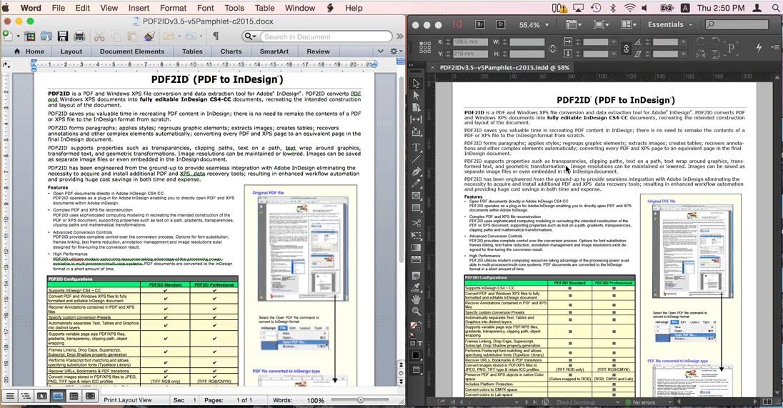
Exporting from an InDesign document is super simple, with the Recosoft menu and an Export to MS Word option added to the InDesign user interface. ID2Office also offers conversion options for managing threaded text frames, text styles, blank pages, and hidden layers. The resulting Word file, while not perfect, usually ends up looking pretty darn close to the original InDesign file. The process is certainly quicker and more accurate than the old “embed images, export stories, copy and paste everything else” method used by many folks in the past. In my tests, converting from PowerPoint and Keynote yields slightly odd results, especially when exporting a tall InDesign layout to the landscape presentation orientation.
Effective Resolution(s)
Whether you’re looking to improve your proofing process, automate your data, or to finally get a grasp on color theory, there’s at least one item for every designer here. And I think a one-item resolution list is perfectly acceptable. I mean, the year just started… no need to strain ourselves so early on. Now, go forth and resolve to turn over that new leaf!
Commenting is easier and faster when you're logged in!

Recommended for you

Learn Typography in Ten Minutes with Butterick’s Practical Typography
What could you learn in ten minutes? A few Photoshop tips? How to speed read (so...

TypeDNA Goes Far Beyond Font Management
TypeDNA is a standalone font manager and plug-in set that integrates with many c...
Pick a Numeral
Even among those who obsess about the text we set — tweaking kerning, trac...