

Today’s digital environment has placed the responsibility of professional typesetting in the hands of the graphic designer, as opposed to the dedicated, highly-trained typographers of the past. This task requires knowledge of proper typesetting conventions, as well as in-depth understanding of the software being used. This can be problematic, as most designers and production people have little or no formal training in either of these, and have to learn by trial and error, along with hopefully some professional guidance or mentoring. In my own experience setting type using Adobe InDesign or Illustrator, I have come upon a number of unwanted occurrences that I have had to solve on my own, or with a bit of research. Here is a list of the most puzzling and annoying of them, with an explanation and solution.
Unexpected line breaks
One of the most frustrating occurrences is when you try to fix line breaks to improve a rag or unwanted hyphenation while in InDesign, and when you do, other line endings in that paragraph can change without a warning. This unwanted and extremely frustrating happening has a rather simple explanation – and easy fix: it is related to the somewhat hidden (and frequently misunderstood) InDesign feature called Adobe Paragraph Composer. Paragraph Composer, located in the Paragraph panel and Control panel menus, is the default feature that is intended to optimize line breaks and hyphenations by analyzing all lines in the paragraph at the same time and re-breaking them accordingly. This feature might seem like a timesaver until you try and make manual edits; once you do, the text in that paragraph (including some above that line) will reflow seemingly unrelated to your edits. And if you try to correct them, it will happen again. The only way to override Paragraph Composer is to select
the text frame or insert your cursor in the paragraph, then open the Control panel (or Paragraph panel) menu, and select Adobe Single-Line Composer. This will allow you to make edits to the rag without affecting any other line ending. As I mentioned, Paragraph Composer is turned on by default. If you frequently use manual line breaks to fine-tune the rags (as I do), you might want to change the default setting to the Single-Line Composer. This puts you in the driver’s seat, and prevents the application from doing too much thinking for you. (NOTE: To change defaults, change settings when no documents are open and your changes set the defaults for new documents. If a document is open when you change settings, the changes affect only that document.)
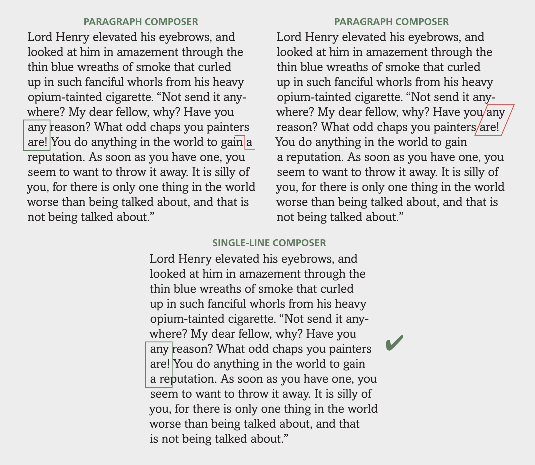
When InDesign’s Paragraph Composer is the default setting (as it is unless you change it), making a manual line break such as the ‘a’ in the eighth line (upper left) can lead to other line breaks changing without warning (upper right in red). Changing the setting to Single-line Composer allows you to adjust the rag line by line (lower).

InDesign’s Adobe Composer settings are located off of the Paragraph panel.
Unexplainable hyphenated words
Have you ever seen either printed or digital material with an unwanted hyphenated word within a paragraph or body of text? I have, many times. This one is totally human error, that is, someone added a manual hyphen to a setting, and then the text was restyled in some way resulting in lines rebreaking without removing the manual hyphen. To avoid this in print, use a discretionary hyphen when reragging text, as this will allow it to disappear when the hyphen is unnecessary due to the text being rerun or restyled. As for the web, never add a manual hyphen as text and line breaks appears differently for each device.
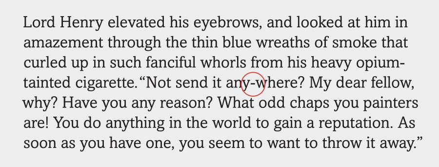
This unwanted hyphenated word occurred when I added a manual hyphen, and then changed the styling, making the word go from the end of the line to the middle, rendering the hyphen unnecessary. Using a discretionary hyphen will alleviate this situation.
Uneven line spacing at the end of a paragraph
Have you ever spotted the occasional rogue line at the end of a paragraph that has different line spacing than the rest of the paragraph? Here’s the explanation: this will happen when you change the leading or size of the text of a paragraph when using auto leading, but neglect to include the invisible end-of-paragraph sign, usually a pilcrow or hash tag, which also carries formatting information. The fix is to make sure and include this sign, which is usually one extra ‘space’ after the last visible character of paragraph, when changing formatting. The best way to select text that needs editing is to triple click on it, which will automatically include this symbol, rather than manually selecting the text but not including this last important sign. Another way to avoid this from happening is to turn on Apply Leading to Entire Paragraphs located in Preferences > Type.
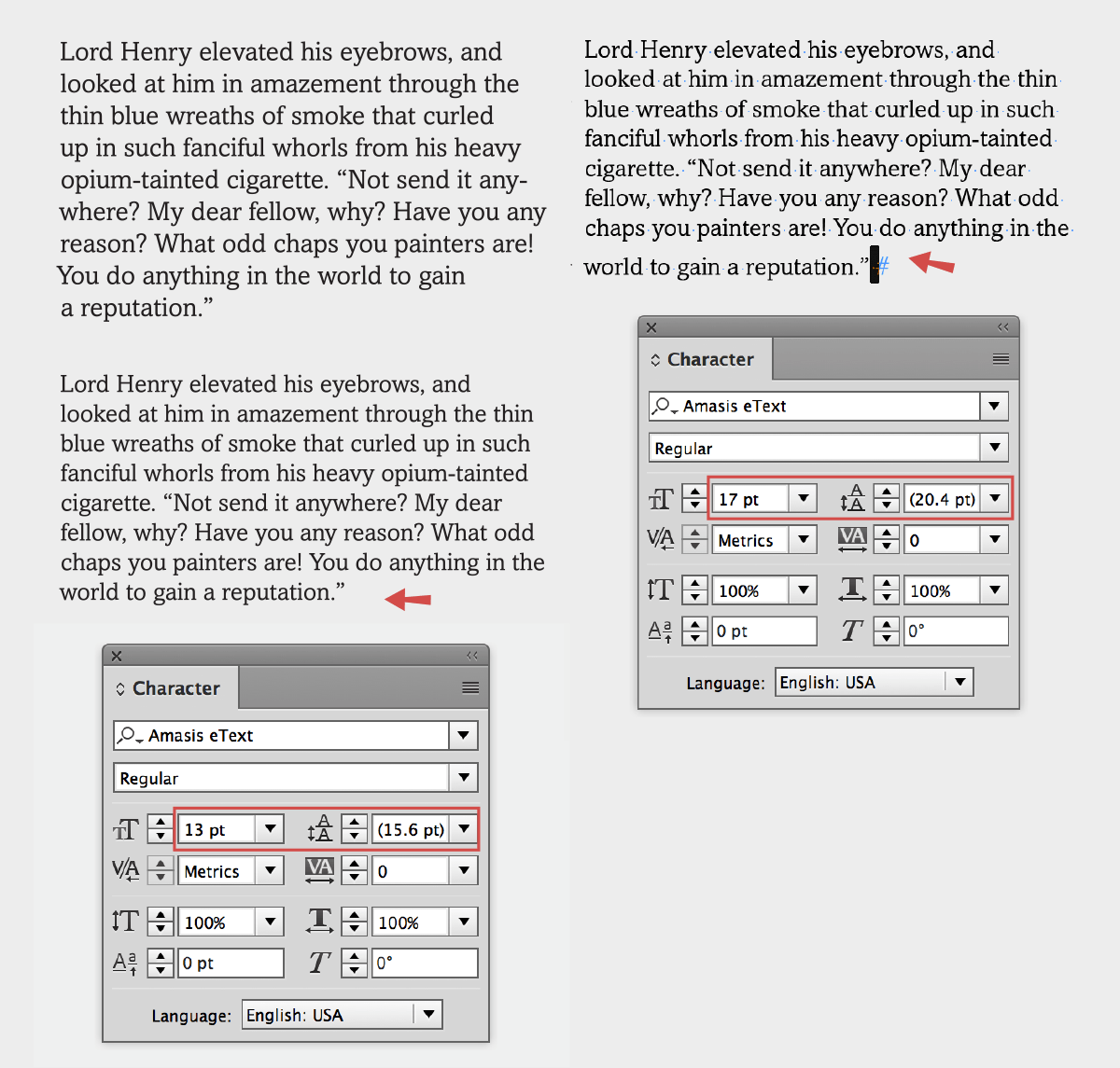
When reducing the size of the upper left text using auto leading and not including the invisible symbol at the end, the last line will maintain the leading of the previous setting (right). When that invisible character is restyled, the last line will match the rest.
Inconsistent line spacing within a paragraph
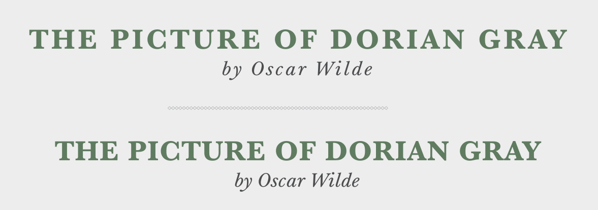
Another unexpected change in line spacing can occur when you are using auto leading and you insert a special character or symbol (such as a sign, symbol, or dingbat) in the text. If the size of this glyph is increased, the auto leading for that line only will increase. This is a result of the use of the default auto leading setting, which calculates the leading as a ratio of 120% of the (largest) type point size in each line. This means that if your text is 15 point with an auto leading setting of 18, increasing the size of the glyph to 25 point will result in that entire line changing to 30 point leading, adding almost 12 points leading to that line alone. The fastest and best solution is to change the overall leading setting of the text block to a fixed value that will remain the same no matter how large you make one character in the paragraph. Once you do that, you can have glyphs of varying point sizes in a line without changes in the leading.
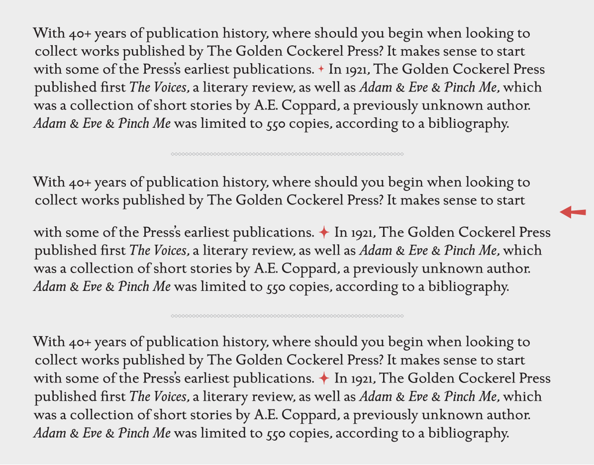
This text contains an ornament as a paragraph separator, but it doesn’t change the auto leading because it’s set the same or a smaller point size as the surrounding text. The text and ornament are set in 15 point ITC Golden Cockerel with 18 point auto leading (upper). When the ornament is enlarged to 25 point, the auto leading for that line changes to 30 point, creating an unexpected “jump” in that line only (middle). When the leading for the entire text is converted to a fixed leading of 18 point, the line spacing stays consistent even though the ornament is still 25 point (lower).
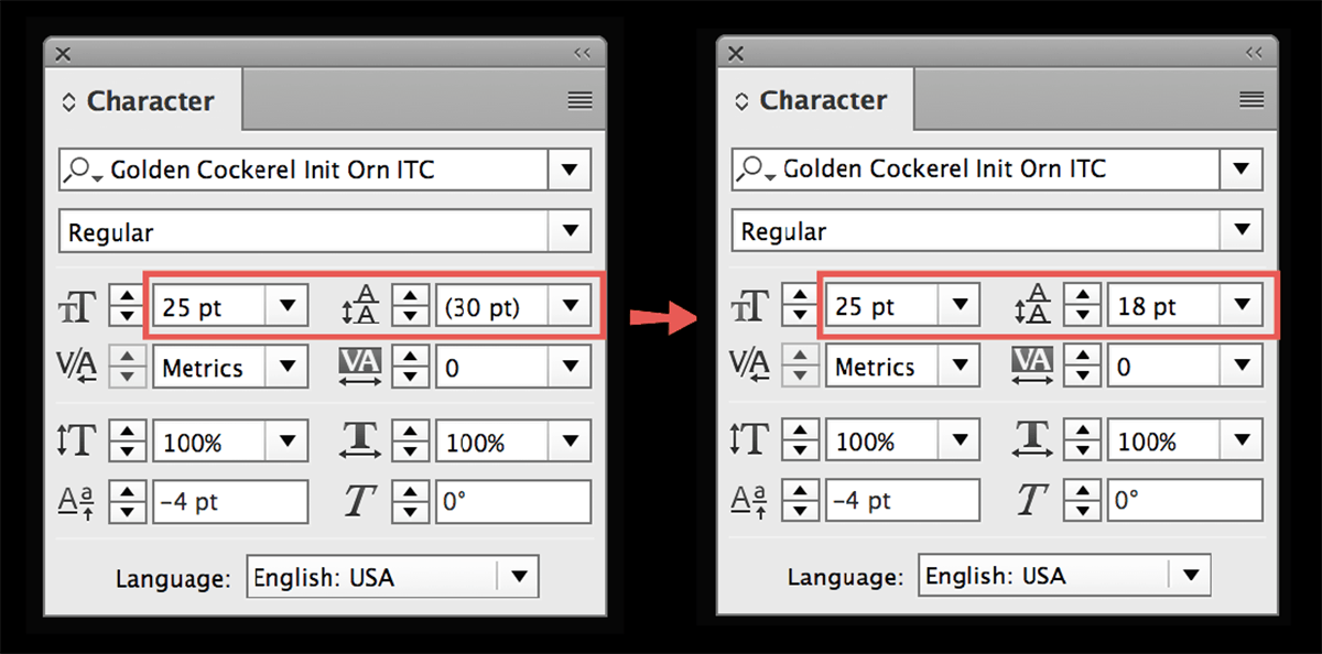
In order to maintain consistent leading in a paragraph when using auto leading – no matter how you size all glyphs within – convert the auto leading in parentheses to a fixed value of the rest of the text.
Unwanted tracking
Have you (or your colleague, teacher, or client) ever noticed the letterspacing of a headline or text looking too open or too tight? Before you blame the font, check to see that the tracking is set to 0, even if you don’t remember altering it. This can happen in two ways: 1) when the last type you set or styled has a plus or minus tracking value, which will then automatically be applied to the next type you style, without a warning, or 2) when you copy and paste text that has custom tracking changes, and then change the font or point size, forgetting about the previous formatting. The only way to catch these unwanted instances is with a discerning eye, but the fix is simple: highlight the text in question and either return the tracking to 0, or to your desired value.
When unexpected and unwanted letterspacing appears mysteriously (upper), make sure to reset the tracking to zero, or whatever value you desire (lower).
Commenting is easier and faster when you're logged in!

Recommended for you
The Ups and Downs of Ascenders and Descenders
The appearance of ascending and descending characters is largely an accident of...

To Double-Space or Not to Double-Space…
Learn the history of the double word space…and whether or not it's a true type c...
InType: Know Your Small Caps
Add sophistication and polish to your type by understanding the different kinds...