
InFocus: April 2017
A bewitching bouquet of InDesign-related goodies, just in time for spring.

This article appears in Issue 96 of InDesign Magazine.
Spring is once again blooming as the seasons continue their cycle. It’s a time for new growth and new beginnings. For some people, it’s a time to get back to the garden. For me, it means new projects, new skills I need to learn, and new ways of getting my job done better or faster. I’ve put together an InDesign-related bouquet of goodies, gathering up a mix of tender new blossoms as well as improved versions of perennial favorites.
Multi-Find/Change
Multi-Find/Change (MFC, from Automatication) is an extension for InDesign that automates the find/change process. This powerhouse add-on can perform multiple searches at one time (well, in a set order, but so quickly it feels like it’s all at once). Those searches are arranged into sets that you create, based on your needs. For instance, perhaps you know that every time Jerry in editorial sends you a Word file, it’s going to have the same old problems that need to get cleaned up. With MFC, you can create a set of queries (Figure 1) just for Jerry’s messy files. The latest version of MFC (v.3) has been rewritten to work with InDesign CC 2017 (and InCopy, too).

Figure 1: With Multi-Find/Change query sets, you can customize and automate Find/Change operations.
A single query set might include a simple text search for all double hyphens to convert them to a single em dash, followed by some GREP searches to strip out multiple spaces after punctuation and multiple returns between paragraphs, replacing them with a single occurrence of each. Even better, those sets can be shared with other users, with those users being able to execute, but not make changes to, the
sets. Multi-Find/Change also sports an undo feature that is often a lifesaver. You can undo a Change All command across the entire set, or by individual queries within the set.
Blendmaze
When it comes to learning tough subjects, I’m not above using a game to achieve my goals. I count color theory as one of those subjects that I know just enough of to be dangerous, or at least sound semi-intelligent about. Fortunately, I recently stumbled upon Blendmaze for the iPad (Figure 2), which teaches the basics of color theory with a visually captivating gameplay.
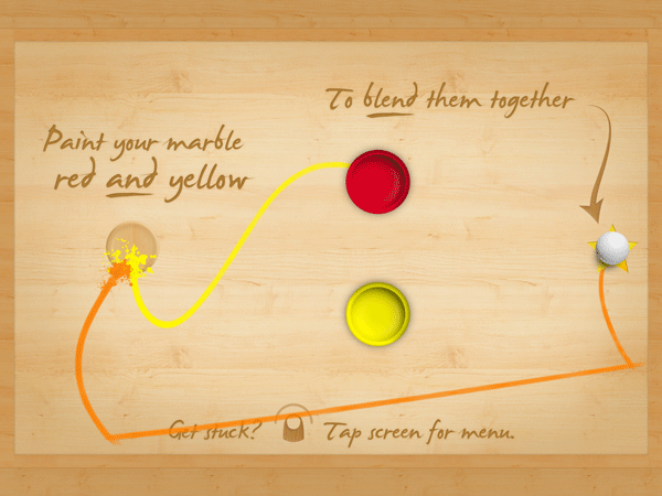
Figure 2: Blendmaze makes learning color into a fun iPad game.
The app features the fun—as well as the frustration—of the old rolling marble game of Labyrinth through simple colorful graphics and sounds, using the interactivity of the iPad. The goal is simple, on the surface: Drop the white marble in the correct paint tubs to end up with a marble coated in the requested color. For instance, roll the marble into the red paint, then the yellow to achieve orange.
The game starts out in the primary colors, moving on to secondary and tertiary colors only once you’ve completed each previous level. There are even full spectrum levels that are dubbed near-impossible by the creators. One of the aspects of the game that makes it so much fun is the trails of paint colors that get left behind as you run the marble between paint tubs. So even if you end up making a mistake, you have some visual clues of where you might have gone wrong! Blendmaze features more than 100 levels and even has a timed mode that hooks in with Apple’s Game Center if you take your play time seriously.
Type Meetups
“Hey there, what’s your type?!” That old line has almost certainly been uttered at a Type Thursday. While it’s not a speed-dating event to find your perfect type, Type Thursdays are—in their own words—events for “people who love letterforms.” Meeting monthly, the type-focused events bring together typophiles for networking, learning, and critique sessions. Creatives are encouraged to bring their works-in-progress, with the critique sessions being led by industry pros, such as type designer James Edmondson. The meetups have a small cost of $25, with free early bird registration if you sign up at least two weeks prior to the event. Los Angeles just launched their inaugural event, and the varied sponsors include MOO.com and Typekit.
In addition to the monthly type meetups, Typekit is working with Type@CooperWest to present a series of type talks and workshops in San Francisco. Most recently, type master Jessica Hische gave a talk titled “Art as Therapy,” and Jim Parkinson spoke on “Highlights of a Lifelong Obsession with Letterforms.” If lecture series and meetups aren’t your thing, and you’d like to indulge your type-loving side, maybe one of Type@CooperWest’s 10-week workshops is for you. Topics include an intro to hand lettering and learning the principles of typeface design. Whether you’re a type designer, a designer working on a logo or UI design, or just a lover of type, these type-centric events are the place to learn about type with like-minded folk.
Adobe InDesign Interactive Digital Publishing
Adobe InDesign Interactive Digital Publishing by Ted Padova takes you from start to finish in creating and deploying interactive and digital publications from InDesign. Starting with some of the core skills needed for any documents—such as working with text, styles, and graphics—Padova walks the reader through the layout process before tackling the specific needs of the digital document. The author covers interactive elements from animations to hyperlinks to creating multistate objects for the full digital experience.
The 500+ page book (Figure 3) is peppered with tips and tricks for navigating the ever-changing digital publishing landscape. But the book doesn’t stop there. It goes on to discuss the output and distribution issues you may encounter on your digital publishing journey. The author discusses hosting interactive documents on social media platforms as well as how to create digital products for consumption across social media, computers, and mobile devices.

Figure 3: Going into digital publishing? Take this book with you.
Extract Pages
How many times have you been knee-deep in an InDesign document before realizing it would have made much more sense to break that document into smaller chunks? Maybe your short story grew into a novel and you suddenly want each chapter as its own file. Or that one client (you know the one) admitted that maybe it was better to have the training modules as separate documents for printing, updating, and exporting. Well, there is most definitely a script for that, courtesy of the brains over at ID-Extras.
The script, called Extract Pages ($49 for a single license) lets you choose a range of pages and which criteria to use for the split (Figure 4).

Figure 4: The Extract Pages dialog box
It gives you the option of creating new documents based on paragraph styles or by ranges of pages. When splitting documents, the script allows for extracting as pages, spreads, or sections, and you even have the option of creating an InDesign book file to organize the individual documents. But by far, my favorite trick the script performs is being able to break a document’s individual alternate layouts into separate InDesign files. The latest version includes several new file-naming choices, so those new documents’ names make sense.
Proxima Soft
Born from Proxima Nova, the Proxima Soft Collection from Mark Simonson Studio is a super-collection of 48 fonts. The mega-collection includes three 16-font families (Proxima Soft, Proxima Soft Condensed, and Proxima Soft Extra Condensed). Not simply a rounded version of Proxima Nova, Proxima Soft is a fully-fleshed-out font with many alternate forms. And I’m not talking about a simple extra ampersand here and there. Nope. I’m talking alternate characters, arbitrary fraction support, and proportional and tabular figures. Unlike many rounded fonts that have a limited range of uses, Proxima Soft is a high-functioning text sans that contains full character sets to meet whatever challenge you throw at it (Figure 5).

Figure 5: The many faces of Proxima Soft.
With the entire super-collection at your fingertips, you’ll have enough weights to choose from for all your text variations, from blocks of text, to pull quotes, to anything you’d need a rounded display font for. The entire desktop collection will set you back $734, or you can purchase each family individually for $254. There is also the option to buy the single fonts for $29 a piece, but why break up such a happy family?
Rotating Spreads
A long time ago, in a galaxy far, far away, Adobe saved many a designer’s neck by introducing the Rotate Spreads command. Since then, that little gem has let generations (I may exaggerate slightly) look at a rotated text frame right-side-up by rotating the spread, simply for viewing onscreen. Of course the execution of this little gift isn’t perfect, as it lies buried deep within the Pages panel menu’s submenu hierarchy (Page Attributes > Rotate Spread View). I wish I could get to that feature faster!
Fortunately, Peter Kahrel’s magic scripting comes to the rescue. His PagesContextAdditions script (Figure 6) unburies that command and makes it readily accessible.

Figure 6: New rotation options in the contextual menu, courtesy of the PagesContextAdditions script
After running the script once, the rotation values—at least 90º and -90º—are in the top level of the contextual menu. Be sure to click within the gray area of the Pages panel, and not on a page itself, and remember these options affect only the view of the current page.
The ability to rotate each spread is certainly handy, but what if you have several pages that need rotating? You know the answer: another script! Kahrel’s RotateSpreads script lets you batch rotate those spreads. The super simple script rotates all spreads with a rotated text frame in one go. But it’s an all-or-nothing operation—no chance to fill in a page range or other criteria. If there’s a rotated frame, the spread gets rotated. However, when it’s time to put everything right again, run the script once more, and choose Undo Spread Rotation. As written, the script works on frames rotated at 90º, though it could likely be modified to accommodate InDesign’s -90º and 180º angles, as well. No more individually rotating spreads, and no more stiff necks due to viewing documents at an angle.
Flightcheck
Markzware is one of those companies that jumps in to pick up where InDesign’s built-in capabilities leave off. When it comes to preflighting, InDesign’s included functionality is decent. But Markzware’s standalone Flightcheck goes further and more in-depth. The latest release (version 7.8) now handles CC 2017 files. And because the software is standalone, it can actually preflight files from Illustrator, Photoshop, and Acrobat, as well as other non-Adobe apps. Flightcheck can even postflight PDF files to make sure they are set up to produce the results you need.
Flightcheck performs a robust set of checks to ensure that the output you create meets—or exceeds—your chosen qualifications for each facet of your document. In addition to checking for resolution and link issues, Flightcheck’s ground controls (preflight items) can check for color mismatches, oddities with gradients and patterns, ink percentages, and other issues that can crop up, whether you’re going to print or digital (Figure 7).

Figure 7: Flightcheck’s Ground Control interface.
Flightcheck can be purchased as a subscription for $199/year or as a perpetual license (i.e., “the old-fashioned way”) for $399.
Junk Type
What is it about vintage signs that make us yearn for a simpler time? I get hit with an unexplained nostalgia when I come across beat-up old signs, as they are often from way before my time. It’s like beautifully-lettered signage from the 1950s and ’60s are somehow a part of our collective DNA and we are instantly drawn to them.
Photographer Bill Rose set out to capture the nostalgic beauty in the typography and signage of that bygone era in his forthcoming book, Junk Type: Typography – Lettering – Badges – Logos (Figure 8).
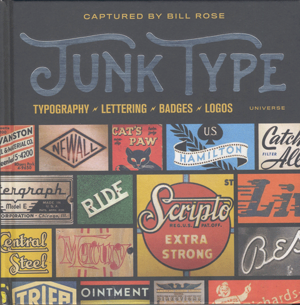
Figure 8: One man’s junk type is another’s type treasure.
The book’s nearly 200 pages showcase the art and beauty of postwar America via typography and lettering in close-up fashion. If you’re looking to nostalgia for project inspiration, the “Junk Type” book just might speak to your nostalgic core.
Spring Forward
I hope you take the time to stop and smell the roses when you’re out and about this spring. And while you’re at it, be sure to check out some of the blossoms mentioned here to keep your InDesign garden thriving and growing.
Erica Gamet is a speaker, writer, and trainer, focusing on Adobe InDesign and Illustrator, Apple Keynote and iBooks Author, and other production-related topics. With over 25 years experience in the graphics industry, she is a regular contributor to CreativePro.com. After living as a nomad, she recently put down roots in El Paso, Texas, where she hikes and bikes every chance she gets.
Commenting is easier and faster when you're logged in!

Recommended for you

Creative Blöks: The Perfection Fairy
Each step you take on a creative path—whether you’re designing, drawing, or deve...


Spiderweb FX
Just in time for Halloween: here’s a web that’s easy to weave, with the help of...