
InDesigner: Roald Dahl Dictionary
Kelly McCathran shares the story behind a wonderful, whimsical dictionary for the young and young at heart.
This article appears in Issue 91 of InDesign Magazine.
If you don’t immediately recognize the name Roald Dahl, you’ll surely know the books and movies that sprang from the man’s imagination: Charlie and the Chocolate Factory, The BFG, Matilda, and James and the Giant Peach—just to name a few. True to Dahl’s legacy, The Roald Dahl Dictionary, with illustrations by Quentin Blake, is unlike any dictionary I’ve ever seen. To learn the story behind the dictionary, I contacted Karen Stewart, Senior Designer at the Oxford University Press, who lives and works in England, set my alarm for 5:00 AM, made a pot of tea, and sat down for the call. The conversation started with a discussion about antique tea cups. Karen mentioned her favorite tea cup has little feet on the bottom. As she says this, I am imagining us having tea in the Big Friendly Garden of Roald Dahl’s Little Whitefield cottage.  Karen has been with Oxford University Press for the past 10 years. Her career has spanned 28+ years, covering a wide range of subjects, from children’s books to motorbikes, planes, travel, astronomy, and fiction. At her very first publishing job, her boss said something profound that has stayed with Karen through the years: “Books need to work.” Karen had never thought of books in that way before. She always thought a book was just “made”—and that was it. But that was not it. “It’s got to be a good experience for the reader, and the reader needs to know where to look and how to navigate through the book,” she said.
When we started discussing all the layout choices designers needed to make in order for the book to work, Karen and I slipped into sharing personal stories. She recalled a
conversation with her great auntie. Her aunt said, “Explain to me what you do.” Karen told her exactly what her first boss said. Then she explained how books were put together. At the end of it, her auntie said, “Well, that sounds very boring.”
Karen and I both had a good laugh over her auntie. We could hear in each other’s voices how passionate we both were about making design decisions that “work.” Thoughtful use of typography, being persnickety about kerning, finding just the right image for the page, serious consideration of the color palette, and many other factors determine if a book works.
According to Karen, the essence of Roald Dahl’s words and narrative is “mischievous and anoetic”—a word that I had to look up because it isn’t in The Roald Dahl Dictionary (or InDesign’s dictionary, for that matter). It means a state of mind consisting of pure sensation or emotion without thought.
When I first opened the book, I was struck by the copyright page (Figure 1). Dare I call it playful? Have you ever seen a playful copyright page? Has anyone ever set legalese askew? Would that make a lawyer wince? Karen said this idea came from the publisher.

Figure 1: The playful design of The Roald Dahl Dictionary is evident right from the start.
Another one of the distinctive features of the book is the vertical alphabetical tabs. The letters are not only tilted in different directions, but every so often you may notice an animal trying to run off with a letter. There may be a bird trying to fly away with an “r” or a frog using a letter as a lily pad (Figure 2). This disruption causes the letters above to bunch together, while the letters below start to fall off the page.
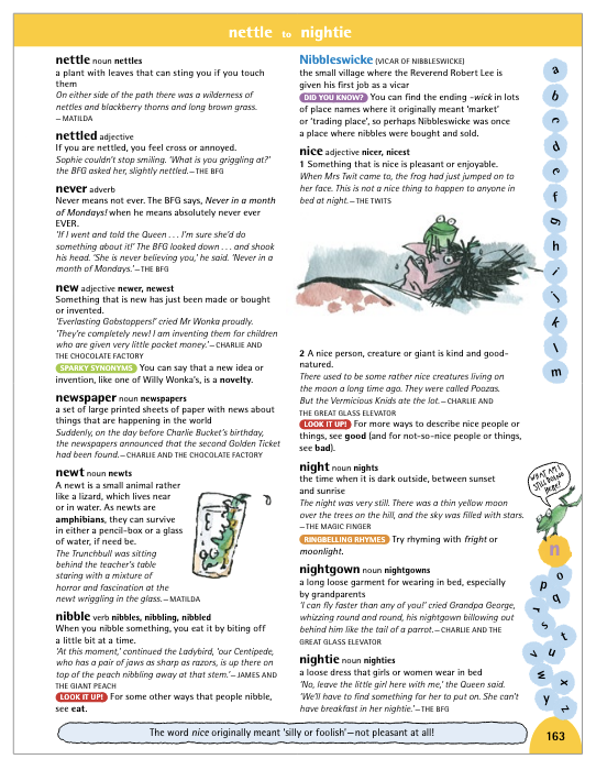
Figure 2: Every page element, including typically mundane things like alphabetical tabs, is a potential source of humor.
When the alphabetical tabs were first discussed, Karen let out a huge gasp and said, “Ooooh, you’re going to move them? We can’t do that!” Then she realized, of course, that moving the tabs was the perfect thing to do. It gives the book that zipfuzz that it needs and won’t leave you biffsquiggled (consult the Dahl dictionary for definitions of those two words).
To achieve the mixed-up tabs, using a global master page was out of the question. Karen did confess that they hadn’t thought about using the Based On feature for master pages, which could have saved some time. Throughout the book there are clever images “working” for you. For example, the entry for upside down is literally set upside down (Figure 3). In some cases, words are even written backwards (Figure 4).
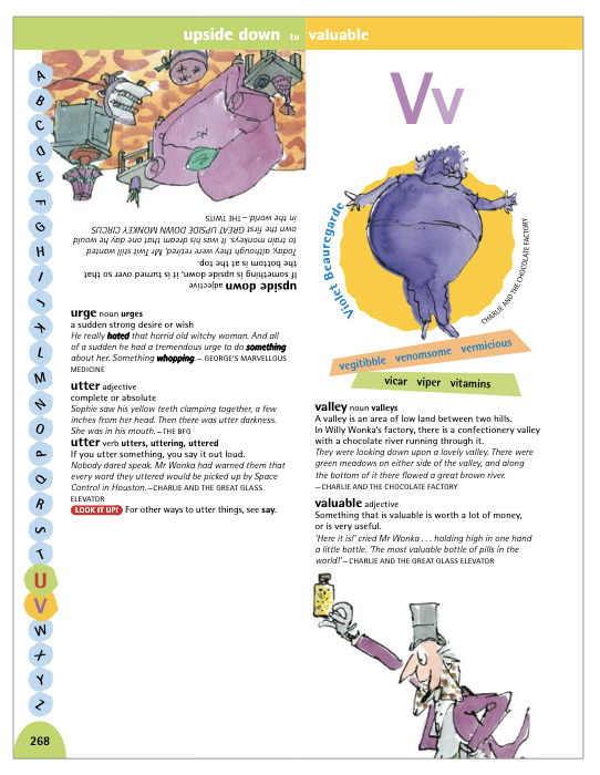
Figure 3: This book literally does flips to “work” for you.

Figure 4: To illustrate the power Roald Dahl gives you with words, some were set backwards, intentionally. In this instance, you can see the definition for Esio Trot (Tort Oise, a.k.a. Tortoise).
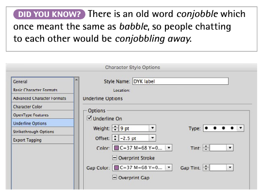
Figure 5: An example of the “lozenges” used throughout the book, and how they were built, using an ingenious method with character styles.
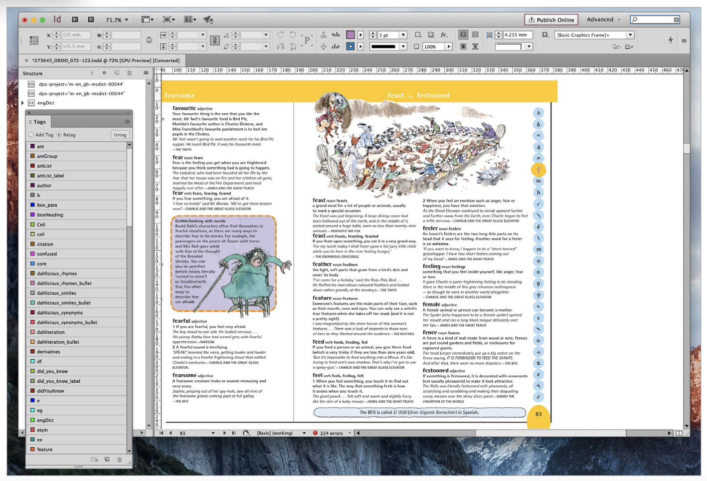
Figure 6: The Tags panel shows how XML was used to structure content and get formatted text to InDesign.


Commenting is easier and faster when you're logged in!

Recommended for you
InDesigner: Wieden+Kennedy
When this ad agency switched to InDesign, their creative concept- ing process go...
InDesigner: Report from Tokyo
The first InDesign Conference in Japan brings a different look at design and InD...

Interview with Monika Gause, Print Designer and Illustrator Expert
Q&A with Monika Gause, who is presenting at the 2026 Design + AI Summit for Crea...