
InDesigner: Report from Tokyo
The first InDesign Conference in Japan brings a different look at design and InDesign.

This article appears in Issue 21 of InDesign Magazine.
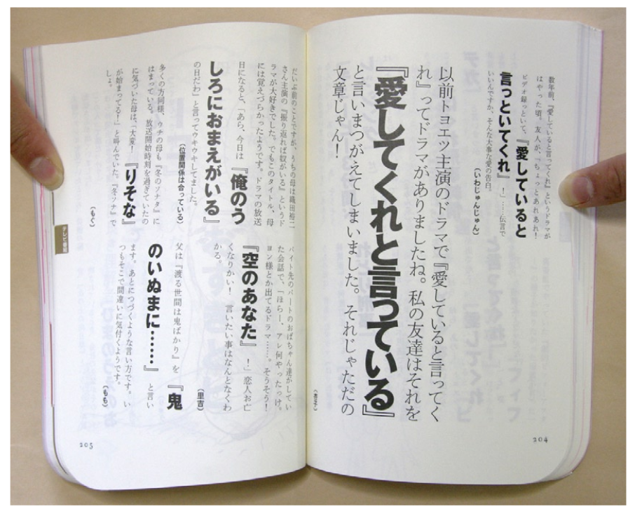
We’re doing something a little different for InDesigners this issue. Earlier this year, David Blatner and I were fortunate enough to participate in the first-ever InDesign Conference in Japan. We thought it would be fun to share some of the work of designers there, as well as get their perspective on using InDesign. The design and publishing industry in Japan is notorious for changing slowly. This is partly because of the complexities of the language: there are over 20,000 characters in the typical Japanese font, and several different categories of characters, including complex Kanji and much simpler kana characters, along with Roman characters, too, just for good measure. The relatively slow adoption of new technologies in design also has to do with the culture itself, which includes very high standards for typesetting this very complicated language! More so than in the U.S., it seems a larger number of Japanese creatives are still using OS9 and QuarkXPress 4 (or version 3). Those versions of QuarkXPress are considered fairly stable, and users have been reluctant to upgrade to the latest version of QuarkXPress, 6.5 (version 7 is not available in Japan). Another interesting difference between Japan and the U.S. is that an enormous amount of page design and production is being done using Adobe Illustrator, which has strong Japanese typographic features. And it’s true: one of my colleagues in Tokyo regularly produces a full-color 150 page + catalog four times a year using Illustrator, one file per page! Hard to imagine, but in Japan, Illustrator is as much a competitor to InDesign as QuarkXPress. In spite of all this, InDesign seems to be catching on, as attested to by the success of the conference. After all, InDesign offers an even stronger set of Japanese typographic features than those found Illustrator or
QuarkXPress, and users in Japan are moving to InDesign for many of the same reasons the shift has occurred here, including its rich feature set and integration with the other Creative Suite applications. To get a sense of Japanese perspective on InDesign, David and I asked four leading designers, who were also speakers at the InDesign Conference, to share their thoughts on InDesign with us. We basically asked two questions:
- Why do you prefer using InDesign over other programs, such as QuarkXPress or Illustrator?
- What is your favorite feature in InDesign?
We think you’ll find their answers interesting. And we know you’ll enjoy viewing some of their work created using InDesign!
Tzutom Toda

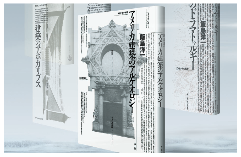
Since 1980, renowned designer Tztom Toda has been focusing on editorial and book design for thousands of publications, including magazines, corporate newsletters, CD-ROMs and HD images. He is the author of D-ZONE Editorial Design 1975-1999 (Seidosha) and Into Electronic Thinking… (Nikkei, Inc.), managing editor of d/SIGN magazine (Ohta Publishing Co.) and graphic/design magazine (Sayusha). He is also a professor at Kobe Design University.
Toda-san expressed a common, underlying reason that many people in Japan, and worldwide, for that matter, use InDesign: “Because InDesign is fun!”
His favorite feature is related to a Japanese typography, namely, the ability to create mojikumi setting profiles. [Editor’s Note: Mojikumi, available only in the Japanese version of InDesign, lets the user control how the various types of Japanese characters space between each other, including controls for spacing between characters and punctuation, numbers and Roman characters, and a host of other combinations.]

Yasuhito Nagahara
 Yasuhito Nagahara is a graphic designer and a professor in the Information Design Department of Tama Art University. He has worked on book design, web projects, and art direction of art exhibits. He is author of Design with Computer (MdN Corporation), Japanese Language Design (Bijutsu Shuppan-sha), and co-author of Design Language (Keio University Press). He is a winner of MMCA’s Multi-Media Grand Prix prize. “I’ve used QuarkXPress for a long time, but it has been priced too high and its operation felt like hanshita (camera-ready copy mechanical) generation software rather than layout software, and that felt strange to me. As for Illustrator, it can now be an illustration tool as the name suggests, because its layout function is not needed now that we have InDesign. I like InDesign because it feels like PageMaker and very much like Mac layout software should. “My favorite feature of InDesign is the OpenType functions it allows us to access. This is especially important in working with design that involves Japanese type.”
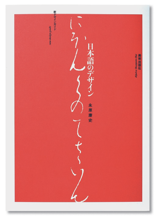
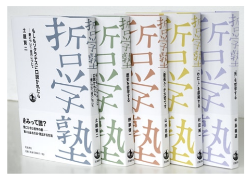
Yoshinori Kikuchi
 Yoshinori Kikuchi is the president/art director of AR, a graphic design firm which produces magazines and books in various fields, including Digital Camera Magazine and Nikkei Architecture. He introduced InDesign into his firm’s editorial design workflow at Version 1.0, produced over half of its annual output using InDesign in 2005, and has transitioned nearly 100% to InDesign as its base operation as of today. “It’s the touch, or feeling of InDesign that I enjoy the most. QuarkXPress is an excellent tool, but when I use it, it feels dry—like eating dry food in the desert. “There are about 10 designers in my office, and for many years, they only used QuarkXPress. When we moved to InDesign, they cried at first, but after some time they forgot about XPress because InDesign matches the designer’s feeling. Designers like to use Illustrator and Photoshop, too, and it’s helpful that the interface is so similar. “My favorite features are the typographic features. Second, the transparency features. I appreciate the Adobe development team for the Japanese version of InDesign, because they know about Japanese typographic features. Quark did not respond to the Japanese designer’s feelings and needs.”


Shin Sobue
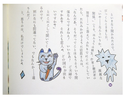
 Shin Sobue founded the design firm cozfish Ltd. in 1993. He won a Kodansha Cultural Award in the Book Design Category for Shigeru Sugiura’s Manga House Vol. 1-5, and a Minister of Education Award for Kuranokami and King of Children (Mystery Land series by Kodansha) in 2003. Designing mainly for publications, advertising and commercial goods, he is currently involved in logo and graphic design for Chichu Art Museum in Naoshima, Kagawa. “InDesign is very playful. There are many rules in Japanese typography, and sometimes it seems very strict, but in InDesign, I can set up these typographic rules with enjoyment. “There are many things that QuarkXPress cannot do, but InDesign can, especially when working with vertical text. I used to create 300-page books with Illustrator, but now it’s much easier to do in InDesign. “My favorite InDesign feature is Composite Fonts, which let you specify different fonts for different characters. Each character can be in its own font. [Editor’s Note: Composite Fonts is a feature found only in the Japanese version of InDesign.] “It seems to me that many users don’t enjoy doing layout, but they should! There are so many interesting and playful features in InDesign.”
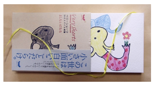
Commenting is easier and faster when you're logged in!

Recommended for you

InPerson: Roger Black
David Blatner caught up with world-renowned designer and font entrepreneur Roger...
InDesign Magazine Issue 133: Object Styles
We’re happy to announce that InDesign Magazine Issue #133 (May 2020) is now avai...

TypeTalk: The Typographic Expressions of Stefan Sagmeister
Stefan Sagmeister is an award-winning designer known for his bold, innovative wo...