
InDesigner: Peachpit Press
David Blatner speaks to the prominent software book publisher.


This article appears in Issue 26 of InDesign Magazine.
Peachpit Press has seen it all. The company was originally founded in the mid-1980s as a self-publishing vehicle for a book about Ventura Publisher. In the early 1990s, they published best-selling books on QuarkXPress and PageMaker, and became known for high-quality books with a down-to-earth, comfortable writing style. But a funny thing happened in 1999: Sandee Cohen wrote InDesign for Macintosh and Windows: Visual QuickStart Guide… and she wrote it in InDesign. Peachpit jumped on this opportunity to get up to speed on the new software quickly. Production editor Lisa Brazieal and designer Mimi Heft remember being excited about the new software, though they wary about its initial limitations. But after version 2.0, Peachpit Press started to get hooked on the product. 
Today, while a few of their books are still laid out in QuarkXPress due to legacy documents or workflows, at least 85% of book interiors—and virtually all the book covers—are designed and produced in InDesign. However, due to the ubiquity of Microsoft Word and the large number of freelancers they employ, they have not yet been able to shift to an InCopy workflow.
Designer Mimi Heft notes that, “InDesign encourages me to innovate. The special effects, object transparency modes, and its robust mixed ink color features feed my creativity. I like that InDesign has some of the features of Photoshop. So when I know it’s something that InDesign can do, I’ll do it in InDesign. When I need more robust Photoshop-type stuff, I’ll do it there and then import it as a PDF or Photoshop file into InDesign.”
Owen Wolfson, who performed freelance compositing work for Peachpit for more than a decade and who now works for Apple, explained that InDesign’s nested styles and find/change with GREP
are “huge” timesavers, especially for common elements such as numbered lists. Similarly, the Fitting features for text and graphic frames, and the auto-pagination feature of book panels are great.
Production editor Lisa Brazieal focuses on the prepress and production benefits of InDesign. “I don’t have any struggles at all with the fonts. You just put them in the Fonts folder [inside the InDesign application folder] and it just works. I feel like I struggled constantly with fonts in Quark.” Her colleague, prepress coordinator Mimi Vitetta, adds, “InDesign also works well with Acrobat to streamline everything from dealing with transparency issues, embedding color spaces and even checking that everything is in the right color space for what we need at press time.”
Of course, Peachpit is also home to Adobe Press (and, until the merger, Macromedia Press), though that doesn’t appear to matter much when it comes to which software they choose. Ultimately, whatever helps them make books faster wins. As Heft noted, “Our printers love us. They love our files for how well they’re put together and preflighted.”

Binary design: A matte UV overlay of text that repeats the computer binary number of 0/1 (zero/one) sits on top of the clouds, and was created in InDesign using layers to design and position the type.
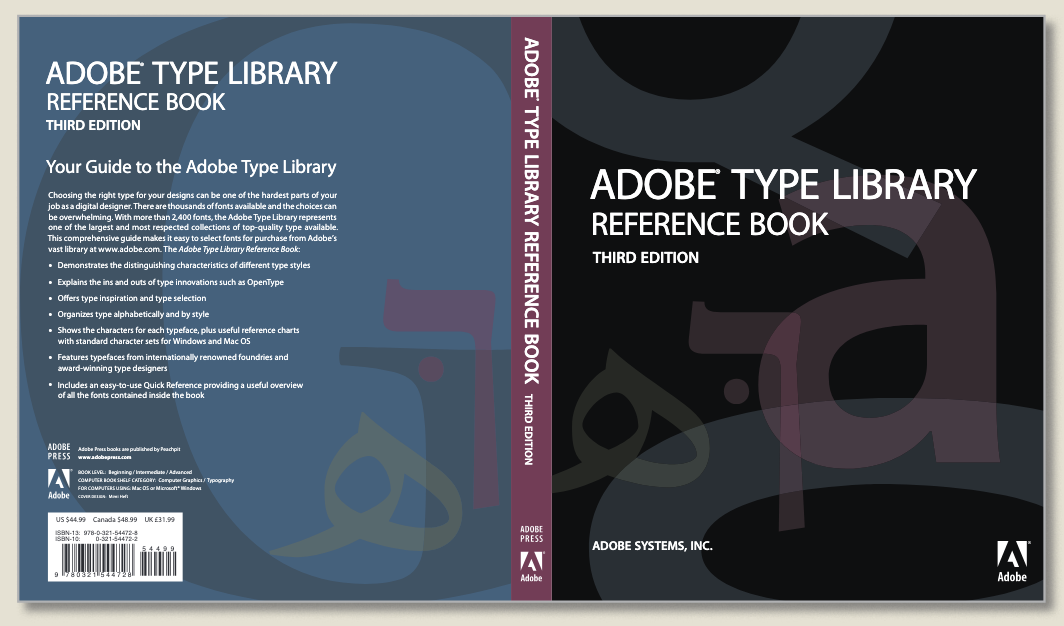
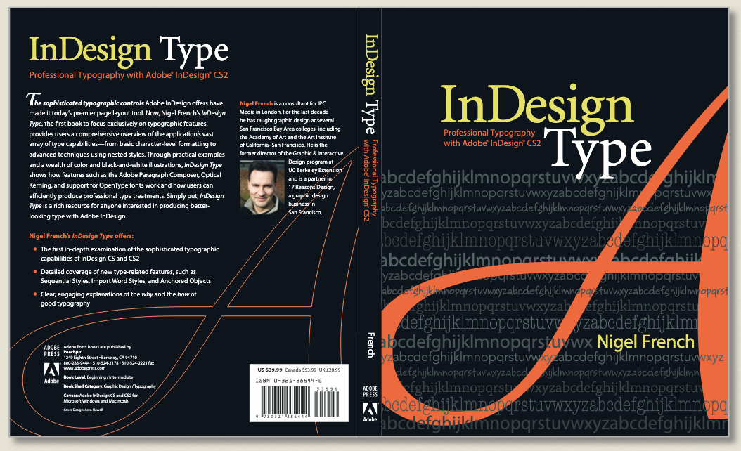
Adobe Type Library: Mimi Heft had fun with transparency and varnishes on this cover. You’ll have to pick it up in a bookstore to get the full effect.
Color gradients in the title treatment: Charlene says, “I wanted to mimic the incredible color subtleties of the cover photograph and InDesign made it easy.”
Deep design: For this cover, Peachpit used multiple layers to handle several different types of images (PDF, EPS, PS, and AI), all placed in InDesign.
More control: Charlene notes, “We love the control we have with InDesign type features. It makes our typography gorgeous—and this cover design reflects how we feel about InDesign type!”
Two inks, many colors: Mimi says that this page from The Open Brand is a “wonderful example of mixed ink colors. It’s a two-color book, and yet there is so much more color they’re getting out of it.” She used the mixed ink group feature to create a number of different ink swatches. “You get all these different tones that expands what you can do with just two colors.”
Design on the fly: All these graphics, from the book Designing for the Social Web, were done in InDesign as the compositor was laying out the pages. “The nice thing about doing this in InDesign is that you know immediately that it’s going to fit on the page—the size and consistent line weights.”
A pioneer: Inside the Publishing Revolution: The Adobe Story was one of the earlier books produced entirely in InDesign in 2003.
Commenting is easier and faster when you're logged in!

Recommended for you

You Can Tell a Lot About These Books By Their Covers
Two UK publishers rely on on standout covers in order to sell publications. Terr...

InDesigner: Insight Guides
Pam Pfiffner examines how one publisher is tackling the problem of creating prin...

InDesign Magazine Issue 112: Green Design
Issue 112 of InDesign Magazine include articles designing for sustainability, sp...