
InDesigner: Pamela Sparks
Learn how Pamela Sparks brings InDesign Magazine to life each month

This article appears in Issue 150 of InDesign Magazine.
As some of you may remember, InDesign Magazine underwent a redesign in 2018—the second major refresh in the publication’s 17-year history. The woman behind the new design? Pamela Sparks. If you’ve been reading long enough, you probably already know that name. Sparks has been designing feature articles for InDesign Magazine since 2015, and in 2017, she was asked to lead the redesign that completely transformed and elevated the magazine. Six months after the new design launched, Sparks took over all design and production responsibilities, and she has been touching every page of every issue since.

Pamela Sparks
For the 150th issue of InDesign Magazine, Sparks gives us a behind-the-scenes look at her creative processes and how she’s kept each issue of InDesign Magazine interesting, fresh, and unique for more than three years.
Working Within a Template
Templates are an important part of publication design. Not only do they help control the layout and look, they also provide an overarching framework and bring together disparate elements in a consistent format. They’re essential tools for efficiency, as well. But when it comes to producing InDesign Magazine, it’s not as easy as simply flowing text into placeholders. Because each issue includes an assortment of content, Sparks had to consider all of the variables and create a template that was dynamic enough to keep things interesting, but not so free-form as to feel disjointed.
“The tricky part when designing any template is giving each element a custom look while trying to envision how far it will need to scale. Title lengths can vary greatly, and some articles have subtitles, some don’t. So you have to allow for that. A template that’s too rigid will stifle editorial freedom,” she explained.
One
of Sparks’ favorite features of the template is the wide library of color options, which she uses to tone the content up or down.
“The color palette is a major character in the overall design, doubly flexible because each color has two tones. I can create almost unending possibilities of combinations: two shades of the same color, two or three different colors that complement or contrast each other, and gradients that are either subtle or vibrant depending on which color combinations I use,” she said. “I often use vibrant colors to punch up articles with lots of dialog boxes or monochromatic figures, and I use more muted colors for articles that already have lots of color so as to not compete or overwhelm.”
Although there are limitations within any template, Sparks made sure that her original design left enough wiggle room so each issue could truly feel unique.
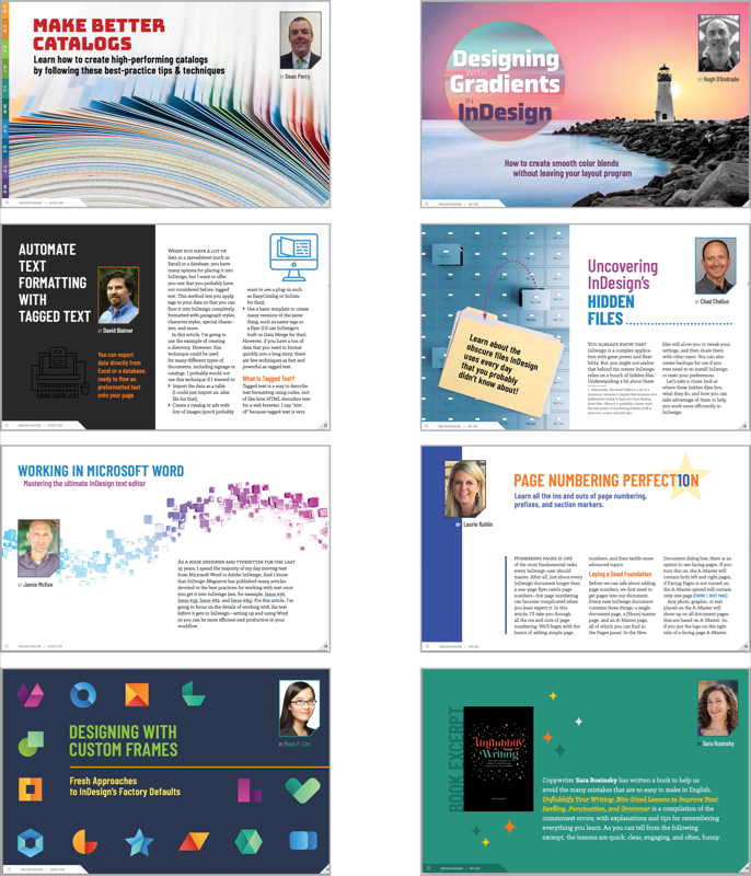
Sparks keeps each issue visually diverse with a mixture of colors and imagery styles, as shown in Issue #124 (left) and #145 (right).
Behind Each Issue’s Design
From a design perspective, Sparks’ primary strategy is to incorporate visual variety throughout the entire issue and make sure elements like metaphors, colors, or themes don’t feel repetitive.
Sparks’ favorite method for making sure no two issues are the same is pulling the design direction from the content itself, especially when it features a visually rich and descriptive title.

“Although my general rule for an issue is to amplify the feature with a unique layout, sometimes a supporting article just begs for special treatment. Who could blame me for having fun with an article titled ‘The FX Files!’” said Sparks.

Similarly, in this article about creative uses of shading, the author’s inclusion of an old black-and-white movie reference set the tone and inspired her to play to that look and feel.
“One of my favorite designs was ‘Taming Wild Assets with Adobe Bridge.’ The wordplay of the title instantly evoked lots of jungle-themed options. If it had been called ‘Using Adobe’s Version of the Finder for a More Efficient Workflow,’ I would have had a really hard time bringing it to life,” Sparks observed.
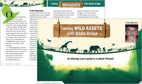
The descriptive title allowed Sparks to use a more animated theme and incorporate visual elements, like animal silhouettes, throughout the entire article.
Some pages are more flexible than others, like the feature article, while sections that have a more singular purpose (like “Script of the Month” or “InType”) remain templatized but allow for some flexibility with formatting and image placement.
Though the title page is the most prominent page of the article, Sparks makes sure whatever design direction she chooses can be carried through the rest of the article so it’s visually appealing and cohesive from start to finish.
“The feature article is mostly a blank canvas. I have pretty much free rein on the title page in terms of layout, artwork, and font treatment. To stand out from the rest of the issue, the running head does not have to follow the standard template and can span the entire width, or even spill over the edges. It’s also the only place in the entire magazine where a non-standard font is used. Instead, I’ll find something on Adobe Fonts that fits the style and personality of the article, and use it throughout in headings and sidebars,” she said.
Another component of the magazine that requires not only its own strategy, but also a concerted team effort is the issue’s cover. In Sparks’ original template, the cover was designed with a large hero image framed by a color border and signature triangle accent. The logo remains fixed, but the rest of the text can be placed wherever makes sense in the “negative spaces” of the image.
“Finding an image that is high-impact, accurately portrays the topic, has suitable space for copy, and has sufficient background contrast is always a juggling act! Rarely does an untouched stock image fit all of the criteria, but that’s where Photoshop and Illustrator come into play,” said Sparks.
Not only does the cover image need to stand out visually, it also has to convey and represent the issue as a whole, embodying a common thread of the content.
“If David [Blatner] has a direction in mind, he’ll let us know at the outset. Otherwise, Mike [Rankin] and I will brainstorm concepts. For example, for the recent Illustrator vs. InDesign cover, David suggested a Godzilla vs. King Kong theme. This turned into one of the most enjoyable covers and feature articles I’ve ever done, and I was able to customize a single vector image of two monsters in multiple ways and places in the issue,” said Sparks.
The biggest challenge she faces when designing each issue of the magazine is coming up with new ways to depict familiar topics.
“We talk a lot about digital processes, and while there is no shortage of metaphorical stock images, the photographic ones can be cheesy or clichéd. Vector illustrations offer more suitable choices, but I try to limit my reliance on that style to avoid overusing it. Sometimes I turn to abstract backgrounds and shapes, or use the text itself as the design,” said Sparks.

In this article, the author extolled the virtues of using white space, so Sparks used a minimalistic design that mirrored the content and let the colorful images take the spotlight.

“For the ‘In’ articles, the template is set, but I can exercise creativity in other ways. This article was about fun ways to use type on a path, so I took the author’s suggestion!” said Sparks.

“Some of my favorite feature layouts are ones where I customized the headings with special touches. In the first layout, I used a nested paragraph style to add tombstones behind the numbered headlines. In the second, I used an object style and anchored objects to add little fireballs to each hot tip,” explained Sparks.
Sources of Inspiration and Education
Even though Sparks has over 20 years of graphic design experience, she continues to prioritize learning new tools, tips, or tricks that push her capabilities as a designer.
“Software is always changing and growing, and with every new release there’s an opportunity to try out a new feature—and not just in InDesign. I use Photoshop and Illustrator regularly in my workflow,” said Sparks. “Sometimes I create my own graphics, and sometimes I leverage Adobe Stock or Noun Project. Whether I use stock photos or vectors, I typically bring them into Photoshop or Illustrator and customize them—anything from changing the colors, removing or adding elements, or collaging multiple images or graphics to create something new.”
Sparks also keeps an “Inspiration Folder” right on her desktop that she revisits if she’s in a creative rut or needs a breakthrough way of thinking.
“Like everyone else, I consume a lot of digital media, and from time to time I see things that stand out from the noise in a visually appealing way. When something strikes me as interesting or unique, I’ll grab a screenshot of the part I want to remember. Maybe it’s an interplay of words or shapes that I haven’t seen before, or a custom brush stroke that I want to try and emulate. Sometimes it’s an infographic or a beautiful photograph of nature. Basically, things that make you go ‘Wow,’” she said. “Cycling through a folder full of artistic deliciousness will wake me up faster than a cup of coffee!”
Sparks also explained that attending CreativePro Week every year is a huge source of inspiration and education.
“Truthfully, I don’t know what I would do without the CreativePro team and all the experts who contribute to the community. They are a treasure trove of knowledge you won’t find anywhere else. Besides all the inspiring design tips and techniques, I’ve even stepped out of my comfort zone and incorporated some handy scripts and custom GREP expressions that have already streamlined my work,” said Sparks.
As for putting all those new skills to use, Sparks frequently references her InDesignSecrets keyboard shortcuts poster when beginning any new project, looking for ways she can save time. In addition to shortcuts, she also created a stockpile of pull quotes, sidebars, graphics, and starter layouts that she keeps in a Creative Cloud (CC) Library. Being able to drag and drop components onto a page helps speed up her workflow tremendously.

“Vectors to the rescue! When I can’t find an ideal photograph of a concept, there’s almost always a vector illustration I can pull apart and customize to my liking,” said Sparks.

Using conceptual themes instead of literal depictions makes for a richer visual experience and establishes a connection with the reader. The concept can then be carried through the article, making sidebars more interesting as well.
Sparks challenges herself not to rely on stock imagery. She enjoys creating her own designs using only colors, shapes, and typography when the topic lends itself to doing so.
The Next Step: CreativePro Magazine
Starting with the next issue (November 2021), InDesign Magazine will evolve into CreativePro Magazine. The new magazine will feature content on design, photography, illustration, and presentations in addition to InDesign. From a design perspective, CreativePro Magazine will reflect many aspects of InDesign Magazine, including the size and format, color palette, fonts, and basic layout. But you will notice some changes as well, including a redesigned cover and table of contents, a new approach to curated web articles, and other design changes that will unfold over time. During the redesign, the overarching goal was to give readers familiar and comfortable elements, while sprucing up some things to reflect the idea that CreativePro Magazine will be a natural evolution rather than something completely new and different.
“One of the biggest changes is the evolution of the ‘Best of the Blog.’ Instead of being combined into one section, each article will now have its own design space with plenty of elbow room to spread out. I’m really excited about this change and can’t wait to start using the new designs!” said Sparks.
Thank you, Pam, for bringing the magazine to life each month!
Commenting is easier and faster when you're logged in!

Recommended for you

Laying out Facing Pages Vertically
Erik wrote:For most jobs the current page/spreads setup in CS2 works fine, but I...

dot-font: The Typographic Art of Matthew Carter
dot-font was a collection of short articles written by editor and typographer Jo...

Tip of the Week: Justify Text With Last Line Aligned Right
Sign up for the InDesign tip of the week to get a new tip, roundups of new artic...