InDesigner: Izzy Poirier
This Ottawa-based designer splits her time between creating thoughtful brand designs and wild, multisensory zines.

This article appears in Issue 27 of CreativePro Magazine.
Step 1: Steep your tea. Don’t worry if you don’t have your own, there’s one here for you.
Step 2: Find the coziest spot in your home. Sit down. Get comfy.
Step 3: Mute your phone. Put on your headphones.
Step 4: Inhale and sip the tea goodness.
Step 5: Open your zine.
Most zines—like most of what we read in general—don’t come with instructions on how to read them. They certainly don’t come with complementary drinks, snacks, and Spotify playlists. But for the Ottawa Design Club, these multisensory elements aren’t bonuses or frills, but an essential element of the experience. Isabelle Poirier (who goes by Izzy) is the co-founder of the ODC and the founder of IP Design, her brand strategy studio. She is passionate about the transformative power of multisensory design—and it’s something she’s bringing to her work as a brand consultant as well. She explains the potential benefits of multisensorial branding, saying “You probably have a memory of a family vacation, to the beach for example, where you remember what you ate that day, how it smelled, the activity you were doing, the texture of the sand. We tend to remember when there are a lot of senses that are triggered at the same time.” She believes that companies could be using this idea to make stronger impressions on their customers and increase brand recognition.
After flipping through a couple of the ODC zines myself, I sat down with Poirier, ready to learn how these unique zines came to be and how she uses these skills in her branding work as well.
A Background in the Arts
Brand consulting and zine production might not seem like two career aspects that go hand in
hand, but it didn’t take long for Poirier to start enthusiastically drawing connections between them. One of the major points of connection for her is art.
“Art and design have always been intertwined in my career… I actually studied to become a visual arts teacher,” Poirier explained. “I changed at the last minute. That’s why there’s such a heavy emphasis on the arts in the work that I choose to feature. All my current clients are either artists or are trying to bring art into what they do.”
Poirier graduated with a Bachelor of Fine Arts in 2011 but struggled at first to find a job in her field. She says that the political climate at the time influenced the kinds of jobs available to creatives, as well as the general attitude towards art and design. “Whenever I would go in for interviews, people would tell me ‘You’re too creative for us, you won’t fit in here.’” Poirier knew that wasn’t a bad thing, but she decided it would help her career to pursue a certificate in web design, which taught her to use the software that would become a fundamental element of her work. She also began collecting freelance clients, establishing connections with artists by attending gallery shows. She built her portfolio this way, offering to design their website portfolios.
In her mid-twenties, she was hired as an administrative assistant for an art gallery, a role that unexpectedly transformed into an interim director position. “It was intense—one of the hardest things I’ve ever done in my life! But I think I caught the entrepreneurial bug there.” The skills she would learn in this role, especially those related to curating art exhibitions, would be essential for her work in the future (Figure 1).
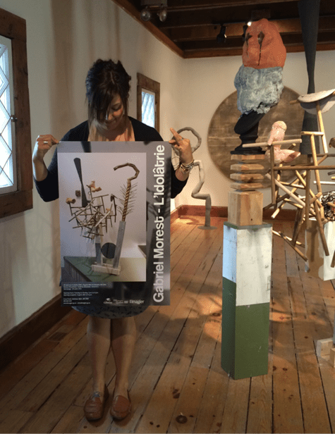
Figure 1. Izzy Poirier with one of her art gallery poster designs
Poirier moved on to work for the Canadian government, but ended up jumping from department to department, trying to find the “spark.” But one day—in fact, the same day she was starting a new job in a different department—Poirier got an offer to be featured in an illustration book. “I took it as a sign. If I’m getting opportunities from outside, just from doing my own work for fun, I could do it on my own.” She took a year to plan an exit from her corporate job, building up her trickle of freelance work into a career in branding.
During this transition year, working only part-time, she took the opportunity to drive from Ottawa to Montreal for a day trip. “I was sipping a drink on a patio, posted about it on Instagram, and one of my followers said ‘Hey, we have this event with this organization called the Montreal Design Club today, you should come. It’s a print edition tonight, you would love it.” Poirier agreed to check it out and ended up falling in love with the event model, the people she met, and the idea of having her own zine. “I was buzzing for three days after this event!” she says. She had been to creative events in Ottawa before, but there was something special about the Montreal event. Two weeks later, she was contacting the Montreal Design Club on Instagram, asking them if they’d be open to “franchising.” And from that exchange, the Ottawa Design Club was born.
From Quarant-zine to Origins
For the next six months, Poirier was building the Ottawa Design Club and putting together a team, all while also trying to launch her freelance branding business. In December of 2019, she quit her job, and by March of 2020, her newborn design club was ready to launch with its first event. Unfortunately, five days before the event, the COVID-19 pandemic hit, and Canada went into lockdown. “The full team didn’t speak to one another that day,” she says ruefully. “I think we were all mourning.” Once they realized that the pandemic would not be over quickly, they pivoted, hosting online events instead of the in-person ones they had planned (Figure 2).

Figure 2. The Ottawa Design Club’s website shows their event history, beginning with their first event in March 2020, canceled due to the COVID pandemic.
The online events were successful, but there were challenges. Montreal Design Club’s model was all about networking, which seemed much harder when confined to a Zoom meeting. Still, they were able to build their community, with a loyal group of participants who stayed patient as the design club experimented. “People knew that we were testing things out, and it was not our ‘real thing,’” she said. “But we knew that we were missing out on touching the lives of people, because we were doing it on a screen. And that’s when the zine idea happened.”
A zine is something tangible, something you can touch and hold and have in your house—but it’s also a means of connection. In the midst of the pandemic, when people were both wary of human contact that could get them sick and longing for a break from their social isolation, a zine, especially one like Poirier was envisioning, was the perfect solution (Figure 3).
Figure 3. A product photo for the third edition of the zine, Raw, highlights the tactile presence of a physical zine.
In a way, the zine was a form of networking itself, just like the in-person social events that it was inspired by. Each artist’s page is like a little window into their work and features not only their name but also their website or Instagram handle. Like an event, the zines are exclusive, contained, and somewhat ephemeral. The content isn’t available online and only a limited number of copies are printed.
The first zine sold out in three days. Called Quarant-zine, the issue explored quarantine creativity at the perfect moment in the fall of 2020. One photograph, Poirier explained as she held the zine up to the camera for me to see, was taken on an iPhone immediately after the artist learned they had been laid off. Another page, splashed with bright pink and purple, features three collages, depicting colorful fabric masks covering women’s faces taken from vintage magazines (Figure 4). Each flip of the page reveals more color, more artistic mediums, more design choices. Poirier mentioned wanting to display the art in different orientations, requiring the reader to twist and turn the zine to see everything from the proper angle. “It was kind of a hidden message, for us to say, ‘You have to look at things from a different perspective to see what’s in front of you’” (Figure 5).
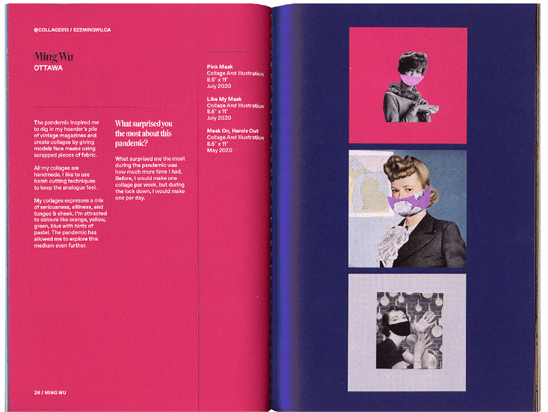
Figure 4. A spread from Quarant-zine is a sign of the times.
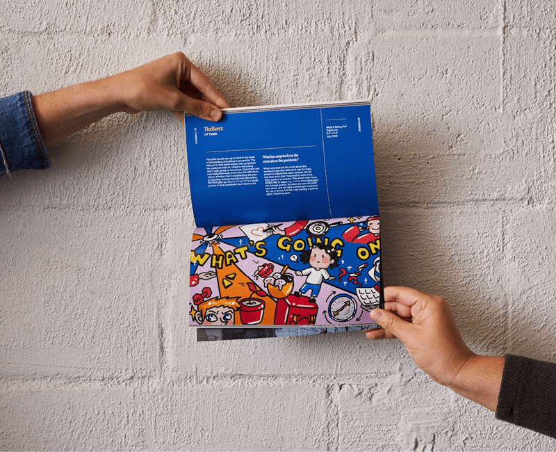
Figure 5. ODC zines encourage readers to see things from a different angle, sometimes literally.
It turned out that Poirier’s old art gallery experience came in handy. Putting out a call for submissions and organizing and curating the results reminded her of putting together exhibitions. The first zine felt like a beta attempt, with Poirier and her co-founder Ariane Bédard just experimenting and having fun, filling the zine with meaningful design details and Easter eggs (Figure 6). After the resounding success of the first issue, they jumped into action to release another, this one called Pop Culture.
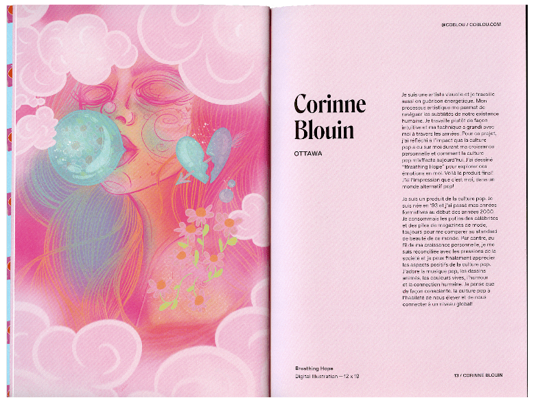
Figure 6. From the beginning, the zine was open to both French and English submissions, to reflect Ottawa’s bilingual community.
It was during the planning stages of Pop Culture that the pair hit on an element that would become a key part of the future zines. Bédard suggested that they ask artists to include a Spotify link to a song they couldn’t stop listening to as part of their submissions. The idea was that they would create a playlist with every song and integrate that with the zine experience. It would also be a branding tool—something digital that they could put on their website and promote on social media to accompany the otherwise very analog zine.
Poirier and Bédard chose a bubble gum pink theme for the Pop Culture issue (Figure 7), both as a visual pun on the pop in the title and to hint at a more nuanced metaphor. “As we started getting submissions, we saw that there was a bad side to pop culture, this duality that was happening. As we were thinking about the narrative, we thought that we consume bubble gum the same way as we consume pop culture: It’s sweet, it’s good, but for what? A minute? After that, it’s stale, and we toss it away. It sticks to the bottom of someone’s shoes. It takes a long time to decompose. It’s a marker of time.” They decided to add to the multisensory experience they had already begun with the introduction of the Spotify playlist by including a piece of bubble gum with every order. The idea was that all your senses would be involved as you flipped through the pages, chewing the gum and listening to the curated music. “But people didn’t get it!” Poirier exclaims. “We would say the word multisensorial and they’re like ‘wha-wha-wha-what? What does that eat for breakfast?!’ and we had to explain. We were so new, we didn’t know how to teach our audience.” Sales for the second issue dropped (though it has since sold out as well.) (Figure 8)
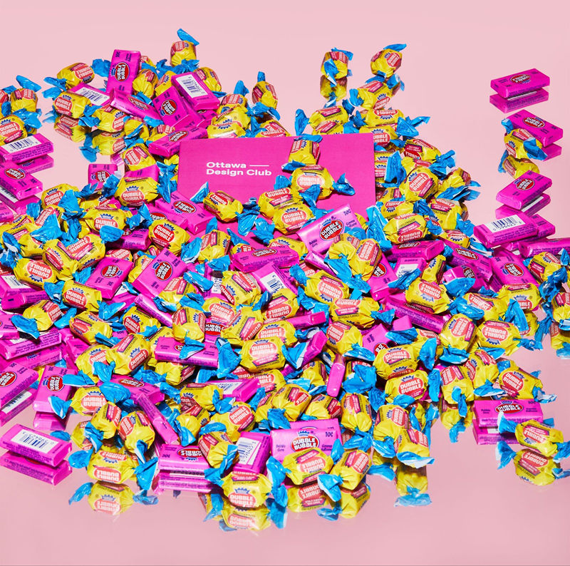
Figure 7. A product photo for Pop Culture shows the zine engulfed in a pile of Dubble Bubble gum.

Figure 8. The art showcased in Pop Culture covers a range of tones and emotions, from the playfulness of a Golden Girls/Batman crossover to the discomfort of a Gucci advertisement face pockmarked by windows.
However, Poirier and her partner were certain they were onto something. A year and a half into the pandemic, they noticed filters were coming off on social media posts and people seemed ready to reveal the more chaotic and emotional parts of their lives. To match this mood, they chose the theme Raw for their third issue: “raw feelings, raw format, raw like an untouched photo.” To give the zine a “raw materials” kind of finish, they spray-painted the paper stock before the covers were printed, making every issue one-of-a-kind (Figure 9).
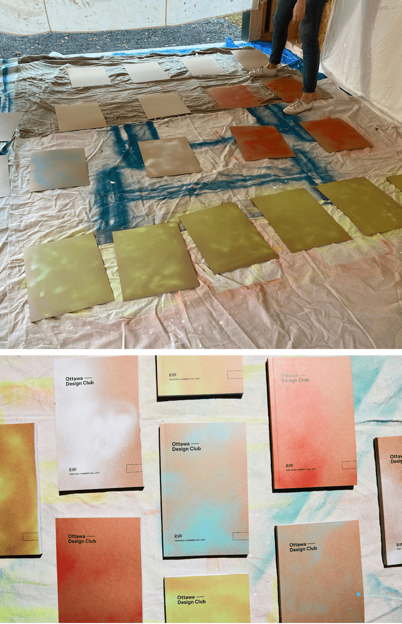
Figure 9. Each copy of Raw sported a uniquely spray-painted cover design.
Poirier is always interested in exploring how to take advantage of the uniquely multisensorial medium of the zine. Each issue is full of design choices that are perfectly suited to (or would work only in) this form. For Raw, Poirier and Bédard hired a D.J. to create a playlist specifically to accompany the zine, inspired by the curated contents. When you scan a QR code at the beginning of the booklet, you’re taken to a 30-minute set to listen to while you flip through the pages. Poirier emphasized how much music can change the emotional experience of looking at art, comparing it to how a film’s soundtrack enhances the experience of the narrative and vice versa. When you read the Raw issue, for example, the happy, upbeat playlist contrasts with the zine’s portrayal of unfiltered emotions, suggesting a person who is trying to keep themselves motivated through difficult circumstances (Figure 10).
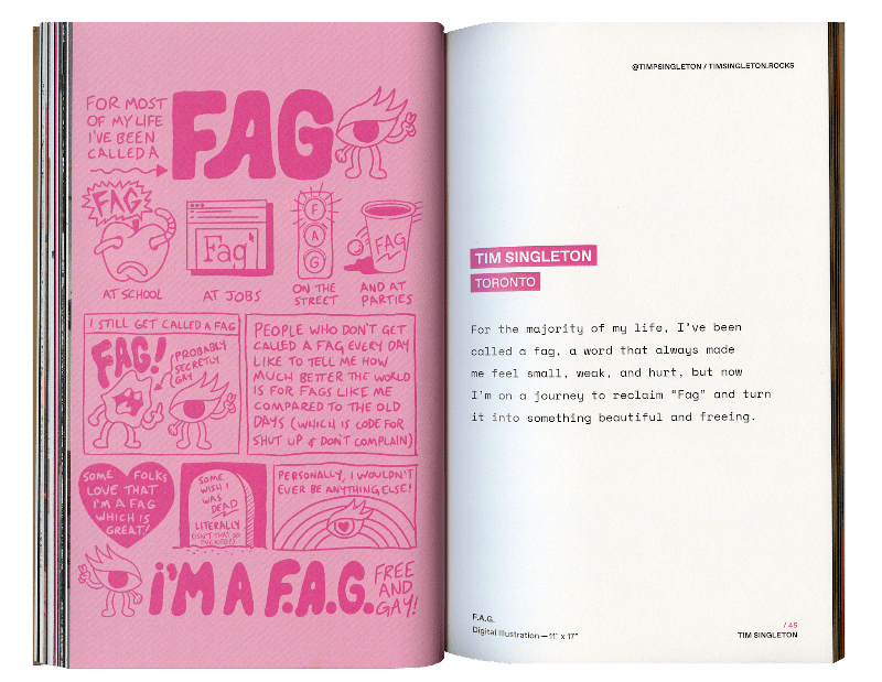
Figure 10. The art for Raw is often blunt, bold, and shocking. Poirier and her team asked that artists submit only one sentence to go along with their work, to leave the pieces more open to the reader’s interpretation.
The ODC’s fourth edition, Origins, was the most immersive and interactive zine yet. The zine comes with a printed-out card with 14 “Steps to ODCertified Zine 0004 Experience,” along with a packet of tea. Although the long list of steps is somewhat tongue-in-cheek, Poirier and Bédard also wanted to ensure that their audience would really understand the full range of content available to them. In this issue, practically every other page features a QR code sending you to an extra photograph, a longer explanation, or even an English translation of text written in another language (Figures 11 and 12).
Figure 11. Many of the submissions for Origins came from artists from outside Canada, like this work by an American artist. Note the QR code in the bottom corner of the page, which reveals a photograph of the artist’s grandmother.

Figure 12. This mobile screenshot shows the English translation of Aarthi Ganesh’s piece, accessible by QR code.
Origins was inspired by a submission that had originally been sent in for the first edition of the zine—a black-and-white photograph of the Indian-Canadian photographer and another model. The photoshoot had been done during quarantine, making it a good fit for Quarant-zine, but Poirier and her co-founder had an instinct that the piece had the potential for more. “We kept it in our back pocket for two years,” says Poirier. “We wanted to test out the market first before diving into something that was too personal. We had to build momentum with our audience and our community before people could truly allow themselves to be vulnerable. Raw was kind of a test, to see how people would react and if it would sell. Once we saw that it worked really well, then we went into Origins.” With Origins, they received more submissions than ever before, with pieces coming in from all over the world—and all entirely by word of mouth. Participants were encouraged to submit their work in their native language (Figure 13).

Figure 13. Each of the three chapter title pages contains a piece of vellum paper. The transparent effect is a metaphor, suggesting that you both can and can’t understand a person’s culture, traditions, or identity by only looking at them.
ODC took advantage of the spring 2022 release of Origins to finally get back to the original intentions of the design club and host their first ever in-person event (Figure 14). The launch event featured three artists who spoke on the theme of their origins and identity, including Marina Verdu, whose work was featured in the zine. The success of this event launched a new era for the club, of hosting in-person launch events, networking events, and speakers on a range of topics, from storytelling to mental health.
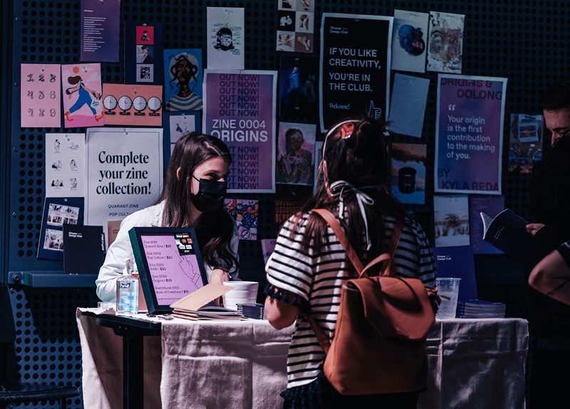
Figure 14. The launch of Origins was a springboard to more in-person events for ODC.
Collaboration: Process and Product
Long before they thought to do an issue of the zine explicitly dedicated to collaboration, Poirier considered it a fundamental aspect of her work process. It’s built right into the way that the zines get made—the team will have virtual meetings for every step of the process, always asking each other for input and inspiration whenever necessary. For example, Poirier laughed as she described her process of collaboration with Bédard: “I did a lot of the layouts for [Collaboration], but the ones that I wasn’t inspired by, I would just drop the content [into InDesign], hand the files over to Ariane, and she whipped it up” (Figure 15). Even the team members, like their copyeditors, who are not trained in design, are encouraged to share their design perspectives.
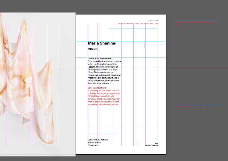
Figure 15. Poirier and Bédard collaborate on the design process, sometimes leaving notes for each other on the pasteboard.
A key feature of the ODC that influences the design process of the zines is that the design club is an entirely volunteer-based organization. As a result, the process of creating the zines is flexible and experimental—each issue has a unique team bringing their unique ideas to the table. And crucially, for each artist and designer working behind the scenes, their goal is not only to provide their knowledge and expertise, but also to learn and experiment. “Some people have their specialties, but they also want to learn other skills—that’s why they volunteer, to gain expertise.” All the volunteers are welcome to join any of the meetings and get involved in any stage of the process that they’re interested in.
“When we get the prints, we will all meet at a coffee shop to look at it together. Even newer designers who don’t know how to look at print. It’s good to show them what to look for, like ‘see this? The blacks aren’t good’ or ‘this here, it’s too saturated, we’re missing details.’ Otherwise, they’re not taught. For many of them this isn’t something you do anymore. It’s kind of a lost art.” But Poirier doesn’t see it as simply a way of educating newer and younger designers—it’s a way to share knowledge in all directions. “I’ll learn from their experiences. If someone is a UX designer, I’m going to learn from them. I may know a little bit about it, but not to their extent.”
The first step of the curation process is to take all the submissions, throw them into a shared Google Drive location, and have each member of the curation team go through the pieces on their own time. Next, they drop all of the artwork into one big, interactive mood board (the team prefers Milanote) so that they can visually compare the pieces side by side. This process happens over Zoom, so the team can work out loud and discuss together as they make curatorial decisions (Figure 16).
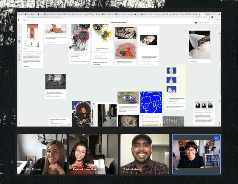
Figure 16. The creation of each ODC zine includes a collaborative remote process.
A lot of the major design decisions were made early on, when Poirier and Bédard were working on Quarant-zine. Once they decided what the cover would look like, the size of the zine, and the layout, they were able to use the same template, with mostly minor aesthetic changes, for each successive issue—until the fifth edition, Collaboration (Figure 17).
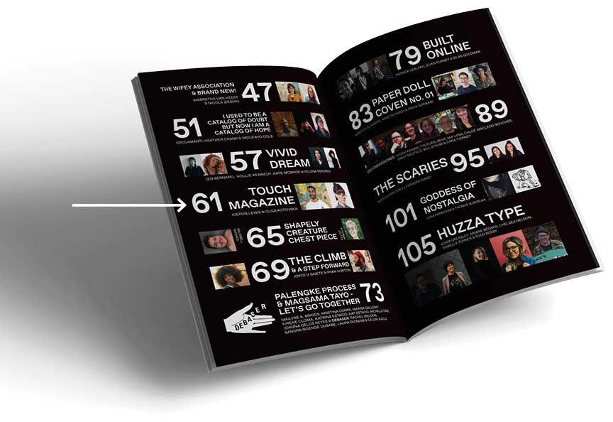
Figure 17. Poirier and Bédard’s design collaborator Émilie Brunet created this intricate table of contents for the issue, featuring photographs of every artist featured in the zine. Can you find Kieron Lewis, another of our featured InDesigners?
Collaboration broke the mold. It features an intricately designed table of contents, a holographic cover, gatefold pages, and much more variation in page layout than the previous issues (Figure 18). It even includes a font (co-designed by Poirier herself), both as a piece of design work showcased in the book, as well as a freebie available to download (Figure 19).
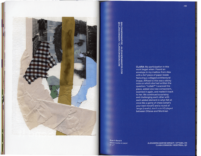
Figure 18. Every single work featured in this edition of the zine was created as a collaboration between two or more artists. This page features a collage that two artists mailed back and forth to each other, adding one component at a time.
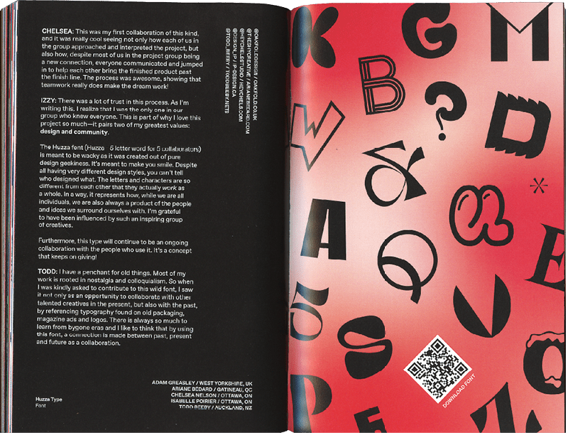
Figure 19. Poirier and her four other collaborators each created a handful of letter designs for the Huzza font, which is available to download via QR code in Collaboration.
After the launch of Collaboration, the ODC took a break from producing zines for five months. At the time, they weren’t entirely sure they would continue at all, thinking that perhaps the concept had run its course. But with the enthusiasm of the club’s creative community buoying their spirits, the team decided to put out a call for submissions with the theme Renaissance.
The results were surprising, inspiring, and incredibly varied. As always, Poirier and her team allowed the submissions to guide the process and ultimate design of the zine. “Our zine’s narrative is never set in stone from the beginning; we allow the submissions to inspire us,” Poirier says. “This time, the selected artworks were incredibly varied, creating a visual puzzle. We tackled this challenge by using color and poetry to bring everything together cohesively.” With the help of their new partner, Gilmore Reproductions, they experimented with metallics, neons, and iridescent gloss (Figures 20 and 21). The resulting effect is more than just aesthetic, Poirier says. “This allowed us to create a synergy between the artworks, with a fascinating duality between metallics (representing the old) and neons (representing the new).”
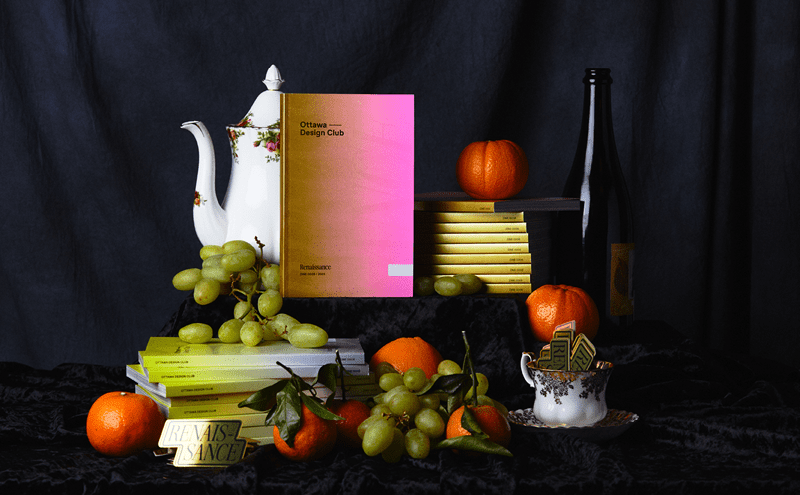
Figure 20. The opulent product photos for Renaissance were taken by Maryne Devine House of Common.
Figure 21. A peek inside the production of Renaissance reveals the luxurious colors and finishes chosen to complement the theme.
Renaissance (and the other zines that haven’t sold out yet) are available for purchase on the Ottawa Design Club’s website.
Brand Design, Another Form of Curation
The Ottawa Design Club is Poirier’s passion project, but her bread and butter comes from her brand consulting company, IP Design Studio. But she sees the two aspects of her work as deeply intertwined, perhaps because she was completing her Level C certification in branding while she was launching the ODC. “I tried out a lot of stuff in the zines that I was learning in those classes. The Ottawa Design Club and the zines are almost like a beta test for strategies that I think could work—and then I apply it to my clients.”
During her consultation with a new client, Poirier tries “to look for gaps in what they’re telling me.” She explained that often her clients will have an idea of what they want or need, but that they’re often putting a perceived solution ahead of the problem. For example, a client may come to her saying that they need a logo. “They’re trying to solve a problem. And they’re thinking, ‘A new logo will fix my business!’” She shrugged. “No.”
Poirier further explained that she thinks of building a brand like building a house: You have to start with the foundation (Figure 22). The strategy comes first, long before you are ready to talk about furniture or decorations. “The front door is the logo. The party invitation that you send out is marketing. When people come to your home, you want to give them an experience, based on everything—how the rooms are organized, what is the vibe inside, how are they interacting with your house, what is the party about. The true test is once you send out another invitation for your second party, are they coming back? If they come back, then you know you have a brand.” And if they don’t come back, you can’t just fix the front door and hope that will solve the problem (Figure 23).
Figure 22. Poirier includes a “lexicon” at the end of her brand strategy documents, breaking down marketing concepts and terminology for her clients.
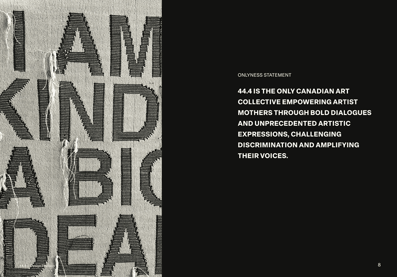
Figure 23. Poirier digs into what makes each business she works with unique by crafting an “onlyness statement.”
The process is about asking the right questions to determine the deeper problem and find out which aspect of the branding process is not working properly for the company. And this takes some time! When Poirier delivers a brand strategy document, it is a thorough, nuanced treatment of the brand, starting with a breakdown of the company’s purpose, mission, vision, and goals; identifying audience archetypes; justifying the design choices made for the visual identity; providing mockups of advertising and merchandise; and finishing with a lexicon of design terms and advice for implementation (Figures 24 and 25).

Figure 24. Each brand strategy guide features several “Audience Members,” complete with a nuanced identity and backstory.
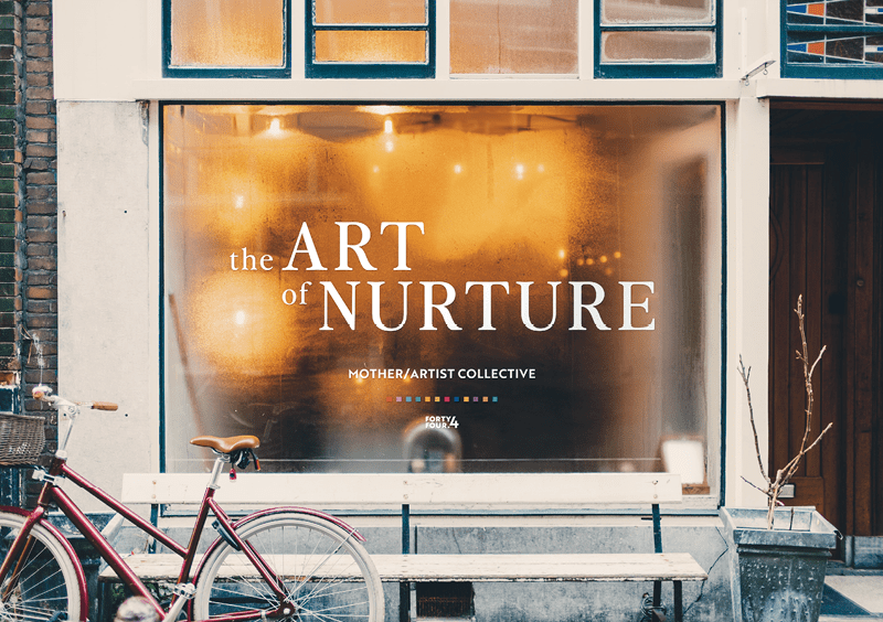
Figure 25. She also includes thoughtful mockups, such as this window design for the mother/artist collective 44.4.
But she also finds the process to be quite similar. “To me, branding is very similar to building an art exhibit or curating a zine,” she explains. “It has the same principles. When you brand a company, it has to have a foundation, a message. You’re trying to interact with an audience, to make them feel something. And you want them to talk about it, spread the word.”
Commenting is easier and faster when you're logged in!

Recommended for you

InDesigner: Oriflame
Can you imagine having to create 40 different versions of a catalog every three...