
InDesigner: The IRS
Learn how the IRS uses InDesign to develop courtroom graphics that bring tax-dodgers to justice.


This article appears in Issue 121 of InDesign Magazine.
Most people think about the United States Internal Revenue Service (IRS) as a tax collection agency. But the IRS has another important job: bringing tax-dodgers to justice. It is in this role that they employ a team of six trial illustrators who create courtroom support graphics to help prosecute a wide spectrum of criminal tax violations. And these designers use a variety of tools to build their presentations, including Adobe InDesign.
Of course, each illustrator does not go to court to testify; instead, they consult with U.S. attorneys and IRS special agents to develop graphics that will help a jury clearly understand the details of a case in the courtroom. Extensive criminal-tax trials often entail a huge amount of information. For a professional trial illustrator, the primary goal is to distill the voluminous information and intricate details into an easily digestible infographic for a jury to understand.
I spoke with Kelly Johnson, one of the IRS’ six trial illustrators, to walk me through the process of understanding, articulating, and visualizing such data-heavy support materials in a clear and objective way.
[Editor’s Note: All graphics in this article have been edited to protect the privacy of all parties.]
Getting Started
When working with high-stakes information, objectivity is very important. As trial illustrators who are not trained in tax law, this objectivity comes in handy in being able to interpret information with an unbiased point of view—similar to what is asked of the jurors.
Johnson explained that before starting any project, the designer reads the indictment to become familiar with the case. The designer also has the opportunity to speak with the trial team, including an IRS special agent, attorney, or, depending on the scope of the trial, other federal agents from the Central
Intelligence Agency, Federal Communications Commission, or the Drug Enforcement Association.
According to Johnson, the special agents often spend months or even years collecting and compiling data, including bank statements, phone logs, travel records, and tax documents, into spreadsheets and tables. After the research phase, the information is shared with the designer to begin concepting and developing the project, which can take at least six to eight weeks to prepare. Sometimes the visuals themselves can take multiple months to create for larger projects.
While meeting with the trial team to discuss which exhibits they need, Johnson said she sketches any initial ideas on paper. The sketches, as well as any basic initial charts in Word or PowerPoint, then serve as a starting point for the visuals.
“When I meet with the team, I usually start by asking: ‘What is the crime and how was it committed?’ I try to glean the story of the crime so I can tell the story visually with graphics,” explained Johnson.
Designing Criminal Infographics
In one particular money laundering case, Johnson was given a list of bank deposits at various bank locations—deposits that consisted of profits from unlawful activities, such as selling narcotics… in short, the spoils/evidence of the crime of money laundering (Figure 1).
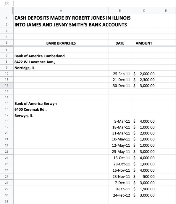
Figure 1
“Structuring” was another part of this crime. This occurs when the criminal deposits no more than $9,000 at a time to keep the amount under the $10,000 threshold, which otherwise would send a red flag to the IRS, explained Johnson.
“Creating an accurate map of bank locations is crucial because the attorney will use the map to explain the concept of structuring bank deposits to the jury,” said Johnson. “The attorney will show that many banks were utilized within close proximity and that multiple deposits were sprinkled among many banks on different days to disguise the criminal activity.”
In this project, the special agent requested that the designer create a map that illustrates each bank location with the corresponding deposit.
Due to the amount of data, it’s important to use multiple layers within the exhibit rather than just one.
“For this type of criminal activity involving various layers of evidence, I usually begin with a master or main chart—in this case, it is the map that serves as the central part of the story,” said Johnson. “The other sixteen parts (the sixteen bank locations and the activity associated with each location) are supplemental.”
Due to the complex nature of the information, Johnson makes the data digestible by breaking it down into smaller parts that are linked back to a larger graphic, such as the main map. A red star represents each bank location and hyperlinks to corresponding pages with the bank account details, including the date, amount, account, and any other valuable information.
Implementing interactive features, like hyperlinks in InDesign’s interactive PDF feature, makes it easier to display and organize a lot of information in a multi-page document. In the courtroom, the attorney is able to navigate seamlessly through each exhibit with the click of a mouse.
According to Johnson, her process for this project began by using Mapquest to plot each bank location (Figures 2–4).
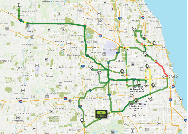
Figure 2. Plot points on Mapquest and take a screenshot of the map.
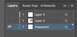
Figure 3. Import Mapquest screenshot into Illustrator as a separate layer.
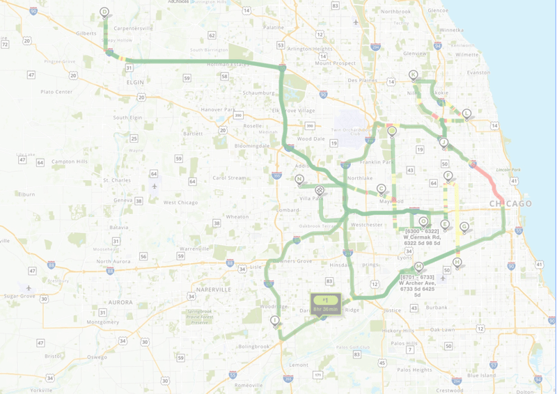
Figure 4. Reduce the opacity of the map to 45%.
Then, she imported a screenshot of the map into InDesign, and re-built the map using the image as a guide (Figure 5).
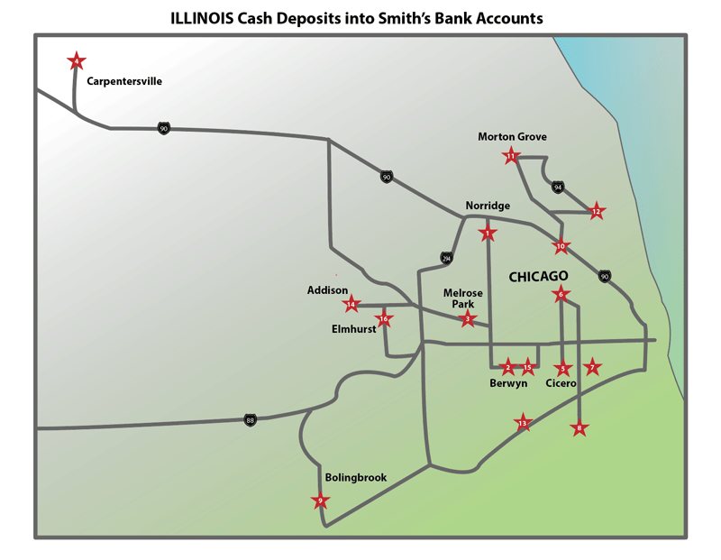
Figure 5. Render the map using the Mapquest screenshot as a guide.
From there, she created supplemental pages that contained the additional bank details (Figures 6–7).
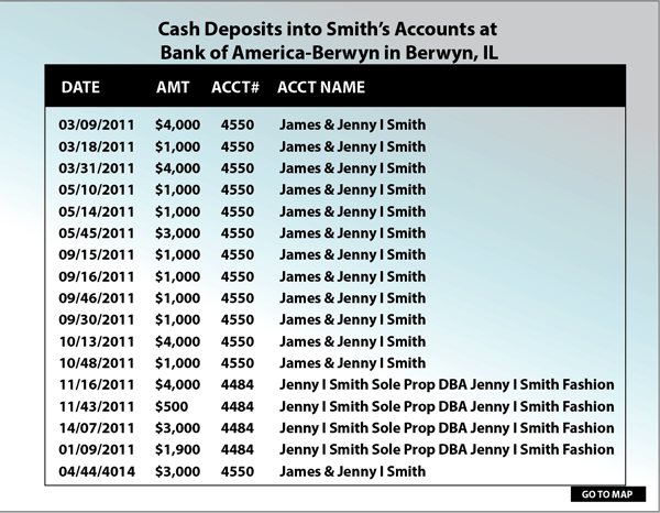
Figure 6. Use each bank deposit as a plot point.
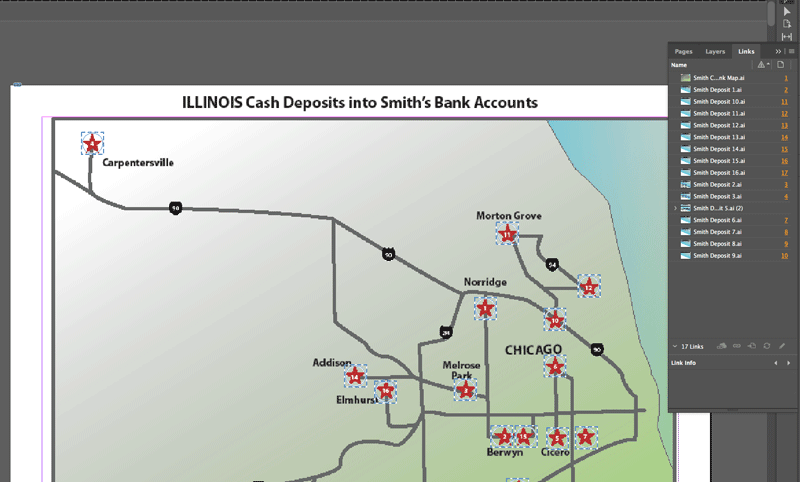
Figure 7. Create separate pages that will link back to the main map.
Next, she added hyperlinks within the InDesign document so each star represented the bank link to the supplementary pages. Finally, she exported the InDesign file as an interactive PDF (Figures 8–15).

Figure 8. Make each data point into a star. Highlight each star to open Options.
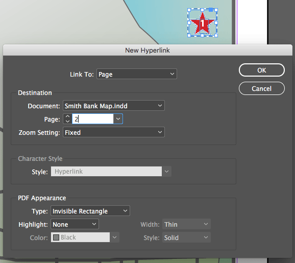
Figure 9. Create a hyperlink for each star, linking it back to the corresponding page.
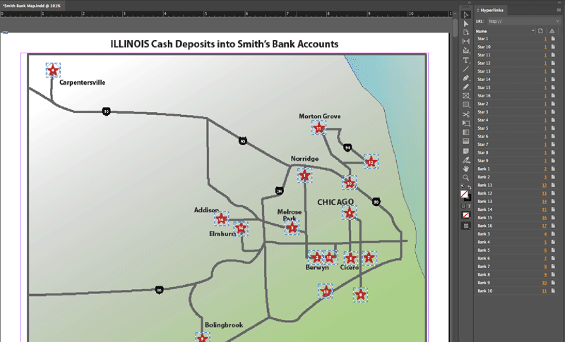
Figure 10. Create hyperlinks for all stars to each page. Highlight each star, and name the hyperlinks accordingly.
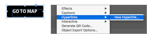
Figure 11. Create a graphic for the links that go back to the main map.
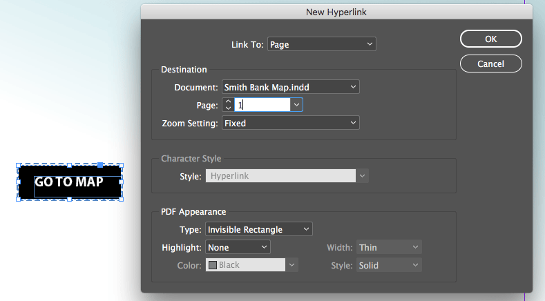
Figure 12. Create hyperlinks on the pages to the main map.
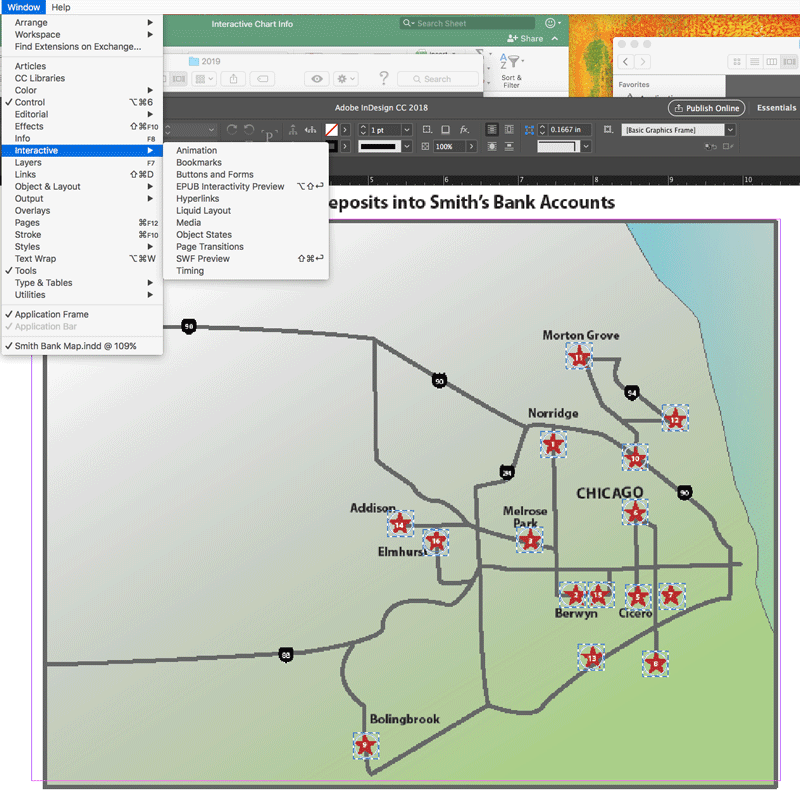
Figure 13. Open the hyperlinks window to view and check links.
Figure 14. Export the InDesign file as an Interactive PDF.
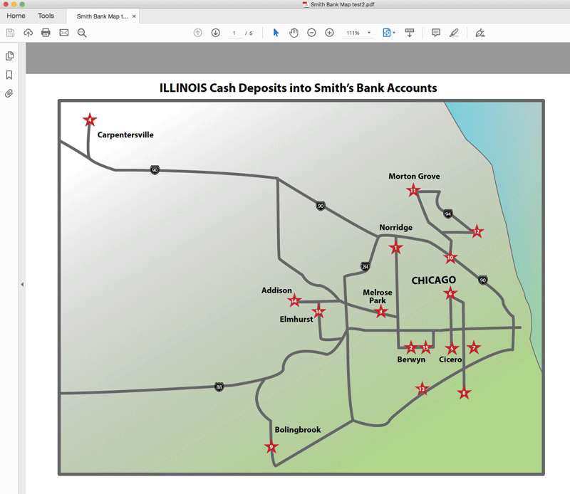
Figure 15. Open the PDF and test each link.
Due to the nature of financial crimes, Johnson said that their work must strike a balance of functionality and design, with the most important question being “Does this chart communicate what it is supposed to?”
“If it looks great design-wise, but does not convey the information in a simple, effective, and accurate way, then we have failed,” explained Johnson. “Our charts are used in a court of law and should enhance the message and story that the attorney is presenting to the jury. We do our best to make the charts functionally work and at the same time look nice, clean, and polished.”
In another example that included a staggering amount of data, the team opted to condense the activity into trends rather than show each data point.
In this specific case, a color key was effective in showing the variety and frequency of cash withdrawals (Figure 16).
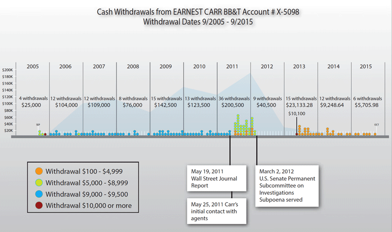
Figure 16
“The trial team wanted to show that the amounts of cash changed substantially after the IRS agent contacted the defendant,” said Johnson. “In other words, the defendant made regular cash withdrawals of just under $10,000, again, to avoid a red flag being sent to IRS, over a period of six years, and then once the IRS got involved, a lot of cash was withdrawn at first, and then the amounts decreased over time.”
Johnson noted that designers use the color red sparingly, as it has natural inflammatory properties, and they want to avoid inaccurately portraying data. In this specific example, red was only used once to highlight a specific amount and bring attention to the point.
“Also, note the background line graph that shows how the total withdrawals spiked right after the IRS intervention,” added Johnson. “The attorney wanted the chart to illustrate a causal relationship between the defendants actions and the IRS actions.”
In this specific example, the combination of layered graphs, shapes, colors, and commentary is a useful way to display a large amount of data that was gathered over a long period of time and is instrumental to the integrity of the case.
Even though criminal tax law includes a lot of complex information, there are ways to make it clear and easy to understand. Through the use of interactive or layered infographics, it’s easier for a juror to be able to visualize and digest a sequence of events that contains multiple elements.
Commenting is easier and faster when you're logged in!

Recommended for you

InType: High-Contrast Fonts
InDesign Magazine issue 113This article appeared in Issue 113 of InDesign Magazi...

The Exquisite Stylings of deVicq Design
Roberto de Vicq is an award-winning designer who is known for his stylish, sophi...

InDesigner: BUST Magazine
Diane Burns shares the story of the first feminist-oriented lifestyle magazine.