
InDesigner: Insight Guides
Pam Pfiffner examines how one publisher is tackling the problem of creating print and ebooks simultaneously.


This article appears in Issue 51 of InDesign Magazine.
If there’s one segment of publishing that’s perfectly suited for eBooks and other mobile devices, it’s travel publications. Rather than haul around print books, globetrotting travelers can carry all the information they need on landmarks, hotels, restaurants, and more in one electronic book or smartphone. Need more information? Change your itinerary? A Wi-Fi connection lets you download new titles in an instant.

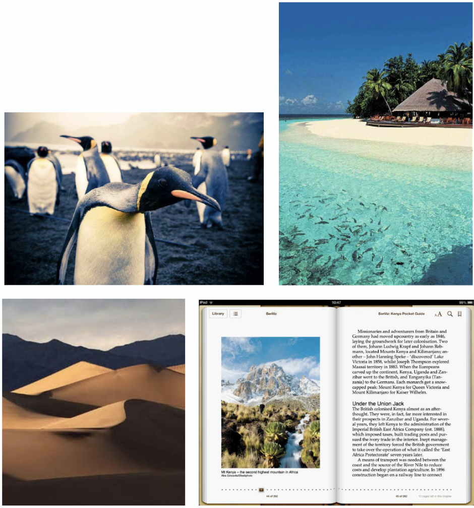
One publisher that has adapted well to an InDesign-based print and digital workflow is Insight Guides. Unlike many other travel brands that chunk content in discrete 100-word blocks or lists, Insight Guides publications are narrative in format. The books are known for their solid writing and beautiful imagery culled from a library of a quarter-million pictures.
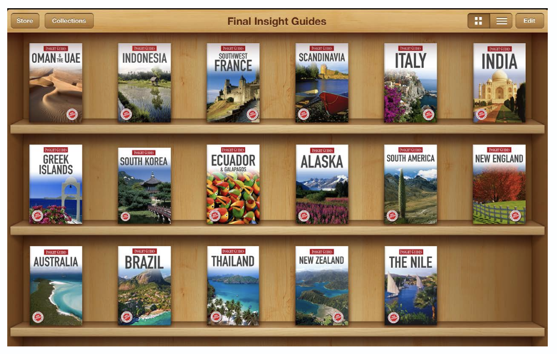
The UK-based company, which also publishes Berlitz travel and language guides, publishes ten book series totalling 120+ books annually. But until 2011, eBook development had lagged. Book files were constructed in such a way that made it onerous to port the content to eBook formats. Naming conventions for style sheets were inconsistent across titles, and manual overrides were common. Creating the structure necessary for an eBook from print content entailed starting from scratch for each title.
Insight made the decision to revamp its workflow to jumpstart its multi-platform program in 2011, and began implementation in 2012. “This was a big year for Insight Guides, because we established our digital publishing program and began creating multiple products from a single source of content,” says Astrid deRidder, content manager for eBook publishing. The original source of content is Microsoft Word. The software that links pieces of all this content, and maps the content structure to formatting, is Typefi Publish, an XML-based workflow solution that Insight Guides uses to connect the dots between Word 10, InDesign CS 5.5, and EPUB.
“We currently have separate print and EPUB templates, so we take our content and flow it into different InDesign documents for the different outputs,” deRidder says. “Typefi composes the pages according to rules we set up in the templates. The print files are basically ready to go to the printer at that point, with only a little bit of design tweaking. The EPUB files go through a further step of automation, because Typefi allows us to export to EPUB 2.0.1 without any post-production manipulation. We’re essentially going from Word to EPUB, via InDesign, at the push of a button.”
Production turnaround has been cut in half, from nine days to four. As a result, Insight has established an eBook program and has quickly published their most popular backlist titles. The goal for 2013 is to produce one eBook for every printed book, and for the styling of that content to take only one day per book.
“Having our content consistently styled has been a key feature in our EPUB creation,” deRidder says. “Our InDesign templates control every facet of the appearance of a product, from character styles to paragraph styles to tables and photographs. We’ve used some of InDesign’s features to transfer this information from one template to another, saving us a lot of time in the initial set-up of new series.
Insight works to make the eBook mimic the print product as much as possible. For example, rather than shrink images to cram more content onto a page, Insight displays its images as large as possible on the page. “The brand identity of Insight Guides is strongly aligned with the appearance of the printed books,” deRidder says. Therefore the decision was made that eBooks resemble the print books as closely as possible.

“This means that in some places we have tweaked the printed design to more easily translate to digital, but mostly we have designed our ebooks by keeping the printed page foremost in our thoughts,” deRidder says. “By making careful decisions, we’ve gracefully degraded the print design into a digital design that both works on its own, but is also clearly related to the printed book.”
One area in which Insight had to compromise its print fidelity is fonts. For example, the print books use DIN Schrift, but the type licensing fees for eBooks were too high an investment. Instead, fonts used in Insight eBooks default to Helvetica and Palatino, both of which are covered under the ADE (Adobe Digital Editions) license. “We do use two more fonts for labeling maps and cross-referencing content,” deRidder says, “but we developed those in-house, so we don’t have to pay licensing fees.”
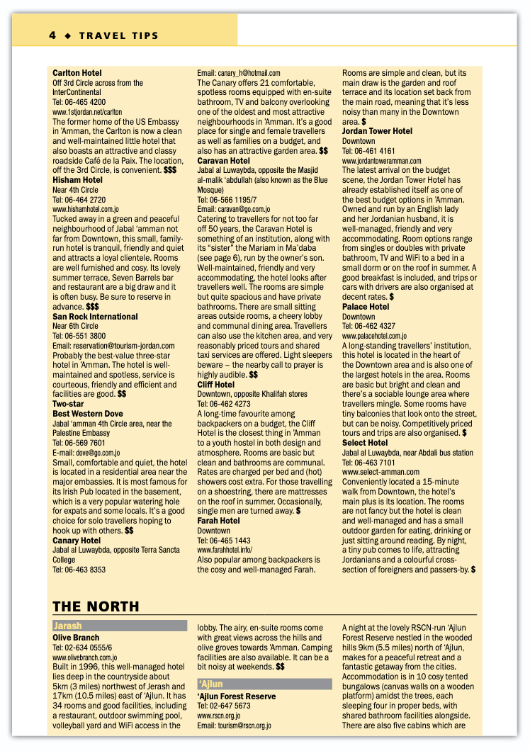
Insight Guides’ visual identity includes its page headers, which use strong colors to distinguish sections. “One feature of InDesign that we love is the split and span columns,” deRidder says. “At the back of our books we have a fairly dense section of text called ‘Travel Tips’ that contains practical information like hotel lists and addresses. Our design calls for either three or four columns of text, separated by a header that spans all the columns. This was incredibly time consuming to do before InDesign CS5.5, but this feature gives us a great deal more flexibility.”
Insight Guides’ eBook content is designed for and proofed directly on the third generation iPad, which is the perfect device to showcase its beautiful imagery. Insight’s content is also available on Amazon’s Kindle Fire, but it lets Amazon do the conversion of their EPUB files to the Mobi format used by Amazon. That convenience will soon end, however. The release of the HD Fire has put another item on deRidder’s 2013 to-do list. “The introduction of the Kindle Fire HD is prompting us to convert in-house starting this spring,” deRidder says.
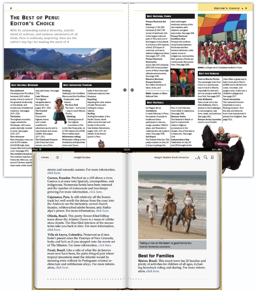
The print version of the Editor’s Choice section uses floating images—photos that can be placed anywhere on the page—and refers to additional resources with page numbers in text. Given the linear nature of eBooks, images are placed as inline graphics, but the eBook version also includes hyperlink to access additional resources. Insight makes the most of the interactivity inherent in eBooks by incorporating both internal and external hyperlinking. A highlights section in the front of the ebook links to the place referenced elsewhere in the book. Other links lead to maps and other resources. The external links take the reader to related sites. “Editors use Word’s auto-linking feature to point to sites,” deRidder says. The links are then automatically imported into InDesign.
By putting new systems and workflows in place, Insight is in a good position to take advantage of new devices and technologies as they emerge. With technologies moving so fast, it’s fun to think about the potential. For example, Insight’s Berlitz Pocket Guides are designed to be the same size as a jeans pocket. It’s not hard to imagine a full-featured jeans-pocket-size eBook reader containing well-written content and full-screen imagery telling you all you need to know about Paris. Sounds magnifique, doesn’t it?
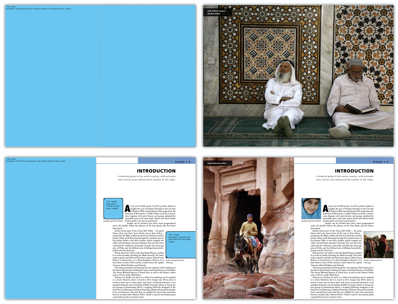
“We use tons of layers,” deRidder says. “We have a script that pulls certain fields of metadata (such as title, description, photographer, etc.) from our images, and puts them in a separate layer in the InDesign file, which is then put onto a separate layer in the PDF. We’ve made the layer bright blue so that it’s obvious to the editor when they toggle this layer on or off. By having this available, our editors can see the details about the picture without having to mess about with Photoshop or Bridge. We want our captions to really add to the quality of the content. By seeing the picture on the actual page, and with the ability to toggle the metadata on or off, it’s easier for our editors to write the best possible caption.”

These images compare samples from Insight Guides’ print books with their eBook counterparts. The layout of the print version informs the eBook version. Note that the eBook sidebar “Dyeing to Make a Fortune” is opposite the map of the city, just as it is in the print version. Double-clicking the map brings up a full-page image. Similarly, the images in the second comparison are located as they are in the print layout. This fidelity between print and eBook versions helps keep the user experience consistent across formats.
Commenting is easier and faster when you're logged in!

Recommended for you

The Women of InDesign
Anne-Marie Concepción interviews four women who have been instrumental in the de...

Interview with Alisa Smith, Accessibility Evangelist
Q&A with Alisa Smith, who is presenting at the CreativePro Design + Accessibilit...
