
InDesigner: Fritz Klaetke
Fritz Klaetke has designed scores of projects for the Smithsonian, including the gorgeous JAZZ anthology.


This article appears in Issue 44 of InDesign Magazine.
Revising an historic package of treasured music produced by an American institution might be a daunting prospect for many designers. But when hired by the Smithsonian Institution to redesign a seminal collection of jazz recordings for its Folkways imprint, Fritz Klaetke was ready for the challenge. JAZZ: The Smithsonian Anthology, which includes six CDs and a 200-page book, builds on the legacy of the initial 1973 Smithsonian Collection of Classic Jazz, considered not only a milestone by many jazz enthusiasts but also a high point in the career of Ronald Clyne, the Folkways art director from 1951 to 1981 who defined the label’s design aesthetic. Clyne’s designs have been compared to those of Blue Note Records’ Reid Miles in terms of influence and impact. Klaetke, who is principal of Boston-based design firm Visual Dialogue, understood that his client wanted to tip its hat to Clyne’s work yet give the anthology—now expanded to 111 tracks—a new look that would withstand the passage of time, just as its predecessor did 38 years earlier. 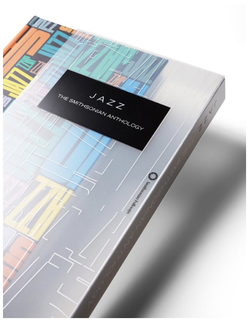
“Throughout the initial research and design phase, project director Richard James Burgess often referenced the ‘sleekness’ of Apple packaging as a goal for the new jazz package,” Klaetke says. “But there also needed to be some connection to the original jazz series as well as a system to organize so much content.”
Perhaps the most important way that Klaetke paid homage to Clyne and retained continuity with the earlier LP set is through the collection’s title graphic. He redrew Clyne’s original JAZZ type in Adobe Illustrator, which allowed him the flexibility to use it in a variety of sizes and media so that it becomes a recurring design element. Scaled larger and smaller, this type graphic
creates a syncopated pattern that appears throughout the package, from cover and end papers to CD labels to poster and t-shirt. The logo when printed as a varnish also provides unexpected structure and subtle sheen to opening pages.
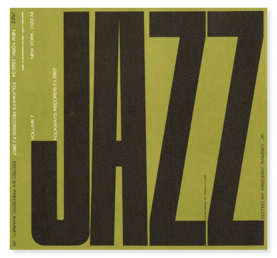

When asked to design Folkways Records’ JAZZ: The Smithsonian Anthology, Fritz Klaetke’s first task was to redraw Ronald Clyne’s original 1973 JAZZ logotype (see top image). He then created a collage of the resized and colored typographic element (see bottom image) to serve as a recurring pattern throughout the package and as the cover of the box set. He lifted the color palette from the original vinyl album set.
Klaetke had access to archives of photography from the Smithsonian and other collections that dated to the dawn of this distinctly American music genre. With so many photos available and a lot of text to place, it could have been difficult to achieve balance between image and type. Klaetke’s solution was inspired by the subject matter. “In the book layout, I set up a system of theme and variation—not unlike a jazz composition,” he says. “The theme is a very straightforward grid for the body text, while the variations are the photos, titles, and color overlay boxes which can bop around more randomly.”
Klaetke says that InDesign—CS4 at the time—was instrumental in achieving that vision. In addition to its precision graphic, typographic, and page-layout tools, such as master pages and book sectioning, InDesign gave Klaetke the freedom to experiment. “It was essential that I was able to visualize things onscreen,” he says. “For example, how will this plastic slipcase look with the silk-screened silver lines over the colors on the cover? Let’s take a look.”

Even when printed with only a varnish, the redrawn JAZZ graphic adds interest and sheen to the title page. Klaetke says he simulated the black-on-black varnish onscreen by “using 4-color ‘rich’ black (40c 40m 40y 100k) for the background and standard 100% black for the foreground.
Klaetke, who began using InDesign with the first Creative Suite, says that “Adobe InDesign is our ‘go to’ tool for designing across different media and materials. Once we had the initial JAZZ type collage, we could bring it in to InDesign create the cover, slipcase, interior spreads, CD labels, poster, t-shirt—you name it.”

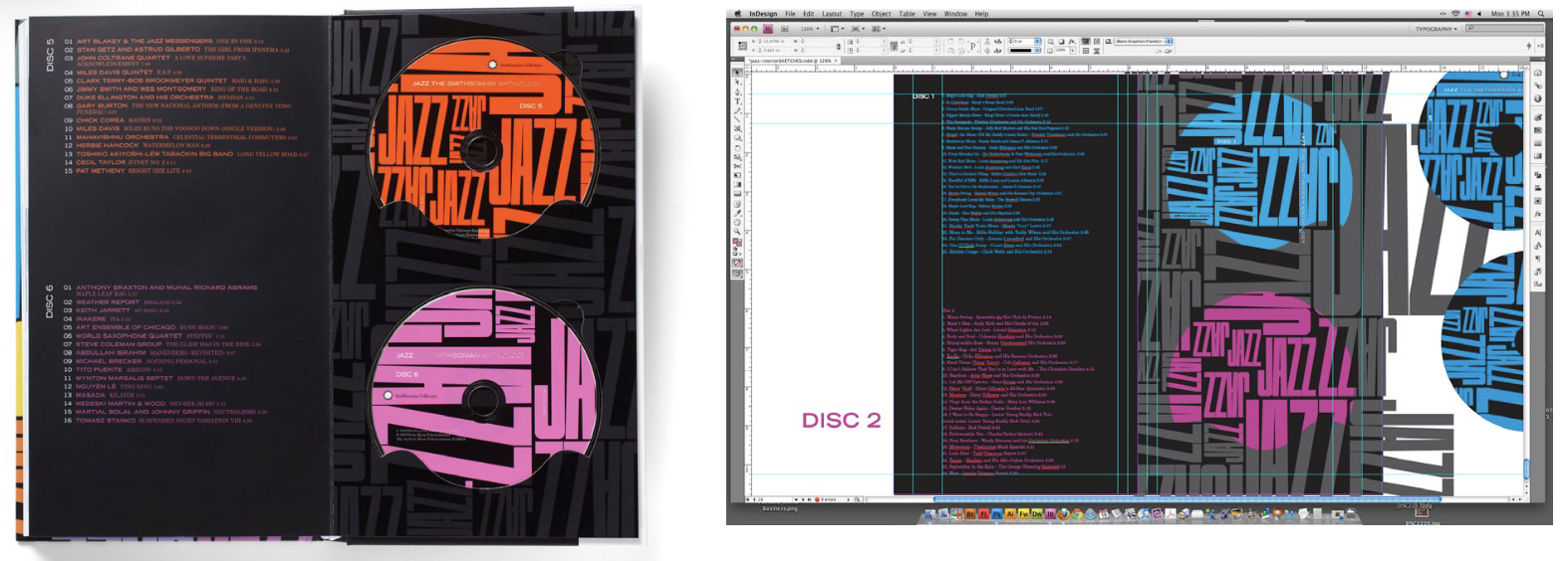
Klaetke was able to mock up the CD pockets early on to test color, placement and so on. The label and tracklist for the CD as well as its corresponding chapter in the book are keyed to the same color, which creates unity and helps organize the material.
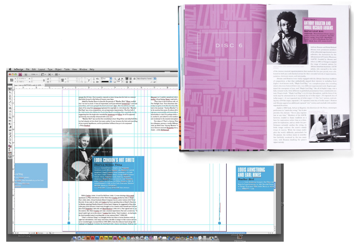
The interior pages showcase each musician and relate information about the track’s composer, players, recording date, and even the tune’s melodic form. An essay providing detailed information about the musician, the recording, and the era accompanies each entry. Fonts used are Trade Gothic Extended, Compacta, and New Century Schoolbook.

Klaetke used InDesign’s Transparency Effects to overlay color text boxes on the photographs, giving cohesion to the entry without drawing attention away from the historic black-and-white photographs.

Images from numerous photography archives (including the Smithsonian’s) gave Klaetke a rich source of graphic material with which he was able to add rhythm to pages and spreads. Some photos, like that of Duke Ellington and His Orchestra, show the effects of time and underscore the historical value of the JAZZ collection.

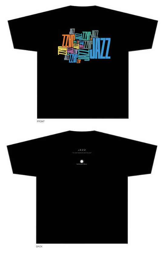
The JAZZ logotype was easily adapted to other vehicles such as posters and t-shirts through InDesign.
Commenting is easier and faster when you're logged in!

Recommended for you

CreativePro Ask the Expert Video: Von Glitschka
In this week’s CreativePro video, it’s another installment of “Ask the Expert.”...

12 Questions for a Photoshop Master
Q&A with Steve Caplin, author of the new CreativePro book, Photoshop Effects, Vo...
InDesign Magazine Issue 148: Designing for Social Media
Issue 148 has articles on designing for social media, dielines for creative fold...