
InDesigner: Florida Cajun Zydeco Update!
Addison Lalier shares how one man turned his passion for live music into a lively publication.


This article appears in Issue 139 of InDesign Magazine.
Jim Hance is a veteran graphic designer with over 40 years of experience working on a wide range of publications. From designing proposals and presentations to managing ad sales and editing content, Hance is a jack-of-all-trades with a love for well-crafted publications.
After moving from California to Florida about 10 years ago, Hance embarked on a new personal project that combined his knowledge of publication design with his passion for music, specifically the Cajun and zydeco music that is popular in southwest Louisiana. Recognizing an opportunity to expand the presence of these genres in Florida, he decided to design and produce a monthly newsletter to promote Cajun and zydeco artists and events.
Promoting Music Today
Cajun and zydeco music are closely related and are often referenced in tandem. Both evolved from Louisiana’s French Creole speakers and combine blues, R&B, and other sounds native to the southern region. Each style has influenced the other over the years.
As a fan, Hance attended festivals in Louisiana and occasionally Florida, but those have since closed down for various reasons, leaving Florida with a minimal Cajun and zydeco music presence.
Shortly after Hance moved to Florida, he decided to DJ his own events to give those interested in Louisiana music a place to dance. He launched a website and began publishing a newsletter, Florida Cajun Zydeco Update!, to keep people up to date on his events. In addition, the publication features bands and provides information on artists—both past and present—that have had an influence on the Cajun and zydeco music of today.
What started out as a long email blast with one column of text has now evolved into an InDesign-based publication that mimics the layout of a printed magazine. The monthly issues reach between 500 and
1,000 readers across the world, depending on the featured artist (Figure 1).

Figure 1. The “Letters” column in issue #89 of Florida Cajun Zydeco Update! includes reader comments from California, Connecticut, Florida, and Illinois. The newsletter even has readers from as far away as Canada and Europe.
“I would spend a lot of time building headers and photo displays in InDesign, convert them to optimized web graphics in Photoshop, and place them in the email format,” said Hance. “But I really wanted to make my publication look like a printed magazine, and I wanted to build it all using my favorite tool—InDesign.”
Hance also wanted to make sure that any changes or edits to the digital publication could update in real time, so Publish Online was a natural solution. “I invariably find a typo or something I want to correct after publishing. In the email blast, I would have to send out a retraction. Now with a simple edit in InDesign and an update to Publish Online, the next time someone goes to the link the correction has been fixed,” explained Hance.
In addition to his website, Hance also publishes a PDF of the newsletter on issuu.com. Many publications publish their printed magazines online without optimizing for onscreen readability. To solve this common problem, Hance decided to use a page format of 11 by 11 inches with 24-point text, so that readers can typically view it without having to zoom all the way in on their mobile devices. In addition, Hance also makes sure to use large photos, pull quotes, and other typographic embellishments to ensure readers can easily follow the story at a glance.
Regarding the content, Hance is the sole contributor—in addition to being the publication’s editor, designer, and producer. He either writes the features himself, or he curates existing stories and edits or re-writes them to fit the issue. “If I use a music reviewer’s exact words, I use quote marks and credit them at least once in the story. And I mostly use photos from a photographer who has given me permission for their use with photo credits for each,” said Hance. His goal in all cases is to make each story interesting, objective, and real to all readers.
Even though COVID-19 has greatly affected the music industry, specifically concerts and festivals, Hance is as committed as ever to promoting the Cajun and zydeco music scene. The most recent issues even include information on where to livestream artists or attend socially distant concerts (Figure 2).
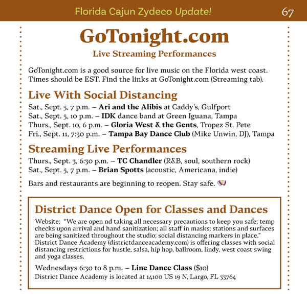
Figure 2. Due to COVID-19, Hance includes information on where to livestream performances or attend live (socially distant) shows in Florida.
Florida Cajun Zydeco Update!
One of the most interesting aspects of Florida Cajun Zydeco Update! is that each issue is styled differently. Hance has figured out a way to not only apply his design skills to a music publication, but also weave in other visual elements so seamlessly that those who read it for the music are also captivated by the design (Figure 3).

Figure 3. Each issue is designed very differently, from type and colors to photo effects.
As a graphic designer, Hance is naturally interested in new typefaces from designers across the world. Although he works on a variety of other publications in his day job, he uses the newsletter as a design laboratory, featuring a new typeface in each issue. He also includes a write-up of the type designer, highlighting their background and the origins or inspiration of the specific typeface.
In issue #89 of Florida Cajun Zydeco Update!, for example, Hance featured Alkes, a serif type family that was released in May 2020. Alkes is an original design by Kaja Slojewska and produced by FontFabric (Figure 4).
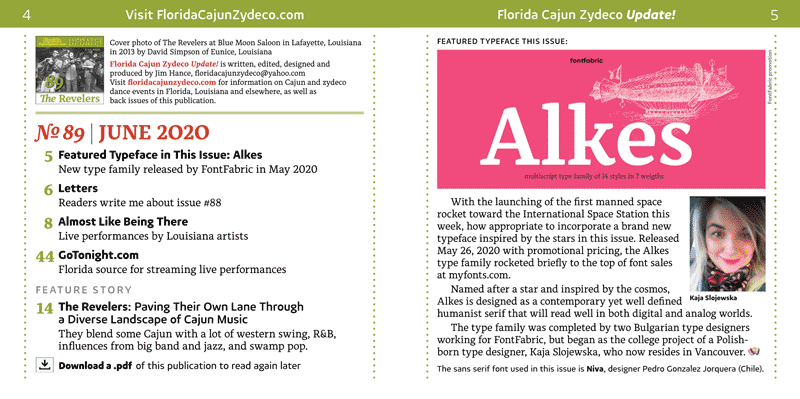
Figure 4. The Alkes typeface and artist highlight in issue #89
“While Alkes is described as a contemporary, humanist serif ‘inspired by the cosmos,’ I was going for an early 20th century feel. I have a stash of old publications I have collected over the years, and some of my references for styling this issue were National Geographic from April 1914, The American Mercury from December 1925, and the mid-century Intellectual Digest from 1971,” said Hance (Figure 5).

Figure 5. Hance used pages such as these from a 1914 issue of National Geographic Magazine as inspiration for some of his design and style elements in issue #89.
Inspired by older publications, Hance likes to see how editors chose to present their work and to analyze the design features and typography that were used. Having spent many years in publishing, Hance has seen firsthand the evolution of design, from operating early computer typesetting equipment and hand-setting headlines one character at a time to now using contemporary publishing technology (Figure 6).

Figure 6. Some examples of publications that Hance likes to draw his inspiration from, whether through type or voice
With this experience, he makes sure to pay homage to the craftspeople who came before him and to appreciate the time and thought they put into each publication (Figure 7).

Figure 7. Publications from the early 20th century were printed on letterpress equipment, and printing process color images was not possible. Instead, they relied on hand-drawn illustrations rendered in spot colors.
In addition to varying typefaces, Hance edits the photos in each feature story to match the overall feel of the issue, working in tandem with the typeface style. “I find inspiration from the artist I am highlighting. The cover design in particular is usually the first thing I work on each month. If I find a great image for the cover, I often promote that artist or band to a feature story and begin researching the artist for the write-up. I may be inspired by a visual I see in a publication or advertisement, and apply something similar to the cover image, but the effect has to contribute to the story I want to tell about the artist,” said Hance (Figure 8).
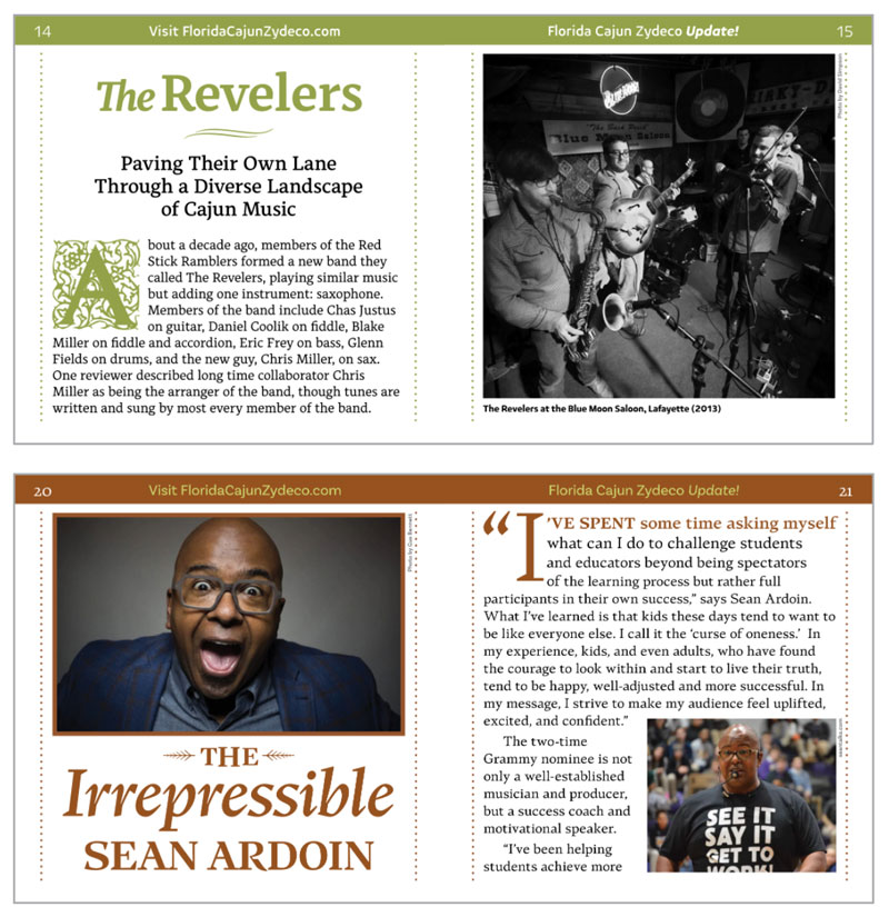
Figure 8. Examples from issues #89 and #92 of how each cover ties into the feature story
For issue #89, for example, Hance incorporated the letterpress look of the early 20th century by styling the photos in high-contrast black and white and experimenting with Photoshop’s Posterization settings to achieve a grainy effect. He converted other images in the issue to black and white, and then burned out the high tones by adjusting the Shadows and Highlights or Brightness and Contrast (Figure 9).
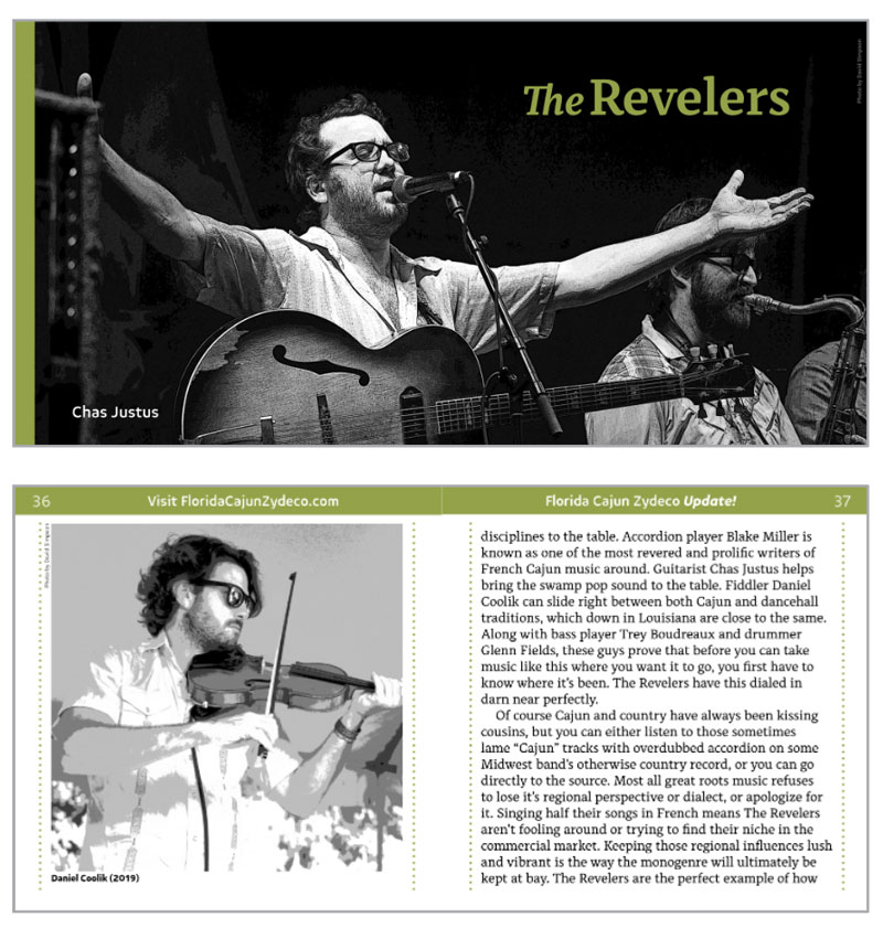
Figure 9. Hance used custom photo editing in issue #89 to achieve a high-contrast, grainy effect. David Simpson of Eunice, Louisiana, took all of the images in this issue.
In other issues, Hance has rendered all of the feature stories as “watercolor” illustrations or as duotones to achieve the desired look. “The consequence of decisions to render all of your photos can be many additional hours of production, but that is part of the art of creating a unique publication,” said Hance.
With so many variable style elements in each issue, it’s important for Hance to use functions that help speed up his design process. For Florida Cajun Zydeco Update!, his favorite InDesign function is the Eyedropper tool. Not only does it enable him to pick up colors in the document, but it can also copy and apply text styling, as well. “Even if I have already created a character style and paragraph style for the text I am sampling, I still find it quicker to use the Eyedropper tool to replicate that styling elsewhere,” he added.
Where Communication Meets Design
In corresponding with Hance, I found it interesting that he could so easily combine two different crafts into one publication—and make it work really well. Florida Cajun Zydeco Update! is as informational for designers as it is for music aficionados, and furthermore, it is deeply rooted in storytelling of the past.
“In the 1960s, more than 30 years before the invention of the internet, a Canadian communication theorist named Marshall McLuhan postulated that ‘the media is the message,’ meaning how we communicate defines who we are and constitutes much of what makes a culture and an individual unique,” said Hance.
Hance has witnessed firsthand the biggest transformations of publishing technology, from what was once defined by such manual labor to contemporary processes that are completely automated and instantaneous.
What makes Hance stand out as a designer is that in his music publication, he is able to weave in a larger story that pays homage to past and largely forgotten technologies, whether that be through what typeface he chooses or how he styles his photos (Figure 10).
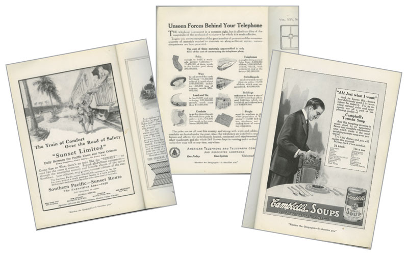
Figure 10. Hance was inspired by these ads from the 1914 issue of National Geographic Magazine depict advertising and editorial design from more than 100 years ago.
As he put it, with a little imagination, we can still achieve that with the latest in communication technology, like InDesign.
Commenting is easier and faster when you're logged in!

Recommended for you

Make an Image Sandwich: Putting an Image In Front and In Back of Text
I have long envied the covers of Sports Illustrated–but not the sports sta...

InDesign Magazine Issue 143: Adobe Mobile Apps for Designers
Issue 143 has articles on Adobe Mobile Apps for Designers, Preferences You Must...

InDesign Magazine Issue 68: Workflow
We’re happy to announce that InDesign Magazine Issue 68 (December, 2014) is...