InDesigner: Carrie Bremner
This UK art director for Newsweek blends bold graphics with editorial accuracy

This article appears in Issue 16 of CreativePro Magazine.
What do you think of when you hear the words membership magazines for professional organizations? Dense text and corporate graphics? I certainly wasn’t thinking of the bright colors and bold conceptual designs of Carrie Bremner’s work.
From an early age, Bremner (Figure 1) had an interest in art. Growing up in South Africa, she attended Technikon Witwatersrand, a university in Johannesburg, to study graphic design.
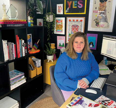
Figure 1. Carrie Bremner in her home office
She says that as a young adult she wanted to do something in the creative field, but “looking back in hindsight, I didn’t actually have very much knowledge of what sorts of things you could do with graphic design.”
Fresh out of university, Bremner got a job in advertising, doing both “above the line marketing” (untargeted, mass media ad campaigns) and “below the line marketing” (ads aimed at specific audiences). But her real goal was to travel and eventually to settle in the United Kingdom.
So, after a few years of advertising work, she packed her bags and went north.
Finding a job in a foreign country (especially without prior work experience there) was a challenge, but after several months of searching she was able to get a job within the magazine design industry. Her first job in the UK was in the marketing department of a publishing house, where she mostly designed marketing collateral for events.
Bremner found she liked working on magazine layouts, which felt brand new and required her to learn on the job. “I hadn’t had any training in InDesign or any of these programs, and everything I learned I learned by myself, from working.”
She had plenty of opportunities to learn.
“At the time, I was working on a very exciting and glamorous magazine called Grower,” she says, laughing. “It was for farmers.”
The magazine was published weekly. “You just had to get things done,” Bremner says. “But for me, that kind of helped.”
“Sometimes you feel tempted to sit with something for ages and ages and perfect it, but there isn’t time, so you just get on with it,” she says. “And because you’re working so fast, you’re learning really fast, too. Starting on a weekly really benefited me.”
A Blessing in Disguise
Bremner spent over a decade working at Redactive Media Group, a business-tobusiness publishing agency that mostly produces membership magazines for professional trade organizations. With dozens of clients across different sectors, the magazines could be for midwives, hair stylists, health and safety practitioners, financial accountants, or speech and language therapists (Figure 2).

Figure 2. Bremner’s redesign of Bulletin, the official magazine of the Royal College of Speech and Language Therapists, won Best Magazine Launch or Re-launch at Memcom’s Excellence Awards in 2022.
She loved the variety. When she first started, she would be given two or three clients to work on at a time, often from totally different fields. This was a big change: In her previous jobs, she’d work on one weekly or monthly magazine at a time. By the time she left 12 years later, Bremner was working on five or six titles concurrently.
Bremner would find herself in charge of everything: the design of every spread, the cover design, commissioning art or outside design work, art directing in-house photoshoots, and creating the title’s brand identity.
Her first Redactive project was Midwives, a quarterly membership magazine for the Royal College of Midwives (Figure 3). In nearly a decade of working on the magazine, she redesigned it three times, updating the aesthetics as design trends and the public face of midwifery changed.

Figure 3. Bremner redesigned Midwives three times over the course of nearly a decade.
Bremner initially balanced her time between Midwives and Recruitment Matters, a magazine for professional recruiters—two very different audiences! Midwives, especially when she first took on the project, was targeted almost entirely toward women and wanted a markedly feminine style, while Recruitment Matters had a much more corporate aesthetic.
A key part of Bremner’s job involved connecting the design and the content. Many of the professions and fields the magazines covered did not lend themselves particularly well to photography or imagery of the topic, so Bremner had to learn how to be creative and conceptual.
“For Midwives, the cover feature was different every time and, in most instances, the topic wasn’t something we could [purchase a stock photo] or get a photographer and do a photoshoot, of a woman giving birth, for example!” she says.
But this need for out-of-the-box thinking could be a blessing in disguise. Bremner says that the pressure to come up with a highly conceptual design for a tricky topic would lead to some of the designs that she’s the proudest of (Figure 4).
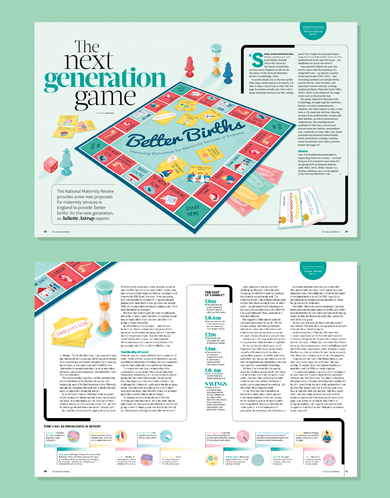
Figure 4. How do you make a piece about improvements in the field of midwifery into a striking feature article? Bremner and the illustrator she commissioned worked together to come up with a concept and eventually settled on the theme of a board game.
Another challenge was the technical level of the writing. The magazines were full of industry jargon and niche subjects—a bit opaque to the designers trying to make an article visually appealing. Bremner says that sometimes some precise internet searching could give her enough information to work with, but she’d otherwise have to ask her editor to give a quick translation into layman’s terms.
“Recently, I had been working on a magazine for biomedical scientists and I’d read the articles several times and still have no clue!” Bremner noted that the business-to-business clients often wanted to include a lot of content in their magazines, so an extra effort had to be made to break up the text so it wouldn’t appear too dense on the page.
Often that would mean pulling out data and statistics to make infographics. In this spread from The Biomedical Scientist (Figure 5), the editor had set aside the information he wanted to use in this manner, but in other cases Bremner would have to pull from the copy herself.
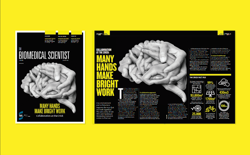
Figure 5. This cover and article spread come from the very first issue Bremner designed for The Biomedical Scientist. Redactive Media preferred to have the cover and feature article match visually to aid recognition, so Bremner would typically design an eye-catching cover and then use the same style and color palette for the article.
Regardless of the topic, Bremner says that she began her design process the same way: “The ideas have to come from the copy, they have to come from the content.” She’d always start by reading the article, often several times. Eventually, some detail from the copy—even something as small as a word or a phrase—would spark something.
“Once I got that little something of a flame, I’d go to the internet, to Getty or another image database, and see where it led me,” she says. “I’d just go down the rabbit hole and let each thing I saw spark something else.”
Art Directing and Commissions
Bremner says that one element of her job that she particularly loved and helped keep her work fresh was her ability to develop original artwork. Because the subjects were so niche, commissioning an illustration was often a much more practical solution than hoping to stumble across a stock image that would fit the topic.
“For some magazines, I would commission up to five or six illustrations per issue. I would be ‘in the know’ with illustrators all the time and have people sending me their portfolios and be looking for what was on trend at the time—or what wasn’t!” she says.
Bremner liked to seek out young artists, like recent college graduates without a lot of experience, and give them a chance. As her work progressed, she also started to collaborate with illustrators on conceptualizing the artwork.
Vitality, the membership magazine for the British Association of Beauty Therapy & Cosmetology, offered Bremner lots of opportunities for commissioning photography, computer-generated art, and illustration. For nearly every cover, she would commission a photographer and then art direct the shoot, like for the cover for “The Age of Youth” (Figure 6).
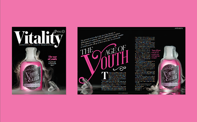
Figure 6. Bremner’s cover art and opening spreads for “The Age of Youth,” in Vitality, the membership magazine for the British Association of Beauty Therapy & Cosmetology
“This particular one was really fun!” she says. “We got dry ice and took tons of different variants of the smoke curling. I made the label for the bottle, [and] we had to go find bottles that looked old and ‘elixir-y’—this is what I expected design to be when I was young!”
Another shoot Bremner reminisced about was for “Survivor Stories,” where she and the artist constructed larger-than-life lipsticks and nail polish bottles out of cardstock and paper and had a photoshoot with the women featured in the article (Figure 7).
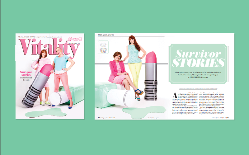
Figure 7. For “Survivor Stories,” also in Vitality, Bremner was hands-on, working to make the props for the original photoshoot.
She made a particular effort to choose artists who worked in a wide range of media, feeling that it kept the magazine fresh—for both the readers and herself. For magazines that she worked on for many years, like her decade-long run with Midwives, this felt especially important (Figure 8).

Figure 8. Four cover designs display four types of art: an illustration (top left), CGI art (top right), a photograph (bottom left), and clay modeling (bottom right). To create the photograph for the ”Life After Loss” cover, Bremner spread sand over the floor and laid a sheet over it, then pressed a baby doll into the sand in order to create an imprint.
Newsweek: A New Direction
Bremner now works at Newsweek, where she faces a new set of problems and challenges.
For one thing, she noted that news publications have to put a big priority on designs that look good enough to get people to buy (or click); the trade magazines that she used to design could be more experimental and conceptual.
When working at Redactive Media, Bremner trained herself to always relate the content and the design with complete accuracy. Even though it would drive her crazy when her editor would point out some tiny discrepancy between her design and the article content, she acknowledges that it was the right policy: A technical mistake in an article illustration would reflect poorly on a professional magazine.
At Newsweek, she has relaxed. Rather than devoting her attention to detail on the conceptual accuracy of her work, she redirects her energy to something else: technical precision (Figure 9). Bremner says she made the career move because she felt she was plateauing in terms of her design skills and she wanted to learn more from a technical perspective, to rely less on eyeballing design elements.
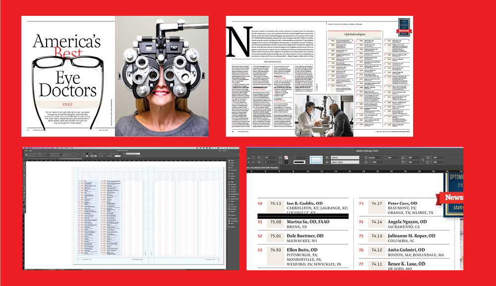
Figure 9. Newsweek often features lists that can span from 6 to 14 pages; Bremner assembles them in tables in InDesign.
There, she found herself working for a creative director who she describes as “so particular and mathematical,” Bremner says. (“He uses picas!” she adds, with amused exasperation.)
Creating magazines with more attention to the page geometry is “so different and far removed from how I always worked before,” she says (Figure 10).
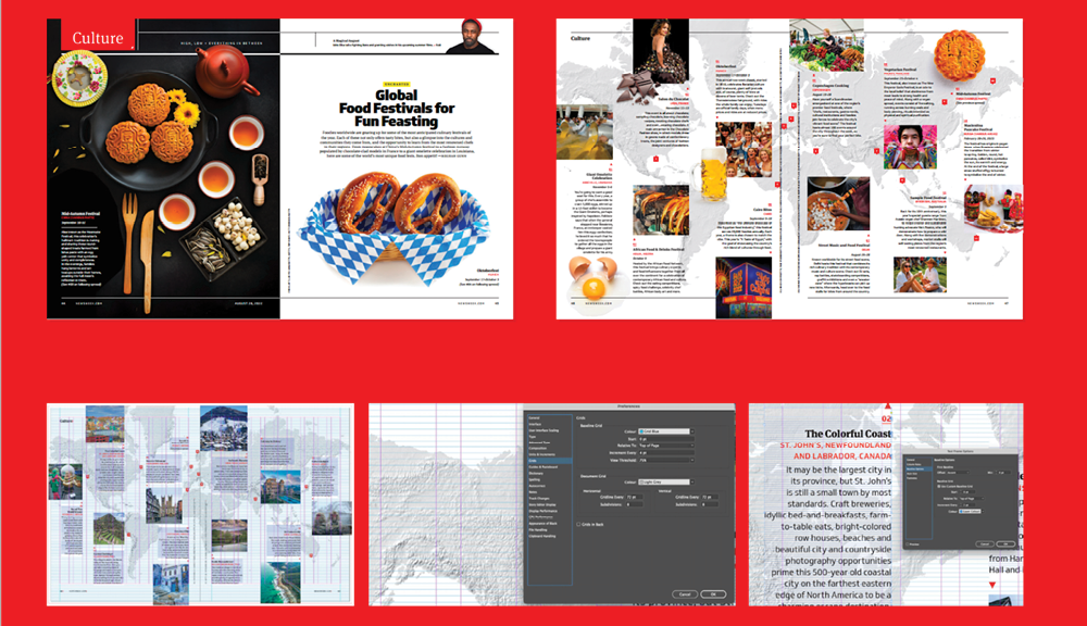
Figure 10. The designers at Newsweek use a baseline grid of 4 pt on the pages, and they adjust the text frames to a custom 2-pt baseline grid, which allows for more accuracy and keeps everything in place on the page.
“But the thing is, I can’t even say that I dislike it,” Bremner says. “I see the benefits, now that I’m doing it.”
“Honestly, even if I went somewhere else, I would probably continue to use picas,” she says.
Commenting is easier and faster when you're logged in!
Recommended for you

Hot Tips
Your favorite InDesign experts bring the heat with this collection of fresh tips...

Variable Fonts in InDesign
A concise Q&A guide to navigating InDesign 2020’s newest tool for type.

InDesign Magazine Issue 79: Tablet App Solutions
We’re happy to announce that InDesign Magazine Issue 79 (November, 2015) is...


