
InDesign to Print & Screen: A Best-of-All-Worlds Workflow
When the output could be PDF, EPUB, or print—or all three—there’s no need to compromise on color or capability. Here’s a real-world look at how to get it all.


This article appears in Issue 122 of InDesign Magazine.
Some might think me a control freak. Maybe I am. If it’s within my ability to make something well, I enjoy the puzzle and challenge involved in doing so. So, creating a single InDesign document that will be printed as well as exported to EPUB and PDF for on-screen consumption can be a satisfying puzzle to solve. This is especially true if one wishes to take full advantage of the best of what both print and screen media offer. When I started my most recent book, Adobe InDesign: A Complete Course and Compendium of Features, that was my challenge. Luckily, the subject of that book is also the tool I was using to craft it!
Planning
I knew that my publisher, Rocky Nook, would distribute my book in three media, two of which are consumed on screens (EPUB and PDF). The third, of course, is print. I had several concerns. For example, since the concept of a “page” is weak in ebooks, I wanted to exclude page numbers in cross-references when viewed in EPUB, but show them in the other versions. Page references are fine in the on-screen PDF, since its pages match those of the printed book. The book is rich with screenshots and other images, many of which contain very vibrant colors (think of InDesign’s bright margin and page guides, for example). In outputting to the light-based world of RGB displays, I knew I could preserve those colors. I also knew that whoever printed the book would want all the colors converted to CMYK (which is rarely as vibrant), but the exact press specifications were unknown at the project’s outset. Fortunately, knowledge of a few less-than-obvious features in InDesign, plus an understanding of how color really works, made managing all of this very possible.
Let’s deal first with the easier of these concerns: hiding content from different media. Then we’ll discuss color.
Hiding Content from Different Media (or What Happens in Print Stays in Print)
Like a lot of books, mine contains many cross-references from one section to another. In the print and PDF editions, those need to include page numbers. In the PDF, I also wanted them to be hyperlinks to the referenced section. However, in the EPUB and Kindle versions, there are no fixed pages: if a reader alters the font or text size, any page-like chunks change. (Personally, I prefer to use continuous scrolling on my e-reader, so there aren’t even “pages” at all.) So page numbers are a confusing distraction, and I didn’t want them in my hyperlinked cross-references. Depending on the circumstance, I used one of two methods to hide page numbers and other distractions from media in which they’re irrelevant.
Styles
First, I created a character style called hideFromEPub that doesn’t alter the appearance of text at all—in print (Figure 1).

Figure 1. The character style applied to text that was not intended to display in EPUB. Note the lack of Basic Character Formats, since the style was not meant to alter the appearance of any text.
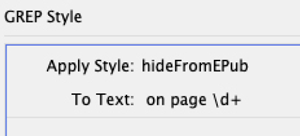
Figure 2. The GREP style for hiding page references in EPUB output
I’ll Show You on One Condition
The second method will prevent unwanted content from being exported at all, rather than just hiding it. I used InDesign’s Conditional Text feature to designate some text as “Print only” and some as “EPUB only.” If I couldn’t use a character style because one had already been applied to a reference, I’d highlight that reference and then apply the “Print only” condition. This would be indicated by a red squiggly underline seen only in InDesign. I then created a second condition for EPUB-only content, choosing blue for the indicator color (Figure 3).

Figure 3. Conditions for marking text as print only or EPUB only
Color: Assumptions and Expectations
As I said, my goal was to create an InDesign document that could be output for both print and on-screen display, while maximizing color fidelity in each. I can tell you that this is possible, but it takes some planning, and it takes some understanding of color, color standards, and how InDesign works with color swatches and color images. There are many assumptions and, frankly, myths about color in publishing, and these have led some designers to resign themselves to low expectations when outputting. For example, one common (and incorrect) assumption is that only CMYK numbers can be used to describe colors for print projects. And that implies another incorrect assumption: that RGB numbers describe only colors that a screen can display. It is true that RGB and CMYK numbers are device dependent, but the reality is more complicated (and flexible) than those assumptions imply. When we say “device dependent,” we mean that very specifically: a particular monitor needs a specific set of RGB numbers to display a specific color. A different monitor requires different numbers to display that same color. The same is true of printing inks: two different printers, or two different papers in the same printer, require different CMYK numbers to produce the same color. But of course if we adjust the color numbers a little bit for each device, we can achieve the same color—or at least often pretty close. This defies the expectation that print output is always different than screen. When they will differ—and this is the most important thing for you to remember—we do not need to make all our media match the most disappointing one. Instead, we can use each medium to produce the best color it can while matching the color of our original images and graphics as much as possible.
Standards
When I start a project, I avoid using color numbers that are associated with any specific output device. And I’m careful to choose the same range of color (called a “color space”) in each of my software applications, so my RGB and CMYK numbers will represent the same color everywhere. InDesign’s default RGB color space—called sRGB—may be very familiar to you. It approximates the color range of most computer monitors, so you may be looking at it right now. Much of that range is printable, so I often use it in InDesign. I sometimes use larger color spaces when I work with images in Photoshop (for their broader ranges of color), but I’ll assume we’re using sRGB for the rest of this article. InDesign also has a default CMYK color space it uses. But for reasons I’ll explain momentarily, I’m less concerned about that one. Some people make RGB swatches for on-screen output and CMYK swatches for print work; I create swatches to match my need, using InDesign’s standard color spaces. That means I often have both CMYK and RGB swatches in the same document—even documents that are destined for print. (When I first mentioned this to InDesign Magazine co-publisher David Blatner, he argued with me, insisting this wasn’t a good idea. However, when I explained my workflow, he considered it and replied, “Wow! You have to write that up for the magazine!” So here I am.) The reason it works to combine both RGB and CMYK swatches and images is that when I export my document to PDF or EPUB, InDesign converts my color numbers to those needed by each of those output devices, displaying the original color as close as possible. In my case, that means InDesign’s RGB numbers are converted to CMYK numbers for print, and either left alone or converted to other RGB numbers for EPUB and PDFs to be read on screens. Similarly, CMYK colors can be exported “as is” when exporting for print, or converted to appropriate RGB colors when I’m exporting for on-screen reading. InDesign’s powerful color management engine is the force behind all the necessary conversions, but I still need to set up my documents correctly and tell InDesign what to convert and when.
Objectives
For my book, I pursued one of two primary objectives for color for each page element. First, I wanted to portray the colors of images and graphics as accurately as possible from the beginning through whatever output I chose. To achieve this, all the images and graphics I placed are in an RGB color space, either sRGB or a larger one (such as Adobe RGB or ProPhoto RGB). Some people insist on converting images to CMYK before placing them in InDesign. However, using a CMYK color space for images is too limiting in two ways: for the most part, CMYK spaces are smaller than RGB color spaces (so you often lose vibrancy); and, more pointedly, each version of CMYK is associated with specific press conditions (machinery, ink, paper stock, and so on). And these conditions are usually unknown to us until close to a project’s conclusion. By using RGB color spaces, we preserve the accuracy of more colors, particularly on screens. More importantly, we can convert from RGB to almost any CMYK we need, so it keeps our options open. While it is possible to convert from one CMYK color space to another, there are often nasty consequences that we can avoid by sticking with RGB. My second objective was to display some colors as vibrantly as possible. This group includes InDesign interface elements like those bright purple and magenta margin guides, pure-cyan ruler guides, red bleed lines, and green smart guides. So, for example, if you were viewing the PDF version of the book on the same display that you use for InDesign, all the interface elements would be the same color in both. In print, those colors should be as vibrant as the inks and paper will allow—although they will never be as intense as they are on screen.
The Flexibility of RGB
As always, my main concern is that all colors’ appearances are maintained right through output—well, as much as the laws of physics allow. For example, I may want to borrow a color from an image, apply it to another graphic element, and have them match each other. Since all my Adobe software typically uses the same RGB color space, any color is represented by the same numbers in Photoshop, InDesign, and Illustrator. So imagine we’ve created an RGB color swatch in InDesign and applied it to some text, and we’ve also placed a photo from Photoshop and a graphic from Illustrator, each of which uses the same color (Figure 4).

Figure 4. Page elements from InDesign, Photoshop, and Illustrator with the same color should match exactly.
- For the downloadable PDF for reading onscreen, I chose the sRGB color space for the PDF’s destination.
- For the PDF that I sent to press, I asked the printer what they’d like, and they requested a specific CMYK color space called Coated FOGRA39.
In each case (exporting for screen and print), the color numbers used by the photo and graphic elements in my layout changed, but that’s okay—the colors that matched each other in the beginning, on screen, continued to match each other all the way to the destination. The yellow in Figure 4 is very much within the gamut (range of color) of Coated FOGRA39, so it will match the original in print, too. But what exactly do I mean by “destination,” and where do we specify it? When printing or exporting a document as a Print PDF from InDesign, in the Output options, we choose whether colors are converted from their current color space (Figure 5).

Figure 5. The three choices in the Color Conversion menu

Figure 6. The Destination profile that was specified by the print service provider (Coated FOGRA39) is selected and included in the PDF.
Preserve Numbers to Prevent Misregistration
We need color numbers to change as we go from one device to another when we want the colors to remain the same visually, as with images. But with something more important than color accuracy—like text legibility—we want the numbers maintained. Without the “Preserve Numbers” part of Convert to Destination (Preserve Numbers), pure black text can become four-color text—a potential disaster for legibility if there’s any misregistration of printing plates at press time. Likewise, if we have fine line work or colored text, we try hard to construct those from as few inks as possible. Heavier line elements or larger text can withstand two or more inks, but, again, to be on the safe side, we’d like to control how many inks are used, and which ones.
A Trick of the Light and Inks
While keeping my colors (including most of my swatches) in RGB ensured that I could produce rich, vibrant color in my documents destined for screen-viewing, it also meant that I had to be particularly careful when creating my print PDF. To exercise precise control over how those RGB color swatches would convert to CMYK, I used a lesser-known feature intended for an entirely different purpose. In both InDesign and in Adobe Acrobat there’s a print production feature called the Ink Manager. It is usually used only with spot color swatches such as PANTONE or varnish inks, but I use it in a different way: to maximize flexibility with my cross-media colors. The Ink Manger is usually called on to convert spot colors to process inks, but it also has a cool feature called “ink aliasing.” When you alias one ink to another, you tell InDesign to find every element in the document that uses a particular spot color and change it to another spot color! Aware of the Ink Manager’s capabilities, I made 10 spot color swatches in my document: five defined with RGB numbers to match the InDesign UI elements I mentioned earlier, and five using CMYK numbers. Then I used InDesign’s Ink Manager (accessible from the Swatches panel menu) to do two things: alias the spot color RGB swatches to the spot color CMYK versions, and then convert all the CMYK spot colors to process colors (Figure 7). This way, when I exported my PDF with a CMYK destination, the colors in the PDF used the exact CMYK builds I specified.

Figure 7. (Left) We see InDesign’s Ink Manager where I aliased my RGB “spot” colors to CMYK versions. (Right) Clicking the spot icon converts that specific spot color to process. I did that to the CMYK “spots.”

Figure 8. Using the Ink Manager to convert all spot colors to process. This disables any ink aliasing.
Transparency (or, I Didn’t See That Coming)
I had one notable surprise when I exported my press PDF after testing the RGB exports. Although I’d done everything described above correctly, my black-only text often became 4-color text! (For the record, I deny using the profanity my wife thinks she heard from my office.) I was stumped until I realized that some elements used transparency effects, such as blend modes. Therefore, I had to pay close attention to the setting in Edit > Transparency Blend Space. When I wanted an EPUB or RGB PDF, I needed to set the blend space to RGB, and then be sure I changed it to CMYK before making the print PDF. Since my book was constructed from about a dozen documents, that meant each time I exported I had to convert them all, one at a time. Such a tedious prospect called for making a script, which I did. (I’d give you the script, but honestly, I’m not much of a coder and while my script worked for me, I can’t guarantee it would work for you!)
A Prepared Mind
Rereading all this, I realize the process likely sounds more complex than it actually was. Since I crafted the final press PDF carefully before making the RGB PDF, there was very little back and forth between blend spaces and ink alias settings. I just had to keep track of the current state of each document. Mostly, it required a bit of planning. Knowing what’s possible is key to that. The bottom line is that with the help of features like conditional text, color profiles, and the Ink Manager, it is indeed possible to build once and publish to many media.
Commenting is easier and faster when you're logged in!

Recommended for you

Using Conditional Text in an Unconventional Way
This past week, I received a message from an InCopy user who wanted to know if t...

Buying a Color Printer
There’s something compelling about seeing your work in print. That holds true ev...