
InDesign Nightmares
Terrifying tales of the evil that lurks in some InDesign files, and how to survive it
This article appears in Issue 90 of InDesign Magazine.
Boo! Did we scare you? If not, then maybe this will: “a long document with no paragraph styles applied.” If you’re an InDesign power user, you probably got chills down your spine when you read that, right? We have all seen scary InDesign documents—pages that were created by well-meaning but not-well-versed InDesign users… files built by designers who don’t understand production techniques… or publications pieced together by a large committee of people who each have a different way of working. It’s not pretty, and it’s certainly not fun when one of those files gets dropped on your virtual desktop. So this article is for everyone who makes InDesign files, in hopes that it will help you avoid these pitfalls. And it’s also for all the InDesign users who receive these kinds of files, to help you fix those problems and turn those nightmares into sweet dreams. Here are some of the scariest InDesign scenarios we’ve seen. You have been warned!
Spooky Style Stuff
The most common horror story in InDesign involves paragraph, character, and object styles—not using them, using them inconsistently, or using them in a way that actually gets in your way. Too many local overrides A “local override” is formatting applied on top of a paragraph style. So if a paragraph style is set to the Minion Pro font and you select a word and change it to Helvetica, that’s a local override. When you place your text cursor in some text that has a local override, you’ll see a + symbol in the Paragraph Styles panel; and if you hover over the style name, you’ll see what formatting has been dropped on it (Figure 1).

you put your cursor over the + symbol next to a style name in the Paragraph Styles panel.” width=”618″ height=”598″ /> Figure 1: You’ll see the details of both paragraph and character level overrides when you put your cursor over the + symbol next to a style name in the Paragraph Styles panel.

Figure 2: From the Paragraph Styles panel menu, choose Redefine Style to incorporate local overrides into the style definition.
Pages of Pain
Did you hear the story of the InDesign user who put every object on a new layer (see Issue 89)? That’s not evil, but it is extremely inefficient. (We approve of using layers, of course, but normally you’d want to put all the text frames on one layer, all the images on another, or some other grouping like that.) Here are a few other really inefficient or problematic ways that people lay out pages. Single page spreads When your publication has facing pages (where most spreads are made from a left- and right-page, also known as verso and recto), those should be two separate pages in your InDesign document—not both on the same InDesign page! Merging pages together like this can cause terrible problems later when people (such as your commercial printer) need to pull them apart. If you need the two pages to print on the same sheet of paper, you can place the individual pages next to each other in the Pages panel, and then turn on the Spreads checkbox in the Print or Export as PDF dialog box to force the pages to print together (Figure 3).

Figure 3: If you need adjacent pages to appear together in a printout, choose Spreads in the General print options.

Figure 4: Page items that span spreads are potential problems if your pagination changes.

Figure 5: When exporting a PDF for print, you must select document bleed settings, or the bleed you added to your InDesign document will not be included in the PDF.
Terrifying Text
Everyone has seen design nightmares, where someone has used six different fonts somewhat randomly on the same page, or squeezed or stretched fonts in unnatural ways. And we’re not going to get into aesthetics here—if you want to make ugly-looking pages, that’s your business. However, we do care a lot about what you do to your fonts and text in InDesign. For example, if you’ve ever selected a whole paragraph and applied baseline shift to move it up or down, consider your hand severed, er, slapped! Baseline shift should be applied only to one or two characters at a time, for things like superscript or subscript styling. Here are a couple of other text-based nightmares we see: Outlined Text Sooner or later, someone is going to tell you to convert all your text to outlines. Maybe it’s a printer who insists they can’t print your document unless you do, or maybe it’s some well-meaning manager who thinks you should do it before archiving the file. We encourage you to just say “no.” Converting all your text to outlines (using Type > Create Outlines) is truly an InDesign nightmare. Of course, once you convert text to outlines, even the smallest edits are difficult. But lots of people don’t realize that many features are lost when converted to outlines, including underlines, strikethroughs, Rule Above/Below, and all automatic bullets and numbering. Ack! Of course, converting a single character or word to outlines for some special effect is fine. But don’t do it to large amounts of text! Instead, you can find a good trick for converting text to outlines in your PDF in this article. Unembeddable fonts Just because you see a font in your menu doesn’t mean you should use it, no matter how cool it appears. For example, we have a font called “Krungthep” on our computer, which looks a lot like the old “Chicago” font. But there’s a hidden problem with this font: It is unembeddable. That means there’s a protection setting in it which stops it from being embedded in PDF or even EPS files! That can cause a lot of problems if you want to make a file to send to someone else to output. When you use protected, unembeddable fonts, it means either everyone who receives your PDF has to have the same font as you, or you have to convert the text to outlines before you send it. (And you know how we feel about that.) We strongly suggest avoiding these kinds of protected fonts. You can tell if a font is protected by applying it to some text, choosing Type > Find Font, clicking the font, and then clicking the More Info button. Or, you can create a custom preflight profile that checks for protected fonts (Figure 6).
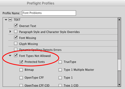
Figure 6: A custom preflight profile can help you head off big problems with unembeddable fonts.
Icky Images
Preventing and fixing problems with text is only half the battle. You need to stick to best practices to avoid nightmarish issues with images too. Here are four of the most common reasons why images wreak havoc in InDesign workflows. Pasted images InDesign was designed to be very flexible in how you work, even allowing you to do things you probably shouldn’t. For example, you can copy images from Photoshop (or your web browser, or pretty much anywhere) and paste them onto your InDesign pages. But do yourself and everyone around you a favor and… don’t do it! There are several problems with pasting pixels into InDesign. First, these images won’t show up in the Links panel, so not only can you not track them inside your document, but you can’t retrieve information about them (such as resolution). Second, pasted images cannot reliably be color managed, so you get whatever color InDesign guesses is right. Third, they can bloat your InDesign document horribly—if you copy and paste a 20 MB image from Photoshop, your InDesign file becomes 20 MB larger. And finally, you might not be able to get the image out to edit it again. Note that we’re not talking about vector images from Illustrator (which, when you paste them, will generally convert into editable InDesign objects). As long as the vector paths are relatively simple, copying and pasting them isn’t that bad. But pasted bitmapped images should make you shudder. If you need a bitmapped image to travel with your document (rather than being a linked file on disk), place it, select it in the Links panel, and then choose Embed from the Links panel menu (Figure 7). That is much safer and more reliable!
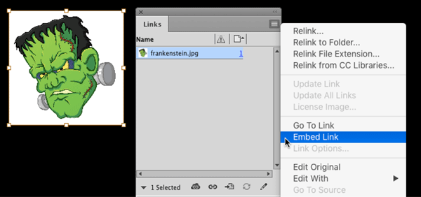
Figure 7: Embedding a raster image is always preferable to pasting into your InDesign layout.

Figure 8: The tightly-cropped image (top) contains a lot more than meets the eye. You can see the entire image if you click and hold on it with the Direct Selection tool (bottom).

Figure 9: You can apply independent transparency effects at several different levels of a text frame: Object, Stroke, Fill, and Text.
Taming the Beasts
As an InDesign user, you may encounter any number of other nightmares—or perhaps create them yourself! We’ve seen our fair share, such as people typing page numbers manually on each page of a long document because they didn’t understand how InDesign’s automatic page numbering worked. Or the book in which every page contained a separate, unthreaded text frame full of text because the designer didn’t understand how to thread two text frames together. Or the designer who didn’t know you could set a negative first line indent, so made “hanging bullets” by breaking every line into its own paragraph and inserting tabs. These are all painful—and scary!—real life scenarios. And sooner or later, unless you create all your documents yourself, you’ll likely run into them. When it happens, take a deep breath, don’t panic. You don’t need crosses, garlic, or silver bullets to ward off these monsters. You just need to use the proper InDesign techniques, and your files will live happily ever after.
Commenting is easier and faster when you're logged in!

Recommended for you

How to Create a Wax Seal in Photoshop
Learn how to combine layer effects in Photoshop to simulate any design pressed i...

100 Great InDesign Tips
We scoured every past issue of InDesign Magazine to bring you the best of the be...

How to Create a Composite Video Effect in PowerPoint
Learn how to create a composite using videos and photos right inside of PowerPoi...