

Preparing Your Artwork and Creating a New Fill
One of the easiest ways to make an object stand out from other artwork in your illustration is by using Illustrator’s drop shadow effect (Effect > Stylize > Drop Shadow). This effect duplicates the shape of the object and softly blurs and offsets it to look like a shadow cast from a light above. The result is that your object will appear to float above other text and artwork on the page.

However, if you want your object to really pop off the proverbial page, it’s worth taking a few minutes to learn how to master the process of making your artwork appear to stand up on the surface, instead of just floating above it. Start with any artwork you’ve created in Illustrator. It can be as simple or complex as you like. Follow along as we modify Steve Gordon’s map icons to illustrate the technique.

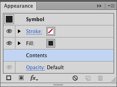
In order to create a single shadow from artwork containing multiple objects, select the artwork you’ve drawn and either group the artwork (Ctrl-G/Command-G) or drag it into the Symbols panel to turn it into an Illustrator symbol. This will produce a single shadow that encompasses the entire shape of the artwork rather than separate shadows for each of its objects. Next, you need to manually create the object that will become the 3D shadow behind your artwork. With the Appearance panel open, choose Add New Fill from the panel menu. Don’t panic when your lovely artwork appears black—by default, this new fill is automatically positioned on top of your artwork, which is contained in the Contents of the Group or Symbol in the panel. You’ll move this fill below your artwork later, but for now you’ll want to see this fill unobstructed by your artwork as you develop the 3D shadow from it.

Using the 3D Effect to Rotate the Shadow Shape
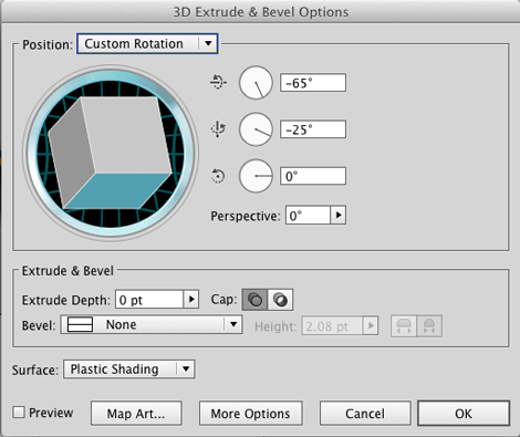
Next, you’re going to add a 3D effect to the new fill to stretch and rotate it to make a shadow-like shape. Although you can use the Effects menu, it’s much more efficient to build your effects right from the Appearance panel. So, with the new fill selected in the Appearance panel, click the fx (Add New Effect) icon at the bottom of the Appearance panel, then select 3D > Extrude & Bevel in the pop up menu. In the 3D Extrude & Bevel Options dialog, enable Preview and set the Extrude Depth to 0 pt. Click and drag on the cube icon to stretch and rotate your black fill. When you’re satisfied with the result, click OK to exit the dialog. Even though the fill is sitting on top of the artwork, it should look more like the shape of a shadow cast by a light than merely a duplicate of the artwork. If you need to change the shape again, simply click on the effect name in the Appearance panel to bring up the 3D Extrude & Bevel Options dialog again.

Repositioning the Shadow Shape
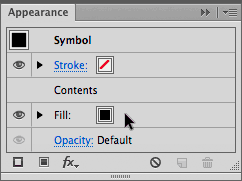
Go ahead and move the fill underneath your artwork by dragging the fill below Contents in the Appearance panel so you can begin to see it as a shadow.

To create the illusion of a shadow on a surface in contact with the bottom of the icon, Gordon had to reposition the fill down to the bottom and right of his icon. To do this, add another new effect to the fill in the Appearance panel. This time, from the fx icon choose Distort & Transform > Transform. In the Transform Effect dialog, click to enable Preview and adjust the Move sliders or text fields to reposition the shadow.


Blurring the Shadow and Making it Transparent
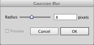
With the shadow positioned, you’ll want to soften the sharp edges of the shadow. From the fx icon in the Appearance panel, add another effect. This time, choose Blur > Gaussian Blur, and in the Gaussian Blur dialog, enable Preview and adjust the Radius until the shadow shape is blurred to your liking.

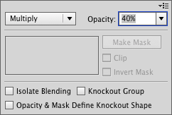
Like a real shadow, the background artwork (in Gordon’s case, a map image) must be partly visible through the shadow. To give the shadow transparency, click the fill’s Opacity control and in the pop up dialog box choose a percentage. Gordon changed the default opacity value to 40% and set the Blending Mode to Multiply.

Reusing the Shadow effects as a Graphic Style
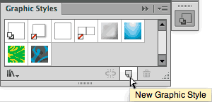
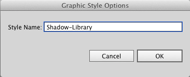
When you’ve put this much effort into creating your own shadow effect, wouldn’t you like to be able to apply it elsewhere? You can, by creating a graphic style and applying that style to other artwork. To create a style, open the Graphic Styles panel and with the icon selected, Alt-click/Option-click the New Graphic Style icon at the bottom of the panel and in the Graphic Style Options dialog, name the new style you created.
You can apply your new style to other artwork in two ways. You can group your artwork or turn it into an Illustrator symbol and then select the shadow style from the Graphic Styles panel. Or if you prefer, you can simply select the artwork and Alt/Option-click the style in the Graphic Styles panel. If you simply click the style in the panel, it will replace your artwork’s existing fill, stroke, and effects with the shadow style so you no longer see the artwork but only its shadow.
The Trouble with Shadows
After Steven Gordon developed the shadow for his map tack icon and created a graphic style from it, he discovered that the shadow didn’t always “fit” when he applied it to some of his other icons. With a few icons, such as the library and the hospital cross, while the shadow was shaped properly, it didn’t align properly at the bottom of the icon. That wasn’t a problem, however, because you can easily customize effects using the Appearance panel. In the panel, click on the fill that contains the four effects comprising the shadow. Click Transform to reopen the dialog, move the shadow by changing the Horizontal and Vertical values in the Move section of the Transform Effect dialog, and click OK. If you wish, you can also save this modified version of the shadow effect as another graphic style.


You can also use the Appearance panel to make a shadow more or less visually prominent. For example, Gordon noticed that the graphic style produced a shadow for the hospital cross that appeared thin and less prominent than the shadows of other icons. To correct that, he selected the icon and edited the Transform effect by changing the default Scale values to 120% in the Transform Effect dialog to thicken the limbs of the shadow.


Once you’re comfortable creating a complex appearance like the shadow, you’ll appreciate the visual power that the Appearance panel offers. Feel free to experiment because there’s never any risk using the Appearance panel. At any time you can remove effects, hide some or all of the effects, or customize and modify anything you do.
 Steve Gordon is a contributing writer for The Adobe Illustrator WOW! Books. He has authored articles on manipulating type in Illustrator and creating nature patterns for maps for Photoshop User magazine. Gordon operates Cartagram (https://www.cartagram.com), a custom mapmaking company. His other website, Maposity (https://www.maposity.com) features interactive maps made with Flash, Google Maps, and Javascript. Currently he’s learning iOS development to build map apps for Apple’s mobile devices.
 Sharon Steuer has been creating, writing about, and teaching workshops on digital art since the early 1980s. The current edition of her Illustrator WOW! book, The Adobe Illustrator CS6 WOW! Book, is the twelfth book in the series. Sharon is also the author of Creative Thinking in Photoshop: A New Approach to Digital Art, and is a regular contributor to CreativePro.com, Untapped Cities, and is host of the new DigitalArtistSpotlight column at AstuteGraphics blog. Her paintings and illustrations have appeared in numerous books and magazines and have been exhibited nationally.
https://www.ssteuer.com
https://www.facebook.com/SharonSteuer
https://twitter.com/SharonSteuer
This article was last modified on December 17, 2025
This article was first published on October 1, 2012
Commenting is easier and faster when you're logged in!

Recommended for you
Changing Image Focus with Photoshop CC 2018
Dual-camera iPhones like the iPhone 7 Plus, iPhone 8 Plus, and the iPhone X have...

Creative Fuel: Death of a Hero
Jef Raskin, a gifted technology designer, artist, educator, musician, and pionee...
How to Increase Image Dimensions and Maintain Quality in Photoshop
Learn best practices for increasing dimensions of an image while maintaining as...