
HTML: The Secret Sauce for Layout, Animation, and Interactivity
As we publish more content across more screens and devices, HTML remains the most prevalent technology in these workflows. Learning to incorporate HTML into digital experiences opens up amazing possibilities...


This article appears in Issue 125 of InDesign Magazine.
Screens surround us, and have become so commonplace that it’s easy to tune them out—not just the ubiquitous phone, but airline departure boards to ebook readers to automobile dashboards to animated photo advertisements playing in the middle of the sidewalk. More often than not, web technologies like HTML, CSS, and JavaScript are running ‘under the hood’ to bring this content to life. Let’s explore some of the ways that web technologies have grown far beyond traditional websites—and how you can add this type of content to your InDesign documents.
It may surprise you that we’re talking about HTML and InDesign, but as you’ll see, combining these two powerhouses can have some awesome results. First we’ll take a look at what the technology is all about and how its core elements work together. Then we’ll explore some awesome CSS tricks for animation and interactivity. Finally, we’ll look at how it all comes together for the InDesign user.
It’s Usually More Than Just HTML
When we’re told that a technology or platform supports HTML, this typically implies support for CSS and JavaScript as well. CSS allows us to add style and layout to HTML content, while JavaScript provides logic for things like displaying the current date or recognizing items placed in an online shopping cart. It’s these three technologies working in unison that allow us to transform our content into rich, interactive experiences.
A prime example of this can be found in ebook readers. When the first ebook readers hit the market, they didn’t “feel” like web pages. You could change the text size, navigate to specific pages and chapters, and view images. The content in these digital books is HTML. Along with HTML, however, CSS is also used to format the text, specify fonts, create
spacing, and control the size and text-wrap behavior of images (Figure 1). And while JavaScript was not supported in the very first eReaders, it was soon added to many eReaders as competition began to increase among companies in that market.
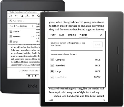
Figure 1. Viewing options on the Kindle ebook readers allow users to customize the display of content to their liking.
And now for the big ‘but’ … But not all features of HTML, CSS, and JavaScript are supported by all eReaders. This is where things get tricky. The same EPUB document can actually display differently in different eReaders, and some functionality, provided by HTML, CSS, or JavaScript, could display—and function—differently. Modern eReaders are addressing these limitations, and support for a greater set of features is growing every few months, especially with devices that support updates for the eReader software.
How HTML, CSS, and JavaScript work together
HTML is responsible for the content and structure of digital products. This includes the text-based content itself, as well as the structure that surrounds the content. This structure can mean defining pieces of content as a heading, paragraph, or items included in a bulleted list. HTML structures can also include grouping content into a header, footer, blockquote, section, or other elements.
CSS is responsible for defining how HTML elements should look and behave when they are viewed. Style attributes include defining colors, fonts, sizes, leading, kerning, and transformations for the text-based content defined in HTML. In addition to style, CSS is also responsible for defining the layout of HTML elements on the page. Defining width, height, spacing, and position properties for an HTML element allows you to create more appealing layouts from the content and structure.
And finally there’s JavaScript (JS). JS provides a way to create a communication channel between the HTML document and the software reading the HTML document—be that a web browser, smart refrigerator, eReader, or mobile phone. With this communication ability, JS can obtain the current date, get the logged-in user from a server, keep track of your online activity, and even store bits of information for you until you need them again (Figure 2).

Figure 2. These three technologies come together to help us create interactive animated content across the web, eBooks, signage, menus, and just about everything with a digital screen.
The “modern web,” as we know it today, functions on these core technologies. These three file types are downloaded to our devices and provide the content, design, and interactivity (among other things) that drive the full user experience of our content. In the web industry, these technologies are often referred to as front-end technologies. They are referred to as front-end because they reside on your device, and act as a front, or doorway, to servers and cloud-based systems available on the internet. These can also be embedded into documents and applications that reside on your device, like an ebook, digital magazine, or an app.
CSS-Driven Animation
In order to make cool interactive HTML, you first need to understand how CSS can control not just how some content looks, but how it behaves.
If you don’t know CSS well, then the following information may seem a bit cryptic. However, I encourage you to read it anyway, because it’ll point you in the right direction when you’re talking with an HTML developer. Or it may inspire you to dive in and learn more about CSS yourself!
CSS Transition Property
While most CSS focuses on formatting text and creating layouts, there is also a full-blown animation architecture built into CSS. The first animation technique available in CSS is the transition property. Simply stated, this property creates an animation between two different values of styling. For example, let’s take a look at a mobile website menu, which may have two different layout states—an ‘opened’ state and a ‘closed’ state (Figure 3).
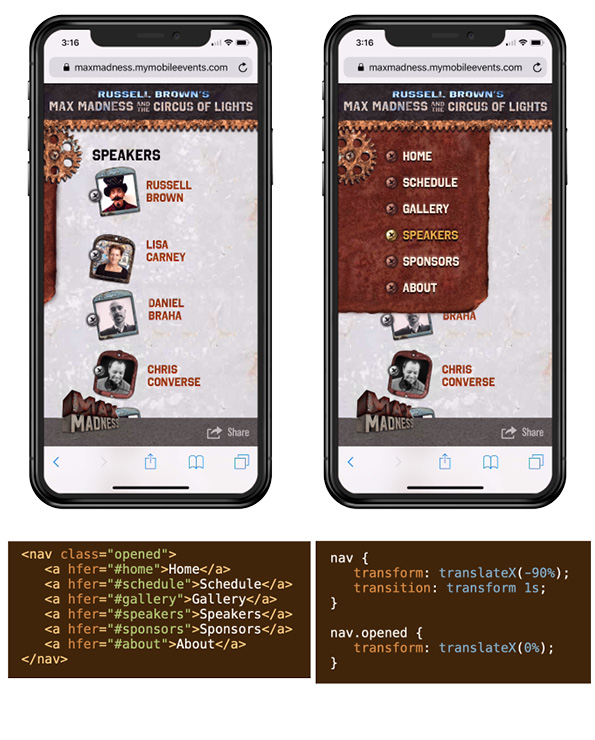
Figure 2. These three technologies come together to help us create interactive animated content across the web, eBooks, signage, menus, and just about everything with a digital screen.
In Figure 3, the mobile menu on the left is in its closed state, where the majority of the menu is actually positioned offscreen to the left. On the right, the menu is in its opened position, where the menu is positioned fully inside the page. To create a sense of animation—where the menu rolls onto the page—we use the CSS transition property to position the menu. This animates the menu between the two positions. Check out the mobile menu example here.
CSS Keyframes
Another option for animating objects is to build keyframes in your CSS. These keyframes give you greater control over your animations and allow you to choreograph the motion of different elements. You define keyframes within “at-rules” in CSS. At-rules are instructions for a browser or eReader, instead of a definition for HTML. Animations in CSS using keyframes are defined in an @keyframes block of CSS rules.
Within the @keyframes rules, keyframes are defined in terms of their percentage within the overall animation. When an animation starts, the first keyframe is 0%, and when it finishes, the final keyframe is 100%. Properties defined within these keyframes are automatically animated when your content is loaded, or when a user interacts with them (Figure 4).

Figure 4. CSS keyframes work just like the Animation panel in InDesign—by defining both the starting and ending properties of the element you want to animate.
Though it might not seem like it at first, CSS keyframes work just like the Animation panel in InDesign. Animations in InDesign define both a starting and ending point, and the animation is automatically created based on those properties.
CSS-Driven Interactivity
Unfortunately, many eReaders do not support JavaScript, making many interactive effects difficult or impossible. However, it is possible to put together a pretty sophisticated interactive experience using only HTML and CSS. You may be familiar with drop-down menus on web pages that use only CSS. These work by showing elements that are hidden within the element your mouse is moving over, or the element you are tapping within a mobile environment. While these are great navigation techniques, they don’t allow you to change the “state” of the content.
HTML, however, gives us a backdoor method of saving the state of a user’s interaction: Using checkboxes and radio buttons. Form elements in HTML are not limited to gathering and submitting data! And what’s more intriguing is that we can test the state of these form elements with CSS. This gives us everything we need to create a tabbed panel user experience without JavaScript (Figure 5).

Figure 5. Radio buttons provide a way for a user to make a single selection that automatically deselects the other options in the group. This functionality can be used to create an interactive experience when combined with CSS.
Because HTML radio buttons keep track of what is selected, this gives the perfect “hook” to create an interactive experience with CSS. Using the CSS pseudo-class selector of :checked, we can detect if a specific radio button has been selected by the user. And of course, we can make radio buttons appear almost any way we want with custom styling. What’s more, we can also target other HTML elements that follow a radio button in the HTML code (Figure 6).
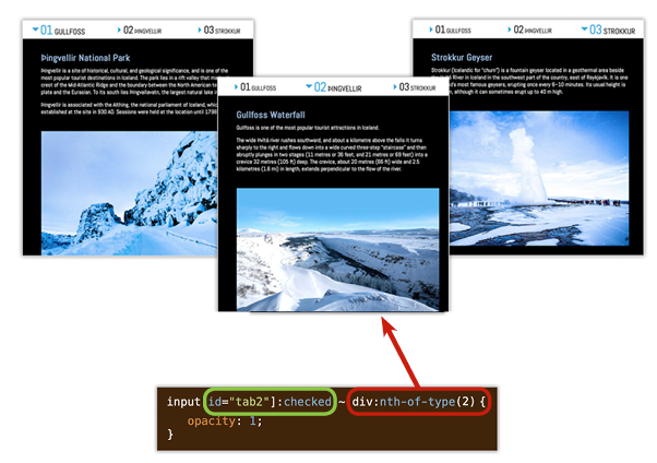
Figure 6. This CSS rule sets the opacity of the second DIV element to 1 (100%) if the second radio button is checked. (The radio button looks like a triangle in this case.) This same pattern can be used for any number of radio buttons and DIVs.
In Figure 6, I have created a CSS rule that looks for a radio button with an ID that equals “tab2” that has been checked. If that radio button is checked, the tilde (~) means look for another element that appears in the HTML code, after that checked radio button. After the tilde, I’m specifying the second DIV element that appears after the checked radio button. So, the final CSS rule that shows the second panel if the second radio button is checked is this:
input[id=”tab2”]:checked ~ div:nth-of-type(2)
The result is that the DIV (with its image and text) appears when you click the radio button. A simple trick that requires no JavaScript at all.
JS-Driven Interactivity
Sometimes, you’ll find you do need to use JavaScript to achieve the interactive effect you want. As discussed earlier, JavaScript allows you to create your own instructions for the browser, or eReader, based on a wide range of possibilities. These possibilities can include user interactions, the current date, or information obtained from a server located on the internet. JavaScript can be used to trigger, or respond to, just about anything you can imagine.
While the possible uses of JavaScript are too vast to cover in this article, I do want to discuss how JavaScript can be used to create the same tabbed panel experience we explored earlier. And the reason we’d create this experience in JavaScript, instead of CSS, is because the EPUB format does not support HTML form elements. Because of this, our CSS-driven user experience will fail in an EPUB, while the JavaScript version will work.
A collection of JavaScript instructions can be grouped together in a function. You can name your function, and pass pieces of information to it. One way to call, or run, a function is to add an onclick attribute into an HTML element. In the example in Figure 7, I added an onclick attribute to the navigation elements, and set it equal to switch_panels (which is the name of my custom JavaScript function). After the function name we add a set of parentheses in order to send information to that function. The information I’m sending is the panel I’d like to show if the user clicks that item.

Figure 7. JavaScript functions can be called, or run, by adding an onclick attribute to an HTML element. The parentheses are used to send additional information to the functions, such as the content we’d like to open when the item is clicked.
For the tabbed panels, the function code performs a few instructions. First it looks at all of the items in the navigation and sets all items to not be checked. Then, it adds a class=”checked” to the item that the user clicked. It also hides all of the content and then displays the content that corresponds to the navigation that was clicked (Figure 8).
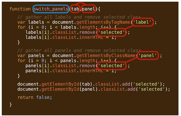
Figure 8. The function named switch_panels contains instructions that reset all of the content and navigation items, then show the items that relate to what the user selected.
If you’re not familiar with JavaScript, this may look a little intimidating; however, the logic works just like the radio buttons in HTML. The main difference with JavaScript is that you can see what the browser is being asked to do, whereas with HTML form elements, this is handled directly by the browser.
HTML + InDesign
We’ve talked about getting HTML in and out of InDesign in the past (notably in InDesign Magazine Issue 53, Issue 55, and Issue 76). But let’s review some of the basics here.
Getting HTML from InDesign
There are a few ways we can get HTML from InDesign. In fact, InDesign creates HTML when using a number of export options. EPUB, for example, creates HTML, CSS, and Java-Script files, among others, directly from your InDesign document. This is also true when using Publish Online, Export HTML, and even when using third-party plug-ins like In5, MediaWide, or Twixl.
Adding HTML into InDesign
While exporting HTML can be straightforward from InDesign, bringing HTML into InDesign takes a little more coordination. The Insert HTML feature, located on the Object menu, allows you to add HTML code directly into a container object that is placed on your page (Figure 9).

Figure 9. Add HTML directly into your document with the Insert HTML feature, found in the Object menu in InDesign.
Use the Insert HTML dialog box to paste custom HTML code into your document. After you click OK, InDesign will create an object on the page that you can resize to control the area of the page it will occupy. It is also worth noting that images cannot be added directly into the Edit HTML panel.
When InDesign creates the HTML object, it generates a rough preview of the rendered HTML. However, it can be pretty jarring to see the preview that is rendered within InDesign. Sometimes it won’t look even remotely like the preview you might see in a browser (Figure 10).

Figure 10. The preview from InDesign can look significantly different from that of a web browser or eReader. Don’t let this alarm you, however, as InDesign will pass along all of the code in the final export—which will look correct in the final EPUB or web page.
This is OK, because InDesign will pass this code into the final HTML that gets exported to formats that include HTML content. Then, the rendering of the HTML and CSS is taken care of by an eReader or web browser.
Different Techniques for Different Formats
When exporting to EPUB formats, it is important to consider the fact that some HTML elements are not supported, which in turn means that any CSS that depends on those HTML elements will also be unsupported. However, other export options that make full use of modern browsers will support interactive solutions that are both JavaScript- or CSS-based. Let’s take a look at some of the considerations when publishing to different formats.
Exporting to EPUB formats
As I alluded to earlier, the EPUB format does not include support for HTML form elements. Not only does this mean that an EPUB cannot capture and submit form data, but it also means that our CSS-driven interactive experience won’t work either. So, for EPUB, we can use the JavaScript version of that user experience (Figure 11).

Figure 11. The EPUB export from InDesign allows you to add custom CSS and JavaScript files that will be included in the final EPUB package.
When exporting your document for Reflowable EPUB or Fixed Layout EPUB, the Export Options dialog box includes the options for including additional files with the final document. Click on the HTML & CSS pane, and then the Add Style Sheet button, to include additional CSS files into the resulting EPUB file. In the JavaScript pane, you can include a JS file in the same way as the CSS.
With your CSS and JS files included, click OK to generate your EPUB file. Open the EPUB in an eReader to experience the interactive content that has been injected into your document. Figure 12 shows the JavaScript-driven interactive tabbed panel displayed in a Fixed Layout EPUB in an eReader.

Figure 12. The resulting Fixed Layout EPUB file opened in an eReader to reveal the fully interactive experience injected via the Insert HTML method in InDesign.
Using Publish Online
When using the Publish Online feature within InDesign, your document is converted to a web layout using HTML, CSS, and JS. The Publish Online service does an amazing job of converting your layout into an interactive web experience. What’s more, if you use the Insert HTML feature, you can make use of all modern HTML-, CSS-, and JS-based features. This means we can take advantage of CSS-driven interactive experiences as well as those built using JavaScript (Figure 13).

Figure 13. The Publish Online feature gives you the ability to create a fully interactive and animated user experience.
In addition to the increased support for web technologies afforded to us with web browsers, Publish Online also makes use of the Animation and Timing panels—converting your animations into CSS- and JS- driven animations automatically.
Adding HTML to InDesign with in5
When considering HTML workflows with InDesign, it’s worth mentioning the capabilities afforded to us when using the in5 plug-in by Ajar Productions. This plug-in allows us to use the Overlays panel in InDesign for the purpose of publishing web pages (Figure 14).

Figure 14. Exporting your InDesign document to HTML using the in5 plug-in gives you the ability to use the features of the Overlays panel while retaining access to the final HTML, CSS, and JS files.
The Overlays panel is designed to allow you to add rich, interactive content into your documents for use with Adobe’s AEM-based publishing platform (formerly known as the Digital Publishing Platform, or DPS). However, the in5 plug-in allows you to repurpose these features when publishing from InDesign to HTML pages for use on your own web server (Figure 15).

Figure 15. Use the Web Content pane of the Overlays panel to include more than just HTML in your in5 export. This feature will add all items in HTML files’ parent folder into your final publication—which can include CSS, JavaScript, images, video, and more.
My favorite Overlays feature is the Web Content option. Similar to the Insert HTML feature, this allows you to include HTML as well as all files and folders contained in the HTML files’ parent folder. This means you can automatically add CSS, JS, and images into your web output automatically. This feature makes it possible for you to embed not only interactive experiences, but full-blown web applications, all by importing a single HTML file in the Overlays panel.
Possibilities Abound
There are a few ways you can work with HTML and InDesign—both from an importing and exporting standpoint. Depending on the final file format desired, different features can aid you in your quest to create the most engaging user experience for your content. Be sure to explore the workflows discussed in this article and keep notes on what works best for both you and your clients.
Commenting is easier and faster when you're logged in!

Recommended for you
InDesign Magazine Issue 133: Object Styles
We’re happy to announce that InDesign Magazine Issue #133 (May 2020) is now avai...

Making Charts Accessible
Simple techniques to ensure your charts can be understood by readers with visual...

Hot Tips
Your favorite InDesign experts bring the heat with this collection of fresh tips...