
How to Set Better Looking Body Text in InDesign
Learn how to set preferences and tweak justification attributes to improve the look of body text.
This article appears in Issue 9 of InDesign Magazine.
More matter is being printed and published today than ever before, and every publisher of an advertisement, pamphlet or book expects his material to be read. Publishers and, even more so, readers want what is important to be clearly laid out. They will not read anything that is troublesome to read, but are pleased with what looks clear and well arranged, for it will make their task of understanding easier. For this reason, the important part must stand out and the unimportant must be subdued… The technique of modern typography must also adapt itself to the speed of our times. Today, we cannot spend as much time on a letter heading or other piece of jobbing as was possible even in the nineties. -Jan Tschichold, Asymmetrische Typographie, 1935 These words could have been written today although, a century later, we tend to refer to our nineties as the dark ages of text composition. Until page-layout applications took over computer desktops, setting text and fine-tuning typographic details were left to highly skilled typesetters. Many graphic designers continue this legacy when they consider body text to be merely gray matter that fills the space in between page margins. The quality of typeset text is judged by its texture and readability. An even texture is essential for readability, whether your graphic style is classical, modern, or post-modern. The right combination of typeface, point size, leading, kerning, hyphenation, and line length results in a page that has an even texture and is not only pleasing to look at but, more importantly, pleasing to read (Figure 1).
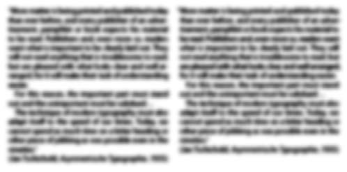
Figure 1: Squint! Before (left) and after (right) fine-tuning Justification, Tracking, and Hyphenation attributes. The texture on the right is more even and presents less visual
distractions for the reader. Machines can approximate “good,” but only the human eye recognizes “great.”
Preliminaries: Inserting Text and Choosing the Correct Point Size and Leading
You can set type in virtually any size, but there are unwritten rules, such as the one stating that for readability, body text should be set in a range between 9 and 12 points. The decisions we make on body-text size depend mainly on the size of the page and the grid system we choose to use. For example, an 11pt text set on a large page looks and feels smaller than it does on a small page. The same concept applies to the choice of leading: Lines should be neither too close nor too far apart so that the pattern they create doesn’t detract from the color and texture of the page.
Paragraph or Single-Line Composer?
Conventional desktop “typesetters,” such as QuarkXPress or PageMaker, adjust word spacing on a line-by-line basis, meaning that the program considers spacing problems only for any single line. This may result in consecutive lines with very different spacing (and therefore different texture), even though the application is respecting all the rules you define in the hyphenation and justification window. InDesign’s Paragraph Composer, on the other hand, creates a list of possible line breaks in the line it examines. It ranks the different sets of possible break points, considering the effect each break point has on spacing and hyphenation in terms of the whole paragraph. Finally, the Paragraph Composer chooses the best alternative to create an even texture (Figure 2).
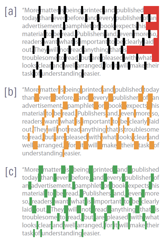
Figure 2: The same paragraph aligned left [a] and justified using the Single-line Composer [b] and the Paragraph Composer [c]; hyphenation is turned off. The default justification settings allow for a 80-percent decrease and a 133-percent increase in Word Spacing.
The composition engine looks at the space that can be used [red] and then chooses to decrease word space to pull words up or increase word space to force justify the text.

Figure 3: When you add words to a paragraph set using the Paragraph Composer, lines above the insertion may reflow because InDesign recalculates break points in the paragraph as a whole.
Justifying Text
When text is justified, it’s aligned along both the right and left margins, filling the spaces that are there when the text is aligned left (Red areas in Figure 2); spaces are redistributed to force the words to align. InDesign uses the settings defined in the Justification settings (Figure 4), which are also available from the Paragraph palette.
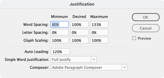
Figure 4: The Justification window lets you determine a minimum, desired, and maximum range (expressed in percentages), which can be used to choose break points within lines of text when it’s justified.
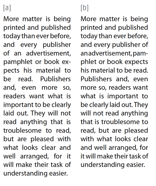
Figure 5: Giving InDesign something more than Word spacing to determine line breaks for justified text helps you get a better texture faster. [a] Paragraph set with only Word Spacing; [b] Paragraph set with a combination of Word Spacing and Glyph Scaling (98/100/102).
Kerning
Kerning is the space between individual glyphs (Figure 6).

Figure 6: in this example, the insertion point is in between the letters h and a. In the Character palette, you can see that the kerning value is set to -12. The parenthesis means that this value is taken from the metrics of the font itself.
Tracking
One all-time favorite of setting text is Tracking. It’s an easy way to squeeze in widows and orphans and to correct spacing problems. The problem is that when you use tracking on one paragraph but not the following, the paragraphs look and feel different —they have a different texture. For this reason, before applying tracking to paragraphs, consider all the other justification and hyphenation possibilities. Both tracking and kerning are measured in 1/1000 em, a unit of measure that is relative to the current type size. In a opt font, 1 em equals 6 points; in a 10pt font, 1 em equals 10 points. Kerning and tracking are strictly proportional to the chosen type size. Tip: In InDesign, you can use keyboard shortcuts to apply tracking to selected text. By default, when you use Option and Left Arrow or Right Arrow on selected text, you increase or decrease tracking values in increments of 20/1000 ems. On the other hand, if you do the same with the insertion point in between two characters, the increments will be applied to kerning. This value is far too high for precision work. In Preferences > Units & Increments, change the Keyboard Increments value for Kerning (and, missing in the interface, Tracking) from 20/1000 of an em to 1/1000. To speed up tracking and kerning, you can use Option+Command (or CtrI-Alt) together with the left or right arrows and the increments will be multiplied by 5.
The Icing on the Cake: Optical Margin Alignment
Even when you know your text is justified because you’ve decided so and you clearly see all lines aligned to the edges of the text frame, when you go to preview mode you may suddenly see uneven edges. This is because characters have different shapes, from vertical (m), to round (o), to punctuation marks. To overcome this annoyance, you can set your text with Optical margin alignment; choose Type > Story and check Optical Margin Alignment. InDesign then applies this attribute to the whole story and affects the text in all text boxes of the same thread (Figure 7). Turning this option on can result in even more balanced texture and therefore better legibility.
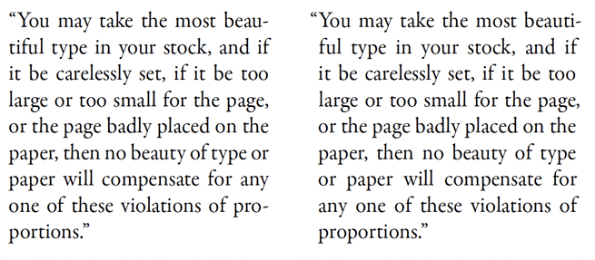
Figure 7: Although the text on the right is justified, the paragraph has a ragged look due to characters such as quotation marks, commas, and hyphens. Turning on Optical Margin Alignment (left) gives the paragraph a more even texture.
Other Attributes Worth Looking At
If you hyphenate your text, make sure that you apply the correct dictionary to your story; this is essential because the choice of language determines not only how you perform spell check but, more importantly, how your words hyphenate. In the Hyphenation Settings, apart from the obvious settings, you can interactively move a slider to choose between better spacing and fewer hyphens (Figure 8). Select Preview, then move the slider to see your text reflow. You can choose whichever setting gives you the better texture.

Figure 8: in the Hyphenation settings, you can interactively fine-tune hyphenation and preview results in real time.

Figure 9: Highlighting composition violations can help you spot possible problems.
Save It All as a Paragraph Style
Once you’ve finessed the texture of your body text, save it as a Paragraph Style so you can apply it to other parts of your publication and import it into new ones.
Commenting is easier and faster when you're logged in!

Recommended for you

DATAformXT XTension for QuarkXPress v8 Now Shipping
XChange International, the source for extended technology worldwide, are pleased...
Chartwell Font Updated
In 2011, type designer Travis Kochel devised a very clever method of creating ch...

Photoshop Downloadable: Top Tips Ebook
A compendium of CreativePro tips, tricks, and techniques for Adobe Photoshop