
Are your prints too dark, or does your published work appear darker (or lighter) than expected? If so, you might benefit from making simple adjustments to your editing environment.
We like to think that seeing is believing. But because of the way human vision works, a few key factors can affect how you perceive brightness and tones in your images and artwork. You can improve how you perceive brightness in your work by following some simple guidelines.
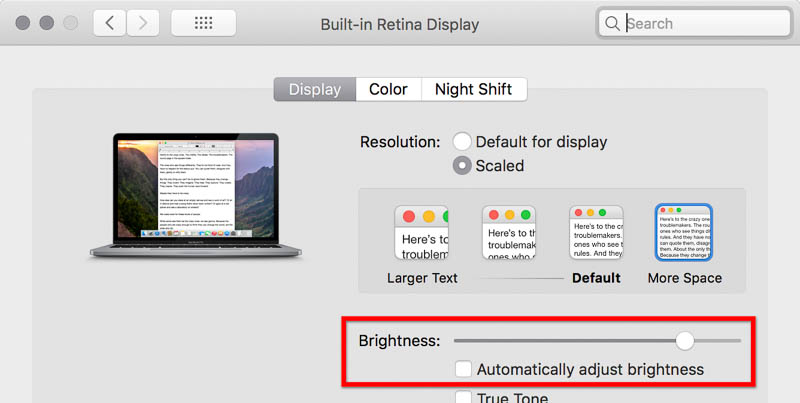
Set the Brightness of the User Interface
Many applications give you the option to change the color of the area around a document and the backgrounds of panels. People tend to talk about this as if it’s just a personal preference, but it’s actually important for your tonal perception.
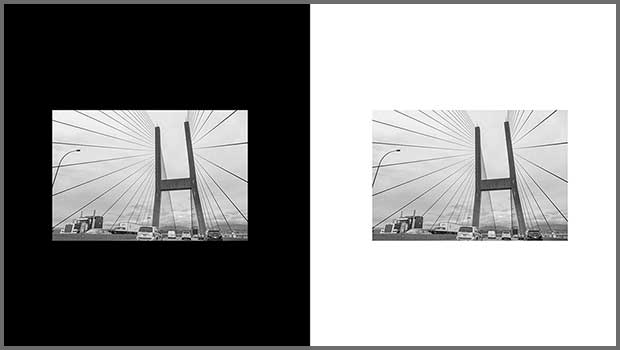
For example, take a look at the following image. The initial impression is of a bright sky, with cars and clouds that appear light gray to almost white.

Now look at the next image.
The cars and clouds on the white background may appear darker than the image on the black background. But it’s the same image in both examples. The only difference is the color that surrounds them. The white background may show something the black background couldn’t: That the lightest areas aren’t as light as intended.
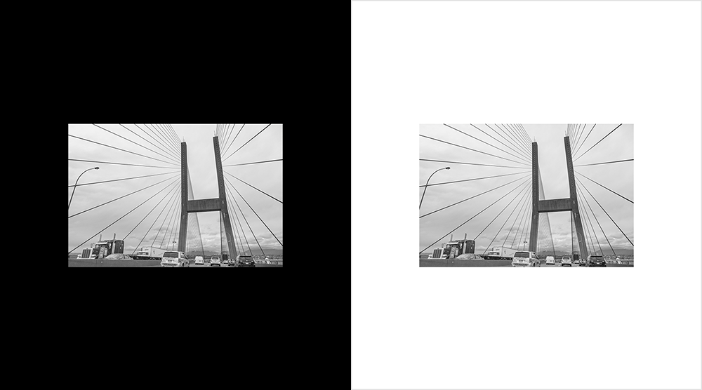
When the illusion is strong enough, your brain might be convinced that the two images use different brightness levels, even when they’re near each other. The following animation simplifies the example — the same gray square appears to have a different brightness on each background.
This is a well-known phenomenon in human color perception. It’s actually based on an advantage of the human visual system: In a real world situation, the eye can use context to identify a color or tone even when the lighting conditions are very different, such as midday versus twilight. However, in this case, the eye’s interpretation may be wrong partly because solid backgrounds don’t normally appear in nature.
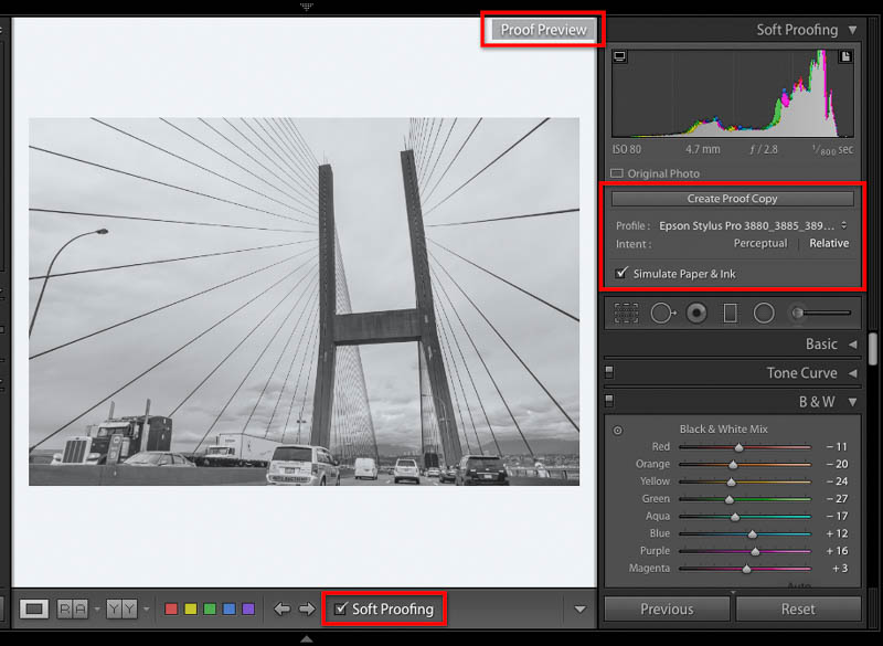
If you edit an image in a dark or black viewing environment, the image may appear darker than you expect when you print it on a white sheet of paper (or post it on a white social media page). This is why Adobe Lightroom Classic switches to a white background when you enter its soft-proofing mode. The white proofing surround gives you a background that’s more appropriate for previewing a print on white paper. (Soft-proofing also causes other visual changes, because it also restricts the color gamut and dynamic range to that of the profile being proofed.)
A white background can help you recognize tones that aren’t as bright as you intend. A black background helps you recognize whether shadow areas are close to black, or more of a dark gray. Set the brightness of the user interface and document windows to match your current needs.

Many creative applications, such as Photoshop, let you set the brightness of the user interface.

In Photoshop, you can change the color of a document window by right-clicking the empty area outside the document.
Choose a Dark Mode System Setting
The latest versions of macOS and Windows include a dark mode setting. This gives the entire operating system a dark theme. Applications also use the dark theme if they support it.

The issues are the same as they are for the darkness of the user interface. Dark mode may be appropriate if you’re preparing media for display on a dark background. But if your final medium uses a white background, going with a light theme might help you evaluate tones more accurately.
Set the Luminance of Your Display
The luminance (brightness setting) of the display is also commonly thought to be a personal preference. But again, your choice can affect how you perceive tones.
As with user interface brightness and dark mode, set display luminance to be consistent with the final medium. Many users like to work with a very bright display. But a bright display is typically set too high for print work. A reflective sheet of paper simply can’t match a display that emits its own bright light. For this reason, a display set to high brightness can lead to prints that appear darker than expected.
Use a display profiler/calibrator device to set display luminance for print. It measures the actual luminance of your display. Display luminance is expressed in candelas per square meter (cdm2). A typical range for print work is 90–120cdm2. The exact setting depends on the viewing conditions you anticipate for the print.

This display calibration software is currently using a preset specifying settings appropriate for print, such as a luminance (intensity) of 100 cdm2.
Although it’s best to use a display profiler/calibrator, you can also hold a print next to your display. Adjust the monitor brightness until the onscreen document has about the same brightness as the print. While not perfect, this method works best when your ambient lighting is consistent with the final viewing conditions expected for the print.
When you edit content for electronic media such as web sites and mobile apps, it’s OK to set the display luminance to 140cdm2 or higher. This approximates the high brightness setting that many people use on their devices.
Make a note of the setting. You can then quickly set your display properly when you need a reliable editing environment. If your computer has an automatic display brightness option, consider disabling it to avoid unexpected changes.
Control Ambient Light
It’s great to be able to work next to a window under natural light. Unfortunately, that’s not the best way to evaluate colors and tones on your display. For example, a display calibrated to print-friendly luminance can become hard to see under high ambient light. Under high ambient light and glare, a display may not be able to accurately show you black and shadow levels.
I like to work by a window as much as anyone. I’ll leave the window shades open when the current task isn’t color-critical, such as editing text. But when I need see colors and tones accurately, I’ll control the ambient room lighting and reduce glare by doing things like closing the shades. This gives my display the chance to perform at its best.
When your work must satisfy specific print viewing conditions, controlling ambient light might not get you there on its own. You can use a calibrated viewing booth that you can tune to the brightness and color temperature specified for proofing the job. This is typically done for viewing a contract proof or prepress proof.
When to Join the Dark Side
So far, the recommendations have leaned toward perceiving tones accurately when you’re preparing images for print. But the more you edit images for web sites, video, and social media, print rules don’t necessarily apply.
For example, when you’re editing for a medium other than print, dark system and application settings might be the right thing to do. In some industries, such as video editing, dark application backgrounds are common because so much video content is viewed in low light environments, such as cinemas or on a TV in a living room at night.
The bottom line: Anticipate the final viewing medium (or get its technical requirements), and adjust your editing environment accordingly. If you’re editing a video for a corporate meeting in a dark theater or for a dark-themed website, working in a dark environment is a good idea. But if another video you edit is for a light gray kiosk on the floor of a brightly lit trade show hall, or the white background of a web page, it might be better to work in a light environment.
What about the middle gray background that many applications use? It’s easy on the eyes, but again, for it to be a perfect viewing environment it must be consistent with your final display medium.
You Can’t Always Control Everything
If you aren’t sure of the final viewing conditions, or if you know they’ll vary, the answer might not be so black and white. In that case, it’s fine to chart your own course. Proof your work against both white and black backgrounds (this is probably a good idea anyway). Or if the viewing environment involves a colored background, proof against that too.
This article was last modified on May 12, 2021
This article was first published on April 1, 2019
Commenting is easier and faster when you're logged in!

Recommended for you

The 7 Skills Every Design Professional Needs Today
Today more designers are finding themselves having to be well rounded with diver...

Design How-To: Images that Break Boundaries
This story is taken from “Before & After” Magazine. Creativepro....

Partner Spotlight: Importing PDF Comments Into PageProof
Learn how PageProof integrates its own browser-based comments and reviews with c...