How to Find Fonts With Specific OpenType Features on Adobe Fonts

The thousands of fonts on Adobe Fonts (formerly known as Typekit) are an incredible resource for Creative Cloud members. And, as a bonus, many of these fonts include extended OpenType features such as extra swash capitals, oldstyle numerals, discretionary ligatures, contextual alternates, fractions, and much more.
But one irritating limitation of the Adobe Fonts web site is that there’s no way to filter the fonts by these features. And what’s more, when looking at an individual font, there’s no obvious way to tell which OpenType features the designer has included in that font.
Sure, when you browse fonts on Adobe Fonts, you can specify the “figure style” to limit your search to only fonts that include old style numerals, for example, but there are no additional filters for other OpenType features.

Thankfully, once you’ve limited your search to a few interesting fonts, there is a way to determine whether an individual font supports the OpenType features you need. Since CSS (cascading style sheets for the web) actually exceed the abilities of InDesign for working with OpenType font features, Adobe displays OpenType features for individual fonts over on the “web” side of fonts.adobe.com. Even if you only care about print, you can still take advantage of this information. Here’s how:
Let’s say that you need to find a serif font that contains OpenType fractions. You’ve decided that you really like Eskorte and URW Baskerville. To see whether or not they support OpenType fractions, follow these steps:
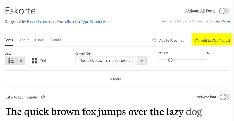
–>1. Once you have drilled down to the page that is displaying the font, click Add to Web Project in the upper-right corner.

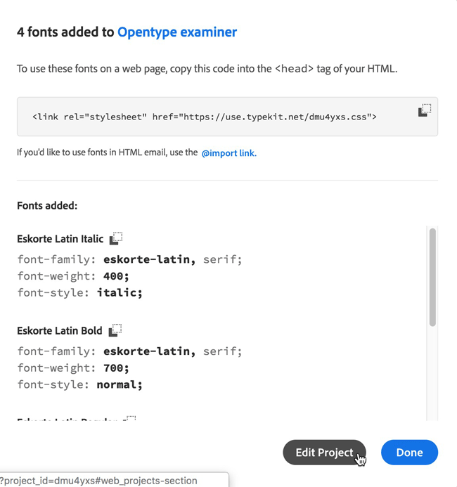
2. In the drop-down list, type a name for the project, then click the Create button. The name you choose isn’t important.

3. In the next box that appears, click the Edit Project button.

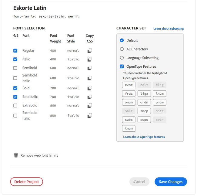
4. In the next screen, you’ll see a Character Set section that indicates which OpenType features are available for the font you added to the Web Project. In my example, I can see that Eskorte supports capitals to small caps (c2sc), fractions (frac), ligatures (liga), lining figures (lnum), oldstyle figure (onum), ordinals (ordn), proportional figures (pnum), small caps (smcp), subscript (subs), superscript (sups), and tabular figures (tnum). You can view a guide to the abbreviations used here.

5. When you’re finished examining the OpenType attributes, you can click Remove web font family, but leave the empty web project behind so you can use it next time you want to examine a font.
You can add several fonts to a Web project, and then go to the Edit Project section to compare the OpenType features of several fonts at once. Hopefully Adobe will make this simpler someday for print designers, but in the meantime it’s better than nothing.
Commenting is easier and faster when you're logged in!
Leave a Reply
Recommended for you

Illustrator Downloadable: Tropical Shadow Overlay Kit
[memb_has_any_tag not=not tagid="282,643,655,657,1664"] Downloadables are an exc...

Illustrator Downloadable: Summer Citrus Pattern Set
Downloadables are an exclusive benefit for CreativePro members! (Not a member ye...

InDesign Downloadable: Tables SuperGuide
Downloadables are an exclusive benefit for CreativePro members! (Not a member ye...
Great bit of detective work, Keith! This is really useful.
Thanks for this clever workaround, Keith!
Keith, thank you so much! That is going to be really handy. So you’re positive, then, that all the features for the web version of the font are also available for the print version? I would think so, but just checking.
@Anne-Marie: Hah! I spent a month testing each and every typeface to make sure! JK. But yes, as far as I’ve found, they are all equivalent.
There’s more that’s lacking at Adobe Fonts than the ability to find extra swash characters. I do science texts. My latest layout project was a book endorsed by no less that three Nobel Laureates. I need to get such books right.
For that, I need fonts with a rich set of science and math characters. I get by because I have the STIX font independently installed, but if I wanted variety, there’s no way to look through Adobe’s collection other than wading through them one at a time. The same is true of languages with other characters sets. Someone doing a book that has occasional Greek, Hebrew or other words would appreciate having a font that includes them along with the traditional set of Roman characters.
I’ve suggested that to Adobe at least twice, but so far these enhanced search features haven’t been added.
Here is STIX. It is free and open source, so Adobe has not excuse not to add it to their collection. Having Adobe supply it would make updating easier.
https://www.stixfonts.org
The latest update is intriguing. Some InDesign Secrets readers might be interested what latest revision of STIX says about the classic (or cursed) Times Roman font.
—-
The original version of STIX was based on Times Roman, which has now been updated for the digital age.
As is well known, Times Roman was originally intended for printing the London Times. What is not generally appreciated is that the production quality of the Times was atypically high: It was printed on unusually high-quality paper on presses that operated more slowly than most newspaper presses. This allowed for the design of a typeface that could exploit this level of care: serifs could be much finer and counters (enclosed areas such as that in the lowercase e) could be much smaller than in other newspaper typefaces. These features of the font have not always fared well in less exacting environments. At the same time, a notable quirk of the Times Roman family is that the bold font is, in many respects, strikingly dissimilar to the roman font.
Tiro Typeworks explain their approach to updating the Times Roman basis of STIX as follows:
“Our principal goal in approaching STIX Two was to address several inherent deficiencies in the Times New Roman model as well as expand the typographic features. This process necessarily involved diverging somewhat from Times as familiar to people who have only known the common digital versions, while simultaneously restoring to that typeface aspects of the size-appropriate design characteristics that made it so successful in newspaper, book, and journal publishing in it’s metal type incarnation. The essential ‘Times-ness’ remains, but are with greater harmonisation of style across the family.
“Most digital versions of Times have been based on an optical size model that appears too light and fine when scaled down to typical text sizes. In the design of STIX Two, we went back to specimens of size-specific designs from the metal era, and adapted proportions, weights, and spacing of the 10pt and 12pt designs. The oft-noted mismatch between the style of different weights of Times has been resolved with a new bold design that matches the construction of the regular weight.”
https://github.com/stipub/stixfonts
—-
Maybe I should update my now years-old version.