
How to be a Better Designer: Study the Past
Learning from history can accelerate your development as a designer.

This article appears in Issue 41 of CreativePro Magazine.
Welcome to the first installment of a new series at CreativePro Magazine. Over the coming months, I’ll offer my thoughts on various aspects of design technique, ways to hone your skills, and why it matters.
Who am I to be giving such advice? Fair question.
I’m a graphic designer. Like many of you, I wear several hats. My working life is a combination of authoring online tutorials, writing, training, consulting, art, photography, public speaking, and… graphic design. I may have put it at the end of the list, but graphic design is what informs everything else. I’m not a great designer, but I am an improving designer. And while I try to improve at all the aspects of my job, I put the most time and effort into improving and growing as a designer. If I am a better designer, it will follow that I’ll also be a better photographer, artist, trainer, and writer.
When I was a novice graphic designer, I found The Non-Designers Design Book by Robin Williams (Figure 1) to be a useful and sobering lesson in keeping it simple—and I still do.
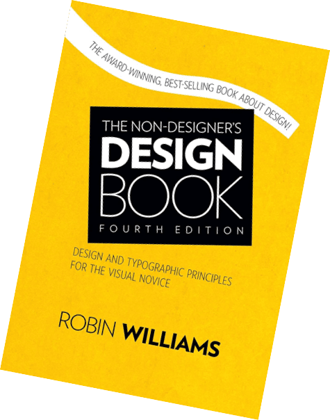
Figure 1. The Non-Designers Design Book by Robin Williams
When I feel I’m over-complicating things, I return to her common-sense advice and practical tips on how to improve your designs. Robin cleverly orders her tips around four design principles:
- Contrast
- Repetition
- Alignment
- Proximity
Not coincidentally, these have a memorable mnemonic: CRAP. Teaching graphic design, I have found this device immensely useful. If the students remember one thing, it is CRAP, and from that they can unravel a set of simple and easy-to-apply design principles.
Graphic design is not complicated.
It is nearly always more effective when it is simple. But the road to simplicity can be a winding one—there’s a lot involved in keeping it simple. To paraphrase Paul Rand: Design is so simple, that’s why it is so complicated.
Over the next few issues, I’ll try to help you unravel “simple.” This series is not a manifesto, however. It is not a “fail-safe system”—nor should you trust anything that claims to be. Rather, it’s an evolving list of unfinished thoughts and contradictions. It’s not random, but it’s not comprehensive either. I’m sure you’re already applying much of the advice I’ll share. I’m equally sure you’ll disagree with my emphasis and the things I’ve left out, intentionally or otherwise. This is a path, not the path. That said, I am confident that if you follow these practices, you will be a better designer.
In trying to boil down life-learned tips to a 10- or however-many-point plan, nuance can be lost. And nuance is important in design, especially so as you become more seasoned. Also important is the ability to embrace contradictions. I don’t mean in the Orwellian sense of 2 + 2 making 5, but rather in the sense that the answers are rarely black and white, nor set in stone—and that as designers we should question everything. While the young guns will have the edge when it comes to pulling all-nighters to meet deadlines, it’s the grizzled veterans that, thanks to their life experience, add the nuance. But I digress. Let’s get to that list.
1. Study the Past
The first item on my multi-point plan is an entreaty to learn from history. We’ve all heard that there’s nothing new under the sun, and that applies to graphic design as much as to anything. Rather than be demoralized by this, we should find it reassuring, because the past is an inexhaustibly rich vein of inspiration (Figure 2).

Figure 2. Left: Aleksandr Rodchenko’s 1924 portrait of Lilya Brik. Right: Cover for You Could Have It So Much Better (2005) designed by Matthew Cooper for Scottish rock band Franz Ferdinand. Rodchenko was one of the most versatile Constructivist artists to emerge after the Russian Revolution, working as a painter and graphic designer before turning to photomontage and photography.
Study the past: Read books, go to museums, listen to podcasts, attend conferences. Be a sponge, and soak up all that history. You’ll be inspired by the best work our civilization has produced as well as humbled by the skills, techniques, and tricks of those who came before you. Through this process of absorbing the past your future contributions will be more original while at the same time continuing a conversation with the past.
Of course, there’s a fine line between paying homage and plagiarism (Figure 3). Common sense should be enough to keep us on the right side of that line.
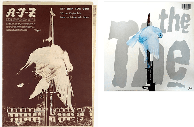
Figure 3. Left: John Heartfield’s design for the cover of AIZ magazine (1932). Right: The back of the CD booklet for The The’s Mind Bomb (1988)—more a copy than a tribute.
Many famous graphic designers wear their influences with pride. For example, Neville Brody, perhaps Britain’s most famous living graphic designer (and honored with an OBE in the 2025 New Year’s Honors list—if you’re British you’ll know what that means, if not, don’t worry about it), makes no secret of the debt he owes, especially in his early work, to Aleksandr Rodchenko (Figure 4).
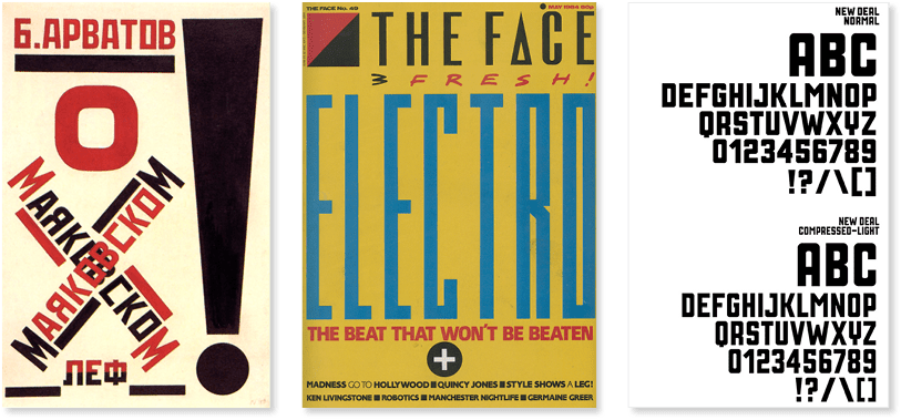
Figure 4. The work of Aleksandr Rodchenko (left) and a Neville Brody–designed cover for The Face magazine (1984) and typeface for the movie Public Enemies (2009)
Acknowledging your sources is about gratitude and connection. Gratitude for how they have informed and enriched your work, and connection because you’re strengthening the continuity between the designers of the present and those of the past. Just as great films give a nod to their sources of inspiration, making conscious references to what went before gives a depth to your work that discerning viewers will appreciate. Your piece may be about many things, but it should also be about everything that led up to it, even in the most subliminal and understated way.
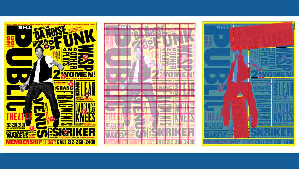
When you find something that speaks to you, pick it apart and figure out how it’s made. As a teenager, I took the family stereo apart to “fix” it. Of course, it never fitted back together again. But there’s no such jeopardy in taking apart a piece of graphic design. It’s an illuminating exercise to choose a historical piece of design, deconstruct it, and recreate it with today’s tools (Figure 5).

Figure 5. Take it apart to see how it works.
Top: The back cover of Pink Floyd’s Ummagumma (1969). Bottom: A spread from Ursus Werhli’s The Art of Clean Up.
And if you can’t think of what to choose, a flick through the pages of books on the history of graphic design like Meggs’ History of Graphic Design (by Philip Meggs and Alston Purvis) or Jens Müller and Julius Wiedemann’s two-volume Graphic Design history—is guaranteed to provide a creative kickstart (Figure 6).
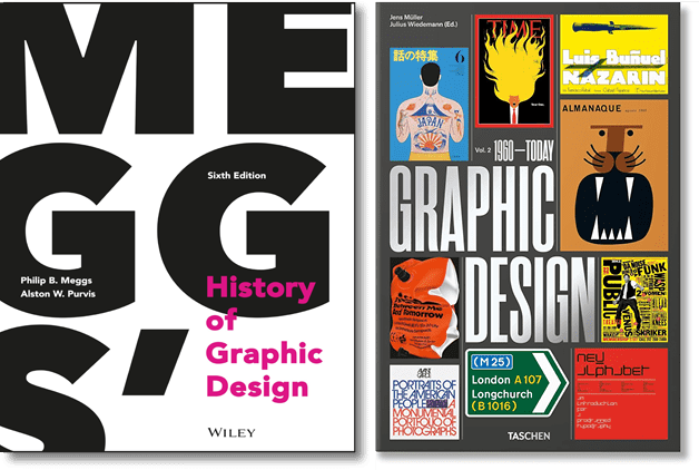
Figure 6. Richly illustrated books on the history of graphic design are a great source of inspiration. They’re pricey, but there’s a good chance of picking up second-hand copies.
The core of good graphic design is the communication, not the tools we use to create the design. It’s all too easy to forget or overlook this, but when we focus on and understand the process, we can adapt the techniques to whatever new tool we’re using. Yes, we’ll need to make tweaks and adjustments, but how we got to where we are now is pretty much how we are going to get to where we are going next. Amid the whirlwind of change and technology companies shoving AI down our throats, that can be a comforting thought.
Change is the only certainty. Which makes it a precarious and risky thing to hitch your wagon to any specific technology or software application. Rather than focus on learning the technology, focus on learning the craft. Underpin your ideas with history, so that your technique is more important than your mastery of the software. When we look at great examples of graphic design throughout history, we see that they don’t look so different from the great designs of today despite being created with very different tools (Figure 7).
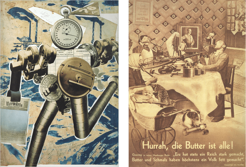
Figure 7. John Heartfield, the world’s greatest Photoshop artist—and all he had was scissors and glue! Left: “Rationalization on the march” (1927). Right: “Hurrah, the butter is all gone!” (1935).
What makes them successful is their power to communicate, and despite all the societal and cultural shifts of recent decades, we still share more points of commonality than differences with our forebears when it comes to communicating ideas.
I’m not saying it doesn’t matter what version of the software you’re using. Of course, it’s imperative to keep up. That doesn’t mean downloading the new version on the day it is released, but it does mean developing a fluency with your software that lets you use it intuitively so that it becomes an extension of your creativity. And we all know that sharing tips and geeking out with others who are using the same tools can be a lot of fun.
Always More to Learn
So, that’s it for this first installment. Our craft thrives on curiosity, exploration, and continuous learning. By studying the past you build a strong foundation for your work—one that will carry you through changing technologies and make you bulletproof to fickle trends. But don’t forget that while these principles are timeless, there’s always more to learn.
Next month, I’ll talk about typography… and, of course, there’ll be more on the need to keep it simple.
Commenting is easier and faster when you're logged in!

Recommended for you

How to Be a Better Designer: Learn About Type
Not everyone who knows about type is a good designer, but all good designers kno...
How to be a Better Designer: Design on a Grid
When you design on a grid, it helps you decide what goes where, so you can spend...
How to Be a Better Graphic Designer: Sweat the Details
Nigel French reminds us how much the little things matter in design.