
How to be a Better Designer: Design on a Grid
When you design on a grid, it helps you decide what goes where, so you can spend your energy making items look good.


This article appears in Issue 44 of CreativePro Magazine.
In last month’s installment of “How to Be a Better Designer,” we looked at the importance of space. This time, we’ll discuss using a layout grid—a tool to help organize that space.
A layout grid is a framework of columns, rows, margins, and gutters. It’s a system that guides where you place elements on a page or screen. The grid helps you decide what goes where—and once you know where things go, you can spend your energy making them look good there.
Grids are practical. They bring order to your page, speed up your workflow, and enhance your creativity by suggesting different layout permutations. But they’re also a design philosophy. If you find they suit you, grids can shape how you work—whatever the tool, whatever the format.
Everything Is a Grid
Grids aren’t just for graphic designers. They’re everywhere (Figure 1).
- In cities: streets in New York and Barcelona
- In buildings: windows, doors, tiles, bricks
- In tech: app icons, web layouts, spreadsheets, keyboards
- In transport: maps, parking bays, seat numbers.
- In nature: honeycombs, leaf veins, seed spirals, the periodic table
- In textiles: check patterns, knitting, weaving
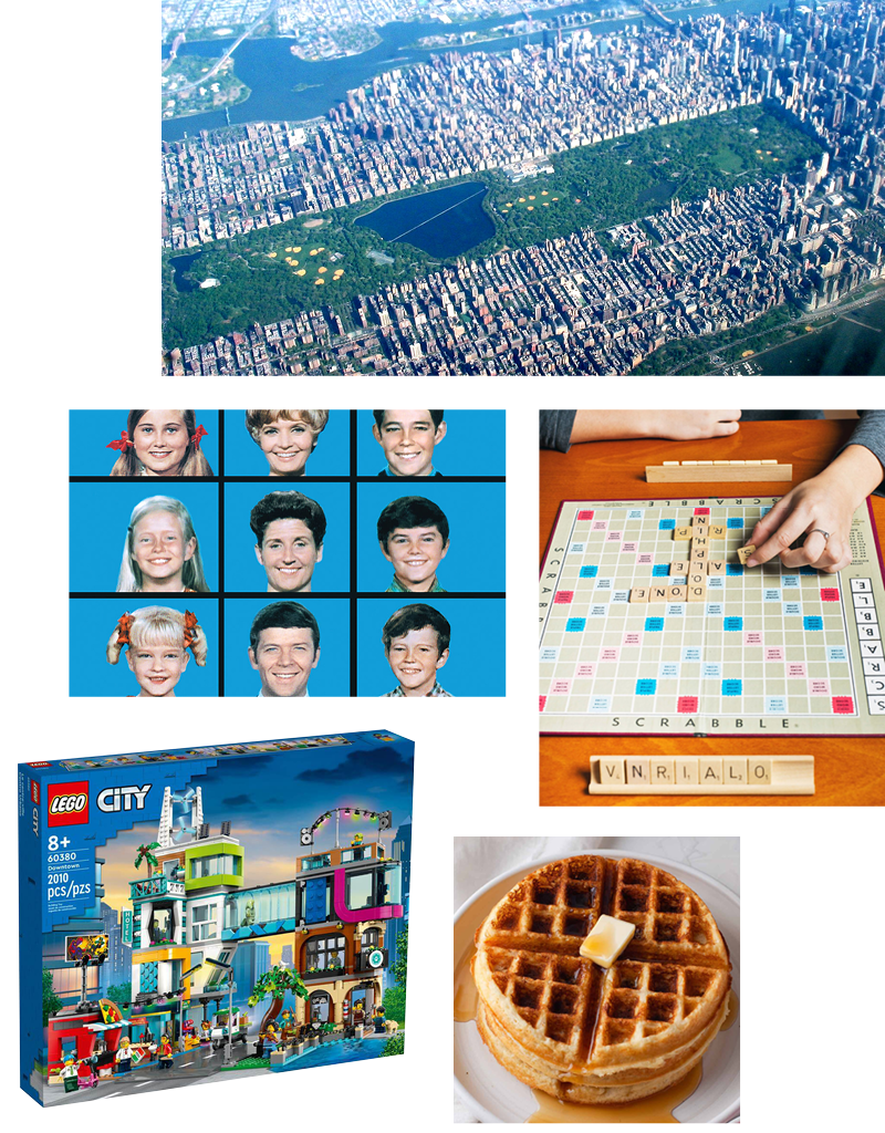
Figure 1. Life is a grid—from urban planning to breakfast.
Once you start looking, you’ll see grids everywhere. And once you start designing with them, you’ll understand why.
Why Use Grids?
Using grids helps you to align and space elements consistently. They make layouts look thought-through, calm, and coherent.
- They guide the reader. A good grid supports the hierarchy and rhythm of a page—especially when you combine it with a baseline grid, which keeps your text flowing at a steady tempo.
- They speed things up. With a grid in place, you’re less likely to struggle with the options paralysis that comes from staring at a blank page. You don’t have to think about alignment every time you drop something on the page. You work quicker, and often better.
- They help you think. A modular grid—made up of smaller subdivisions—suggests all sorts of layout options. It gives you a playground. It encourages you both to slot things into defined spaces and to push against its rules.
- They’re adaptable. A grid makes your layout scalable and responsive—especially useful when designing for screens, when the design must flex for different viewports.
- They keep things consistent. In magazines or books, a grid makes sure the rhythm and logic of one page carries through to the next, making the pages easier to navigate and gaining the trust of the reader.
Grids in History
Grids have long been used in art as a tool for structure, proportion, and composition, but after the cataclysm of World War I, art movements like the Bauhaus and De Stijl championed grids as a visual language and a way to bring order to a fractured world.
Dutch painter and art theorist Piet Mondrian’s compositions of strict grids of black lines and primary colors explored harmony and abstraction (Figure 2); Jan Tschichold’s Die Neue Typographie (1928) showed how structured layouts and functional type could bring clarity to the printed page (Figure 3). It was a landmark publication whose pages look contemporary nearly a century later, so it’s easy to appreciate that it revolutionized modern graphic design.

Figure 2. The work of Piet Mondrian (left) is now so widely reproduced it looks like a tote bag, but 100 years ago it was a radical challenge to an artistic tradition rooted in realism and narrative. Mondrian used only vertical and horizontal lines in his compositions, believing they conveyed a universal harmony and order. So serious was this philosophy that when Theo van Doesburg (right) introduced diagonal lines into his work around 1924, it led to an irreconcilable rupture between the two former friends and collaborators.
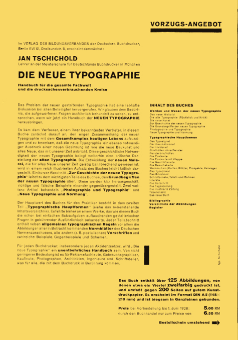
Figure 3. Publicity leaflet for Die Neue Typographie (1928)
While Tschichold mellowed in later years and rejected some of his book’s precepts, as an angry young man he was adamant that design should be about communication, not decoration. And, of course, grids (along with asymmetry, standard paper sizes, and sans serif typography) were a big part of that.
In the 1950s, the Swiss Style (also called the International Typographic Style) took grids to another level. Designers like Josef Müller-Brockmann and Emil Ruder used strict grid systems to create clean, rational, disciplined layouts (Figure 4). Müller-Brockmann’s book Grid Systems in Graphic Design (6th edition, 1996) is still a standard reference.

Figure 4. Josef Müller-Brockmann (1955). Each successive circle radiating outwards from the offset center point doubles the thickness of its stroke. It’s a fun and informative exercise to reproduce this in Illustrator using the Polar Grid tool, combined with Live Paint.
From the 1960s onwards in the Netherlands, Wim Crouwel pushed these ideas forward with a distinctly Dutch flavor (Figure 5). He also brought a technological edge to the style, particularly with his experiments in modular and digital type.
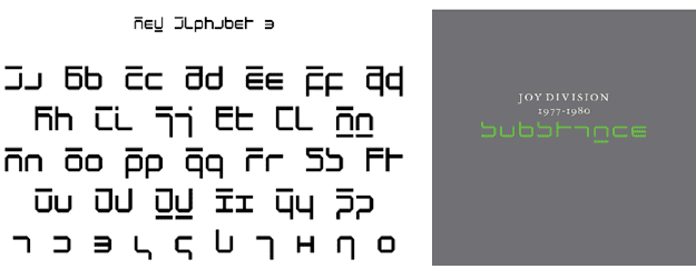
Figure 5. Wim Crouwel’s New Alphabet typeface (1967) in its entirety (left) and as used on the cover of the compilation album Substance by Joy Division, designed in 1987 by Brett Wickens (right)
In 1970s, Massimo Vignelli and Lella Vignelli redesigned the U.S. National Park Service’s brochure system based on a strict grid structure (Figure 6). The modular grid was flexible enough to be applied across a wide range of brochures, posters, maps, and other materials. This coherent approach, along with clean typography and a generous use of white space, made the brochures visually appealing, highly collectible, and very effective in conveying essential information to visitors.

Figure 6. National Park Service brochures by Massimo and Lella Vignelli (1977)
From the late 1980s and into the ’90s Paula Scher used grids in her work for the Public Theater in New York City to establish a sense of order and clarity, while at the same time breaking the grid to allow text and images to overlap and interact in dynamic ways, conveying a sense of energy and excitement (Figure 7).
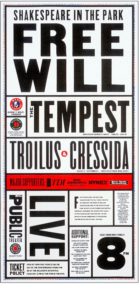
Figure 7. Paula Scher designed this poster for the Public Theater in 1995.
In the digital era, grids—whose fundamental structure you can see in Figure 8—also became essential for web and UI design, as well as for print. The Bootstrap framework uses a 12-column grid system to structure content on web pages (Figure 9), allowing designers to create flexible, grid-based layouts that adjust seamlessly and responsively across different screen sizes, from desktops to mobile devices.
Figure 8A: A blank page is divided into a 12-column, 8-row layout grid, fitted to the margins.
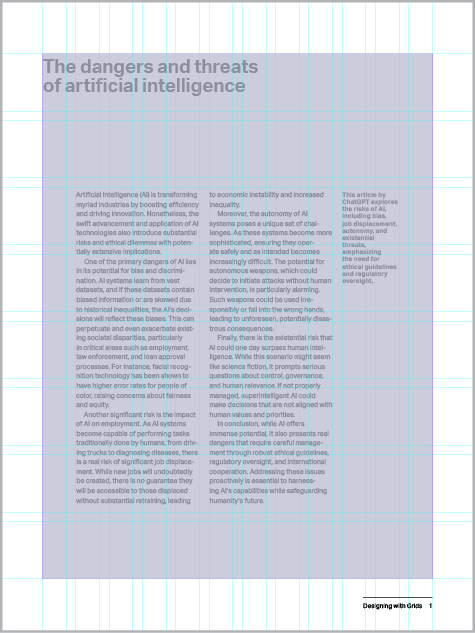
Figure 8B: The Type Area, as defined by the margins. The margins help frame the content and give it room to breathe.
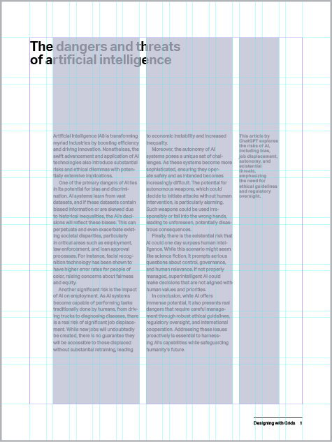
Figure 8C: Columns: Here the 12 columns are subdivided into two type columns of 4, one caption column of 2, and two white space columns.
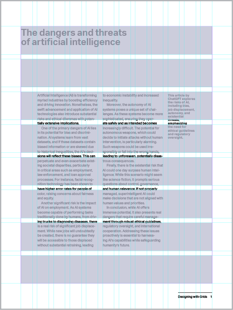
Figure 8D: Rows: A 12 × 16 grid broadly corresponds to the aspect ratio of the page and would yield square grid fields. Here, I have halved the number of rows to 8 to avoid visual clutter.
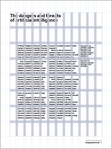
Figure 8E: Gutters help keep spacing consistent. Typically, I make these the same value as the body text leading.
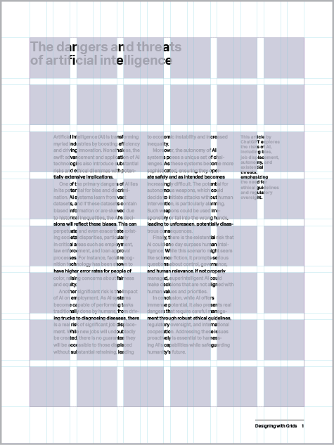
Figure 8F: Grid fields: the building blocks of the grid. Content is typically placed in their top left corner.

Figure 9. Some website column width options use a 12-column grid.
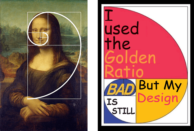
Figure 10. The Golden Spiral is found in many famous works of art and architecture. But before you get too excited about having unlocked some secret law of the universe, know that if you look hard enough, you can find it in just about anything. The golden spiral is a sometimes useful, perhaps instinctive, compositional tool, but that’s all it is.
Grids in InDesign
InDesign gives you plenty of tools to set up and use grids (Figure 11):
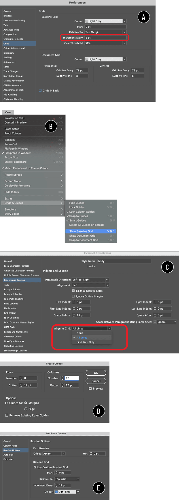
Figure 11. InDesign offers a range of features for building and managing your grid:
A: Setting the baseline grid increment in grid preferences
B: Showing the grid
C: Locking text to the grid
D: Subdividing the page
E: Adding a custom baseline grid
- Baseline Grid is like an invisible lined notebook for your text. It makes sure lines of text align across columns and pages. Usually, it matches the leading of your body text.
- Grid Preferences (under Preferences > Grids) let you set up a baseline grid—its increment, start point, and color, and the view threshold at which it becomes visible, assuming it is turned on (View > Grids & Guides > Show Baseline Grid).
- A Custom Baseline Grid can be set per text frame (the Baseline Options section at Object > Text Frame Options). This is occasionally useful if different parts of your layout need different rhythms, but if your grid is well planned, you shouldn’t need this option often. Remember, a main reason for using the grid is consistency.
- Align to Grid (in Paragraph Style options or the Paragraph panel) makes your text snap to the baseline, overriding your leading. You can choose whether all lines align or just the first line (useful for headings and captions that need some freedom).
- Create Guides lets you divide a page—or type area defined by margins—into a grid of rows and columns, each with gutters, by creating horizontal and vertical guides. With care, this becomes a flexible layout system that keeps spacing consistent and makes the most of the white space on your page.
Tip: Grids like this can get complex—full of intersecting lines, so you might consider putting the grid on its own layer, which can be hidden if required.
Breaking the Grid
Any system used too rigidly becomes an orthodoxy, and orthodoxies are boring. A grid should suggest, not dictate.
Breaking the grid doesn’t mean throwing it away. It means bending it—knowing the rules and intentionally flouting them. Overlap things. Rotate elements. Bleed images outside of the type area. Interrupt the rhythm to draw attention—then slip back into the tempo.
You don’t need to go too wild—just enough to keep things interesting (Figure 12).

Figure 12. In this 1995 piece for New York City’s Public Theater, designer Paula Scher uses grids to create both order and chaos.
A: A layout grid of 12 columns and 20 rows
B: Grid fields combined to create content areas
C: The grid broken by rotated text elements and the figure
Grids in Illustrator
Illustrator gives you several ways to set up and play with grids (Figure 13).

Figure 13. Use Illustrator’s tools and settings to:
A: Convert any shape to a guide.
B: Create a grid from a rectangle.
C: Set the constrain angle to draw shapes at specific angles. (As well as being a fun trick to play on coworkers, changing this setting can be useful if you’re working with a diagonal grid.)
- Make Guides (View > Guides > Make Guides) turns objects into alignment aids. This means that just about anything can become a guide—draw your own rectangles, lines, or shapes and convert them to guides to create custom grids.
- Split Into Grid (Object > Path > Split Into Grid) divides a rectangle into rows and columns, with control over the number of each and the gutter size. Much like Create Guides in InDesign, this feature is great for posters, infographics, and modular layouts.
- Diagonal grids aren’t built in, but you can make them manually using Make Guides or, if you’re feeling intrepid, set your Constrain Angle setting (Settings > General) to something other than 0.
- The Polar Grid tool lets you create a radial grid. It’s good for circular compositions that radiate from a center point (Figure 14).
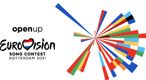
Figure 14. It’s speculation on my part, but I bet the 2021 Eurovision logo was created with the Polar Grid tool.
- The Perspective Grid tool lets you draw in in one-, two-, or three-point perspective (Figure 15).

Figure 15. The Perspective Grid tool lets you play with type in two-point perspective.
- Live Paint—perhaps my favorite Illustrator tool—lets you color sections of a grid independently. Great for mosaics (imagine what Mondrian might have done with Live Paint!) or abstract layouts.
Grids in Photoshop
Let’s not forget Photoshop, which also has some interesting grid-related tools.
- New Guide Layout (View > Guides > New Guide Layout) lets you set up rows, columns, gutters, and margins—perfect for web comps.
- The Crop tool includes several guide overlays—Rule of Thirds, Golden Spiral, and more—that you can use to help compose your image (Figure 16). Press O to cycle through the overlays. Press Shift+O to flip the orientation of the Golden Spiral.
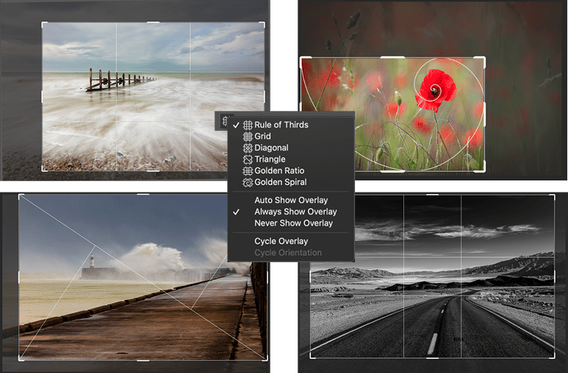
Figure 16. Trying out the crop grid overlays in Photoshop
Grid Is Good
Grids give structure, rhythm, and clarity. They make a design stronger by giving it something to lean on—and more interesting when you decide to push against their constraints. They’re not just lines on a page; they’re a way of thinking.
Once you start using grids, you’ll see the whole world a little differently. How you apply the grid is up to you. You can tread lightly or go all in; the rules are yours to make and, when necessary, yours to break.
Push back if you need to, but don’t ignore the grid. While not everyone loves a grid, even those layouts that are successfully chaotic and random looking are likely underpinned by one.
Next time, we’ll look at color—how it works, what it means, and why getting it right is about more than just picking something pretty.
Commenting is easier and faster when you're logged in!

Recommended for you

Tip of the Week: Seeing Page Sizes with the Page Tool
How to see the size of any document page in InDesign, using the Page tool.

Designing with Grids
Maya P. Lim shows how working with a grid opens up all kinds of creative design...

How to Be a Better Designer: Learn About Type
Not everyone who knows about type is a good designer, but all good designers kno...