
How to Be a Better Designer: Learn About Space
Learn how to be a better designer by arranging elements in ways that are both visually compelling and functionally useful.

This article appears in Issue 43 of CreativePro Magazine.
As designers, we organize elements within a finite space. Our designs are like jigsaw puzzles—with the key difference that we get to vary the size and number of the pieces and can fit them together in a near-limitless number of ways. That might make it sound easy, but to solve the puzzle effectively, we need to understand the figure-ground relationship of our letterforms, type blocks, images, illustrations, and other graphic components—how the eye and brain decide what the subject of the design is, in contrast to the remaining design elements in the background.
Why? Because for every positive form we create, we generate a corresponding negative space (Figures 1 and 2).
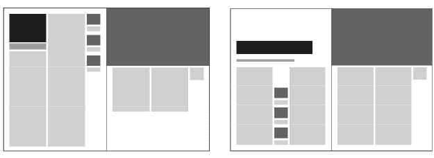
Figure 1. The same amount of content arranged over a double-page spread. On the left, the space is “left over;” on the right, the space is incorporated into the design.

Figure 2. Compare the blank page (left) to the page with the white space activated by a figure-ground relationship (right).
The interaction of the positive and negative is both our challenge and opportunity. It’s a challenge because it’s harder than it looks. With so many “right answers” you can lose perspective on what’s the “best” solution. The opportunity is that these spaces allow us to arrange elements in ways that are both visually compelling and functionally useful.
Accentuate the Negative
Many years ago, in Brighton, there was a second-hand bookshop that was piled from floor to ceiling with books. The stacks were at differing heights with narrow passages between them, and there was no discernible order or method. The bookshop had been there forever and would seemingly continue to be there forever. Legend had it that if you asked for a book, the owner would know exactly where to find it, no matter if it were buried beneath piles of other, unrelated books, no matter how long it had been there.
While such eccentricities can be both brilliant and charming, clutter is rarely beneficial in graphic design. A chaotic layout may evoke a specific mood or style, but it’s usually the mark of a novice designer. Just as when we’re nervous or “winging it” we might be prone to babble, designers unsure of themselves tend to overcompensate with more stuff. It’s an understandable impulse and very human, but it’s an impulse we should resist.
When faced with a design challenge, instead of adding more to the fray, consider doing the opposite: Increase the negative space—the area devoid of content—to bring clarity and focus to the content you already have.
Confident design means allowing certain areas to remain unoccupied, ensuring that the remaining content carries more impact. (See the sidebar “An Exercise in Minimalism.”) What you leave out is as important as what you put in; the notes you don’t play allow those you do to soar.
Part of this process may be reducing the amount of content you already have: Interrogate every element of your design for its purpose. If you can’t articulate a reason for including something, it’s probably unnecessary. When in doubt, leave it out.
Negative space is also referred to as white space (even though it can be any color, texture, pattern, or even a background image). To use it effectively requires confidence and an understanding of its role.
First and foremost, it is not empty space; rather, it is a designed absence that enhances presentation and context. Instead of filling every inch of a layout, the crafted use of negative space makes the fewer positive elements that are present more engaging and meaningful.
In a visually cluttered world, designs that employ white space stand out. When everyone is shouting, the calm, assured voice commands attention—even if the current state of the world belies this maxim.
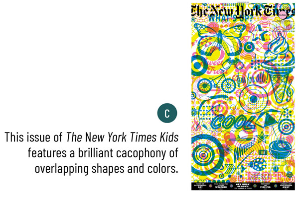
White space provides structure, emphasis, and coherence to a layout. A blank page remains empty until something is placed upon it; once an element is added, the surrounding area transforms into white space. Without it, content can become overwhelming, making it difficult for viewers to determine the hierarchy, to know what’s important, and to navigate the design. (See the sidebar “Changing Times.”)
The Challenge of Selling White Space
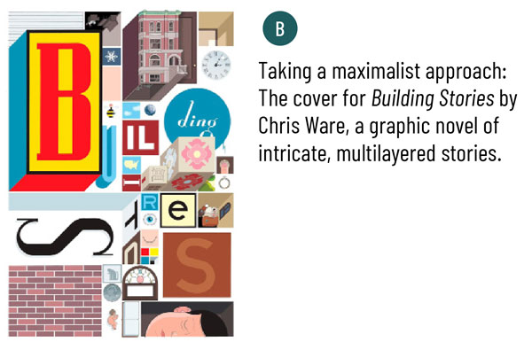
This is all very well in theory, but white space can be a hard sell to clients unfamiliar with design principles. In print media, where space is at a premium, clients often feel compelled to maximize content density. The impulse to fill every available space—to say as much as possible, as loudly as possible—is difficult to counter. Many humorous internet parodies, such as White Space Eliminator and Make My Logo Bigger Cream, highlight this tendency.
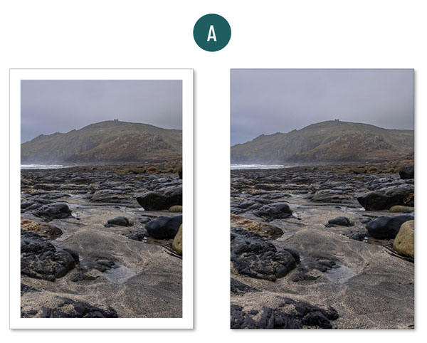
Convincing a client to use more white space may require shifting their mindset from seeing it as “empty” to understanding it as a powerful design tool. In your argument, frame the white space as making the content easier to read, scan, and understand. And because nothing convinces like a before-and-after comparison, show your client by simplifying one of their cluttered designs with more white space. Let them marvel at how much cleaner, more modern, and credible it looks.
Additionally, you might want to make the connection with high-end brands and show how they use white space to signal confidence, clarity, and sophistication. More space equals more perceived value.
Micro and Macro White Space
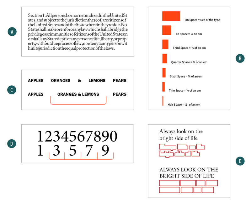
White space is both micro and macro. At the micro level, it’s all about readability and operates on an almost subliminal level. It includes spacing within and around letters (an important aspect of your font choices), between letters, between words, and separating lines of text. (See the sidebar “Micro Spacing Affects Your Design.”)
The mindful arrangement of these words in accordance with long-established conventions enhances readability and comprehension. This applies both to a text-heavy scientific journal and a glossy perfume ad with nothing more than a tagline.
In a crowded layout, the use of white space is perhaps even more important. Without everyday workaday devices like indents, sufficient leading, section breaks, pull quotes, callouts, and sidebars, the text will struggle to communicate.
At a macro level, white space reinforces hierarchy. We naturally assign more importance to design elements that are bigger, bolder, surrounded by space, or a combination of all three.
Macro white space also makes layouts more approachable and more enjoyable. (See the sidebar “Negative and Positive Space.”) Just as cities need parks and public space, publications need white space to provide visual rest and balance.

This space can be symmetrical or asymmetrical. Centered compositions result in passive white space that is equal on either side of the figure. Done well, you’d call it classic; done badly, you’d call it static. Asymmetrical layouts, on the other hand, activate the white space above or below, left or right of the figure.
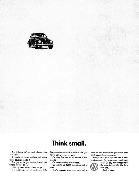
Done well, you’d say it was dynamic (Figure 3); done badly, you’d call it unbalanced.
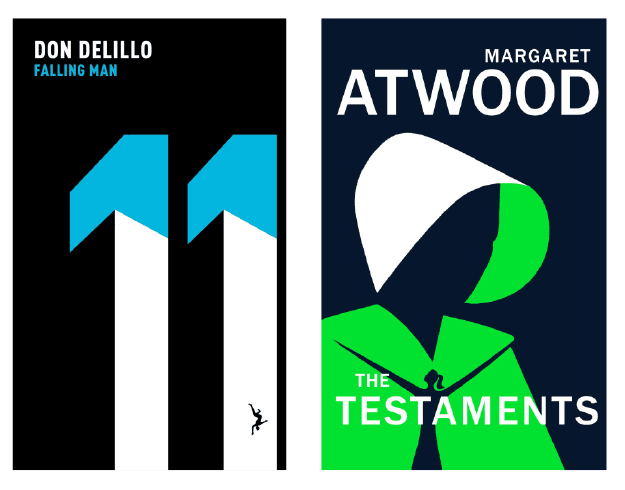
Figure 3. Noma Bar makes ingenious use of negative space on the book covers he designs.
Too Much of a Good Thing?
Discussions of white space are usually about how and why to add more, but there are times when too much white space can backfire.
Although its generous use can communicate elegance and exclusivity (think high-end store with minimal displays versus crowded discount retailer), it can come across as snooty or tone deaf if your client is a nonprofit or selling a budget-conscious product. Additionally, excessive blank areas look environmentally irresponsible in print or make a design look unfinished or lacking substance.
Just like with everything else, context is everything. And there are times when eliminating the white space with intent adds impact. (See the sidebar “White Space with Intent.”)
Never an Afterthought
Margins, spacing—between the letters, the words, the lines, the columns—and the relationship between text and images: All contribute to a design’s effectiveness. White space or its absence should never be an afterthought, but a fundamental design tool.
While designing with white space is partly intuitive, it also benefits from a structured approach. Which leads me conveniently to next month’s topic of the importance of designing with a grid: a system to help you organize all that white space.
Commenting is easier and faster when you're logged in!

Recommended for you
How to Be a Better Graphic Designer: Sweat the Details
Nigel French reminds us how much the little things matter in design.

How to Be a Better Designer: Step Away from the Computer!
Look away from the screen to find yourself as a designer

How to Be a Better Graphic Designer: Do It Yourself
Doing it yourself pushes you to move beyond your usual tools and deepen your und...