
How InDesign Understands Fonts
A daring exposé of the numerical truths behind all those characters you type.

This article appears in Issue 94 of InDesign Magazine.
Psst! Want to hear a little secret? Fonts are not what you think they are!
Most people think that fonts are a collection of characters, or glyphs, such as the letters of the alphabet, numbers, and odd symbols. But actually, fonts are software programs that include thousands of instructions. Of course, most of those instructions do describe glyphs—most importantly, how to draw them, and how to adjust them in low-resolution displays so they’ll be more readable.
Fonts also often include a variety of instructions for how and when to swap characters. For example, font software can be programmed to know that an f followed by an i can be substituted with the fi ligature (a single character that acts as a combination of the two glyphs). Similarly, some fonts have instructions to swap out fractions, swashes, old style numerals, and a wide variety of other special characters.
The font can’t do the substitution alone, of course. It requires a partner, and in our case, that partner is Adobe InDesign. Our favorite page-layout app communicates with the font—requesting information, directing the font, and so on—like a dance, where each performs its part.
Few InDesign users ever think about this dance, but I believe you should know about it because of what I humbly call “Blatner’s Third Rule of Design and Publishing”: The more you understand about the technologies you use, the more efficient you will be as you work. To see my other “rules” check out this article on LinkedIn.
Software Versions
If fonts are software, then they probably have versions, right? In fact, this is true: There are often multiple versions of a font, and you can typically see that by selecting the font file and choosing File Info (Mac) or Properties
(Windows). But there’s an even easier way, from within InDesign: Choose Type > Find Font, and then choose the font from the list of fonts used in your document, and then click the More Info button (Figure 1).
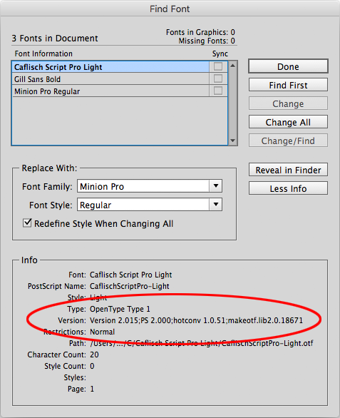
Figure 1: The More Info button in Find Font lets you find where a font lives on disk and what software version it is
In some cases, you’ll see a simple version number. I’ve seen some versions that include their creation date, too! In other fonts (especially those from Adobe), you’ll get a mouthful of numbers, including a PS (PostScript) version, and hotconv and makeotf.lib versions. The latter two have to do with Adobe Font Development Kit for OpenType, and you can generally ignore them.
Font developers create new versions of fonts for the same reasons software developers release new versions of an app: to fix bugs and add features. Unfortunately, it’s often a real pain to keep track of various versions of fonts, and you may have more than one version of a font on your computer!
In most cases, an old version of a font won’t be a big problem, but sometimes it can cause deep mysteries. For example, when you open InDesign’s Bullets and Numbering dialog box, you might see a really weird bullet option that appears like an A with several accents. (Other InDesign users may see a pretty ornamental bullet instead.) This is a font versioning problem that I explain in this article.
Unicode and GID
When you type the letter A, InDesign doesn’t ask the font how to draw an “A.” Rather, it has to convert the character into a number (remember, computers really only understand numbers). This is called encoding. Actually, each character is represented by one or more different kinds of numbers!
ASCII. In the old days, each character you could type had an ASCII number. For example, the letter A is encoded as the number 65. Unfortunately, this number limited each font to 127 characters. So InDesign doesn’t bother with these. (But I’m including it because I know that someone is going to complain if I don’t mention ASCII!)
Unicode. The Unicode system was created as a single encoding system that could include almost every possible character, not just in every language, but even symbols. Every glyph has a Unicode number—even emoji characters and musical notes. There are over 128,000 different characters specified in Unicode! Unicode numbers are written in hexadecimal (base 16) so they’re often a combination of numerals and letters from A to F. For example, the letter A is Unicode 0041, and the infinity symbol ? is 221E (often written U+221E). In InDesign, you can find a character’s Unicode value by selecting it and looking in the Info panel (Figure 2).

Figure 2: The Info panel shows a selected character’s Unicode number.
GID. Unfortunately, even with all those Unicode positions, there are still many characters that don’t have their own Unicode number. For example, Adobe’s Minion Pro font has 26 different “bullet” characters, each assigned the Unicode number 2022! So InDesign tells them apart with a GID (“glyph ID”) number. So GID 1253 is like “the 1,253rd character in this font.” You can find a character’s GID number by hovering over it in the Glyphs panel (Figure 3).

Figure 3: The regular bullet character is Unicode 2022… but as you can see in the Glyphs panel, there are many other characters in this same font with the same Unicode number, including this moon symbol.
However, a character’s GID is not always the same in each font—the letter “A” has a GID of 36 in one font, a 34 in another… it depends entirely on the font and how the designer created it.
Note that GID is an InDesign-specific thing—it doesn’t always extend to other programs. That’s why you might choose a specific kind of character (like a fancy bullet) in InDesign, but get a normal, boring, round bullet after you export to EPUB, HTML, or a Word/RTF file. Fortunately, you should always get the correct character when you export to PDF.
Dreaded Pink Tofu
When you type an A in InDesign, the program records that internally with the Unicode number and the GID number (along with the font name). As I said, some fonts have alternates with the same Unicode number, such as swashes that you can select (Figure 4).

Figure 4: In recent versions of InDesign, you can choose a glyph alternate by selecting a character and hovering over the blue underline. In CC 2015 and earlier, you can find alternates in the Glyphs panel.
When you do that, the Unicode number typically stays the same, but the GID number changes.
Let’s say you then change the formatting of the text by applying some other font that doesn’t have that same alternate glyph. In that case, InDesign uses the underlying Unicode value and replaces the swash-A with a regular A.
However, here’s a different scenario: Let’s say you use the Glyphs panel to insert some truly odd character, like the one in Figure 5.


Figure 5: When you insert a special character (in this case, with the Glyphs panel) and then change the font, you may get pink tofu!
(Note: If you often need to add special characters and want to learn how to do it without the Glyphs panel, see my article “Insert a Character by Unicode or GID” in the Best of the Blog.)
If, after you insert the character, you change the text to another font, and that font doesn’t have a character with that Unicode value, then InDesign gives up and provides what is affectionately known as “tofu,” highlighted in “the dreaded pinkness.” (The word tofu refers to the shape of the placeholder rectangle, which may or may not have an X in it.) Worse, in some fonts, you get only a space with pink highlighting (not even a rectangle character).
Personally, I wish that InDesign would automatically default to the nearest font that does include that Unicode character… but no, you just get that rectangle (and yes, it still looks like that when you print or export to PDF). The only solution is to choose a different font that includes that character.
If you’re concerned that you may overlook these kinds of missing characters, I encourage you to create a custom preflight profile (Figure 6).


Figure 6: You can create a custom preflight profile that finds when a font or glyph is missing.
That way, the Preflight panel will quickly identify whenever you have a glyph problem. (For more information on building preflight profiles, see issue 61.)
The Biggest Font in the World
The OpenType font format was designed so over 64,000 glyphs would fit in a single font file. However, most fonts contain only between a few hundred and a few thousand individual characters. That’s plenty to cover most publishing needs. But what if you need many more characters? Chinese and Japanese fonts often have over 10,000 glyphs. And James Kass created a font called Code2000 that has over 53,000 Unicode characters. Unfortunately, there are over 110,000 characters defined by Unicode, and they cannot all fit in a single font. So Google decided to create a family of fonts that, together, would convey the largest number of Unicode characters in the world. The result is a font called Noto—short for “no more tofu.” You can learn more about the font on Wikipedia here. This article includes a fun video about the Noto project.
Your Number is Up
Understanding the fundamentals of how font software works—and especially how InDesign thinks about fonts and “dances” with them—is essential for mastering high-quality typography. Be sure to keep your Glyphs and Info panels open (or ready to open at a moment’s notice) so that you can track, insert, and understand the special characters you need.
That way, you’ll always be ready for whatever typographical (or tofugraphical!) emergency may jump out at you from the page.
Commenting is easier and faster when you're logged in!

Recommended for you

Typographic Guidelines for Kickass Presentations
Visual presentations are a fact of life for both designers and non-designers ali...

TypeTalk: Justified Text
TypeTalk is a regular blog on typography. Post your questions and comments by cl...

Paragraph Indents: Old Standby or Old Hat?
Indenting the first line of a paragraph is one of the most basic typographic con...