
Hanging Punctuation with Optical Margin Alignment in InDesign
One simple trick to improve the look of justified type.

This article appears in Issue 44 of InDesign Magazine.
Sometimes little things can make a big difference. When it comes to typography this is especially true. One of the simplest enhancements you can make to your type—especially if you’re working with justified type—is to use Optical Margin Alignment.
What is Optical Margin Alignment?
Have you ever noticed how punctuation at the margin of a text frame can make the left or right sides of a column appear misaligned? When a line begins with punctuation, like an opening quotation mark, or ends with a comma, period, or hyphen, you get a visual hole. Once, this was regarded as the price of progress. We could do so much more with our page layout programs-did it matter that we had to forgo a few niceties? But today, with InDesign’s Optical Margin Alignment, we can easily ensure that punctuation, as well as the edges of letters, hangs outside the text frame or column margins so that the column edge remains flush (Figure 1).
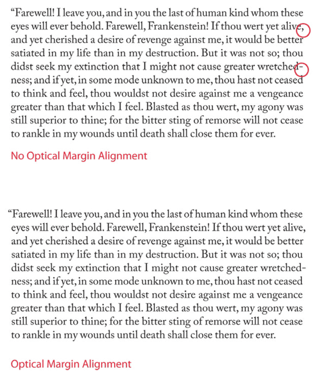
Figure 1: The text is the same; the margin alignment is not.
This makes Optical Margin Alignment especially beneficial when working with justified text, but even with left-aligned text, the first character of the line will “hang” outside the text frame.
Optical margin alignment isn’t to everyone’s taste. Some consider the look of optically aligned text too fussy, preferring instead to have everything contained within the text frame. Perhaps they became accustomed to text columns that weren’t optically aligned during the early days of desktop publishing because it wasn’t possible, in the same way as some people have become so accustomed to the taste of instant coffee that they prefer it to the real thing.
How to Use It
Optical margin alignment is controlled through the Story panel,
which is perhaps the simplest panel in InDesign (Figure 2). You select the story you want to align, either with the Selection tool or the Type tool, choose Story from the Type menu, check the box and you’re good to go. The only user-defined option is the font size, which determines the amount of overhang.

Figure 2: To apply Optical Margin Alignment, just choose Type>Story and check the box. The point size should correspond to the size of your type, but 12pt works well for Align Left Edge.
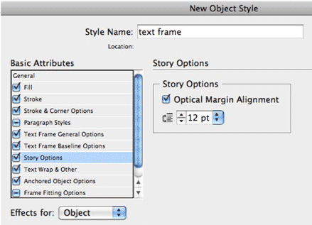
Figure 3: Incorporating Optical Margin Alignment into an Object Style.
When to Avoid Optical Margin Alignment
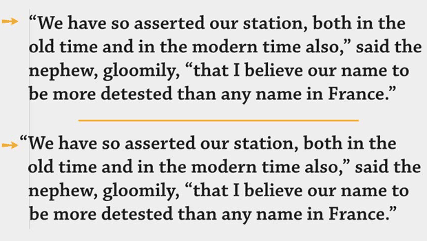
There are certain types of paragraph that won’t benefit from optical margin alignment. The left edges of bullets and numbered lists, for example, should remain flush. To do this, choose the Ignore Optical Margin Alignment option in your Paragraph Style Options (Figure 4). Or, if you want to turn it off manually—as a local override to a particular paragraph-you can select Ignore Optical Margin from the Control or Paragraph panel menu.

Figure 4: In both examples, Optical Margin alignment is turned on for the story. But in the example on the right, the numbered paragraphs ignore Optical Margin Alignment. Note how the “1”s align better.
Hanging Punctuation
A couple other InDesign features are closely related to Optical Margin Alignment. The first is the Indent to Here character, which can be used to good effect on display text— especially pull quotes and callouts that begin with a quote mark—to create a hanging indent and thus maintain the flushed edge of the text (Figure 5). You can hang an opening quote mark using the Indent to Here character: Cmd+\ (CtrI+\). This special character indents all subsequent lines in the paragraph to the point where you add the character, fixing the optical hole on the left edge of the text.

Figure 5: A hanging quotation, before and after. The Indent to Here character is inserted after the opening quote mark.

Figure 6: Click the Align Left Edge checkbox to keep opening characters flush with the left edge of the text frame.
Commenting is easier and faster when you're logged in!

Recommended for you

Turning Off Hanging Punctuation for Quotes in Middle of a Paragraph
The art director said "only hang quotes at the beginning of a paragraph"! This l...
TypeTalk: Hung Punctuation & Optical Margin Alignment
Learn how to create the appearance of a more optically-aligned edge for your tex...

Tip of the Week: Using Optical Margin Alignment
This InDesign tip on using optical margin alignment was sent to Tip of the Week...