
Going From Print to Ebook: Next Steps
Laura Brady shows how to making reflowable EPUBs more appealing and usable.

This article appears in Issue 108 of InDesign Magazine.
One of the foundational principles of ebooks is that they are flexible and ready for the reader to personalize in ways that the developer couldn’t anticipate. The idea is that it is not up to the people who make ebooks to dictate how consumers read them. So if your audience wants 30-point type on a loose line height and fully justified with gaping holes on the page/screen, then that’s their right. They change the fonts, manipulate the layout, fuss with the justification until the reading experience suits them, potentially in ways that make designers gasp in horror (Figure 1).

Figure 1. My mother’s ereader at the settings she enjoys. It was a harsh shock to my system to see this layout.
This is one of the key affordances of ebooks: they are what the reader needs them to be.
And while I have long proselytized that a good ebook is one that is well-coded and ready for the user’s preferences to be layered on top of that solid framework, I am excited to bring this message as well: ebooks can be a thing of beauty, too. No joke. And to prove it, I am going to use the example of Nigel French’s article “Book Design: A Guided Tour,” from the January 2018 issue of InDesign Magazine to demo the ways and means. I’ll walk you through some important fundamental techniques for good ebook design used in that project, and then show other samples of successful ebook designs provided by some of our colleagues, including relevant code snippets along the way.
It All Starts with Structure
It’s fair to say that if all the InDesign files
that I received to convert to ebooks were in the same shape as Nigel’s was when he sent it to me, I would be a very spoiled ebook developer. Real life is rarely this easy. Nevertheless, there were still a few things I had to do the file to prepare it for ebook export, in addition to the usual ebook export cleanup work. And by “prepare,” I mean use smart formatting and techniques to make the components of the book work smoothly and aesthetically.
White Space Items
Em-spaces won’t export to ebooks. Unfortunately, when setting poems, the designer used em spaces to stagger the poem indents—a fairly common way to accomplish this kind of spacing (Figure 2).

Figure 2. Em spaces won’t export to EPUB.
Only non-breaking spaces will hold during an EPUB export. I could replace these em spaces with non-breaking spaces (Command+Option+X on a Mac, Ctrl+Alt+X on Windows). However, in this case, I opted to create a fresh paragraph style for those paragraphs, with a different indent value.
Chapter Titles
A common challenge for ebook developers is how to treat the chapter number versus the chapter title. In most InDesign files, these are two different paragraphs, each with its own paragraph style, which feels logical. In an ebook context, it makes sense to use a different treatment. I want the chapter number and the chapter title to be part of one <h1> tag, likely at the top of an HTML file. Structurally, it doesn’t make sense for the chapter number to be an <h1> and the title an <h2>. For accessibility reasons as well—making an ebook accessible to vision-impaired readers using read-aloud software—those two pieces should be part of one header.
The way that I remediate a file with separate paragraph style treatment for chapter names and numbers is to merge them, separating the two parts by a soft line break (Shift+Return) and keeping the chapter number paragraph style, and then applying a character style to the chapter title (or vice versa). See Figures 3 and 4. This isn’t just me; it’s a current industry best practice.

Figure 3. Merging the chapter number and chapter title

Figure 4. The resulting HTML markup.
Object styles
I was so pleased to see that Nigel anchored all the images in the text so that they flow nicely with the text. But he went one step further and helpfully applied an object style to the images! So there was little I had to do to prepare the images for export. But I will edit the settings for the “initial cap” object style slightly, by changing its Object Export Options. In order for it to flow in the text in a way that is similar to the print book, I will assign some custom settings to the object style, the most significant of which is “Float Left” (Figures 5 and 6).

Figure 5. Object Style Options for the initial caps.
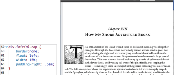
Figure 6. This CSS (below) will create a nice drop cap of that artwork (right).
Page Lists
A page list is a separate navigation tool that is synched to the print page breaks. This EPUB 3 feature means that it is much easier to use print and digital books simultaneously in, say, a classroom. Or a book club. It also adds a very nice layer of navigational richness to any ebook. Read more about page lists and how to create one from within InDesign here.
Navigation
There are two very nice pieces of navigation already built in this file: a table of contents and a list of illustrations. I will leverage both of these constructions for the ebook, with slight modifications. First, the inline table of contents (the TOC that often comes after the copyright page in the print book) doesn’t need hard page numbers, because it will have hyperlinked chapter titles. In fact, the presence of print page numbers in that TOC would not only be redundant, it could make for a slightly puzzling reading experience. That said, I will also build a print-corollary page list into the ebook’s navigation (see the sidebar “Page Lists”).
The next step is to add some semantics to the InDesign file. What do I mean by semantics? I think this quote from Matt Garish in his book, Accessible EPUB 3, says it best: “Structure is the elements you use to craft your EPUB content, and semantics is the additional meaning you can layer on top of those structures to better indicate what they represent.”
Semantic inflection is also an important concept. It refers to a layer of coding on top of the HTML markup that allows more precise meanings to be applied to generic HTML tags. Sometimes reading systems will use that semantic inflection to prescribe a specific behavior, like pop-up footnotes.
I will add semantic inflection to both the List of Illustrations and the Table of Contents with Object Export Options. First, I select a text frame and choose Object > Object Export Options. In the dialog box, I click on EPUB and HTML. Then, from the epub:type flyout menu, I choose epub:type=”loi” for the list of illustrations and epub:type=”toc” for the table of contents. This same menu contains a full set of epub:type choices, so you’ll never have to type any of this semantic inflection code (Figure 7).

Figure 7. epub:type semantics are added via the Object Export Options dialog box.
Now, InDesign does need a little coaching to get this List of Illustrations into the navigation proper. It will automatically be part of the Landmarks (see the sidebar “EPUB Landmarks”), but you will have to edit that inline listing into a <nav epub:type=”loi”> list in the toc.xhtml document. Doing that will get you a drop- down menu with an extra way to navigate into the content in some reading systems, like Adobe Digital Editions (Figure 8).
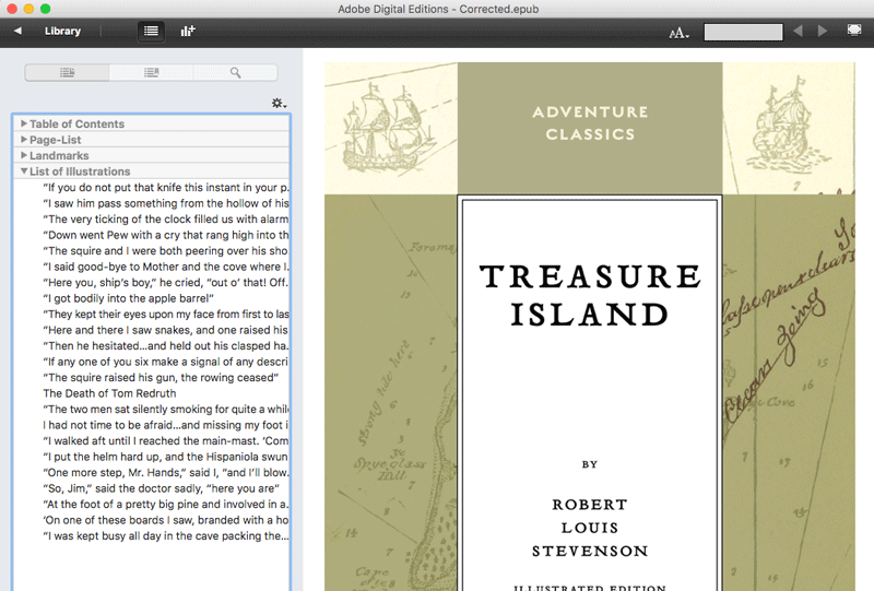
Figure 8. List of Illustrations as seen in Adobe Digital Editions.
EPUB Landmarks
Another key feature of EPUB 3 is landmarks. In much the same way that a page list can add to the richness of you ebook’s navigation, landmarks provide another way into the content by marking the structure of your book with semantic tags that make it machine readable—and the easier it is for reading systems to parse content, the more able they are to present that content in a broadly accessible way. In short, marking the landmarks makes your content easier to use, read, and comprehend. In addition, it’s a good idea to mark basic things like the start of body content and the table of contents (epub:type=”bodymatter”, epub:type=”toc”). A full set of landmarks—frontmatter, bodymatter, backmatter, toc, list of illustrations/figures/maps, page list, copyright page, contributors, endnotes, index, glossary—both makes the books easier to use for a variety of readers and makes the conversion to MOBI (Amazon’s Kindle format) easier.
Let’s Get to the Good Stuff
Now that the technical preamble is done, let’s get to the design part of this design essay, shall we? Nigel’s layout of this title is elegant, thoughtful, and very pleasing to the eye. Does it hold up when exported to EPUB? You tell me. To my eye, this particular title looks mighty fine in the various reading systems (Figures 9–12).

Figure 9. The view from iBooks is the most typographically sound.

Figure 10. Definitely holding its own in Adobe Digital Editions.

Figure 11. How a chapter opening spread looks in the Readium plug-in for Chrome.

Figure 12. Were I uploading this title for sale, I would edit the version that I sent to Kindle. I would reduce the chapter start drop, and tighten the line height a smidge. It’s fair to say that the font isn’t working as nicely here as in the iBooks and Digital Editions versions. You can see that most clearly in the difference in the weight of the capitals and the small caps in the chapter title.
Note that I have opted out of justification intentionally. This is a lovely font that would likely lend itself to fully justified text without issue but, in general, I don’t trust the reading systems to achieve justification well. None of the views (Kindle, iBooks, Digital Editions, and so on) have terrific built-in hyphenation dictionaries, the CSS controls over the number of hyphens in a row are weakly supported at best, and there is no reasonable way to prevent the text from getting gappy (Figure 1).
As type designer and typographer Charles Nix noted: No amount of finessing will make justified type work well on a short measure (line length). There just aren’t enough characters on the line to play the game of distributing space and hyphenating words. On the Kindle, where full justification is the default, smooth, agreeable typography is… well, just not possible.
More Design Samples
The Treasure Island sample is one prism through which to view ebook design. While preparing to write this piece, I polled some of my colleagues for their finest samples of design. And, living up to their generous, collaborative reputations, my #eprdctn friends delivered. Let’s have a look at some great ebook designs.
Figure 13 shows a simple yet elegant page design from Kevin Callahan that has fairly straightforward CSS (Figure 14) and uses the default serif font built into the reading system, but the effect is studied and confident. Despite the lack of frills, the designer here understands white space and uses it well.
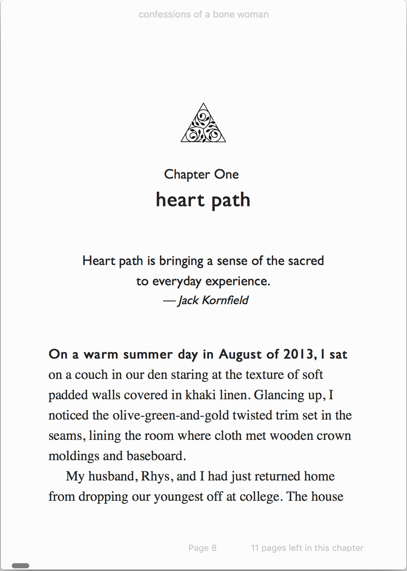
Figure 13. From Confessions of a Bone Woman by Lucinda Bakken White. Published by Wild Woman Books

Figure 14. The corresponding CSS from Bone Woman.
Switching gears, but not designers, a second sample from Kevin shows slightly complex non-fiction content using white space, color, and other design elements to present a chapter opener with a lot of information. Figure 15 shows a graceful chapter drop and font switching to achieve the variegated display of different parts of the chapter opener. The underlying CSS is shown in Figure 16.
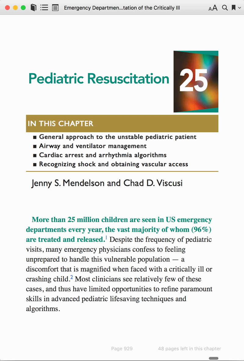
Figure 15. Emergency Department Resuscitation of the Critically Ill by
Michael E. Winters. Published by American College of Emergency Physicians

Figure 16. The CSS acting on that page.
The next design sample (Figure 17) is from Ron Bilodeau, an ebook developer from O’Reilly Media who also freelances. The Art Space Tokyo book from which these samples are drawn is ancient in digital publishing timeline terms (it’s from 2010), but holds up as a sterling example of clean, functional page layout, thoughtful font use, and employing color meaningfully and to great effect.


Figure 17. A number of spreads from Art Space Tokyo.
The thoughtful hanging indents on page 2 of Figure 17 are powered by a paragraph style, and then a span style with hidden brackets; the brackets furnish the exact amount of white space for alignment within the layout. Tricky to achieve, but oh so well done here. (Figures 18 and 19.)
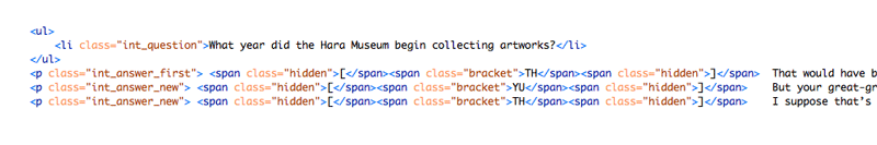
Figure 18. The HTML underneath the Q&A hanging indents on page 2 of Figure 17. The TH/YU refer to the speakers in the text. The hidden square brackets give it exactly the right amount of space to form a nice hanging indent.
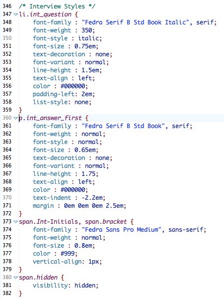
Figure 19. The styles driving that elegant rendering of the page.
Print Hangovers
One of the streams of my conversations with publishers and authors is convincing them that yes, their print design is lovely and important, but that they shouldn’t necessarily try to recreate that in an ebook by using the fixed-layout format. (Besides accessibility issues, the “design replica” look of fixed-layout ebooks is not supported at all well on Kindle devices and apps, cutting out around 70% of an ebook’s potential market.) This often means pointing them to examples of print-to-digital transitions that are both reflowable and successful.
Figure 20 is from Colour and Two-Dimensional Design. The flow of an ebook is necessarily much more linear than print. This print design looks dramatically different as an ebook, but because it’s reflowable it is still highly usable as a classroom text. The images are very important to the text and have loads of resolution to double-tap and use pan-and-zoom gestures to explore.

Figure 20. The left-hand image is from the print book, the right-hand is the ebook. From Glenn McArthur’s Colour and Two-Dimensional Design (OCAD)
This next example is also from an ebook that I created. The source material was highly designed, magazine-like in feel and tone, with many graphics and images sprinkled across the pages. A few design elements were necessarily lost in the transition to ebook, including the full-bleed image. But there were few sacrifices in turning this graphics-heavy book into a nice-looking ebook (Figure 21).
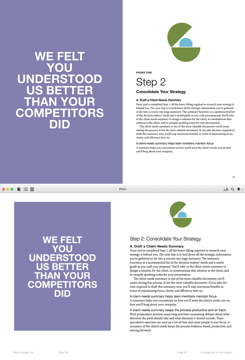
Figure 21. From Hamish McKenzie’s Pitch (Parcel Design/Canadian Writers Group)
One need only have a quick look at the rich designs of cookbooks on the ebook market to see that the informational presentation of words and pages of detailed information in digital publishing is thriving. Lavish page designs can translate to ebooks without loss of character or tone, and with the added advantage of extra usability that print can’t compete with—like recipe lists, double-tap full page images (on iOS), and instructional video. Figures 22 and 23 are pages from of a couple of recipe books and a peek at the CSS making them look so nice.

Figure 22. From Superfoods at Every Meal (Fair Winds Press)
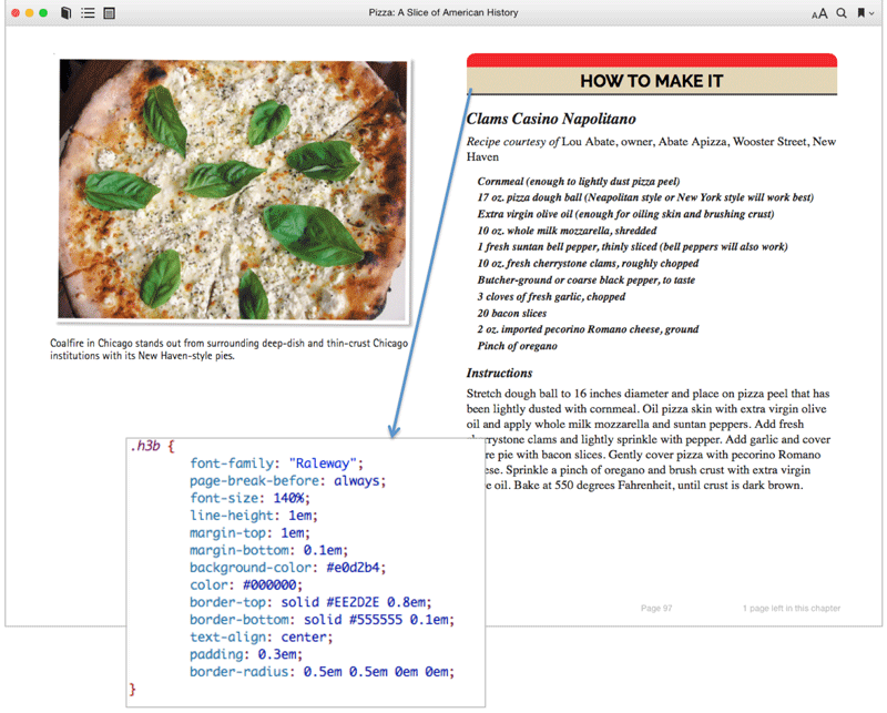
Figure 23. From Pizza: A Slice of American History (Voyageur Press)
Finally, in case you need any further proof that ebook design is alive and well, maybe even flourishing, have a look at this set of images (Figure 24). These snapshots are from an iPhone in the Kobo app. Pretty, huh?
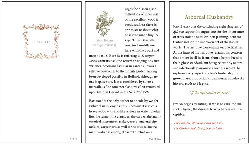
Figure 24. From The Hidden Life of Trees (Greystone Books)
The Next Generation
If ebooks are your business and book design is your passion, I hope you can see that the full force of book design can be brought to bear in executing successful ebooks. They don’t have to look like bare-bones, ill-thought-out Word files. Use some of the code samples here to level up the design of the ebooks that you touch, and be grateful for the amount of control we actually have over this decidedly user-controlled format. It’s not really all out of our hands, after all.
Commenting is easier and faster when you're logged in!

Recommended for you
Creating an Animated Bar Chart in InDesign
Editor’s Note: this post was excerpted from Diane’s handout from Cre...

This Week in InDesign Articles, Number 43
Whether you're into interactive or print, there's always more to learn about Ado...

InDesign Magazine Issue 122: Cross-Media Color
We’re happy to announce that InDesign Magazine Issue #122 (June 2019) is no...