Free Fonts: Are They Worth It or Not?
One of the most frequent questions I am asked by students and designers alike is, is it worth it to buy fonts when there are so many free fonts available? Having worked with dozens of typeface designers during my years as director of typeface development for ITC (International Typeface Corporation), I have a strong, somewhat emotional reaction to this. But truth be know, the answer is not a simple yes (or no). It is an important query that deserves a complete, in-depth reply.
A bit of history
Prior to the digital age, typefaces were drawn by hand, that is, with pencil, pen and ink, and paper or vellum. It was an extremely lengthy, painstaking process that often took months to complete a single typeface, and even years for a typeface family. No matter what the historical era or timeframe, designing a typeface is a skill and an aesthetic that takes years to learn to do properly. The design process not only consists of drawing individual glyphs that make up the complete character set of hundreds, if not thousands of characters; it also requires the knowledge of how to properly space and kern the characters in order to create even “color and texture.”
Most typeface designers were (and still are) self-taught, as up until the past few decades, there was no formal training in typeface design. Today, there are three programs (that I am aware of) that specifically teach this art and skill: University of Reading in the UK, Royal Academy of Art, the Hague, and most recently, The Cooper Union, NY. Even so, the majority of type designers today are still self-taught. But learning to design a typeface cannot be learned in a vacuum; it requires years of practice including acute observation of existing, well-designed typefaces, learning to use the font production software (which is a challenge in itself), as well as networking with other type designers. All in all, it takes time, patience, and a strong commitment.
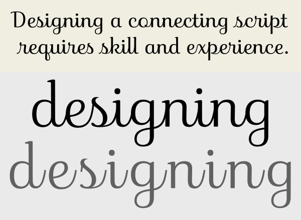
Insouciant, designed by James Montalbano of TerminalDesign, is an example of a well thought out, and skillfully drawn script. Connecting scripts are some of the most difficult type designs to draw, as they require perfectly drawn connectors that flawlessly join with all other characters. The lower example shows the unconnected individual letterforms.
I’ve divided free fonts into three categories: promotions from reputable foundries; those made by novices and hobbyists; and pirated and knockoff fonts.
Free commercial fonts as promotions
The “safest” free fonts are those that are offered by reputable font foundries and resellers. Many offer a free font or fonts as a promotion, either with a font sale or for signing up on their web site. The latter is a good thing as they often send out regular mailings announcing new typeface releases, best sellers, educational articles, and special promotions. The fonts they offer for free might be a single-weight display design, or one or more weights from a larger family intended to entice you into purchasing the rest of the family. There is nothing wrong with this – in fact, is a great way to allow a user to “try before you buy.”
Monotype (fonts.com) offers a monthly free font with any purchase, as well as flash sales.
Myfonts.com has many rotating font promotions, making the purchase of fonts more affordable if they offer the one(s) you need or like.
Note to students and educators: Some foundries and resellers offer free font collections to students for non-commercial usage (such as the Monotype Student Font Pack), so ask and you might receive.
Free fonts made by novices and hobbyists
These days, anyone can create and upload a font. So how did this come to be? The digital age, and the subsequent availability of affordable font production software, has provided the ability to anyone to try their hand at designing a typeface. This, in turn, has resulted in many type design hobbyists and typographic “weekend warriors” with little or no training and experience producing fonts, many of which they make available for free. These amateur efforts frequently have inferior and inconsistent design traits, digital outlines with bumps, bad curves and unnecessary points, as well as uneven spacing and poor (or non-existent) kern pairs.
So what’s wrong with downloading the occasional free font that appears to look good and suits your design purpose? The problem is that most type users, including some of the most seasoned professionals, do not have the trained “typographic” eye required to easily see the difference between a well-conceived and designed typeface, and the product of a novice. Just because your design chops are finely-tuned, and you are skilled at choosing and combining typefaces, does not, in turn, mean you are able to recognize the design and spacing details that go into a finely crafted, professional typeface design. So while free fonts falling under this category might be fine for personal use, they’re usually not a reliable choice for professional usage.
This free typeface (upper) is very poorly designed, with bad proportions, inconsistent stroke widths, varying serifs, and poor spacing. Notice the bumpy spine of the ‘s’ due to the inexperience of the its author drawing curved strokes. Novices often think that geometric designs are the easiest typefaces to draw, but in reality they are some of the most difficult. Below it is a setting of Memphis, a well-drawn slab serif with proper proportions and design characteristics.
Upper: While the actual design of this free font has some merit, it contains no kern pairs, making for uneven overall spacing. It also has a very limited character set with no punctuation (except for a period) or figures. Lower: Both the letter and word spacing have been improved with the addition of manual kerning pairs, which requires skill and experience to get just right.
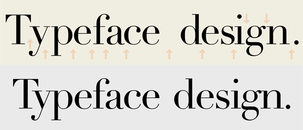
Even a well-designed typeface can have bad spacing and kerning, as illustrated by the upper setting of Didot, whose poor spacing I simulated. The actual typeface, below it, looks quite good, but that is not always the case with free fonts.
Knockoff and pirated fonts
If something seems too good to be true, it often is. This is the case with a good number of the popular free font websites, whose offerings can include knockoff fonts, as well as pirated fonts.
Here is the scoop on knockoff fonts: although there is no copyright protection on an actual typeface design in the United States and North America (unlike Europe and other countries), there is protection for the font software. That is, the digital data that represents a typeface is registrable for copyright. In addition, the name of a typeface can be registered as a trademark. (Note that copyright registration protection laws vary from country to country). What is done by some unsavory beings to get around these laws, is to take an existing font, and both change the position of some of the vector points which in effect changes the digital data (even if it doesn’t actually change the design), and also change the name of the font, sometimes to a sound-alike name (i.e. Helvetica to Helmetika, or Fenice to Pheniche). By downloading and using a knockoff font, you are, in effect, denying potential payment to the typeface designer whose work you like enough to use, which is unethical, and also illegal in the countries that do protect actual typeface designs.
A pirated font generally refers to a commercial font that is borrowed, stolen, illegally downloaded, or otherwise used with disregard for the font’s EULA (End User Licensing Agreement) that states the licensing terms for its usage. (Note that when you purchase a font, you are buying a license to use the font, not own it.) Once again, you are using something that you do not have the legal right to use, and are therefore denying payment to those who are rightfully entitled to be compensated for their work.
In summary, if you want to be assured that the fonts you use are of the best quality and meet the highest professional standards, stick to those legally obtained from reputable foundries and resellers. As type designer James Montalbano says, “A well-made font costs somewhere between $15 and $50 dollars and will probably work for 20 years. I have old PostScript Type1 fonts in my library that are over 20 years old and still function as intended. I don’t think you can say that about any other type of computer software. If that is not real value, I don’t know what is.”
* * * * *
Read about Open Source Fonts here.
This article was last modified on May 25, 2023
This article was first published on November 5, 2014
Commenting is easier and faster when you're logged in!
Recommended for you
Scanning Around with Gene: Makin’ Pages With Bruce
When Bruce Springsteen played the halftime show for the 2009 Super Bowl, it sent...

TypeTalk: Small Caps in Illustrator
Q. When I’m using Adobe Illustrator, how can I access the true-drawn small...
Remembering Legendary Man of Letters Hermann Zapf
If you work with type, you no doubt know the name of Zapf. Whether you’re...


