

The email newsletter from the Hoefler & Frere-Jones type foundry is a real gem: An eye-pleaser that also delivers useful information while soft-selling H&FJ’s wares. For instance, the most recent missive includes four techniques for combining fonts, “all built around H&FJ’s Highly Scientific First Principle of Combining Fonts: keep one thing consistent, and let one thing vary.”
I’ve included the basic principles and four examples below, but you really owe it to yourself to read the newsletter online for more advice and samples. And then subscribe so you don’t miss the next one!
1. Use typefaces with complementary moods to evoke an upbeat, energetic air.

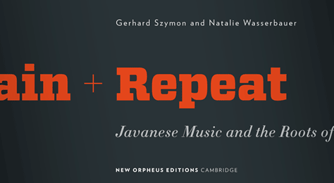
2. Mix typefaces from the same historical period whose families have different features.
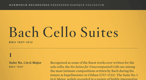
3. Mix typefaces with a similar line quality if they offer different textures.
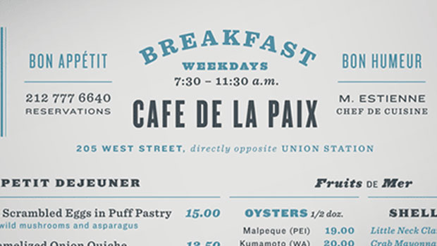
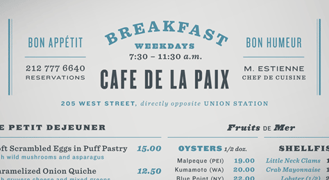
4. Mix typefaces with similar proportions and give each a different role.
This article was last modified on August 13, 2021
This article was first published on March 17, 2010
Commenting is easier and faster when you're logged in!

Recommended for you

The Art of Hand Lettering
There is something so fascinating about watching a true craftsman at work, espec...

Typodarium, the Font-a-Day calendar
What’s the best way to discover new fonts? One great way is to partake of...

TypeTalk: Typographic Emphasis
Designing with type often calls for the use of typographic emphasis in order to...