

Return to page 1.
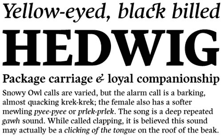
Harfang from PsyOps Type Foundry
André Simard’s angular serif face is easy to read in long texts, advertising copy, annual reports and the like; but one that also provides a crisp and stylish appeal in more prominent display settings. The “Harfang” is a Snowy Owl, the official bird of Simard’s native Québec.
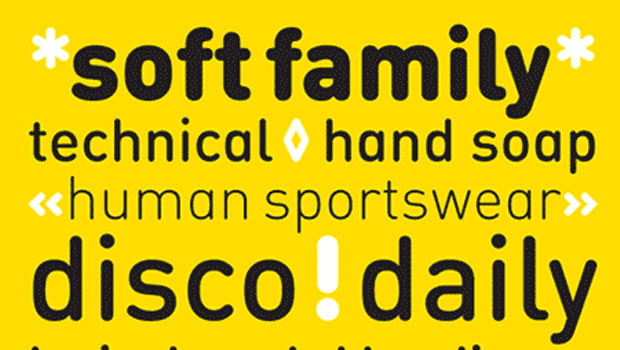
Lavigne Text & Lavigne Display from ReType
The well-received Lavigne Display now has a companion optimized for ease of reading at small sizes. Lavigne Text is as striking as more ornamental faces like Cochin and DeVinne, but with a structure designed for long reading. It features generous x-height, short ascenders and descenders, open counters and simplified details that improve its reproduction at small sizes.
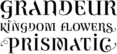
Balduina from Circulo de Tipografos
Capture the beauty and elegance of the hand lettered book covers of the past century with the Balduina font series. Each of the seven type designs rescues a model of calligraphy or lettering obtained from book covers designed by Boudewijn (or Balduino, as he was affectionately known in Mexico). Many alternate glyphs, and uppercase and lowercase ligatures enhance the hand lettered feel of the distinctive alphabets. The Círculo de Tipógrafos were able to incorporate the opinion of Ietswaart in the design process. However the level of personal interpretation was very high, since each cover contains only a limited number of characters. Now those beautiful letters, originally drawn by Boudewijn Ietswaart, have been converted into a series of digital fonts to be used in diverse contexts.
Ambicase Modern from Teeline Fonts
Ambicase Modern takes the next step in unicase font design, offering not “either/or”, but rather “both/and”. Each letter in Ambicase Modern is a combination of its traditional upper and lowercase forms, in a modern (didone) style. In modern OpenType-aware applications, Ambicase Modern can be set in swash mode, which features sophisticated decorative flourishes.
Geotica from exljbris
Another new type design built to be adaptable and versatile is Geotica. It represents a unique amalgamation of geometrical line elements and playful, elegant Didone sensibilities.
Geotica comes in four grades, each with four styles. Swashes, ligatures, alternates and ornaments abound. Each font includes support for Central European languages. All told, each font contains over 600 glyphs.
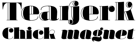
Margarita from PampaType
With several accomplished text families under his PampaType banner, Alejandro Lo Celso is a serious type designer. But he also knows how to have fun. His latest release takes the Didone style to a delightful extreme. A tribute to Bodoni’s widow, Margarita is a beautiful set of four fonts in solid and highlight (Luce) versions. Scores of ligatures allow the balls and hairlines to merge seamlessly for dynamic headlines. Setting Margarita small is not recommended–not that you’d want to: these letters beg to fill the page.
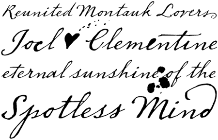
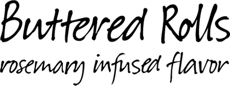
Dear Sarah from Betatype
Carefully considered letters written longhand, sealed in an envelope, and sent across continents were once the only connection for distant friends and lovers. Dear Sarah is a handwritten typeface that evokes the emotion of those messages. Handwritten typefaces often work for two or three words, but as soon you look at them in a paragraph, their unnatural textures make them feel contrived. Using alternates, ligatures and a complex system for randomization and natural connected characters, Dear Sarah is a natural looking script that works well in running text.
Suomi Hand Script from Suomi Type Foundry
Finland’s Tomi Haaparanta joins FontShop with a remarkable font that simulates everyday handwriting better than any we’ve seen. It accomplishes the feat not with hi-tech OpenType magic but with hundreds of ligatures, connecting pairs and trios of letters the way most of us do when we write. Suomi Hand Script strikes a balance between legibility and authenticity, readable at nearly any size because it demonstrates the natural rhythm and contrast made by the human hand.
Affair from Sudtipos
Earlier this year, we brought you Alejandro Paul’s 1044-glyph Ministry Script. The swashbuckling Argentinian followed that crowd-pleaser with another superfont full of ligatures and alternates. The basis of Affair is an elegant, readable calligraphic italic. Dress it up with decorative swashes, and it becomes irresistibly ornate.
This article was last modified on August 12, 2021
This article was first published on December 29, 2010
Commenting is easier and faster when you're logged in!

Recommended for you
The Ins and Outs of Tracking
The term ‘tracking’ is relatively new, being a product of the digital age, and r...

TypeTalk: Biting the Bullet
TypeTalk is a regular blog on typography. Post your questions and comments by cl...
TypeTalk: Smart Punctuation on the Web
TypeTalk is a regular blog on typography. Post your questions and comments by cl...