

What better time to round up new typefaces than on Friday. Not only is “Fonts on Friday” alliterative, but showcasing new fonts also seems like a good way to end the week.
I’m in a plain-speaking, no-frills mood today, so I’ve chosen sans-serif fonts with those same characteristics. That’s not to say that Regular and Prosto aren’t beautiful fonts — they most certainly are — but they’re genuine enough to become your go-to typefaces.
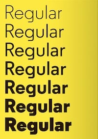
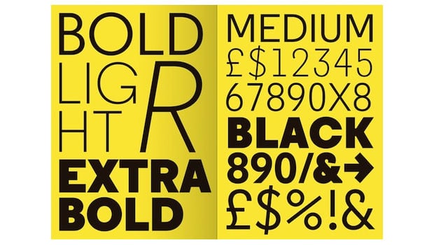
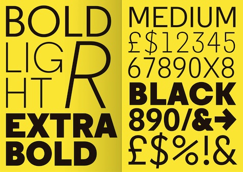
Gosh I love this font’s name. It suggests utility and pragmatism. It’s the kind of font you’d let your kid sister date. Yet Regular is by no means ordinary. It adapts easily to text- and headline-sizes. The examples below show how impressive it looks in large sizes.
According to developerA2-Type, the inspirations for Regular are “the popular hot metal fonts — Memphis, Karnak, Stymie, and Futura.” The family consists of seven weights and 14 styles.
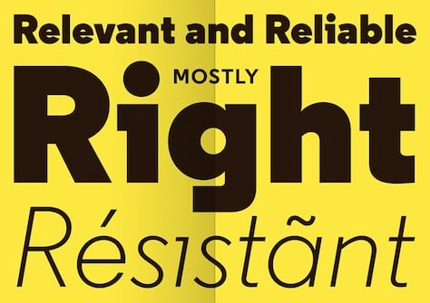
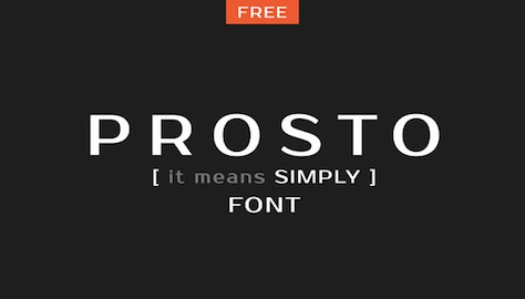
The other unadorned typeface I’m drawn to this week is Prosto, which means, simply, “font” in Russian. Prosto is part of a collection of free fonts developed by 26-year-old Ivan Gladkikh (Jovanny Lemonad), whose ambition is to quit his day job to devote himself to designing and distributing free fonts around the globe as a kind of humanitarian act. (He’s aiming for a stipend of $55,000 to complete this goal. Go to his site to find out more or to sponsor him.
I really like the lowercase letters in Prosto, by the way.


Check out more of his free fonts (45 so far).
This article was last modified on August 2, 2021
This article was first published on April 13, 2012
Commenting is easier and faster when you're logged in!

Recommended for you
Open Source Fonts
In the recent past I’ve written about Free Fonts – the pros and cons, the ins an...
Typophonic Showcases Great Record Cover Typography
Once upon a time, vinyl record album covers were a major form of artistic expres...

How InDesign Understands Fonts
A daring exposé of the numerical truths behind all those characters you type.