

What better time to round up new typefaces than on Friday. Not only is “Fonts on Friday” alliterative, but showcasing new fonts also seems like a good way to end the week as well.
This week’s round-up consists to fonts that are thin, angular, and illusory. These typefaces definitely fall into the category of experimental.
Because of their strong personalities, these three typefaces seem well-suited for posters and other projects where unusual display type won’t distract from the message.
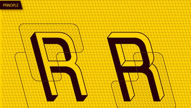
Frustro, by Martzi Heged?s of Budapest, Hungary, looks like something M.C. Escher might have drawn. It has the appearance of both facing out and facing in. Based on a concept called the Penrose Triangle — an impossible object that cannot be built in three-dimensional space — every letter is an optical illusion.

Lineo’s lines are so thin the font almost seems to disappear on the screen, yet its strong geometry gives it a presence that belies its somewhat wispy appearance. Designed by Gergely Bogányiof Budakeszi, Hungary, Lineo’s square serifs and non-connecting lines give it aplayful quality as well. Lineo would look nice at large point sizes.

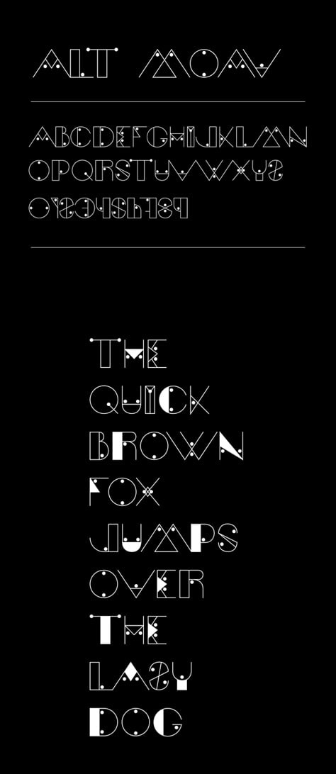
Designer Andreas Leonidou of Limassol, Cyprus, says Moav is an experimental typeface. “I just love experimenting with geometric shapes,” he says.
This article was last modified on August 2, 2021
This article was first published on March 30, 2012
Commenting is easier and faster when you're logged in!

Recommended for you

Calling Type Lovers Under 30
Press Release SOTA Catalyst Award: Call for Entries The Society of Typographic A...
Super Fonts Assemble!
If you love going to the movies like I do, the ramp-up to the summer season is a...
Hand Lettering from SketchType
If Jim Felici’s article about his trip to West Africa got you thinking about the...