

Gregory W. Jacobson of Dead Image Design created Millesime, a French word that, according to the Interwebs, means “vintage year” when it’s a noun and “vintage” when it’s an adjective. Either way, the name fits.
“I draw heavily from vintage design while incorporating contemporary elements,” Jacobson says.” The idea is to create and conceptualize something unique yet timeless while avoiding your typically sterile computer generated artwork. I believe the human element has disappeared from most modern design, and I aim to rectify that with my own work. Also, I sincerely hope that the aforementioned statement doesn’t make me sound like a pretentious twit.”

Now, are you ready for the best news? This font is only $3.99 from Chank Diesel’s Web site. Yet another reason to love the guy.
Do you suffer from font fixations? There are sympathetic ears in the Fonts and Typesetting Forum.
This article was last modified on December 17, 2022
This article was first published on March 24, 2008
Commenting is easier and faster when you're logged in!

Recommended for you

10 InDesign Preferences You Must Change Today
10 ways you can customize your work environment in the panels of the Preferences...
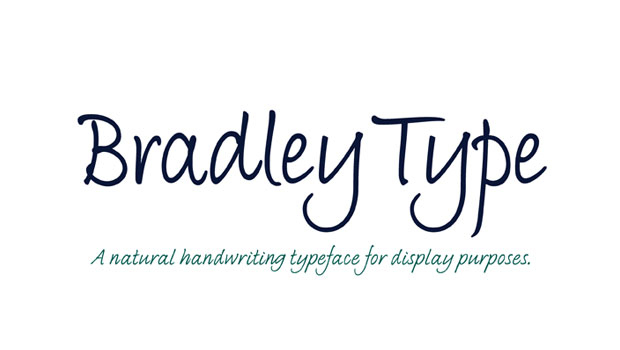
New Handwriting Font Release
Press Release Monotype Imaging Holdings Inc. (Nasdaq: TYPE), a leading global pr...
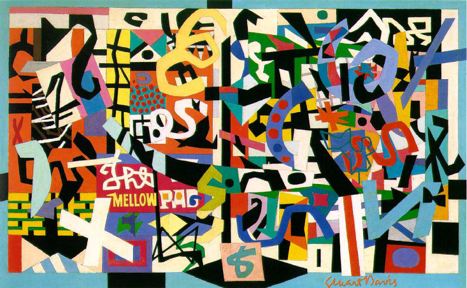
TypeTalk: Stuart Davis and his Love of Letterforms
Lettering can turn up in the most surprising places. Stuart Davis (1892 – 1964)...