

This blog isn’t always about recently released typefaces, and this entry proves it by going back to a family David Berlow released in 1994 that was inspired by faces popular in the early part of the 20th century.
Meyer Two, which comes in Condensed and Regular weights, is meant to evoke silent films’ intertitles; that is, the words that appeared between the film clips and served as dialog and narration. You can buy the family for $80 at Font Bureau’s Web site.
Post your font fixations in theFonts and Typesetting Forum
This article was last modified on January 9, 2022
This article was first published on March 19, 2008
Commenting is easier and faster when you're logged in!

Recommended for you

Unique Lettering Styles from Handmadefont
Struggling to find just the right font to make a striking title or drop cap for...

Download Second dot-font Book for Free
From digital to print to digital again—that’s the path John D. Berry...
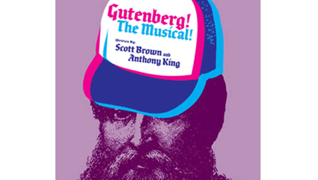
Gutenberg The Musical?
If you’re as out of touch with the off-Broadway scene as I am, you too will be s...