


If you never use the Terminal application in Mac OS X, don’t bother reading this. I happen to like Unix, so I’m always using the Terminal. Strange things happen if you have the Terminal’s font set to Monaco (the default), but don’t have the Mac OS X version of Monaco active. Take a look at Figure 1.
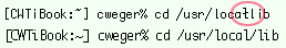 Figure 1
The top line was displayed when only the Mac OS 9 version of Monaco was active (in the Classic Fonts folder). Notice how the combination “l/” has turned into a bizarre character. The bottom line shows how this should look. It only looks this way when the Mac OS X version of Monaco is active. So beware.
This article was last modified on January 6, 2023
This article was first published on August 20, 2003
Commenting is easier and faster when you're logged in!

Recommended for you

A Quicker Quick Apply
You’ve got a ton of text you need to apply your publication’s styles...

Universe Software to Launch pdf-FieldMerge for Software Developers
PDF specialist UNIVERSE Software GmbH based in Solingen, Germany, has announced...
From Paper to PDF: Vectorizing Hand-Drawn Artwork with Photoshop and Illustrator
I have a close friend, Mike Manoogian, who is a brilliant lettering and logo des...