
Serif typefaces are the foundation of typographic communications. They can be seen everywhere from signage, logos, packaging and branding, to web sites and other digital media. Serif typestyles have a broad range of applications, from oversized billboards to very small text. While it is true that there are already thousands of serif designs available in digital form, there is always room for more to create a unique identity and make a statement.
The good news is that more and more of these dependable type designs are available from Typekit via Adobe’s Creative Cloud service, which is how most designers access their favorite Creative Suite apps. Typekit is a subscription font service that brings thousands of fonts from foundry partners into one library for quick browsing, easy use on the web or in applications, and endless typographic inspiration. Most Creative Cloud subscriptions include a Typekit Portfolio plan with access to their full library of fonts, while a few Creative Cloud options include a Typekit Free plan, with a subset of the fonts available.
We reviewed the ever-expanding Typekit Library and have chosen five original serif designs to highlight. They range from large, workhorse superfamilies to a small, boutique three-weight offerings, and were selected for their strength of concept and execution, as well as their originality and usefulness.
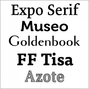
Expo Serif Pro
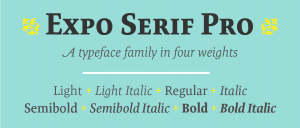
Expo Serif Pro, designed by type designer, graphic designer and educator Mark Jamra, is a workhorse typeface family ideal for the professional font library. Like its companion Expo Sans Pro, this serif version is highly readable and has the ability to project personality without becoming obtrusive, allowing it to perform well in a multitude of tasks and media. One look at Expo Serif Pro reveals that it is much more than merely a clone of Expo Sans Pro with serifs. It was made with the same spirit and expressiveness, but not designed to be an identical twin. Expo Serif Pro combines easily with Expo Sans Pro while maintaining its own warmth and integrity. This design was a winner in the 2009 Type Directors Club typeface design competition.
Museo
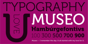
Museo, designed by Jos Buivenga for his exljbris Font Foundry, is a semi-serif typeface with lucid, open forms and highly original details – especially the pipe-like, bent half-serifs. It is great for stylish-looking headlines but also very effective in medium-sized texts. This very original, five-weight family all started with the designer’s love for the letter ‘U’. He says, “This uppercase letter just came to me as an image in a daydream. The top of both stems bent into semi-slab serifs. From this principle I worked out the rest of the uppercase letters. My first intention was to make it an all-caps display font, but after a while, I changed my mind. I wanted it to be a bit more versatile, so I decided to add lowercase and adjust spacing and kerning to increase legibility.”
Goldenbook
Goldenbook, designed by Mark Simonson, is based on the logotype of a literary magazine from the late 1920s called The Golden Book Magazine. This three-weight family is an art deco take on the classic Roman letterforms, but with lowercase. Simonson says, “There were only the letters in the logotype to work from, so I used my imagination for the rest. I tried to be true to the period, as if it had been a full font, and not the work of a lettering artist. With its fine features, it is best used large. I don’t know if it’s because of the name, but I see it used most often on book covers.”
FF Tisa
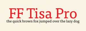
Mitja Miklavcic drew FF Tisa to meet the technological and aesthetic requirements of modern magazine use. His goal was to develop a softer, more dynamic version of a nineteenth-century slab serif wood type. A large x-height and pronounced serifs make this 14 weight family extremely legible in text sizes, and its unique design details and a fairly upright italic become evident in display applications. This typeface was selected by the TDC judges for a Certificate of Excellence in Type Design in 2007.
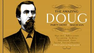
Azote

Designed by graphic and typeface designer Thomas Jockin, Azote was inspired by the 1968 Mexican Olympics. Azote is a multiline typeface family that uses the addition of lines to add weight rather than stroke thickness. It consists of three roman and three italic versions, with the italics containing some very free-flowing and decorative glyphs. Jockin says, “I love the tough design briefs. A retail typeface is the chance to tackle bigger, and more complex, design problems.” We love his adventurous spirit, and think he nailed this one!
* * * * *
Typekit has these offerings plus hundreds more serif typestyles to choose from. Their library includes new and original designs, as well as beloved historic revivals such as Caslon, Garamond, and Baskerville. Have fun exploring these selections, and then get yourself to the Typekit website library and find your own favorites!
This article was last modified on July 25, 2019
This article was first published on August 29, 2016
Commenting is easier and faster when you're logged in!

Recommended for you

This Month in InDesign Articles, Number 138
You have a choice: you could fritter the next half hour looking for new cat vide...

Reveal Your Fonts’ Hidden Secrets with Wakamai Fondue
This magical tool will show everything your fonts can do with a simple drag and...
Data Merge SuperGuide
Master InDesign’s Data Merge features with this collection of articles covering...