

Some time ago I designed a book in InDesign, in which I wanted the picture captions to have arrows pointing to the corresponding images. I used the font Wingdings 3, which contains the arrows I wanted.
In Wingdings 3, you type T for the left arrow, U for right, P for up and D for down. It’s a senseless lack of correlation between shortcut and purpose, so I decided to build my own Dingbats font that used U for up, D for down, L for left and R for right. And since I was building a font, it made sense to include the other glyphs I need regularly – circles in numbers, keyboard modifiers, social media logos, and a few other symbols for which I’ve previously had to hunt through Zapf Dingbats.
The font was built in Illustrator, using the Fontself Maker plug-in available from Fontself.com.
Step 1: Start your design
Since the key purpose of this font was to create arrows, it made sense to start with some arrow shapes. I drew one arrow by making a triangle; it was then easy to rotate this to make the arrows pointing in other directions. When making a font of any kind you need to define the baseline and cap height, and you can do this by dragging guidelines down to the locations where you want them.

Step 2: Define your guidelines
Before you import the glyphs into your font, you need to explicitly name the guidelines. You can do this in Illustrator’s Layers Panel: open the current layer by clicking on the triangle next to its name, and you’ll see all the shapes and guides on that layer. Select the top guide and click its name in the panel, then rename it “capsheight”, then name the bottom one “baseline”.

Step 3: Add the shape to your font
Open the Fontself Maker panel, and select your first shape – together with its upper and lower guides. Fontself Maker is designed for making alphabetic fonts, and makes it easy to drag entire upper or lower case alphabets and numbers into the panel to convert them all in one go. Since you’re creating a dingbats font, you need to drag them into the Any Character space at the bottom of the panel.

Step 4: Define the shortcut
When the glyph appears in your font, you’ll need to select the marker beneath it and type the key with which you want it associated. Here, I’ve typed L for the left arrow. You can, if you wish, drag multiple shapes in here and rename them one at a time.

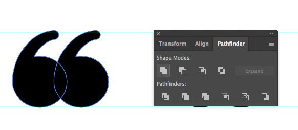
Step 5: Unite your glyphs
If you create a shape that consists of two or more overlapping objects, such as this double quote, you need to unite them into a single shape or Fontself Maker will turn them into two glyphs. Select them both, open the Pathfinder panel, and click the first icon – “Unite”. This turns the two objects into a single shape.
Step 6: Add some more glyphs
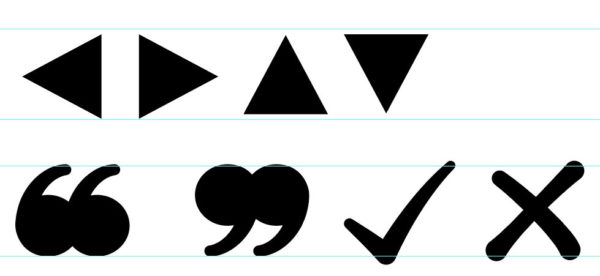
You can continue to add the remaining shapes, assigning a key for each as you do so. Choose whichever keystrokes you think will be most memorable: I used q for the opening double quote, and Q for the closing quote, with Y (for ‘yes’) for the tick and X for the cross. If you need to create an extra line in your Illustrator document for new glyphs, then hold Option/Alt as you drag an existing glyph – together with its guidelines – down the page to duplicate them.
Step 7: Only one color allowed!
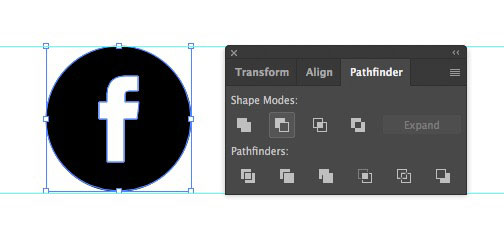
If you’re creating a glyph that incorporates a symbol within a circle, such as this Facebook logo, then the standard way of doing so would be to draw a black circle and then add a white Facebook “f” on top of it. But if you add this to Fontself Maker as a glyph, it will be seen as a two-color element, prompting the plug-in to convert it into a color font, which would cause compatibility issues. To avoid this, you need to make sure the object is black only. You can do this easily by selecting both the logo and the circle, and clicking the second button – Minus Front – in the Pathfinder Panel. This will knock out the logo from the circle, and you’ll be able to add the glyph as normal.
Step 8: Name your glyphs
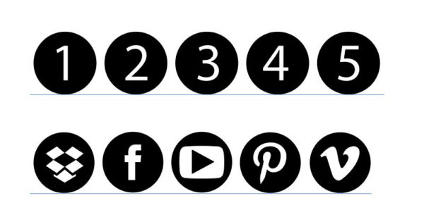
Keep adding glyphs and naming them as you go along. For maximum ease of remembering the shortcuts, plan them out as you go: I used Shift plus F for Facebook, T for Twitter, I for Instagram, V for Vimeo, Y for YouTube, P for Pinterest, D for Dropbox and L for LinkedIn. You can try out your shortcuts by typing them in the space at the top of the Fontself Maker panel, as you create them.

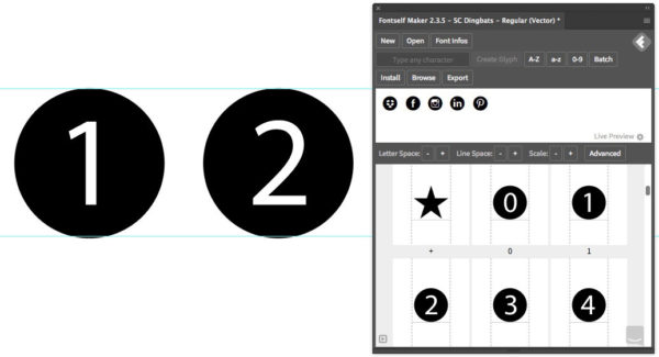
Step 9: Building single numbers
The numbers 0 to 9 are easily made by setting them in the font you want, then turning the font to outlines and finally using Pathfinder (as in step 7) to turn the shape into a single black object. You can then add them to Fontself Maker, assigning (naturally enough) 1 to 1, 2 to 2, and so on.
Step 10: Building double numbers
Having the numbers 0 to 9 is all very well, but what if you want your numbering to go higher? The answer is to create number pairs, whereby each number is created in a semicircle. Here, I assigned Shift with 1, 2, 3 and so on to the left-hand part of each pair, and Option/Alt with 1, 2, 3 and so on to the right-hand part of each pair. This gives the opportunity to create numbers up to 99.

Step 11: Kerning number pairs
By default, Fontself Maker adds spacing between its glyphs. When you type a number pair into the space at the top, you’ll see an unwanted gap between each pair. The solution is to click the Advanced button in the Fontself Maker panel, then type and select each half number pair in turn. You can now see that the space before and after each pair is set to a value of 50.
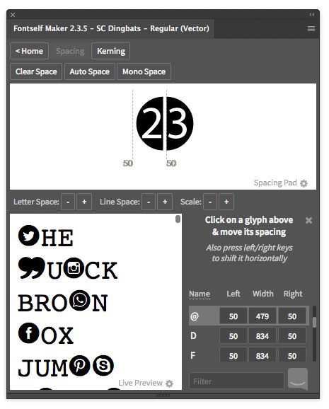
Step 12: Correcting the kerning
All you have to do is change the spacing from 50 to 0 by typing this value into the numerical fields. If you wish, you could just set 0 for the Right value of each left-hand numbers, and 0 for the Left value of each right-hand number, to allow for spacing between them.

Step 13: Troublesome teens
The number pairs work fine with numbers from 20 to 99, but when the first digit is 1 the combined numbers look like they’re too far over to the right. You can’t move them all to the left, or the right number will stick out of its semicircle; it’s important to leave enough space on the left for a wider digit.

Step 14: More teen trouble
The answer is to create new individual glyphs for the numbers 10 to 19, so they’re typed as single keystrokes. We’ve already assigned Shift to the left-hand numbers and Option/Alt to the right-hand number, so our only option is to use Shift + Option/Alt for these teens. The problem is that the combination Shift + Option/Alt together with 5 and 6 is reserved for creating fi and fl ligatures; my solution was to set Shift + Option/Alt f and s for fifteen and sixteen respectively.

Step 15: Try it out
If you click the Install button in the Fontself Maker panel, it will install the font in Illustrator only so that you can try it out. It’s well worth doing this multiple times as you go along, so you can be sure you’ve assigned the correct keys to your glyphs, and that the kerning you’ve set works as you want it to.
Step 16: Export your font
Once you’ve created the font, you can Export it using the button in the Fontself Maker panel. Once you’ve done this, the panel will offer to open it for you and install it into your system. I recommend you do this using a name other than the final name you’ll give your font, so you can try it out in a word processor, in InDesign and other apps to make sure it’s all working correctly. Only when everything works to your satisfaction should you export the final version with the name you choose.

Step 17: Try it for yourself
If you don’t want to go through this process, you can download my font, SC Dingbats, here. You may use it in your personal work if you wish. And you’ll find a handy chart showing the keyboard associations here.

This article was last modified on July 16, 2026
This article was first published on August 21, 2018
Commenting is easier and faster when you're logged in!

Recommended for you

Announcing the InDesignSecrets Adobe Font Pack
Fonts are like voices, or like facial expressions: each one tells a story and ex...

Type Any Unicode Character You Want in InDesign
Special characters are a pain to type or find in the Glyphs panel; here's how yo...

InDesign Magazine Issue 64: The Music Issue
Cue the music… We’re happy to announce that InDesign Magazine Issue 64 (August,...