

The holiday season is the busiest time of the year for travel here in the US, and I’m thankful to not be going anywhere. Even though I love to travel, I will be happy to not be out exploring and working my way through airports or across the open highways of America.
Thinking about all my friends that are zipping from place to place made my mind wander (not really difficult to do these days) to how we are able to navigate places we have never visited. That’s where wayfinding comes in. Wayfinding is more than just a bunch of signs telling you how far away a museum is or where the bathrooms are. It’s a co-ordinated system of orienting a user within his environment and assisting him in choosing his path.
I think my love of wayfinding signage and graphics grows out of my appreciation for—though total lack of knowledge about—architecture. I’ve put together some interesting examples of wayfinding that I find beautiful or intriguing. Check them out for inspiration, techniques, or just to let you mind wander away.
The Dewey Decimal system never looked so good as it does at the Mediateket, the media library at Westerdals School of Communication in Norway.

More from Norway’s Westerdals School of Communication, even the stairwells get attention!

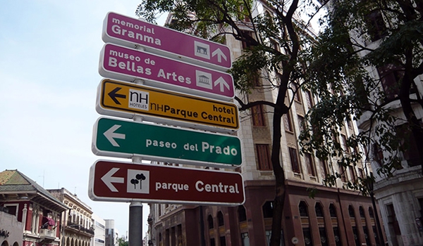
Havana city signs, something most Americans haven’t seen.
Even if you’ve had too much vodka, Poland’s Tobacco Hotel will help you find the correct room!

This abbey-turned-museum in France blends old and new elements nicely.

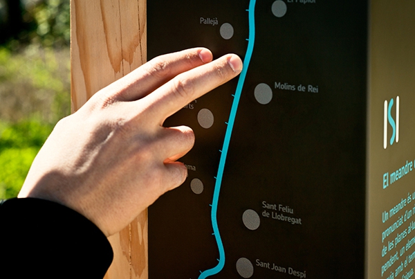
The signage for this recreational trail in Spain works well in its environment.
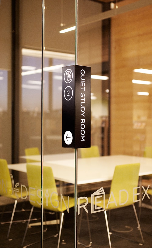
The Hume Global Learning Centre in Australia uses wrapping signage to get people to their destination. Shhhh!
The spa area of a Moscow area hotel uses bright colors and large icons to depict different activities.

Vancouver, Washington Community Library stacks the wayfinding along with the architecture.

The Glasgow pedestrian wayfinding plan is great, but I’m still going to stop and ask people for directions. Because accents.

This nature park in Latvia makes sure you don’t miss the signs for all the trees.

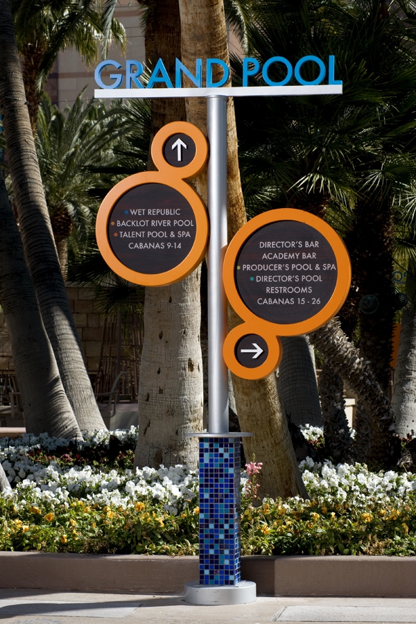
The pool area of Las Vegas’ MGM Grand harks back to its studio roots. Which way to the casting couches?
Norway’s Literature House makes finding the right floor easy. “Nabob’s Your Onkel!”

Budapest Airport signage is clear, colorful, and calming.

The floating Bota Bota Spa in Montreal incorporates a maritime theme into the architecture and signage.

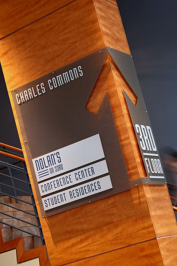
Johns Hopkins University’s Charles Commons blends warmth and clarity.
Bristol’s Cabot Circus shopping center uses architectural elements to draw the eye in.

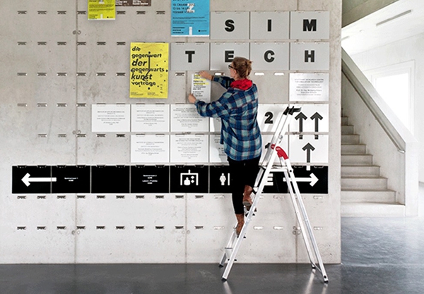
Stuttgart University’s Sim Tech uses integrated clipboard clasps to facilitate changes. A prankster’s dream come true!
London’s Europa studios makes it simple to change out occupants of the individual studio spaces.

Barbican Arts Centre’s large floor numbers and bright colors aren’t easily missed.

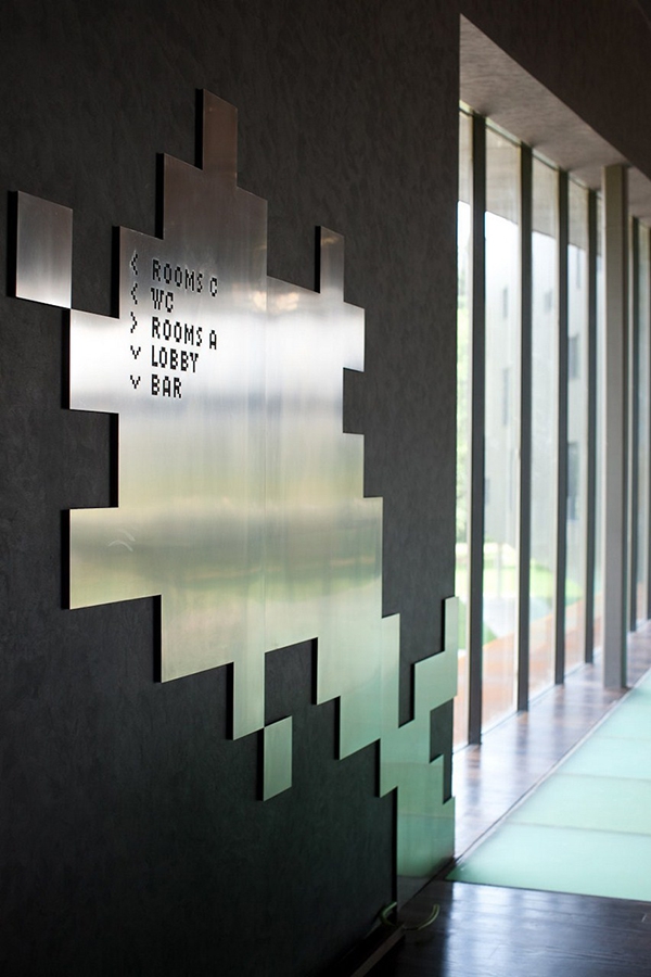
The Miura Hotel in the Czech Republic uses an 8-bit retro look for its signage.
This article was last modified on December 1, 2014
This article was first published on December 1, 2014
Commenting is easier and faster when you're logged in!

Recommended for you
Design How-To: Turn One Photo Into a Thousand Images
You can subscribe to “Before & After Magazine” in PDF or Print....

Scanning Around With Gene: Drawing with Walter T. Foster
I grew up in Southern California. Each time we drove to the beach or Disneyland,...