


Last week I waxed idyllic on what the perfect navigation set-up might look like on a Web site. I talked about what to do and what not to do. I ranted about things I like and things I don’t like. I admonished designers to forget some conventions and embrace others. What I didn’t do is show you examples of sites that are doing things right. So that’s what I’ve set out to do this week.
I had my work cut out for me. As the relatively well-known print and Web designer Roger Black told me last week, when I had the pleasure of speaking with him in between his jetting to and fro about the globe, there is hardly any good work on the Web. We could talk for days about why this is, but, for now, let’s chalk it up to the still-developing status of this mushrooming medium. At any rate, it’s hard to find a perfect Web site; one that gets everything right. Fortunately, I was just looking for good navigation; content, typography, and layout be damned.
I was lucky enough to stumble across amycarlson.com, the Web site for a pseudo-successful actress (successful because she obviously earns a living at it, pseudo-successful because few people have heard of her. Jennifer Lopez she is not) designed by Flash-mongers Zooropa. Amy Carlson’s navigation is entirely Flash based, and the site’s designers have done an excellent job using the format in a utilitarian, and not flashy (heh, heh) way. My favorite thing about the navigation on this site is that it doesn’t actually take you anywhere. After waiting a few moments for the site to load (while a few simple animations lull you into submission), you have it. The whole site. When you click on any of the topic headings, the sub-headings spring into view on the same page; they disappear when you click another topic heading. Even the actual information on the site, things like Amy’s zodiac sign and the names of the TV shows she’s appeared in, appear and disappear against the backdrop of the one main page. Viewers are spared that sense of nagging anxiety one can get after clicking a few layers deep into a site, when you are not quite sure you can make it back to the point where you started. With Amy’s site, you are always in the same place. Still, like I’ve said of Flash before, just because it exists doesn’t mean it’s the right option for you.
Now not every site can do thing’s the way Amy’s does. Take fashion designer Todd Oldham’s site, for instance. It also relies heavily on Flash, and , as you might expect, has a crisp and fresh aesthetic feel to it. The problem is, it makes no real sense. There is a lot to look at on Todd’s site, but I’ll be damned if I can find any of it in any way other than the purest accident. The site mashes so many different things together into one screen, it’s hard to tell which elements are for navigation and which are just pretty pictures. You’ve got to be a real Todd Oldham fan (and who can afford to be?) not to be immediately put off by the confusion of it all.
Amy Carlson’s site works, again, because none of the navigation elements ever leave the page. Though it is clearly more difficult to create this effect with a more content-heavy site, it can be done. Look now to the unlikely paragon of navigational virtue, marthastewart.com. As you can imagine, Martha has got loads of content on her site. She’s got ideas and how-to’s for cooking, crafts, weddings, babies, you name it. Each category goes several layers deep, but being the crafty organizer she is, Martha makes sure all of her navigation elements stay put on every page of her site. It takes some doing, to be sure, but viewers can browse the section on melding Christian and Jewish wedding ceremonies without fear that they won’t be able to return to the section on carving tiny woodland creatures out of marzipan.
The lesson we can learn from sites like Martha’s and Amy’s is that the more freedom you give your viewers, the less anxious they will feel, and the more likely they will be to stick around and give you more pageviews. It’s hard enough to find your way around the Web (which, I suspect, is why they call it a Web in the first place) without having to work to find your way around just one site. Make it easy for people to visit you, and they will. Make it difficult, confound them with too many incongruous options, let them bury themselves deep in your hierarchy without hope of rising back to the surface, and you’ll probably find them on MarthStewart.com, learning now to knit baby blankets out of pine needles.
Andrea Dudrow is a writer living in sunny San Francisco. She has been covering the Web and Web design for the past four years and has contributed to Macworld, MacWEEK, eMediaweekly, Adobe.com, Adobe magazine, Publish, and the San Francisco Chronicle, among others. She also writes about arts and culture, and spends a great deal of time fantasizing about the broadband future.
This article was last modified on January 8, 2023
This article was first published on March 20, 2000
Commenting is easier and faster when you're logged in!

Recommended for you

Linotype: The Film hits the small screen
Since its premiere in New York in February, Linotype: The Film has been tou...

iStockphoto Seeks Video and Animation Submissions for New User-Generated Stock Video Collection Starting at $5 per Clip
iStockphoto®, the world’s leading community-powered marketplace for stock...
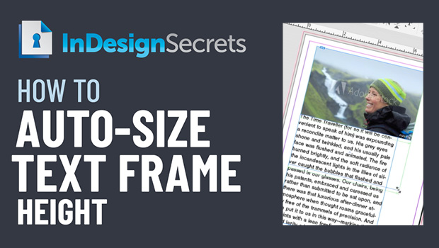
InDesign How-to: Auto-Size Text Frame Height
In this InDesign how-to video, Erica Gamet demos how to auto-size a text frame’s...