

Setting Highlight and Shadow Aimpoints
One of the main objectives of color correction is to take full advantage of the available tonal range, which is achieved by mapping the brightest part of the image that contains reproducible detail — the highlight — to the whitest white of the output medium, and mapping the darkest part of the image-the shadow-to solid black in the output medium. When the final output device is not known at the time an image is corrected, target values are used that will allow it to be repurposed for the widest variety of output conditions.
Photoshop’s Info palette provides an easy way of measuring the original color values in key tonal areas, such as highlights and shadows, while the Curves tool provides an excellent way of converting the original color values to the ideal color values.
The question is: What are the ideal color values?
First, the answer depends on whether the target output device accepts RGB or CMYK data. A theoretically pure white would be 255R 255G 255B in the RGB model (formed by combining the red, green, and blue primaries at full strength), but 0C 0M 0Y 0K in the CMYK model (the absence of all four inks).
More practically, the answer depends on the color characteristics of the output device or output medium, regardless of whether it’s a monitor, desktop printer, or printing press. For example, consider the problem of creating bright neutral highlights on different kinds of RGB-based devices, such as monitors, film recorders, and desktop inkjet printers (which invariably take RGB input, even though they print with four or more inks).
RGB Highlights
At first glance, it seems that to get the broadest overall tonal range, the highlight must be set to the brightest possible value, which in the RGB model is 255R 255G 255B. However, a simple test reveals that almost all output devices have a practical limit, with slightly lower RGB values such as 250R 250G 250B or 245R 245G 245B.
Here’s how to determine the actual RGB highlight value for a particular device, such as an inkjet printer. In Photoshop (or other imaging, drawing, or page-layout application), create a one-page document consisting of 12 small squares without borders and containing 1 percent increments from 255R 255G 255B to 244R 244G 244B (see below for PDF files for highlights — aimpoint.hl.pdf — and shadows — aimpoint.sh.pdf).
PDF downloads. To determine optimal highlight values for your RGB output device, print a test page containing patches filled with incremental values from 255R 255G 255B through 244R 244G 244B.
Note: These files are large. For best results, do not open them in your Web browser. Instead download them to your hard drive before opening them in Acrobat or Acrobat Reader. To get Acrobat Reader, click here.
Highlights: aimpoint.hl.pdf
Shadows: aimpoint.sh.pdf
The first patch containing visible tone indicates the lightest area in which your printer can maintain highlight detail. Note that depending on the particular paper stock and printing conditions used for this book, it may not be possible to see anything in many of the patches, especially those that are close to the white point.
Print this page and look closely to see which square contains a just barely visible gray tint. For instance, if the squares filled with RGB values 255 through 251 appear pure white, but the square containing 250R 250G 250B is just slightly gray, then it’s pointless to assign tonal values in the image higher than 250, as these will simply disappear. That could be a big problem, as there is sometimes crucial image detail in the highlight areas.
The solution is to either measure the RGB highlight values appropriate to your specific output device or use a standard value that will produce excellent results with the vast majority of output media. For output to monitors and to color inkjet and laser printers, the optimal values are typically between 245 and 248 (with equal amounts of red, green, and blue, to ensure that neutral tones stay neutral). Some devices, such as high-end film recorders, can maintain detail up to and beyond 250, and your target highlight value should be adjusted accordingly.
Another key reason for using a highlight value below 255 is that it leaves room for specular highlights-those caused by glare from shiny objects or surfaces. The real highlight isn’t necessarily the brightest area in an image; it’s the brightest area that contains detail. Setting this highlight to a value of 245 or 250 makes it possible to reserve 255R 255G 255B for an area so white that the background paper shows through, such as for the reflections from glass, metal, water, or snow. For instance, leaving room for specular highlights has made it possible to maintain essential detail in the antique car image (see figure 1).
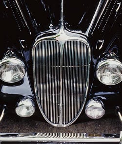
Figure 1a

Figure 1b
Figure 1: Instead of using a pure white value of 255R 255G 255B as a highlight aimpoint, the standard practice is to use a value closer to 245R 245G 245B (1a), both to compensate for limitations in the output medium and to allow for specular reflections. The setting of 255R 255G 255B (1b) has slight better contrast).
For instance, the image of the antique car was corrected for a standard 245R 245G 245B highlight (figure 1a) and retains detail in the headlamps and the grille.
The same image separated with a 255R 255G 255B highlight (figure 1b) has slightly greater contrast, but some subtle highlight details are no longer visible. The difference isn’t huge, but it’s significant, and can’t be ignored if you’re committed to producing the highest possible quality color.
Given a choice between using a standard value of 245R 245G 245B or 250R 250G 250B, it’s probably better to use 245 to protect highlight detail. Also, these corrections are being applied to correct tonal defects, not to compensate for the properties of a specific output device, so it’s best to use a conservative value that can later be modified automatically at print time for any output device for which a profile is available. Highlight values of 250 or higher can routinely be achieved by the high-end film recorders used to produce “second-generation originals” for rescanning.
The tradeoff in using a highlight aimpoint of 245 instead of 255 is that compressing the image’s tonal range into fewer shades of gray slightly increases the possibility of banding, because there’s now a bigger gray difference from one shade to another.
Despite this tradeoff, we’ll use 245R 245G 245B as the standard RGB highlight aimpoint throughout the exercises in this book. However, if the preceding test showed that your particular output device can attain a brighter highlight value, by all means use that value to make full use of the tonal range of your device and media.
This article was last modified on January 3, 2023
This article was first published on October 29, 2002
Commenting is easier and faster when you're logged in!

Recommended for you

3D Printing from Photoshop
3D printing is the technology of the year, but few people realise you can create...
Add Grain Effects to Photos and Type in InDesign
Using just six variables in the Effects panel can achieve an almost infinite var...

Peachpit Announced the Publication of Layers: The Complete Guide to Photoshop’s Most Powerful Feature
Peachpit announced the publication of Layers: The Complete Guide to Photoshop’s...