
Email Design: Beyond the Essentials
Connecting the dots between attractive design and a design that attracts customers

This article appears in Issue 33 of CreativePro Magazine.
Last year in issue #20, I wrote a detailed article about how building a strong library of effective email templates is important in laying the groundwork for good email design. Now that you’ve taken that step (you have, haven’t you?) we can move on to the fun part—designing the emails!
A well-crafted email doesn’t just inform. Design and layout play a pivotal role in capturing attention and sparking engagement. It entices recipients to take action, whether that means clicking a link, making a purchase, or sharing the content.
In this article, we’ll explore how the use of visuals, typography, spacing, and prominent calls to action can significantly influence the reader’s decision to interact with your email.
Design and Layout Best Practices
With few exceptions, the content of your email should be highly skimmable to respect the reader’s time and attention. Keep your paragraphs short and comfortably spaced. Bold or highlight a few important words here and there to keep the eye moving down the page.
Tip: You can make a long email more interesting by inserting images, bullet lists, or buttons between blocks of text.
Single-column layouts are the easiest to build and most widely supported. There’s absolutely nothing wrong with a single-column layout, so don’t feel like you have to make it more complicated! Many would argue that emails designed this way also perform better. When it comes to email, you want to get your message across as quickly as possible, without distractions. Simpler is usually better.
The same idea applies to your color scheme as well. Having a simple, high-contrast color palette makes the message easier to consume—for all your readers but especially those with vision impairment (Figure 1).
You can leverage the elegant simplicity of a one-column email layout as a deliberate design tool. Go for high contrast for best results.” width=”475″ height=”705″ /> Figure 1. You can leverage the elegant simplicity of a one-column email layout as a deliberate design tool. Go for high contrast for best results.
Answering the call
Getting your readers to take a desired action is the whole point of sending your email.
Your call to action (CTA) needs to convert your reader—that is, get them to complete the action on the other side of the button (register for an event, buy a product, subscribe to a mailing list). What happens at that stage is a topic for another day, but the journey begins with a well-crafted email and compelling CTA.
Choose a color for your CTA button that matches your branding yet stands out. It should visually pop against the surrounding elements. If it’s too subtle, it will blend into the design, causing readers to skip right over it.
Also be sure to test your email in dark mode, as some automatic conversions can change the color of your buttons and text. Verify that your text and background colors create sufficiently high contrast in both light and dark modes (Figure 2).
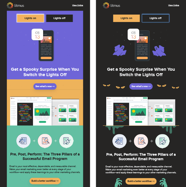
Figure 2. This Halloween-themed message provided Litmus the perfect backdrop to create a dark mode version that’s not just accessible but also fun! Users are encouraged to discover hidden surprises by turning the “lights” on and off.
Regarding CTA placement, here are a few strategies you can try out:
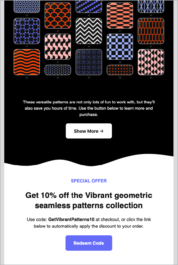
- Create a hierarchy. In longer emails with multiple links, such as newsletters or shopping promotions, you still need to call out the main thing you want your reader to do above all else. Use a button for the primary CTA, and use standard hyperlink text formatting for secondary links (Figure 3).
Figure 3. You can pepper your email
with links, but keep the big button—the primary call to action—visible and important.
- Get to the point. To grab the reader’s attention, feature your primary CTA near the top of your email to make the conversion as convenient as possible for readers who already know what they want.
- Make a CTA sandwich. If you feel more convincing is needed, you can employ a best-of-both-worlds approach: Put your CTA button near the top and at the end. This way, you provide your reader with another chance to convert after they’ve read all the facts.
Regardless of which method you choose, when you design your email, treat your primary CTA like an A-list actor by giving it the spotlight at center stage. Give it plenty of space to ensure all eyes are focused on the star of the show.
Formatting text
Let’s talk about HTML for a moment. Nowadays most email service providers offer a WYSIWYG interface, so you don’t necessarily need to know how to code.
However, I find that being able to see the underlying HTML code still helps for troubleshooting. If you test your email and something isn’t displaying or working correctly, it can help to peek at the code, if you have access to it (Figure 4). Look for a button or command that says Code or Source or for an icon with brackets (</>).
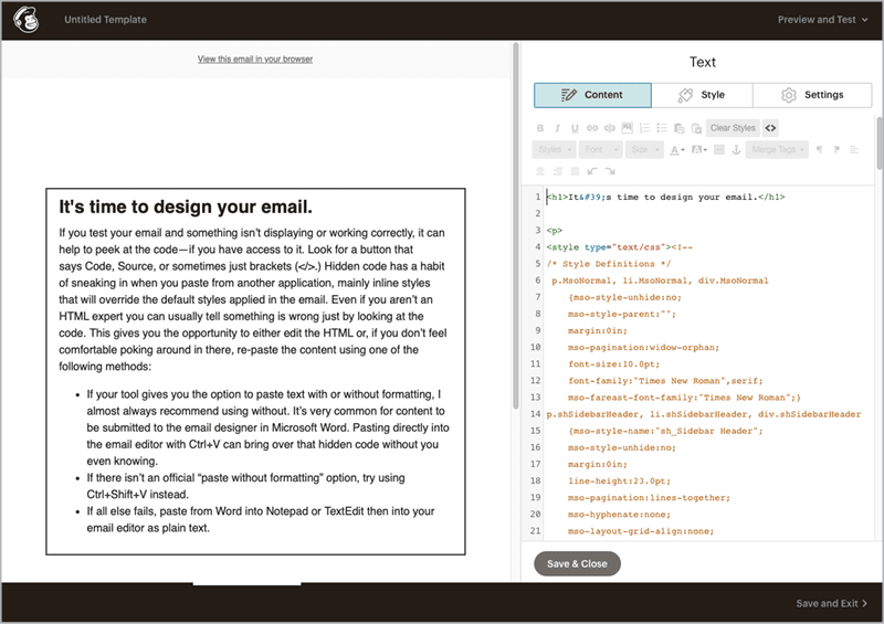
Figure 4. Only in the HTML panel can you see hidden formatting that often comes along when pasting content from other applications. In this example, dozens of lines of unecessary code were imported along with the text in the left panel. The orange HTML text can be safely deleted since the desired styles are already defined in Mailchimp.
Hidden code has a habit of sneaking in when you paste formatted text from another application, mainly inline styles that will override the default styles applied in the email.
Even if you aren’t an HTML expert, it helps to know enough to tell if something is wrong just by looking at the code.
Tip: You can look at the code of an email project that was formatted correctly to see how your troublesome project’s code should look.
This gives you the opportunity to either edit the HTML or, if you don’t feel comfortable poking around in there, start over. This time, paste the content using one of the following methods:
- If your tool gives you the option to paste text with or without formatting, I almost always recommend using without. It’s very common for content to be submitted to the email designer in Microsoft Word. Pasting directly into the email editor with Command/Ctrl+V can bring over that hidden code. (In Word, choose Edit > Paste Special, and then select Unformatted Text.)
- If there isn’t an official “paste without formatting” option, try using Command/Ctrl+Shift+V instead.
- If all else fails, paste from Word into Notepad or TextEdit then into your email editor as plain text.
Trust me on this: It takes less time to strip out all the formatting and manually format only what you need than it does to find and fix hidden overrides!
Lovely layouts
Even within a single-column layout, there are lots of ways to punch up the interest.
For example, you can cheat image borders by extending objects beyond the background color, or by making a square image file appear circular or blobby.
Look at the emails that come into your inbox. If you want to know how they were built (i.e., where the boundaries are, what is part of the image, or what is background), click and drag on an image and you’ll see a ghost copy of it following your pointer. This is a good way to deconstruct the techniques that others are using and learn how to create sophisticated effects like overlapping boundaries (Figure 5).

Figure 5. Deconstruct email layouts you like to learn what’s behind effective design techniques. This creative example gives the appearance of overlapping images.
On the other hand, boxy can be beautiful! You don’t have to fight the natural boundaries of tables and divs. Lean into the lines, and you can create some very striking layouts (Figure 6).
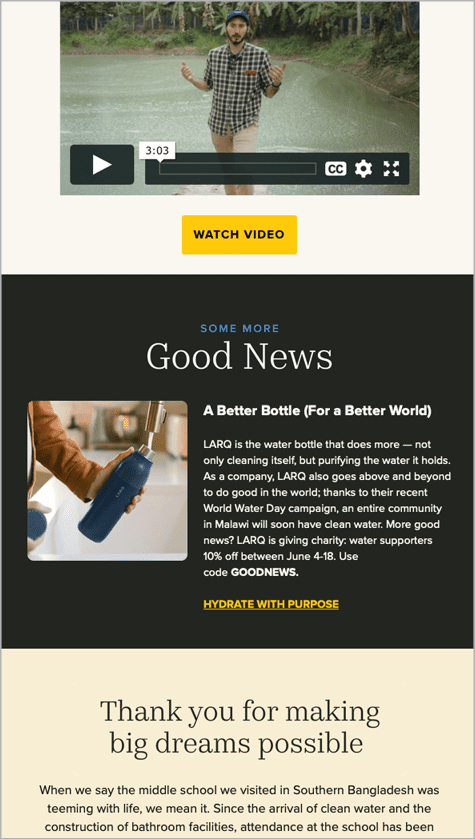
Figure 6. This bold color-block design from charity:water effectively reinforces the distinct structure of the email’s content, ensuring each section gets noticed.
You’ll never get a second chance to make a first impression
I cannot overstate the importance of a subject line, which gives your reader their first glimpse of what your email holds. So hold their attention!
To paraphrase Shakespeare: “How do I craft thee? Let me count the ways.”
- Break out your thesaurus, and experiment with changing up your wording.
- Rephrase a statement as a question.
- Quantify your content with “Five ways… ” or “7 reasons… ”
- Stuck for ideas? Find inspiration online.
- Run some options past a coworker or two.
Above all, try to break away from using the same tired language that makes people feel like they’ve already seen your message a hundred times before, like “Join our webinar” (snooze) or “Don’t miss out!” (overused).
Think about your subject line critically. Does it sound natural for your brand voice? Is it engaging? Is it compelling? Does it stand out from the noise?
While you’re on a roll, don’t forget about the preheader (sometimes called preview text). You’ve seen this: It appears directly below the subject line in your inbox and sometimes at the top of your email.
The subject line and preheader are meant to go hand in hand (Figure 7). A subject line without a preheader is lonely. Like Sherlock and Watson, they work better together. A well-crafted preheader continues the story where the subject line leaves off. With 50 to 70 extra characters, it’s free real estate. Don’t waste it!
![Figure 7. Designer and illustrator Meg Lewis—whose brand is built on “abstract shapes, eye-popping colors, and quirky characters [that] may cause uncontrollable smiling”1—hits the mark with standout subject lines and effective preheaders.](https://creativepro.com/wp-content/uploads/2024/06/Figure-7_625-fs8.png)
Figure 7. Designer and illustrator Meg Lewis—whose brand is built on “abstract shapes, eye-popping colors, and quirky characters [that] may cause uncontrollable smiling”1—hits the mark with standout subject lines and effective preheaders.
Design + Development
Like everything else in design, form follows function. An email can’t just be pretty. It must perform efficiently to create a frictionless user experience.
Unlike print media, where the final art is static, many technical aspects must all work together to make your email successful when it’s delivered to many providers, when it’s read using a wide variety of email clients on multiple operating systems, and when it might be read on screen sizes ranging from phones to huge desktop monitors.
Many of these technical variables are outside your control and take place after the email is sent, but there are things you can do to reduce formatting and display snafus.
Picture this
When adding images to emails, keep your file size as small as possible. Large image files can slow down the loading time of your email.
TinyPNG is a free online resource you can use to compress images (including animated ones!) without compromising quality.
The dimensions of your images should be optimized for the size of your email; 600 to 650 pixels is the most common width for desktop viewing. On mobile devices content will be reformatted to fit the screen size. This could present as simply-scaled images and large, reflowing text (mobile-friendly) or a different layout, images and content altogether (responsive), depending on how the designer has structured the email (Figure 8).
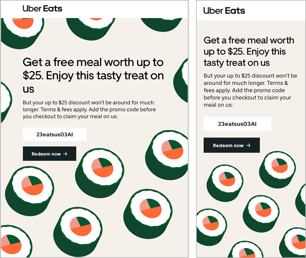
Figure 8. When you use a responsive design, your layout will automatically change depending on the width of the screen in which the email is viewed.
Make sure your email still functions well and makes sense even with images turned off. Go into your own inbox and turn off image rendering in your email client program, and you’ll see what I mean. Some recipients will have images turned off by default (i.e., they won’t automatically download from a remote server) for security reasons. You’ll run across this scenario more frequently with business-to-business clients than you will with consumer audiences, but it’s still something to be aware of. You will never regret having a failsafe that ensures that your full message will reach—and will be meaningful to—the greatest number of contacts!
For this reason, you should make CTA buttons live text and not render them as a graphic. However, if you do have a highly designed marquee image that incorporates the CTA in a more creative way, just be sure a button or link outside of the image will render if you turn off access to this artwork. Sure, you can hyperlink the image to your promotion as you would with a button, but if users don’t see the image, they won’t know to click on it.
Consider the alternative
Alt text—textual descriptions of the images used in your design—is mandatory for any important image. In situations where images are turned off, what context is the user missing out on (Figure 9)?
Figure 9. Turn off your images to see how well your email communicates without them. In this example, Wayfair opted to keep alt text brief and to-the-point, including only the category names and prices. The structure and desired actions are still clear even without the images.
Let’s say you have a graphic with promotional text, product imagery, and sale prices. If the information doesn’t appear in the body copy, you’ll definitely want to capture it in the alt text. For an infographic or chart, you’ll need to summarize the content rather than describing every aspect. Keep it short and sweet, just enough to get the point across. Pretend you are being charged by the word (Figure 10).
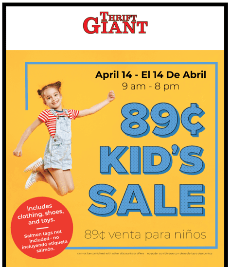
Figure 10. This promotional email uses a single large image for the entire message; none of the text is live. In order to retain efficacy with images turned off, the alt text should convey (in both English and Spanish, since this is a bilingual email) the important details such as the date and time of the sale, featured sale items, and potentially the fine print.
Exception: Images that are solely eye candy, like a background image or something decorative that doesn’t advance or support the messaging, would actually be better without alt text so a screen reader doesn’t waste the person’s time describing it.
In these cases, leave the alt tag, but make it empty (alt="").
Be judicious if using an automatic alt text generator. You can use this technology for ideas, but you need to decide if the computer-generated content follows the best practices we discussed. If you’re spending more time editing than you saved auto-generating, just write the alt text yourself.
Final Details
Don’t overlook the small stuff. Little details can make a big difference to your enterprise’s credibility and your success in landing a response from your reader.
Controlling breaks
One of my favorite HTML hacks is using a small piece of code between words to prevent lines you want to keep together from breaking.
When you see an awkward line break you might feel tempted to add a soft return, but don’t! Text needs to be free to resize and reflow on different screen sizes.
Let’s say you are writing about an event and you want to keep a multi-word location (New York) or the full date (October 15) from breaking. You can go into the HTML editor for that text block and add between the two words (New York or October 15). This will replace the standard space with a nonbreaking space so the words will never be split no matter what size screen the email is viewed on.
I use this little gem every day!
Making the plain text version
Many people skip the step of creating a text version of an email, perhaps thinking that no one will see it or that it’s just too much hassle.
A plain text email may not be pretty, but it’s still pretty important. Emails with a text version that match the content help your sender reputation/score and, hence, deliverability, so it’s worth taking a few minutes.
Using the “copy from HTML” option is a real time-saver. This is usually a button or checkbox that brings over the entire text from your email, from preheader all the way down to the footer, converting it to plain, unformatted text.
Sometimes, the raw text version runs everything together like one long rambling thought. if this happens, read your email through the eyes of a recipient to ensure that it makes sense without any of the visual cues present in the designed version. If your email message references a graphic (which will not be displayed in the plain text version), you should tweak the wording to compensate for that.
Lastly, those long URLs typically hidden behind buttons and links will be displayed in full. So, change verbiage like “click the button below to register” to “Register here:” followed by the URL.
Test, Test, Test!
I never send out an email blast without sending myself a test first, which I check in both desktop and mobile views. Even if you are using a tried-and-true template, every time you go back and make edits, you create an opportunity for an error to sneak in.
Of course, you can use your ESP’s previewer to check your work, but there’s something about seeing that test come into your inbox that puts you in the viewer’s mindset, and you’ll catch things you didn’t notice in the previewer (when you had your designer/editor hat on).
A pre-launch test is your last chance to check all the links, look for missing or inaccurate alt text, ensure the subject line and preheader aren’t getting cut off, and so on.
Create a pre-launch checklist (or find one online), and adapt it to match your specific workflow. After a while the steps will become second nature, and you won’t need to refer to it as much, but it’s still a good idea to document your process. If someone had to step in and send an email in your absence, would they know all the nooks and crannies to check?
Some email tools require you to open a hidden panel to add preheader text so if it’s not on your checklist or habitual it’s easy to overlook. Not including a preheader can cause the space below the subject line to be populated with the first text found in your email. If that turns out to be the H1 text, that might be fine, but I’ve also seen odd things end up there, like the filename of the first image. Or my personal fave: “Trouble viewing this email?” (How would I know? I haven’t even opened it yet!)
One last piece of advice: Never rush an email out the door! If your manager or stakeholder is pressuring you to hurry, or if someone wants a quick turnaround on a brand-new email, or you think you’re done and suddenly get changes at the last minute, you are at higher risk of errors, typos, broken links, and so on.
Set the expectation that a last-minute change constitutes resetting the clock to deployment. You won’t regret having a safety buffer!
Your Path to Effective Emails
Employing best practices such as compelling subject lines, clear and concise copy, simple layouts, and strong calls to action will empower your email strategy and pave the way for a positive and profitable relationship between you and your audience.
It’s not just good business or good coding. It’s good design.
Commenting is easier and faster when you're logged in!

Recommended for you

How to Create a Single-Image Book Promotion eBlast
Here are step-by-step instructions so you can make a single-image graphic that c...

TypeTalk: The 10 Commandments of Email Etiquette
Gone are the days when we relied upon the telephone and the mail service for mos...
Building Email Templates
Rise to the top of your customers’ overflowing inboxes with effective and effici...