


Set the WayBack machine for 1995. Designers were installing Photoshop 3 from floppy disks to take advantage of its new-fangled layers feature. And a 6 megapixel digital camera cost cost more than the median household income in the US ($35,000).
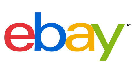
How times have changed. But one thing that hadn’t changed since 1995 was the eBay logo. At least until this week, when the online auction giant finally replaced it with a tweaked version. The colors of the new logo are similar to the old one, but the letters are no longer floating around. They’re also spaced out more (though still touching just a little) and are set in a much slimmer font.

eBay is just the latest in a series of high profile logo changes, coming on the heels of Microsoft’s logo reboot, and Twitter’s new version of Larry the Bird earlier this year.
You can check out the new logo up close and read the accompanying letter from Global Marketplaces President Devin Wenig on the announcement page at eBay.
This article was last modified on July 29, 2021
This article was first published on September 14, 2012
Commenting is easier and faster when you're logged in!

Recommended for you

Sorting Out the Dress Mess: A Round-Up of Color Visions Tests and Articles
White and gold? Black and blue? Last week the Internet learned that the color of...
Applying Gradients to Dot Leaders in InDesign
Give your next table of contents a unique look.

InDesign How-to: Find All Files That Contain a Specific Image
In this InDesign how-to video, David Blatner shows off a great trick for finding...