

dot-font was a collection of short articles written by editor and typographer John D. Barry (the former editor and publisher of the typographic journal U&lc) for CreativePro. If you’d like to read more from this series, click here.
Eventually, John gathered a selection of these articles into two books, dot-font: Talking About Design and dot-font: Talking About Fonts, which are available free to download here. You can find more from John at his website, https://johndberry.com.
The Dutch Type Library (DTL), despite its official-sounding name, is not the most widely known source of new Dutch type designs, nor do all of the fonts it sells come from the hands of Dutch designers. But it represents a useful collection of well-thought-out typeface families that are not as well known in North America as they ought to be.
Old Type in New Bottles
The foundry is the brainchild of Frank E. Blokland, and it’s based in ‘s-Hertogenbosch, Netherlands. (Don’t be confused by the coincidental resemblance of Blokland’s name to the names of his compatriots, Erik van Blokland and Petr van Blokland; Erik and Petr are brothers, but Frank is unrelated to them, although they are all type designers and they studied at the same school.)
The heart of the DTL collection is revivals of typefaces from the history of Dutch type design. Dutch punchcutters and type founders dominated European printing in the 17th century, and the Netherlands have been a source of typographic creativity in the 20th and 21st. One of the Dutch Type Library’s releases, several years ago, was DTL VandenKeere, a revival of the elegant typefaces created in the 16th century—well before the supposed heyday of Dutch punchcutting—by Hendrik van den Keere (whose types have also, coincidentally, served as the basis of both Fred Smeijers’s Renard and the Poynter Oldstyle family of digital newspaper fonts).
A 20th-century Dutch type designer, Jan van Krimpen, was arguably the first to design a sans serif type family as a deliberate companion to a serif family; DTL has continued and extended that tradition by bringing out a digital version of Van Krimpen’s neglected Haarlemmer typeface and then creating a new Haarlemmer Sans to go with it.
All of the DTL typefaces are text families, or extended families that include both text and display versions, and some of them include an almost bewildering variety of weights, styles, and variations. Indeed, the only serious fault of the Dutch Type Library’s offerings may be that it’s hard to get an overview of all the typefaces and their variations, either from catalogs or from the company’s website. On the other hand, as I have mentioned before, DTL has produced some very fine type specimens for individual type families; I’ve learned to look in my goody bag at ATypI conferences to see what DTL may have come out with this time.
Letters by Numbers
One of those type specimens, a couple of years ago, was a 32-page booklet showcasing DTL Fleischmann, a revival of the idiosyncratic Baroque typefaces cut by Johann Michael Fleischmann in the 18th century. The digital DTL Fleischmann, which has a robust weight to the regular text face and some very distinctive, attention-getting details in some of the letters, was created by Erhard Kaiser, a German type designer who worked for Typoart in Leipzig before the reunification of Germany. (Perhaps because the designer is German, the text of the Fleischmann specimen is entirely in German, rather than in DTL’s native Dutch, or in the most common international language of typography these days, English. It makes me wish I could read more German.)

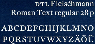
DTL Fleischmann was drawn by Erhard Kaiser, who based the design on the 18th century type of Johann Michael Fleischmann.
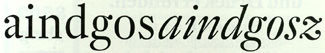
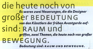
More recently, Kaiser has completed an entirely different kind of typeface family, a new sans serif called DTL Prokyon, which owes very little to any earlier typeface. This too merits a well-produced 32-page specimen book (again, auf Deutsch) that shows off the weights and styles, and the design details and unusual touches, quite thoroughly. Prokyon is largely monoweight, like most sans serifs, and has fairly classical proportions; its most noticeable trait is its simplification of the forms of some common letters: particularly lowercase a, m, n, and r. Kaiser says that his aim was “Formreduktion” or simplification of the letter shapes, starting with the m and n. This simplification, which almost eliminates the curves of those two letters, works surprisingly well in text. Even the odd form of the lowercase g, in which a one-storey design includes a little “ear” that is simply a continuation of the curved stroke beyond the stem, doesn’t draw too much attention in a block of text; and it certainly makes the typeface easy to identify.


Kaiser also developed DTL Prokyon, a sans-serif face that’s not a revival of an earlier face but completely new.
Like many DTL typefaces, Prokyon includes three different kinds of numerals: uppercase or lining numerals (which match the cap height); lowercase or old-style numerals (which match the x-height and have asenders and descenders); and small-caps numerals (which match the small-cap height, a little taller than the x-height, and have very slight ascenders and descenders). There are also superior and inferior numerals, and fractions. All four weights include small caps, in both the roman and the italic.
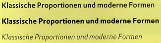
In use, at least judging by the specimen, DTL Proklyon looks clean and modern, while having enough variety to be readable. DTL (or perhaps Erhard Kaiser) describes it as having “classical proportions and modern forms.”
A Small Clan of Large Families
The two different type designs by Erhard Kaiser neatly represent the opposite ends of the DTL design spectrum, from Baroque revival to streamlined modern. Other noteworthy typefaces include Gerard Unger’s DTL Argo and DTL Paradox, Michael Harvey’s DTL Unico, Elmo van Slingerland’s DTL Dorian, and DTL Nobel, a revival by Andrea Fuchs and Fred Smeijers of the 1930 geometric sans by S.H. de Roos.
DTL also manufactures one of the current crop of font-developers’ tools, DTL Fontmaster—but that’s another subject.
If the Dutch Type Library hasn’t become as well known in the North American market as you might think, one reason is that the fonts have only been available directly from DTL—and so far the Web site has been only in Dutch. (That’s about to change.)
It might also be because DTL fonts are relatively expensive, by the current depressed standards of font pricing: a flat price of €100 per single font (€125 to combine the old-style-figure and lining-figure versions of the same font), with a 10 percent discount when you buy the whole family. Not exactly mass-market pricing, but it may assure a fairer return to the typeface designers for their work. And all of the DTL typefaces look like they’d be workhorses that you would use again and again, not just one-time novelties.
This article was last modified on March 2, 2022
This article was first published on April 21, 2003
Commenting is easier and faster when you're logged in!

Recommended for you

dot-font: Type Design Today
dot-font was a collection of short articles written by editor and typographer Jo...

dot-font: Faux Pas, or Things Not to Do When Using Type
dot-font was a collection of short articles written by editor and typographer Jo...

dot-font: Big Pages, Flamboyant Typography
dot-font was a collection of short articles written by editor and typographer Jo...