dot-font: Type Goes Global

dot-font was a collection of short articles written by editor and typographer John D. Barry (the former editor and publisher of the typographic journal U&lc) for CreativePro. If you’d like to read more from this series, click here.
Eventually, John gathered a selection of these articles into two books, dot-font: Talking About Design and dot-font: Talking About Fonts, which are available free to download here. You can find more from John at his website, https://johndberry.com.
On January 17, a bitterly cold evening in New York, the bukva:raz! exhibition opened in the visitors’ gallery at the headquarters of the United Nations, where it will be on display through February 9. The opening was attended by around 200 people, who braved the cold and the after-hours UN security system to see the first showing of bukva:raz! in North America.
I’ve written about bukva:raz! in this column before; I won’t do more here than the briefest recap. (That, after all, is what links are for.) The salient points are that it was an international competition organized by ATypI (Association Typographique Internationale) to encourage excellence in the design of typefaces for all languages and writing systems around the world, and that it was ATypI’s contribution to the United Nations Year of Dialogue among Civilizations (2001).
The idea for the competition was hatched by two Russians, Maxim Zhukov and Vladimir Yefimov. Maxim works as a typographic advisor to the UN in New York, so he was uniquely positioned to make the connection between the typographic community and the world political organization. And the event had clear support from the UN: Not only did they agree to hold the exhibition in their exhibit space in the classic Modernist UN headquarters building, but the opening was jointly hosted by Mark Batty, president of ATypI, and Giandomenico Picco, the Personal Representative of the Secretary-General for the United Nations Year of Dialogue among Civilizations.
Live in New York
The formal part of the opening was quite brief. Gillian Sorensen, Assistant Secretary-General for External Relations, welcomed the guests and did the introductions. Giandomenico Picco set the stage by reminding us what the Year of Dialogue really means, in a short poetic statement (“Are there children of a lesser God? / Are there lives which are less worth? / Are there truths which are more so?”), putting the concerns of type designers into the wider context of global peace and war. Mark Batty described the project and thanked the sponsors. Gary Van Dis, Vice President Corporate Creative Director at Conde Nast (whose major sponsorship had made the exhibition possible), spoke of how typography fosters communication in his business of international publishing. Joachim Müller-Lancé, co-founder of Typebox and who had four winning typefaces in the show, spoke for the many type designers represented. Finally, Gillian Sorensen invited the speakers to join Giandomenico Picco in cutting a symbolic ribbon (spanning two upright stanchions in front of the exhibit) and declaring the exhibition open.

Speakers Gary Van Dis, Mark Batty, Joachim Müller-Lancé, and Giandomenico Picco before the opening ceremony.
Joachim Müller-Lancé, who had come in from San Francisco, was both funny and poignant when he spoke. He described the lonely work of the type designer and the odd economics of the business, then he too put it into a broader context: “We all know,” he said, “the serious developments and events of the past months. Gaps have opened, and we need to build bridges in talking and writing. As type designers, we hope to provide the nuts and bolts for these bridges. Doors have been closed, so new windows have to be opened. We hope we can be the hinges.”
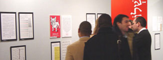
Laetitia Wolff had curated the exhibition and made sure it actually got set up in time for the opening. It looked impressive, especially in that setting. The panels showing the 100 winning typefaces were hung on a set of freshly painted movable walls in the exhibit area beyond the visitors’ information desk. Besides the typeface showings (of intimate interest to everyone involved in the type business), Maxim had designed seven full-length panels showing examples of seven different writing systems, with a word on each set in one of the winning typefaces; these were in white and black against the competition’s signature bright red.

Attendees viewing the type showings during the opening.
One of the seven panels, the one showing Japanese, used Joachim’s typeface Shirokuro to set the word ai (love) in kanji. After the formal ceremony, Joachim annotated the panel, using a large marker to write in three more words in Japanese (mind, heart, and hands) and contribute a unique bilingual gloss to the prepared display. (He had almost as many people observing this action as had listened to the earlier ceremony.)

Joachim Müller-Lancé annotating the panel that used one of his winning typefaces to show Japanese kanji.
Light in a Cold World
After the opening proper, many of the guests walked several blocks up First Avenue (against a stiff wind) to have drinks and dinner at Meltemi, a Greek restaurant that Maxim had suggested. It wasn’t a long walk at all, but by the time we got there, we were all feeling like frozen popsicles. (Fiona Ross, who had been on the jury when the competition was judged last winter in Moscow, and who was in New York as a judge of the current Type Directors Club competition, said that it was colder that night in New York than it was in Moscow. “I know,” she said. “I just checked.”)
I don’t describe all this just to document a social event. The importance of the bukva:raz! exhibit at the United Nations is its role as a small but crucial contribution to—precisely—dialogue among civilizations. The making of those nuts and bolts and hinges, as Joachim Müller-Lancé aptly put it, is important work. The best way we have of countering the destructive forces at work in the world today is to go on creating, and to encourage clearer and better communication. We aren’t just talking to ourselves.
This article was last modified on March 2, 2022
This article was first published on January 27, 2003
Commenting is easier and faster when you're logged in!
Recommended for you

dot-font: Acrobatics—Putting the Story on the Screen
dot-font was a collection of short articles written by editor and typographer Jo...

dot-font: “It’s [Still] Alive!”
dot-font was a collection of short articles written by editor and typographer Jo...

dot-font: Book Design, Part II
dot-font was a collection of short articles written by editor and typographer Jo...


