


dot-font was a collection of short articles written by editor and typographer John D. Barry (the former editor and publisher of the typographic journal U&lc) for CreativePro. If you’d like to read more from this series, click here.
Eventually, John gathered a selection of these articles into two books, dot-font: Talking About Design and dot-font: Talking About Fonts, which are available free to download here. You can find more from John at his website, https://johndberry.com.
A greater than usual number of commercial type specimens and other frankly promotional pieces appeared in this year’s ATypI goodie bag, as opposed to the traditional non-commercial keepsakes. But the line is sometimes hard to draw, and type samples and specimen books are inherently useful to typographers. Back home from Leipzig, these typographic souvenirs not only help me put names to new faces but also remind me just how large the international type community is.
Font Bureau
Font Bureau included two different editions of its Font Bureau Retail booklets: numbers 23 and 24. The company has established a simple and effective format for the booklets, which it also combines periodically into larger catalogs of the complete type library. Each display typeface or type family has a page to itself; text families, or especially complex families, are given a two-page spread. (In one case, the Interstate family, which was released in 1994 but has recently been expanded, was given two spreads, to show off all the variants in both display and text. I’m not convinced that Interstate, which was originally based on highway signage letters, is a wise choice for text, but the specimen does give you enough samples to judge for yourself.)
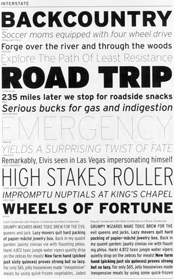
The Font Bureau shows off its Interstate family.
The display showings consist of a bunch of one-line headlines, in varying sizes, weights, and styles. The headlines don’t show all the characters, but they’re usually witty or at least odd. “Contractors Hired” reads one headline for the typeface Gangly; the next line, all caps in a much smaller size, says, “REWIRING DONE ON LUNCH BREAK.” Another typeface uses the alarming announcement, “PLANS FOR 367-SLOT TOASTER MAY NOW PROCEED.”
Faces meant to be used in running text get the same treatment, but they’re also shown in two-column blocks of text on a facing page. The text itself is a series of nonsense sentences that show off all the characters; the purpose seems to be more to demonstrate the visual color of each face in a column of text than to let us judge how easily our eyes devour a real passage of prose. The text samples intersperse short bits of italic or bold or small caps, as appropriate, to show how they contrast with the roman styles.
At the bottom of each page is a brief passage about the typeface and (usually) the designer (this fine print is set in a consistent text face, rather than in the face being shown on that page), plus a showing of the complete character set in one weight and style.
For a complex family, sometimes these specimens don’t show enough of the characters you might want to see, in the style or weight that you’re interested in. But considering the space constraints it was operating under, Font Bureau did manage to show a lot. And the showings are always enticing; they always make me want to get my hands on each typeface and put it to use.
Magpie
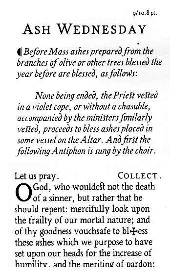
One small booklet that fits squarely into the keepsake tradition, yet shows off a new type family, is Vincent Connare‘s Magpie™. He created the typeface of that name as part of the master’s program in type design at the University of Reading. But Connare is no novice; he spent several years in Microsoft’s typography department, and he is responsible for Trebuchet, one of Microsoft’s freely downloadable typefaces designed specifically for reading onscreen. Magpie, though, is much more traditional; it’s a condensed text face based on the designs of the 18th-century French type designer Pierre-Simon Fournier le Jeune. This booklet explains the provenance of the design, and the design process, and it puts the typeface through its paces—in the text itself, in sample settings of two French poems (one in roman, one in italic), and in a two-page spread of religious text taken from an English missal. With its classic look and its narrow width, Magpie could easily be used as a bible face; Connare obviously had this in mind, given that he provided a number of special characters for exactly that purpose.
Magpie, by Vincent Connare
The booklet is sober and straightforward, though graced with a lyrical paean to the magpie. The typeface is lively, perhaps because the roman seems to have evolved from the italic: “My first breakthrough was when I began on the italic font. I wanted it to be cursive and very different from the roman font… I was pleased with the results and after showing Gerard Unger my attempt he suggested a method he once discussed with Matthew Carter—that if you are more pleased with the italic an experiment which may help put life into the roman font is to tilt the italic upright.” Connare removed the more obviously cursive features from the resulting font, but it gave him the calligraphic quality that he was looking for.
With Connare’s experience on Trebuchet, it may be no surprise that Magpie was designed with the screen in mind as well as the printed page. At the end of his booklet, he shows samples of Magpie in use with the Microsoft Reader and ClearType on the screen of a handheld PocketPC. The letters look squarer here, but they show promise as a potential text face for electronic books.
Dalton Maag
In the frankly commercial category, several large-format brochures appeared from the Dalton Maag studio in London: three showing specific typefaces, and one promoting Dalton Maag’s custom type-design work for large clients, called “What’s a brand without a typeface?” The individual type specimens fold out into long posters, with text on the back in the appropriate typeface. They’re simply and elegantly done, especially the one for the old-style text family Pan. The more robust, no-nonsense slab-serif Lexia is shown in brighter colors and a slightly starker design, and the playful Royalty, which comes in four weights (Anorexic, Average, Chubby, Obese), leaps out in purple and pink. Although all three of these type families are available to the public, it’s clear that Dalton Maag’s main business lies in custom type design.
Dutch Type Library
The Dutch Type Library, which is not well known in the United States because it’s not actively marketed here, put two rather different items into the goodie bag: a CD-ROM full of samples of its typefaces in PDF form, and a nicely designed and printed booklet about one of them, DTL Fleischmann.
The booklet appears to be an offprint of an article from Typografische Monatsblätter by the distinguished Swiss type designer and teacher Max Caflisch, about DTL’s revival of the 18th-century types of Johann Michael Fleischmann. Since I can read very little German, I can’t do Caflisch’s article justice, but the illustrations clearly show the process of researching Fleischmann’s printed examples (with their sometimes peculiar serifs) and turning them into the basis for a digital type family, with multiple weights and both text and display versions. The work of digitizing this energetic, baroque type was done by German type designer Erhard Kaiser. As a historical revival, it includes a very large number of ligatures, including something I’d never seen: f-ligatures and long-S ligatures for vowels with an umlaut.
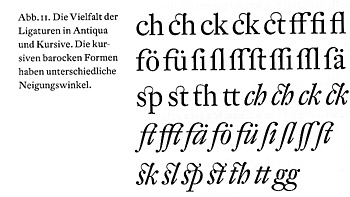
The Dutch Type Library’s DTL Fleischmann specimen illustrates the typeface’s large number of ligatures.
The files on the DTL CD-ROM are true, if virtual, type specimen booklets: page after page of sample settings (plus a page of introductory text, in Dutch), which you can either view on screen or print out for future use. Some of these run to 70 pages or more. There are also “small type specimens,” shorter booklets of eight pages or so that might be more practical to print.
Rayuela
Another type specimen booklet emerged this year from the master’s program in type design at Reading: Rayuela, una bitácora de diseño, or Hopscotch, a design log, by Alejandro Lo Celso. Rayuela is the name of a type family with both serif and sans-serif versions. It’s informal in appearance, but it’s intended for text setting. In this bilingual booklet, the serif version is used for the dominant Spanish text, with the sans serif for the English translation. Lo Celso has an idea to explore about language: that the visual differences between written languages mean that each language has particular typefaces that are suitable to it. To make his arguable but interesting point, Lo Celso shows paragraphs in several different languages, all set in the same size and style of Rayuela Serif. An idea to explore further.
Two from Brazil
There were two rather flashy publications from Brazil: Tipografia Brasilis, the catalog of the first exhibition in Brazil devoted exclusively to type design; and Tupigrafia, the first issue of an eclectic graphic design magazine edited by Claudio Rocha and Tony de Marco.
The type exhibition was organized by Fundação Armando Alvares Penteado, in São Paulo, and a lot of what was shown—or at least what’s in the catalog—is highly conceptual. Each page is essentially a small poster from a single designer. The catalog itself is a riot of embossing, blind embossing, and metallic embossing. The printer and the paper company were clearly having some fun.
Tupigrafia features everything from graffiti and seriously vernacular street signage to a historical article about Chinese calligraphy and a (reprinted) interview with Hermann Zapf about his calligraphic face Zapfino. The typographic style varies with the article. Although in some cases design overwhelms text, I still found myself wishing that I could really read Portuguese (instead of trying to triangulate from other Romance languages).
More Still
I’ve hardly exhausted the wealth of type specimens and related publications that made this year’s goodie bags weigh so much.
Linotype‘s big catalog certainly contributed to the weight; it’s a useful volume to have on your shelf, but a heavy one to lug around in a shoulder bag.
Fundición Neufville went the other way, with two tiny pocket-sized brochures for their new Neufville Digital line. One was for Futura ND, the first in the Bauer Classics line (from the old Bauer foundry); the other was for Neufville’s Grafía Latina line, which mixes display faces first issued in metal in the ’50s with new designs.
Mexican type designer Gonzalo García Barcha showed off his typeface Enrico in a large poster reprinting Pablo Neruda’s “Ode to Typography” (in Spanish, of course). Enrico is the first font from the Compendio de tipografía mexicana.
P22 put its characteristic small, square catalog of artist-related revivals and specialty fonts into the mix. For fun, it included an oval sticker in the form of a European country identification plate, which you could slap on the bumper of your car, saying “P22.”
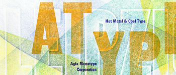
Agfa Monotype’s keepsake letterpress poster
And Agfa Monotype, following the old tradition of keepsakes rather than catalogs, simply contributed a small poster, printed letterpress in several colors by Brian Allen from wood type and Monotype hot-metal Univers. A nice touch.
This article was last modified on April 6, 2022
This article was first published on November 3, 2000
Commenting is easier and faster when you're logged in!

Recommended for you

dot-font: Can a Book Teach You to Set Type Perfectly?
dot-font was a collection of short articles written by editor and typographer Jo...

dot-font: News on Paper in the Digital Age
dot-font was a collection of short articles written by editor and typographer Jo...
dot-font: Font Bureau x 3
dot-font was a collection of short articles written by editor and typographer Jo...