


dot-font was a collection of short articles written by editor and typographer John D. Barry (the former editor and publisher of the typographic journal U&lc) for CreativePro. If you’d like to read more from this series, click here.
Eventually, John gathered a selection of these articles into two books, dot-font: Talking About Design and dot-font: Talking About Fonts, which are available free to download here. You can find more from John at his website, https://johndberry.com.
In September, an ambitious exhibition of the type designs of Matthew Carter opened in Baltimore. The exhibition’s catalog, “Typographically Speaking: The Art of Matthew Carter,” which was edited and designed by Margaret Re, is a remarkable book in its own right.
The Ubiquitous Renaissance Man
Re conceived of both the exhibition and the book as ways help people outside the closed world of typography understand the art and craft behind the letterforms that we all read and use every day. Matthew Carter is a uniquely suitable subject for such a survey, because he has created typefaces in such a variety of styles, formats, and technical environments, and because his typefaces are so widely used in everyday reading.
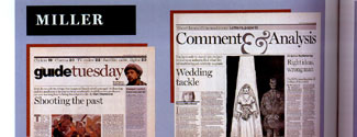
As Johanna Drucker puts it, at the beginning of her essay on Carter’s work (tellingly entitled “Typographic Intelligence”): “He commands a wider audience for his work than most artists ever dream of. Open a book catalog from any major publisher and you will see ITC Galliard. Browse a newsstand and some version of Miller News will pop into view. Go online and you’ll find Verdana everywhere on the Web. Use a reference book. Find a telephone number. Buy a ticket for an event. Read an announcement in a digital source. Carter’s work pervades the media through which the messages you receive are being conveyed.” Very few of the people doing any of the actions Drucker describes have any idea of the name or identity of the person who created the typefaces they’re reading (except, of course, for the percipient readers of Creativepro). The fate of the type designer is to create tools that others will put to use.

Margaret Re, at the conclusion of her essay, “Matthew Carter’s Typefaces: Integrating Technologies and Bridging Cultures,” puts it more formally: “A major artist with whom most people are unknowingly familiar even as they encounter his work daily, Matthew Carter has designed typefaces, of which ITC Galliard, ITC Charter, and Miller are the best known, for setting continuous text. He has made typefaces for journalistic purposes: Olympian, Time Caledonia, and Miller News, among others, that daily grace the pages of popular magazines and respected newspapers. His typefaces for on-screen viewing, Georgia, Verdana, Tahoma, and Nina, regularly lend readability, legibility, and efficiency to screen-based communications and to the Internet. He has received major commissions to design proprietary typefaces, whose use are restricted to one organization, for news media corporations, software companies, and cultural institutions. Carter, the perennial student, is a master at considering and utilizing divergent elements in the construction of a typeface as he quietly ‘serves’ letterforms used to lend structure to thought across time and space.”

A Book for the Eye and the Hand
The exhibition catalog comprises several essays (all well illustrated), a set of color plates that reproduce some of the display panels from the exhibition (organized by typeface), and the sort of supplementary material you would expect in a catalog that comes from an academic institution (chronology, bibliography, a checklist of the exhibition, and a very nicely illustrated three-page “Type Vocabulary”—altogether a useful set of back matter). Tucked into a pocket in the back of the catalog is a second book, “A Check-List of Typefaces Designed by Matthew Carter,” produced by Carter himself and illustrating most of the typefaces with sample character sets.
At first glance, the color plates look a bit crowded, but since they reproduce the actual display panels from the exhibition, it’s understandable that they each show several different items juxtaposed. The page size of the catalog is generous, but of course the original panels are much larger still. They show everything from drawings and factory proofs of individual letters to examples of Carter’s typefaces in use. The illustrations in the essays, which were created for the book, are appropriately large, in black and white.
The book is invitingly designed and manufactured; the paper and cover stock have a bite and texture to them, the size is spacious, and the typography is elegant. Carter’s own typefaces are used throughout, with various text faces used for various essays or parts of essays. There are some missteps, however, in the book’s design. The binding is very stiff, which makes it an effort to hold the pages open; and the page layout is sometimes self-indulgent: varying the width of the text block or shifting it back and forth across the page at random, which interferes with reading.
There’s a lot of content here. Perhaps the most erudite and clearly presented essay is James Mosley’s on Carter’s relationship with historical models for his type designs, primarily ITC Galliard. In this one short essay, Mosley puts the entirety of modern typeface revivals into perspective, and puts Matthew Carter’s work into that context by giving the details of how things actually got done and what the people involved said about what they were doing. It would be easy to quote from Mosley’s essay, but hard to choose where to stop, because his ideas are effortlessly and inextricably woven together.
Seeing is Believing
The exhibition “Typographically Speaking: The Art of Matthew Carter” runs through December 7 in the Albin O. Kuhn Library & Gallery at University of Maryland, Baltimore County, after which it will travel. The catalog is available for $20 plus $3 shipping. Contact:
Cynthia Wayne
Albin O. Kuhn Library & Gallery
UMBC
1000 Hilltop Circle
Baltimore MD 21250
telephone (410) 455-2270
e-mail cwayne@umbc.edu
This article was last modified on March 9, 2022
This article was first published on November 4, 2002
Commenting is easier and faster when you're logged in!

Recommended for you

dot-font: Easing Designers (and Readers) into E-Books
dot-font was a collection of short articles written by editor and typographer Jo...
dot-font: A New Face for Small Text
dot-font was a collection of short articles written by editor and typographer Jo...

dot-font: Type Off the Wall
dot-font was a collection of short articles written by editor and typographer Jo...