

dot-font was a collection of short articles written by editor and typographer John D. Barry (the former editor and publisher of the typographic journal U&lc) for CreativePro. If you’d like to read more from this series, click here.
Eventually, John gathered a selection of these articles into two books, dot-font: Talking About Design and dot-font: Talking About Fonts, which are available free to download here. You can find more from John at his website, https://johndberry.com.
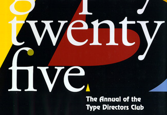
Every year, the Type Directors Club in New York hosts an exhibition of the winning designs from its competition for the year’s best typography—that is, the best graphic design using type—and from its companion competition for the best new typeface designs. And every year, a few months later, TDC publishes its annual, Typography: the Annual of the Type Directors Club, which shows all the winning entries from both competitions. The first TDC show was in 1954, and the first annual was published in 1979, which makes last year, 2004, the fiftieth anniversary of the competition and the twenty-fifth anniversary of the TDC annual. So Typography 25 (showing work done in 2003) is a special volume.
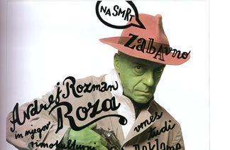
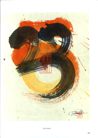
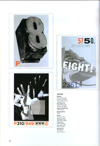
Since this is the twenty-fifth Typography annual, TDC asked twenty-five typographic designers to design a special section at the back of the book, “Celebrate 25,” where each designer created a page that embodied one of the numbers from 1 to 25. Some are high-concept, some are playful, some are calligraphic, some are photographic; each of the designers (all of them well-known in their field) obviously had fun with this eccentric assignment.
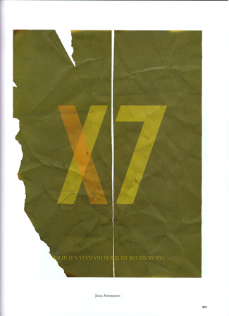
Twenty-five years in twenty-five pages: the number ’17’ interpreted by Jack Anderson, and ’23’ by Tim Girvin
Typographic Variety
It’s always tempting to try to find patterns and draw conclusions about the current state of typography based on the results of the competition. While the sheer size of the book gives a pretty good overview of the state of the art, there’s usually very little you can point to as a trend. There’s just good work.
Some of this work uses straightforward type in straightforward ways, valuing clarity and simplicity over complexity. The type may be integrated into a visual composition that does something unusual while making no bones about its typographic origins.
Sometimes simplicity is the most effective technique.
There’s also an awful lot of layering and mixing up of forms and styles, including plenty of faux-naïve lettering. This is most effective when it manages to combine complex textures with stark contrast, emphasizing both, while making visual sense of the whole. Often it’s not type at all but hand-lettering that’s being used. Rarer is type integrated successfully with calligraphy.
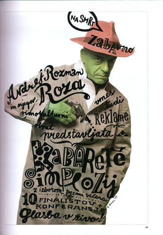
Unbridled handwriting and controlled calligraphy
Books and Magazines
I was pleased to see a number of books among the winners—both covers and interior designs. Books are harder to evaluate in the short time allotted for judging competitions, so the flashier ones tend to get the most attention. On covers, this often makes sense; in the interior pages… well, it depends on the book’s purpose. (If only a well-set page of text really were normal enough to be dismissed as ordinary! Unfortunately, today’s norm is often very sloppy in its typographic details.)
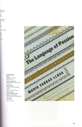
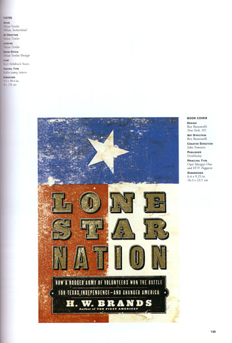
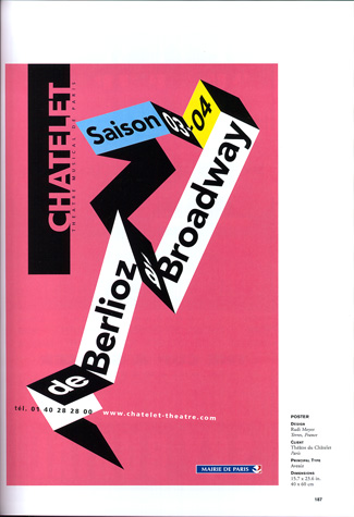
Striking book covers where the feeling of the type itself is important
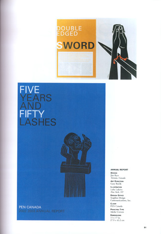
Not surprisingly, a lot of interesting typography is done for magazines, and the selection here reflects that. Although there are separate competitions for publication design, the TDC competition focuses on how type is used—and naturally, in any popular magazine with a lot of words, there’s ample opportunity for imaginative type treatments.
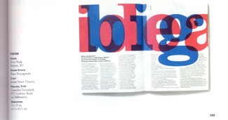
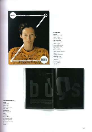
A typographic spread and a magazine cover, both playing with the size and placement of the type
TDC-too
The typefaces chosen by the judges of the type-design competition, TDC2 2004, are almost all text faces, or at least faces that can do double duty as display or text. Christian Schwartz has by far the biggest presence this year, with three different type families that he designed for the Font Bureau among the winners, as well as FontShop’s FF Unit, which Schwartz worked on with Erik Spiekermann. Multilingual and multiscript typesetting is given plenty of attention: Jovica Veljovic’s Sava, which is entirely made up of caps and small caps, has Latin, Greek, and Cyrillic versions, and there are two carefully balanced text faces for bi-scriptual setting: John Hudson’s Nyala (Ethiopic and Latin) and Adi Stern’s Noam (Hebrew and Latin). There are a lot of typefaces here that look like they would stand up to extended use.
New typeface designs by Mark Jamra (top) and Adi Stern (bottom)
The Typography of Typography
Every TDC annual is also a showcase for its own design, since each year a different designer handles Typography. This year it was Diego Vainesman, a New York designer who is also on the TDC board of directors. The basic page design is always as simple and straightforward as possible, since its purpose is to show off the winning entries without getting in the way. There is always a mix of full-page displays and pages with two or three small entries shown together. It’s important that the caption information be easy to find and clearly associated with the right image, but the captions shouldn’t be too large an element on the page. Vainesman’s design achieves its goal without apparent effort (which means that it must have actually taken a lot of effort).
A page showing three posters from the same designer
Where a designer can have fun with a book like this is in the front matter and back matter, and of course on the cover. Vainesman’s use of enlarged numbers and punctuation marks as design elements, in contrasting color, treats type as image, but keeps that essentially decorative use subordinate to the content. For the actual text of the book, he chose a highly readable typeface, though he contrasts that with an obviously 1970s-style bold display face for the section titles. (He uses both together on the jacket.)
The typography of a book that celebrates excellence in typography ought to be exemplary, so the handful of faults in Typography 25 bother me more than they might otherwise do. In the list of TDC members in the back, where each name is followed by the member’s date of joining the club, the dates are given in abbreviated form—’67, for example—but every one of the apostrophes is reversed, appearing as a single open-quote. This is what a word processor or page layout program will do automatically, but it should have been caught in production proofreading. A more conscious mistake was using caps and small caps in the subheads of the captions but not choosing a typeface that had real small caps; the resulting difference in weight between large and small caps is jarring, once it comes to your attention.
But the wit that Vainesman displays in his design is a pleasure. I laughed out loud when I noticed what he had done with the “fi” ligature in the book’s title on the front of the jacket. (Then I chuckled again when I looked at the jacket’s back, but you’ll have to get the book to see what amused me there.)
Is that a real ligature, or isn’t it?
Both typography and type design are, at heart, crafts that everybody sees but very few people appreciate, or even consciously notice. Although the typographic design in the larger competition is sometimes flamboyant, perhaps the last word should go to the chairman of the type-design competition, Charles Nix: “The type specimens that follow are testimony to the efforts of the best practitioners of our quiet craft for 2003. We congratulate the winners and offer every encouragement for continued excellence.”
This article was last modified on February 16, 2022
This article was first published on May 2, 2005
Commenting is easier and faster when you're logged in!

Recommended for you

dot-font: Type Buzz in Vancouver
dot-font was a collection of short articles written by editor and typographer Jo...

dot-font: Designing Running Heads
Learn the best practices for designing these inconspicuous but essential book pa...
dot-font: Avant Garde, Then and Now
dot-font was a collection of short articles written by editor and typographer Jo...